2Slides Team
18 min read

Quick answer: A reliable image-to-image style prompt does two jobs at once: it locks down what must not change in the photo, and it describes the new medium in physical terms. The 34 prompts we tested share six parts: a layout rule with exact proportions, a preserve-the-photo rule, a material description of the medium, a palette taken from the photo, caption rules, and a forbidden list. Supply your own text, and treat numbers as direction, not law.
An image-to-image prompt is harder to write than a text-to-image prompt. The model already has a picture, and everything you write is a license to change it. Ask for "warm natural daylight" and a model may relight your dusk photo. Give an example caption and it may print your example.
We know this because we tested it. Each effect on 2Slides Photo Effect Tools is one fully written style prompt, and this guide analyzes the 34 that were live on October 9, 2026. Each takes a user's photo and returns a poster: the original photo on one part, usually the top half, and the same scene redrawn in one medium on the other. Before an effect went live, we ran its prompt 4 to 12 times on fixed test photos in our production image model and scored every output against written rules. That came to 205 runs, of which 169 (82%) were clean.
This guide pulls out what those prompts have in common, quotes them directly, and then uses the test notes to show which instructions failed and why. All of these prompts are published in full on their effect pages, so you can check every quote. One note on language: our production prompts are written in Chinese, and each effect page publishes the original alongside a full translation into the reader's language. The quotes below come from the published English versions.
A style prompt has to keep some things fixed and change everything else on purpose. It needs to say which parts of the photo are locked (subjects, count, pose, composition), what the new medium is made of, where each element goes in the frame, and what is off-limits. Vague prompts fail because the model fills every gap with its own defaults.
The published English versions of our prompts range from 870 characters (Colored Pencil Travel Poster) to 6,614 (Marker Portrait Poster), with a median around 2,600. Both of those extremes passed every test run (5/5 and 6/6). Length alone did not predict success. Specificity in the right places did.
Almost every prompt in the set is built from the same six parts, usually in this order. Not every prompt has all six, but the reliable ones state each one explicitly rather than leaving it to the model.
| Part | What it does | Real excerpt |
|---|---|---|
| 1. Layout rule | Fixes the frame, the split and the proportions | "Split it horizontally at y=768 so the upper and lower halves are exactly 50% each in height — no border, no white margin, no black bars." (Paper Cut) |
| 2. Preserve rule | Lists what must not change in the photo | "every person, animal, plant and object in it must be preserved exactly — the same count, the same poses" (Vintage Stamp) |
| 3. Medium, in physical terms | Describes materials, tools and marks | "Lay large colour fields with a wide chisel nib … seams where strokes overlap" (Marker Portrait) |
| 4. Palette from the photo | Derives color from the source, with a direction | "pull the brightest, liveliest, most alive colours out of the photo above and remix them rather than averaging" (Couple Diorama) |
| 5. Caption and typography | Sets what text appears, where and how big | "keep the main line to three to eight English words" (Marker Portrait) |
| 6. Forbidden list | Names the failure modes outright | "Forbidden: text floating on top of the image, ordinary typesetting, realistic painting, a background filled edge to edge" (Calligram) |
Most prompts open with the frame and the split, stated as a number rather than an adjective. "Vertical 3:4, the two zones strictly 1:1 in height, 50% each" is typical. Many also ban the most common layout error in the same breath: "not a collage of several images," "No grids, no compilations, no nine-up layouts" (Needle Felt), or "a left-right split instead of a top-bottom one" in Vintage Stamp's forbidden list.
The split was one of the most reliable things in testing. It measured 49.9% or 50.0% across run after run, and needle felt's 2:3 frame came back at the expected 1696 × 2528 pixels in 6/6 runs.
"Keep the original photo" is not enough. The stronger prompts list what to keep and name the edits a model tends to make. Marker Portrait is the clearest example:
"Closed eyes must not become open, a closed mouth must not become a toothy smile, a profile must not become a frontal view, and a back view must not be given a face."
Most prompts also give the model one safe outlet, so it doesn't distort the subject to fill the frame: "The background may be extended naturally to fit the frame, but the subject must not be stretched or distorted."
The prompts rarely just name a style. They describe how the object would be made. Needle Felt asks for "wool felt, felting fibre, raw edges, stitching and layered felt pieces." Vintage Stamp asks for "ink that varies in density, colour plates that register slightly off, and patches where the ink skipped and the bare paper shows through." Chinese Ink Wash lists "spreading ink halos, layered wet and dry strokes of varying density, flying white, bleeding, accumulated ink."
Physical description gives the model concrete marks to draw. A style name alone gives it a vague average of everything tagged with that name.
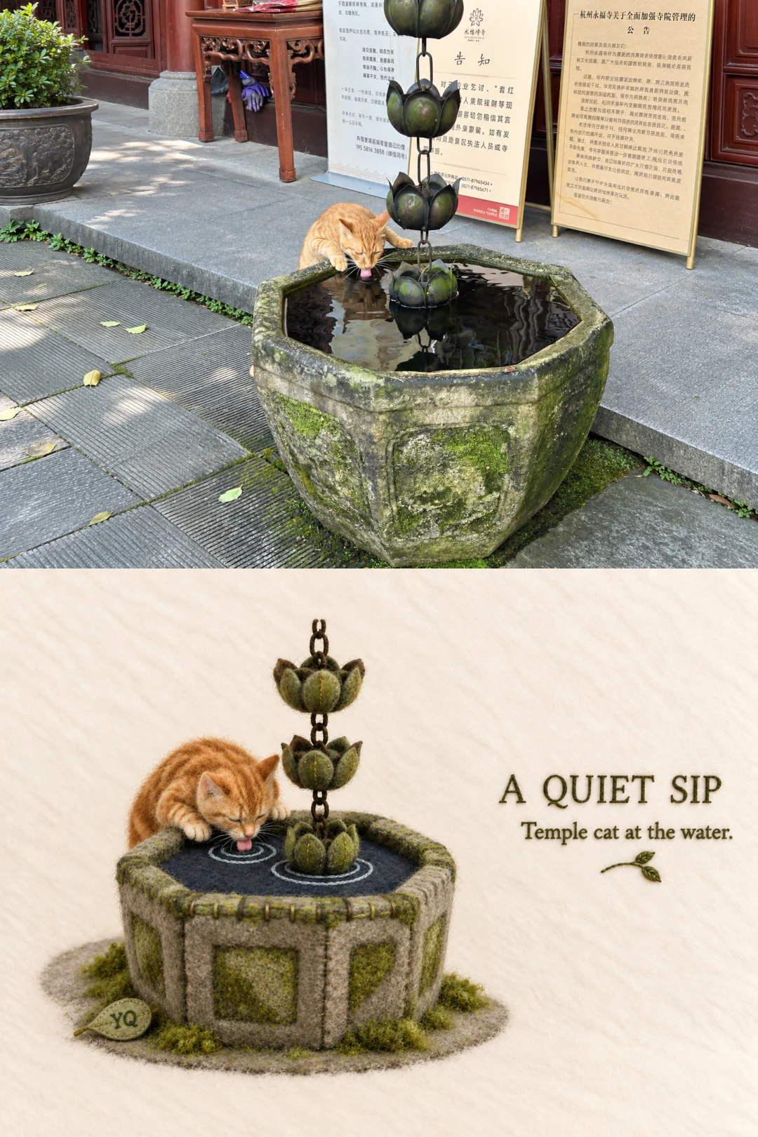
Needle felt: the moss on the stone survives as flecked green fibre, because the prompt names the fibre, not just the style.
Nearly every prompt derives its colors from the source photo instead of naming a fixed scheme, then says which way to push them. Calligram: "take two to four dominant colours from the original, purify and deepen them." Vintage Stamp converts them into "slightly faded old stamp-ink shades." Chinese Ink Wash keeps ink dominant and allows only "a little colour … distilled from the liveliest tones of the original."
This is why results from the same prompt look different from photo to photo. It is also why each prompt adds a short list of colors to avoid, such as "grey, dirty, aged, sombre or brown-filter tones."
The prompts that carry text say how much, where, and in what voice: "a short English title distilled from the place or subject" (Paper Cut), "The text must be complete and correctly spelled," "Never apply a preset fixed title or a serial number" (Chinese Ink Wash). Prompts that must stay text-free say so outright, and that held: the text bans in Ukiyo-e Woodblock and Crayon Travel Poster kept every run clean of titles, seals, logos and garbled characters, 6/6 each.
Many prompts end with a labeled list of failures: "Forbidden:", "Strictly avoid:" or "Strictly forbidden:". The one in Palette Knife Painting has 28 items, from "a wrong split" to "black borders." The useful entries name specific, visible outcomes ("watermarks," "duplicated people," "a background filled edge to edge") rather than qualities like "low quality."
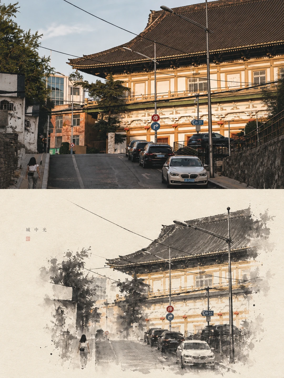
Chinese ink wash: the prompt gives the subject "roughly 30–45% of the lower zone," and the overhead wires survive as three ruled lines.
A written instruction is a request, not a guarantee. Across 205 runs, most failures broke a rule the prompt already stated in plain words. These are the patterns from our regression notes, with what each one teaches.
| Instruction in the prompt | What happened in testing | Lesson |
|---|---|---|
| Calligram: "Forbidden: … a background filled edge to edge" | 2 of 6 runs flooded the frame with type anyway; 1 laid words over a copy of the photo | Restating a ban rarely fixes a composition failure |
| Watercolor Painting: top half uses "natural daylight" | 1 of 2 runs on a dusk photo relit the photo itself into daytime | Never describe the photo half with style words |
| Watercolor Painting: example phrases "summer days" / "a quiet afternoon" | Both runs without a user caption printed the example phrases | Examples become defaults |
| Japanese Minimal: "Do not illustrate it, redraw it, recolour it" | 6 of 6 failed our strict photo-unchanged check on a small 1080×720 test photo* | Feed the model a full-resolution source |
| Storybook: "a few short phrases, objects, place names, numbers or playful annotations" | About a third of runs garbled one label in mixed scripts | Constrain every piece of text the model writes |
| Marker Portrait: "note the actual generation date" | Six runs, six different made-up dates | Don't ask for facts the model cannot know |
| Needle Felt: scene width "must never exceed 62%" | 5 of 6 runs exceeded it | Numbers steer; they don't bind |
*Japanese Minimal Watercolor Print scored 0/6 against our strictest rule because fine detail such as snow patterns shifted between runs. Scene, composition and lighting were preserved, and it was published after manual review. The likely cause is the model upscaling a deliberately small test photo.
The calligram prompt forbids exactly what went wrong: "text floating on top of the image" and "a background filled edge to edge." Two of six runs flooded the frame anyway, one painted words over a posterized copy of the photo, and one misspelled two headline words. Only 2 of 6 were clean, the lowest rate in the set. Our conclusion was that saying it a third time won't help. The next experiment we plan, not yet run, is to make the requirement measurable, such as a stated maximum ink coverage for the lower half. We cover the calligram in depth in how to make a calligram from a photo.
Watercolor Painting Poster describes its top half as "real travel photography" with "natural daylight" and "soft shadows." On a dusk photo, one run obeyed that literally and relit the user's photo into daytime. Any adjective attached to the preserved half is a license to edit it. Describe that half only in terms of what to keep.
The same prompt shows a second trap. It offers "summer days" and "a quiet afternoon" as example captions, and both test runs without a user caption printed them. If your prompt includes example text, expect to see it.
The most serious failure is the model replacing the user's photo with a new one: a different station, a different beach, a different mountain lake. It happened in about one run each for seven effects, including Editorial Magazine, Architectural Sketch, Geometric Collage, Oil Painting Diorama and Particle Dispersion, despite firm preserve wording in every one. A related failure runs the other way: the model skips the effect and pastes a near-copy of the photo into the art half. That happened once each in Couple Diorama, Palette Knife, Plaster Relief and Risograph.
The lesson is practical. Always compare the preserved half against your original, and budget for a rerun.
Our caption templates once wrapped the user's title in CJK corner brackets, as in 「{title}」. The model sometimes drew the brackets into the artwork as part of the title. In a controlled comparison on Chinese Ink Wash, the original template had 2 of 6 runs with bracket defects. The revised template puts the string on its own line and forbids quotes, brackets and wrapping punctuation, and it had 0 of 6. Six runs each is not statistically significant on its own, but the cause was visible in the images and did not recur.
Position words need an anchor too. Doodle Icon Grid's first version said to put the title at the "top," and the model read that as the top of the whole poster and set the title above the photo. That version had 3 defective runs out of 6. Changing it to the top of the lower half fixed it: 0 defects in 4 runs.
This was the clearest pattern in the set. User-supplied captions were copied verbatim almost every time. Vintage Stamp set its caption text cleanly across 22 consecutive runs, and Storybook set the user's two lines exactly in 6/6. The failures came from text the prompt told the model to make up: Storybook's free-form annotations with no language constraint produced a Japanese particle spliced onto a Korean word, and Photo Memory Stamp once invented a date inside its stamp. Style descriptions of lettering were also weak. Prompts asking for handwriting or stitched thread lettering often got a clean typeface instead.
Use this skeleton as a starting point. It follows the six-part structure and builds in the fixes from testing. Replace everything in angle brackets.
Make one standalone image from the uploaded photo. Not a collage, no grids.
Vertical <3:4>, split top to bottom at exactly 1:1, each half 50% of the height.

TOP HALF — the original photo.
Keep the uploaded photo itself: the same subjects, the same number of subjects,
their poses, positions, expressions, clothing, the composition, viewpoint,
light and colour. Do not redraw, relight or recolour it. Apply only a light grade.
If the frame needs more space, extend the background naturally; never stretch
or distort the subject.

BOTTOM HALF — the same scene as <medium>.
Rebuild the main subject and <two to four> supporting elements from the photo
as <medium>, made of <materials>, with <tool marks / texture / edges>.
Keep each subject's silhouette, pose and position relative to the others.
Do not copy the photo; this half must clearly be <medium>, not a filtered photo.
Place it on <ground, e.g. warm ivory paper> and leave about <30>% of the lower
half empty.

COLOUR.
Take <two to four> dominant colours from the photo and <deepen / fade / brighten>
them. Avoid <colours that break the medium>.

TEXT.
Set this title exactly as written, on its own line, with no quotes or brackets:
<your title>
Set this subtitle exactly as written, on its own line, no quotes or brackets:
<your subtitle>
Place both in the empty area of the bottom half. Add no other text, labels,
numbers, dates, signatures, logos or watermarks.

FORBIDDEN.
A collage or grid; a left-right split; changing the top-half photo; the
bottom half filled edge to edge; text over the subject; <medium-specific
failures, e.g. "3D render", "plastic texture", "flat vector">.
Three notes on using it:
Every 2Slides effect page publishes its full prompt, free to copy without an account. The prompts are written for models that take a reference photo, so they work in image-to-image models such as Nano Banana and GPT Image 2. Our test numbers come from our production image model only, so expect different hit rates elsewhere, and run your own small test before trusting any prompt.
For how the models differ, see our comparisons of GPT Image 2 vs Nano Banana and Nano Banana 2 vs Nano Banana Pro. For the full list of effects with their test results, see our comparison of all AI photo-to-art styles.
Test a prompt the way we did: several runs on the same photo, scored against rules you write down before you look. One good output tells you very little.
Keep the numbers in proportion. Zero failures in six runs still leaves a 95% upper bound of roughly 40% on the true failure rate. Six runs is a smoke test, not a measurement.
It is a text instruction given to an image model together with a reference image, telling the model how to transform that image. A style prompt is a kind of image-to-image prompt that keeps the content of the photo and changes the medium, such as turning a photo into watercolor, woodblock print or felt.
List what must stay the same (subjects, count, pose, composition, light and color) and keep style words out of that section. Allow one safe outlet, such as extending the background. Use a full-resolution photo. Even then, check the result, because in our tests a strong preserve rule still failed in about one run for several effects.
Partly. In our tests, bans on adding text held well: two text-free prompts had no stray text in 6/6 runs each. Bans on composition problems were weaker. The calligram prompt forbids filling the frame edge to edge, and 2 of 6 runs did it anyway.
Yes. Every prompt is published in full on its effect page and is written for image-to-image models. Our success rates come from our own production model, so run a few tests in yours before relying on any one prompt.
Usually because the prompt invites it, through example captions, requests for "annotations," or a blank title slot the model fills itself. Supply the exact text you want on its own line, without quotes or brackets, and add "no other text" to the forbidden list.
Long enough to state the six parts clearly. Our 34 tested prompts run from 870 to 6,614 characters, and both extremes passed every test run. Detail in the layout, preserve and medium sections matters more than total length.
A good image-to-image style prompt locks the photo with specifics, describes the medium as a physical object, takes its colors from the source, and names the failures it forbids. Then it gets tested, because written rules fail in predictable ways: bans don't fix composition, style words leak into the preserved half, and invented text goes wrong far more often than supplied text. To see a prompt that held up in testing, read the full published prompt on Vintage Stamp Postcard, which passed 6/6 runs and set captions cleanly 22 times in a row.
Create stunning AI-powered presentations in seconds. Transform your ideas into professional slides with 2slides AI Agent.
Try For FreeIhr KI-Agent für Folien. Sparen Sie Zeit, glänzen Sie schneller mit intelligenter Präsentationserstellung.




© 2026 2slides. Alle Rechte vorbehalten.