Chinese Ink Wash Poster
Your photo on top, the same scene distilled below into ink on xuan paper
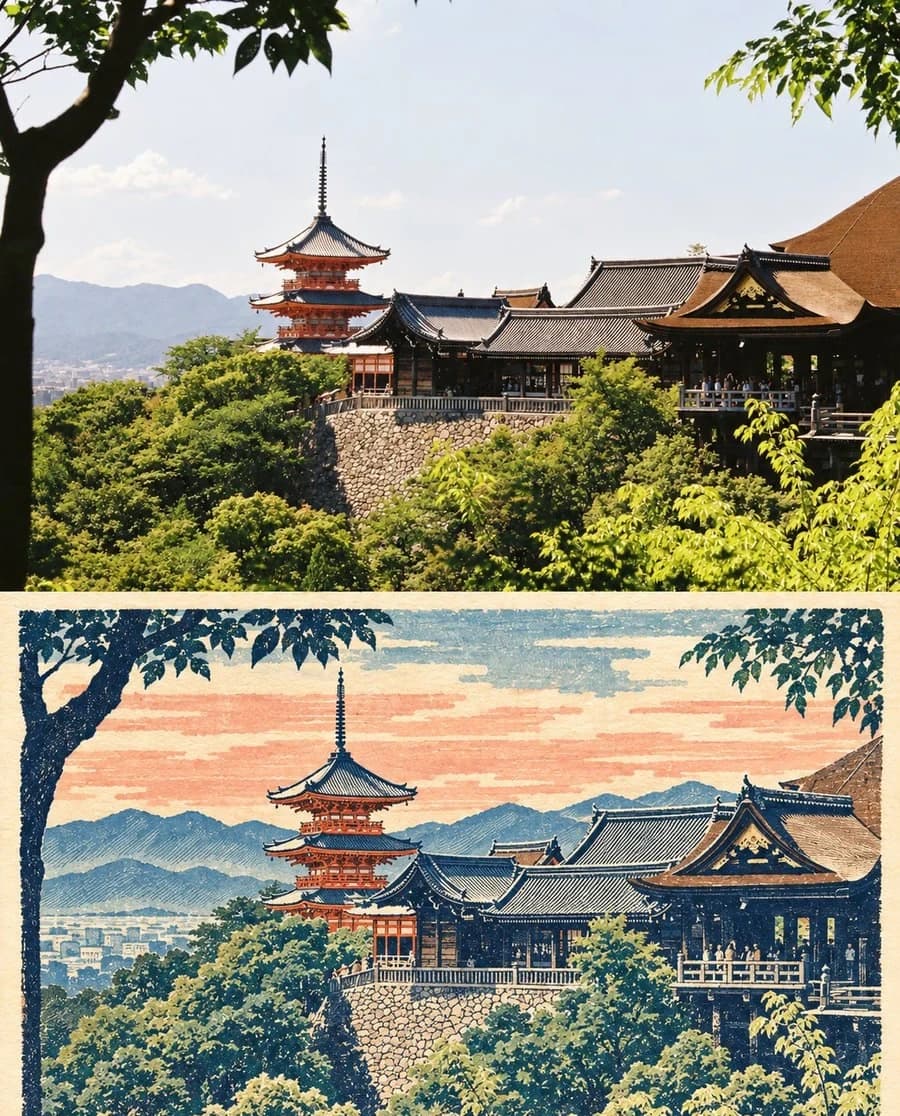
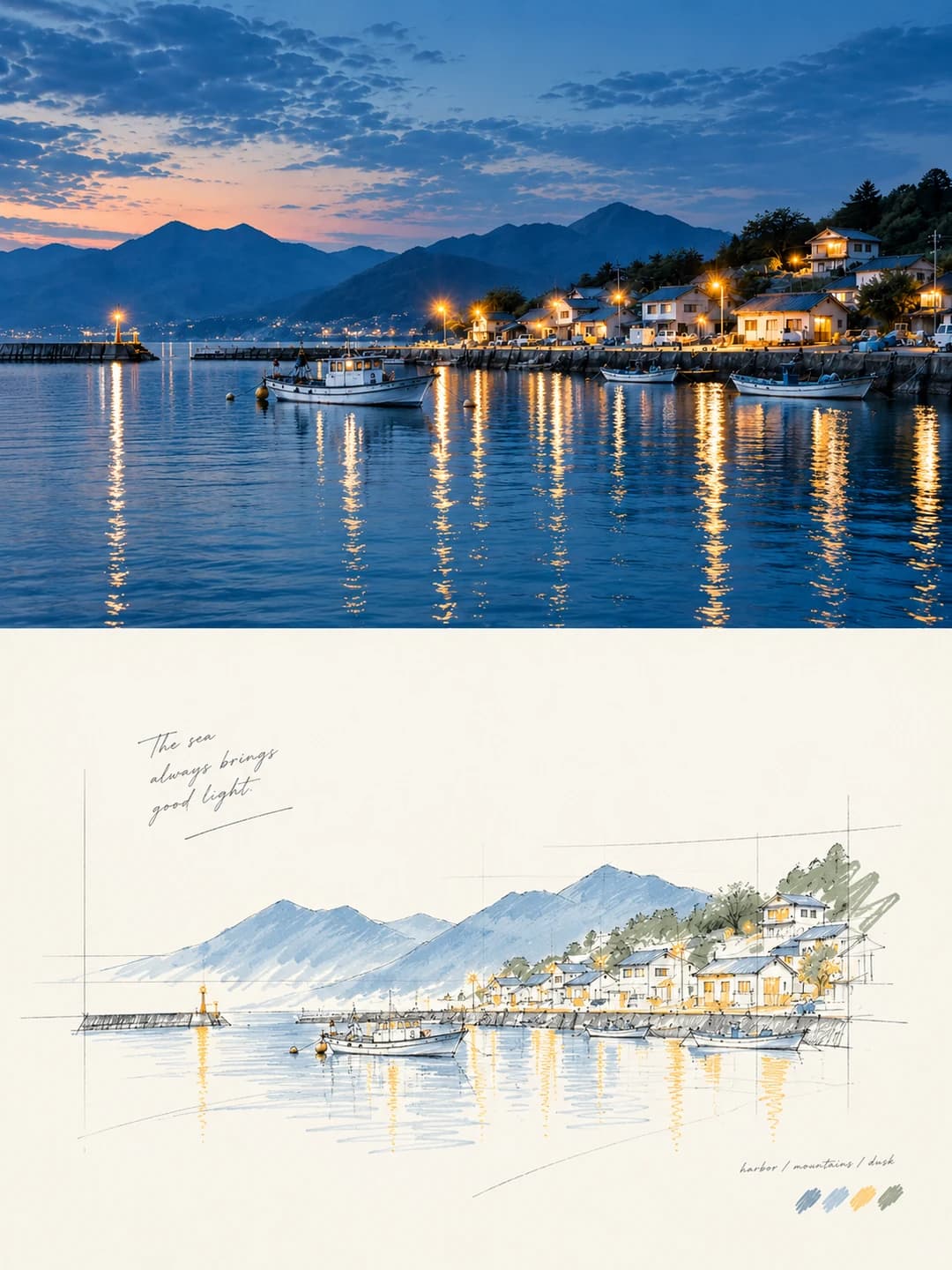
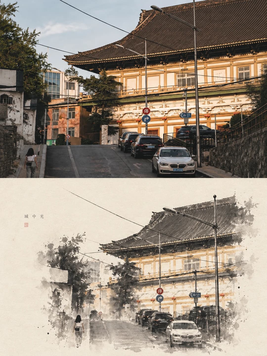
Upload a photo and get back a 3:4 poster: your photograph across the top, the same scene distilled underneath into black, grey and pale ink on xuan-paper tone — bleeding halos, flying white, and a great deal of empty space.
100 credits per image · about a minute · New accounts get 500 credits — 5 free images.
Try it with your own photo
New accounts get 500 credits — 5 free images.
Examples
Every image below was made with the prompt on this page.
What is a chinese ink wash poster?
A Chinese ink wash poster splits a 3:4 frame into two equal zones. The top is your photograph, preserved in subject, outline, perspective, material and light with only careful grading. The bottom rebuilds the same scene as a minimal ink-wash image on ivory or xuan-paper ground: spreading ink halos, layered wet and dry strokes, flying white, bleeding and accumulated ink, with secondary detail removed and only the silhouette, the structural turns and the atmosphere kept. The subject fills 30–45% of the lower zone, its edges diffusing into emptiness, and a handful of words sits quietly in the white space.
Works well with
Architecture and landscape with a clear silhouette and layered depth: a temple roofline, a street rising between buildings, a mountain ridge, a bridge, trees in mist. Ink wash works by deleting, so it needs a structure strong enough to survive losing its detail.
Struggles with
Portraits, close-ups and anything whose interest is colour or fine texture. The prompt keeps the image dominated by ink and empty space and forbids reproducing your photo's colour values, so a photograph that lives on its colour comes back almost monochrome. Busy, evenly-detailed scenes have no skeleton for the ink to keep.
The prompt behind this tool
This is the full prompt, translated into English. Copy it and use it with any image model that accepts a reference photo.
Make one poster from the uploaded photograph. Handle it on its own; never collage several photographs or visual elements together.

Overall layout
Use a strict vertical 3:4 composition, divided horizontally into two zones in an absolute 1:1 ratio, each taking 50% of the canvas.

Upper zone — the photograph as taken
Preserve the subject's characteristics, its structural outline, the perspective, the real materials, the natural light and shadow and the original colour mood of the uploaded photograph. Apply only careful high-end grading and minor adjustment, bringing it to the quality of an art magazine or a photography exhibition. The background may be extended moderately where the composition needs it, but never stretch, deform, reconstruct or alter the form of the subject. Do not damage its structure, its posture or the core composition.

Lower zone — a minimal ink-wash reconstruction
First distil the most recognisable core elements of the photograph: the subject, the silhouette, the run of the structure, the perspective, the sense of rhythm and the atmosphere. Then rebuild them as a minimal image with the quality of ink wash. Never transcribe the photograph's realistic detail or render it representationally. Keep only the most characteristic skeleton and spirit, so that a viewer sees its correspondence with the photograph above at a glance.

The ground is ivory, warm white or the tone of traditional xuan paper, with a fine paper fibre and natural texture. Rebuild the subject through spreading ink halos, layered wet and dry strokes of varying density, flying white, bleeding, accumulated ink and intentional empty space, creating a deep, restrained, poetic Eastern aesthetic. Remove secondary detail and keep only the most recognisable silhouette, the structural turns, the spatial layering and the atmosphere. Do not pursue representational completeness; concentrate on abstraction, deletion, distillation and a visual expression that leaves an aftertaste.

Work mainly in black, grey and pale ink, building gradations of density and a rhythm of dense against sparse. A little colour may be distilled from the liveliest tones of the original as a local accent or a light wash, but never mechanically reproduce the original's colour values. Colour may be selectively translated into a clear blue-grey, distant-mountain blue, pale gold, warm yellow, cinnabar red or pale cyan, to strengthen the visual focus and the swell of feeling. The whole image must remain dominated by ink tones and large areas of empty space. Avoid dull, muddy greys, aged yellow-brown, elaborate ornament and garish colour.

The core of the subject should be tighter and more concentrated, while the edges scatter naturally, diffuse, fade and merge into the surrounding space, using large areas of emptiness to create room to breathe. The subject occupies roughly 30–45% of the lower zone; the rest is unhurried empty space. The composition may be off-centre, against an edge, suspended or slightly cropped, but must hold an asymmetric visual balance and a refined editorial design sense. Empty space is not nothing: it is an indispensable structural element of the composition. Subtract rather than fill. Let the subject read like an ink seal set down on paper, or an Eastern object of art displayed in an exhibition catalogue.

Typography
Add minimal editorial typography only where it is needed. Never apply a preset fixed title or a serial number. The text should be drawn from the subject, the place, the time, an action, an emotion or a metaphor, distilled into a handful of words or a short phrase, set quietly in the empty space or along the edge of the subject. The typesetting must be restrained, open and full of air, and must never upstage the image.

Overall aesthetic
Contemporary Eastern aesthetics, minimal ink-wash reconstruction, expansive artistic emptiness, a finely judged visual mass like a seal, quiet and composed editorial typesetting, and the pure, refined quality of an exhibition poster.

Avoid complicated backgrounds, overly representational realistic detail, excessive ornament, long text, templated typesetting and an over-filled composition.
Frequently asked questions
- Will it change my photo?
- Not the upper zone. The prompt preserves the subject's characteristics, structural outline, perspective, real materials, natural light and original colour mood, allowing only careful grading and a moderate extension of the background. It explicitly forbids stretching, deforming or reconstructing the subject. The lower zone is a distillation, not a copy — it is meant to keep the skeleton and the spirit and drop everything else.
- Can I choose the text?
- Yes. Type a handful of words and the model sets them quietly in the white space or along the edge of the subject. Leave it blank and it distils its own from the subject, the place, the time, an action or a mood. The prompt explicitly forbids preset titles and serial numbers, so what appears is always drawn from your photograph.
- Why is there only one text field?
- Because the prompt asks for 寥寥数语 — a handful of words or one short phrase — set quietly in the emptiness. It is not a headline-and-subtitle structure, so a second field would not correspond to anything in the drawing.
- Can the words be in Chinese?
- Yes, and it suits the form. The sample uses a three-character Chinese phrase. English works too, but a short Chinese phrase sits more naturally with ink wash and xuan paper, and takes less room in the white space.
- What kind of photo works best?
- Architecture and landscape with a clear silhouette and layered depth: a temple roofline, a street rising between buildings, a mountain ridge, a bridge, trees against mist. Ink wash works by deleting, so it needs a strong structural outline to keep once the detail is gone.
- Where do the colours come from?
- Mostly there are none. The image is built in black, grey and pale ink on ivory or xuan-paper tone. A little colour may be distilled from the liveliest tones of your photo as a local accent — translated into blue-grey, distant-mountain blue, pale gold, warm yellow, cinnabar or pale cyan — but the prompt forbids reproducing your photo's actual colour values and insists ink and empty space stay dominant.
- What size do I get?
- 2K is 1792 × 2400 pixels, which prints cleanly at poster size. 4K doubles that and costs 200 credits instead of 100.
- What happens to my photo?
- It is stored privately so the generator can read it, and deleted on a schedule. It is never made public, never shown to other users, and never used to train a model.