Architectural Sketch Poster
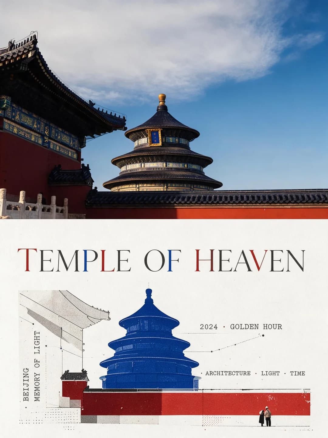
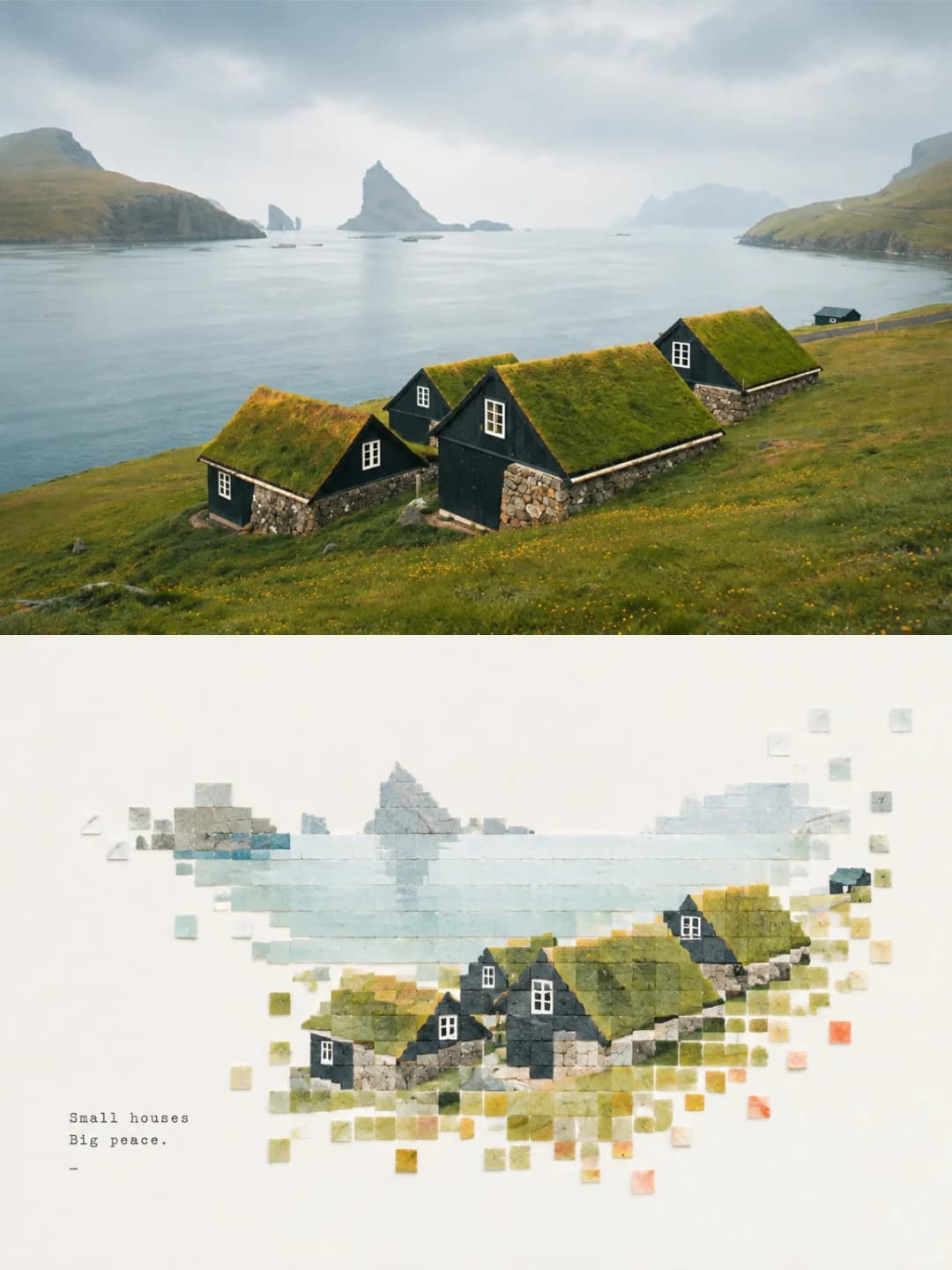
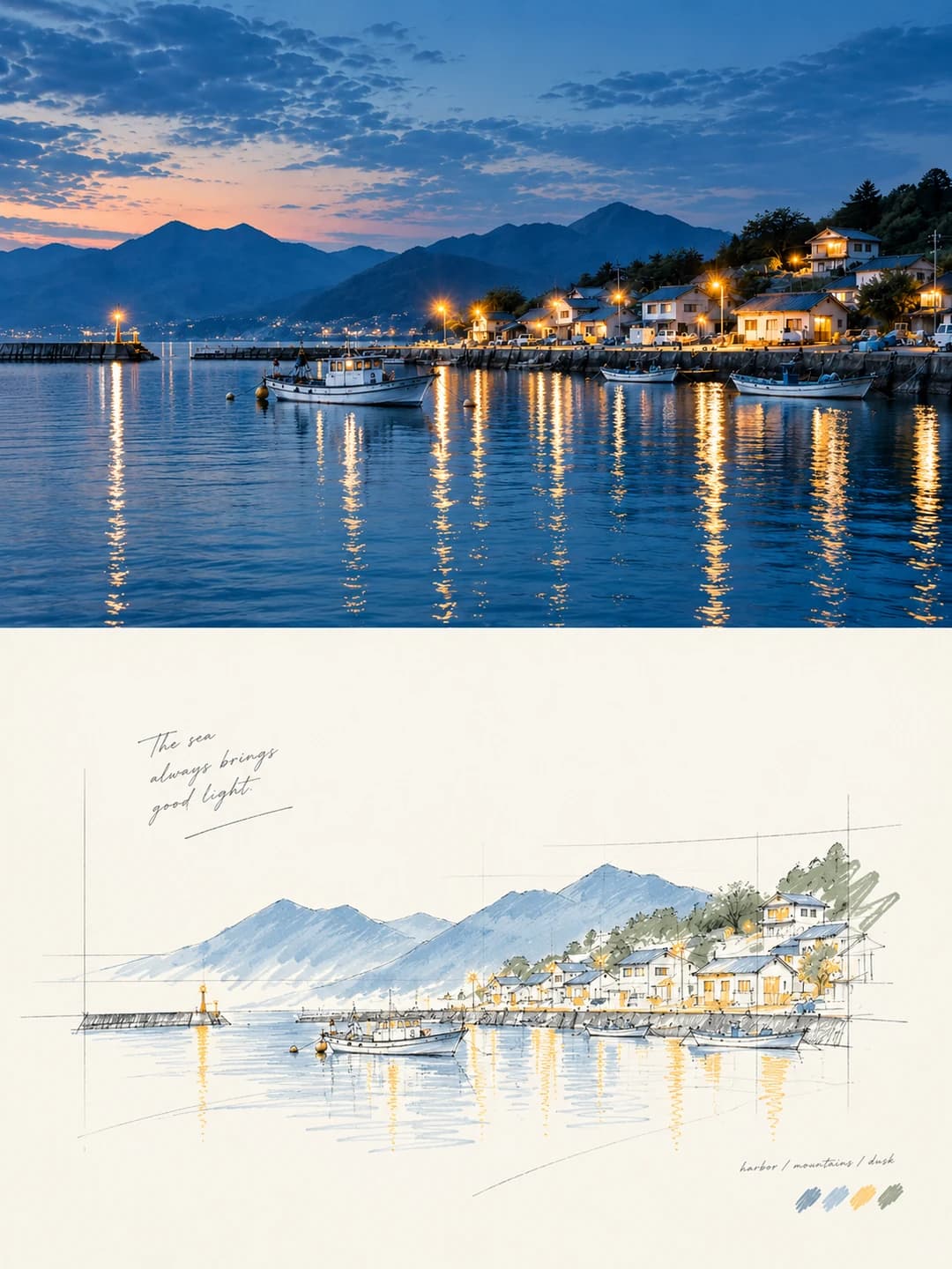
Your photo on top, the same scene redrawn below as a designer's concept sketch
Upload a photo and get back a 3:4 poster: your photograph across the top, the same scene redrawn underneath as a loose freehand perspective sketch — construction lines left showing, colour only where it earns its place, and a wide field of blank paper.
100 credits per image · about a minute · New accounts get 500 credits — 5 free images.
Try it with your own photo
New accounts get 500 credits — 5 free images.
Examples
Every image below was made with the prompt on this page.
What is a architectural sketch poster?
An architectural sketch poster splits a 3:4 frame into two equal halves. The top half is your photograph, lightly graded and otherwise untouched. The bottom half is off-white paper carrying the same scene redrawn as an architectural concept perspective: a relaxed freehand line drawing that keeps its guide lines, extension lines and geometric references visible, so it reads as a scheme being worked out rather than a finished render. Colour appears only where it does work — on the subject, a structural edge, a patch of shadow. Most of the frame is deliberately left empty, and a short caption settles quietly into that white space.
Works well with
Buildings above all: a street of houses, a harbour front, a temple, a bridge, a facade. It also holds up on anything with clear structure and depth — a boat, a vehicle, a staircase, a landscape with a strong horizon. The sketch needs edges and perspective to draw.
Struggles with
Portraits and close-ups. A construction-line sketch flatters architecture and does nothing for a face. It is also weak on scenes that are pure texture — dense foliage, crowds, open water with no structure — because there is no geometry for the guide lines to hang on.
The prompt behind this tool
This is the full prompt, translated into English. Copy it and use it with any image model that accepts a reference photo.
Turn the uploaded photo into a single high-end design poster — not a collage of several images. Use a vertical 3:4 composition split into two zones of strictly equal height, 50% each.

The top zone keeps the original photograph: the subject's identity, structure, posture, real texture, natural light and original colour mood all preserved, with only light high-end grading so it carries the feel of an art magazine or an exhibition print. The environment may be extended naturally to fit the frame, but the subject must not be stretched, distorted or altered.

The bottom zone takes only the most recognisable subject, contours, structure, posture and narrative relationships from the photograph and rebuilds them as an architectural concept perspective sketch — the kind of freehand drawing used to present a scheme. Do not preserve the scene in full and do not copy the photograph object by object. Actively delete most of the background, the secondary scenery and any irrelevant detail, keeping only the core forms, the spatial relationships and the visual hooks that stand for the original subject.

Make a fresh artistic judgement in the bottom zone. Even if the original is badly composed, has a cluttered background or a small subject, rescue it into a picture that stands up — through deletion, rearrangement, cropping, changes of scale and white space. The model genuinely has the authority to re-direct the frame.

The style is a free, hand-drawn perspective line drawing plus a small amount of selective colour. Lines are relaxed and restrained, with a slight sense of repetition and hesitation. A few auxiliary lines, extension lines, construction lines and the geometric reference lines of architectural hand-drawing may be left in, so the drawing reads clearly as design thinking in progress. Colour is laid in lightly and only at a few key places — to emphasise the subject, the structural hierarchy, a patch of shadow or a spatial focal point. Leave the rest of the surface undrawn.

Deliberate, generous white space must be the core of the image. The subject should be smaller and more distilled, with the rest of the space left largely empty. That emptiness is not a blank background; it is part of the composition, and it should work with the subject, the line work, the reference lines, the shadows and the few colour patches to produce breathing room, a sense of space and rhythm. The subject may sit off-centre, run to an edge, be partly cropped or reduced in scale. Draw too little rather than filling the frame.

A few geometric shadow blocks may be added to strengthen mass, depth and spatial layering, but avoid heavy rendering, complex surroundings and the look of a photorealistic architectural visualisation. Keep the background minimal, with only the faintest suggestion of a site.

For colour, take the two to four most recognisable and alive colours from the photograph above and reorganise them into a cleaner, more restrained, more durable sketch palette. The whole may be lifted, purified and de-greyed a little, built mainly on off-white, light grey, warm grey, soft green, pale wood and pale blue-grey, with a small amount of a brighter but never harsh accent colour retained in places. Avoid dirty greys, murkiness, an over-vintage look and cheap high saturation.

Text — generated
Type is an editorial intervention only, and kept to a minimum. Any language is allowed. Generate a few words, a short phrase or an annotation from the subject, the place, the action or the mood, and let it settle quietly into the white space, holding a restrained relationship between image and type.
Frequently asked questions
- Will it change the people or the subject in my photo?
- Not in the top half — that is your photograph, and the prompt allows only light grading and natural extension of the background to fit the frame. The bottom half is explicitly given licence to re-direct the scene: it deletes most of the background and keeps only the forms that stand for the original, so it is a reinterpretation, not a tracing.
- Can I choose the headline?
- Yes, and it is the more reliable path. Type your own headline and annotation line and the model transcribes them exactly as written. Leave them blank and it writes its own short phrase from what it sees in the photo, which is a coin toss on wording.
- What language can the headline be in?
- Any — the prompt explicitly places no restriction on language, and the model sets whatever string you hand it. Short lines suit the style: a handful of words sitting in the white space reads better than a sentence.
- Where do the colours come from?
- From your photo. The prompt tells the model to pull the two to four most recognisable colours out of the source and rebuild them into a cleaner sketch palette — mostly off-white, greys, soft green and pale blue-grey, with a small accent held back for the places that need it. Most of the drawing stays uncoloured on purpose.
- Why are there stray pencil lines left in the drawing?
- Those are deliberate. The prompt asks for construction lines, extension lines and the geometric reference lines of architectural hand-drawing to be left visible, so the result reads as a scheme being worked out rather than a finished render. Removing them would make it a much more ordinary illustration.
- What size do I get?
- 2K is 1792 × 2400 pixels, which prints cleanly at poster size. 4K doubles that and costs 200 credits instead of 100.
- Can I use my own prompt instead?
- Not in this tool — it runs one fixed prompt. The full text is published on this page, so you can copy it and run your own variations anywhere that accepts image prompts.
- What happens to my photo?
- It is stored privately so the generator can read it, and deleted on a schedule. It is never made public, never shown to other users, and never used to train a model.