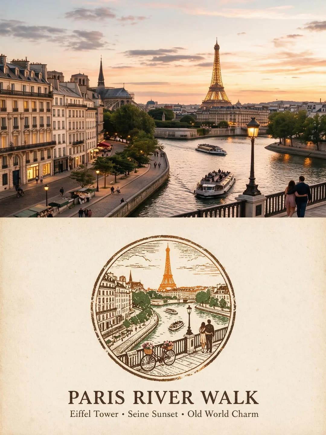
Editorial Magazine Poster
Your photo on top, the same scene as flat editorial artwork below
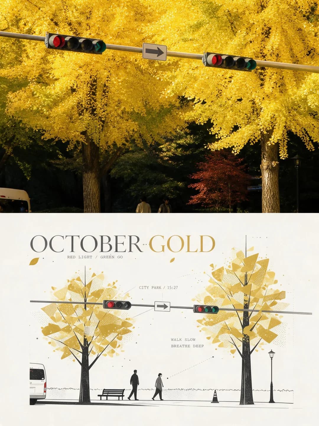
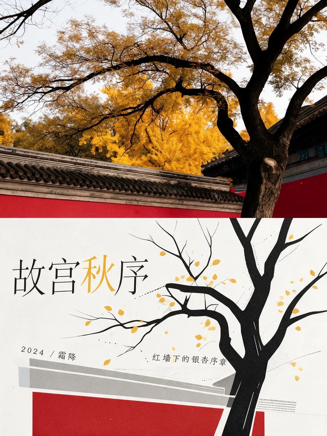
Upload a photo and get back a 3:4 poster: your photograph across the top, the same scene redrawn underneath as crisp geometric colour blocks on off-white card, with a magazine headline you can write yourself.
100 credits per image · about a minute · New accounts get 500 credits — 5 free images.

Try it with your own photo
New accounts get 500 credits — 5 free images.
Examples
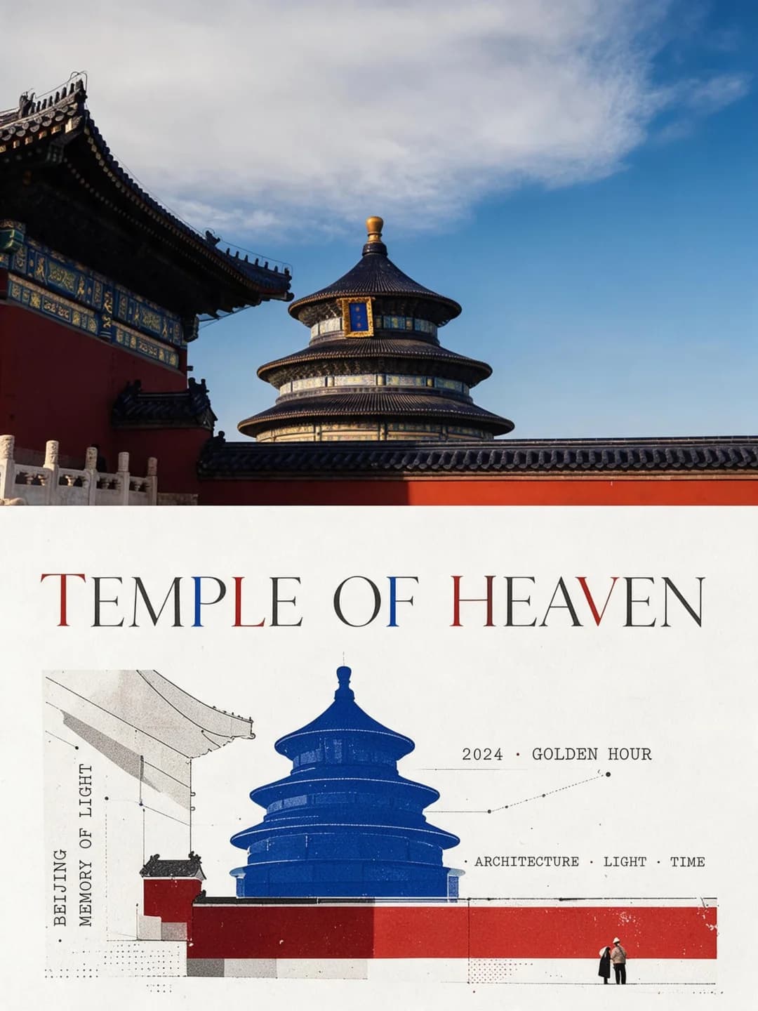
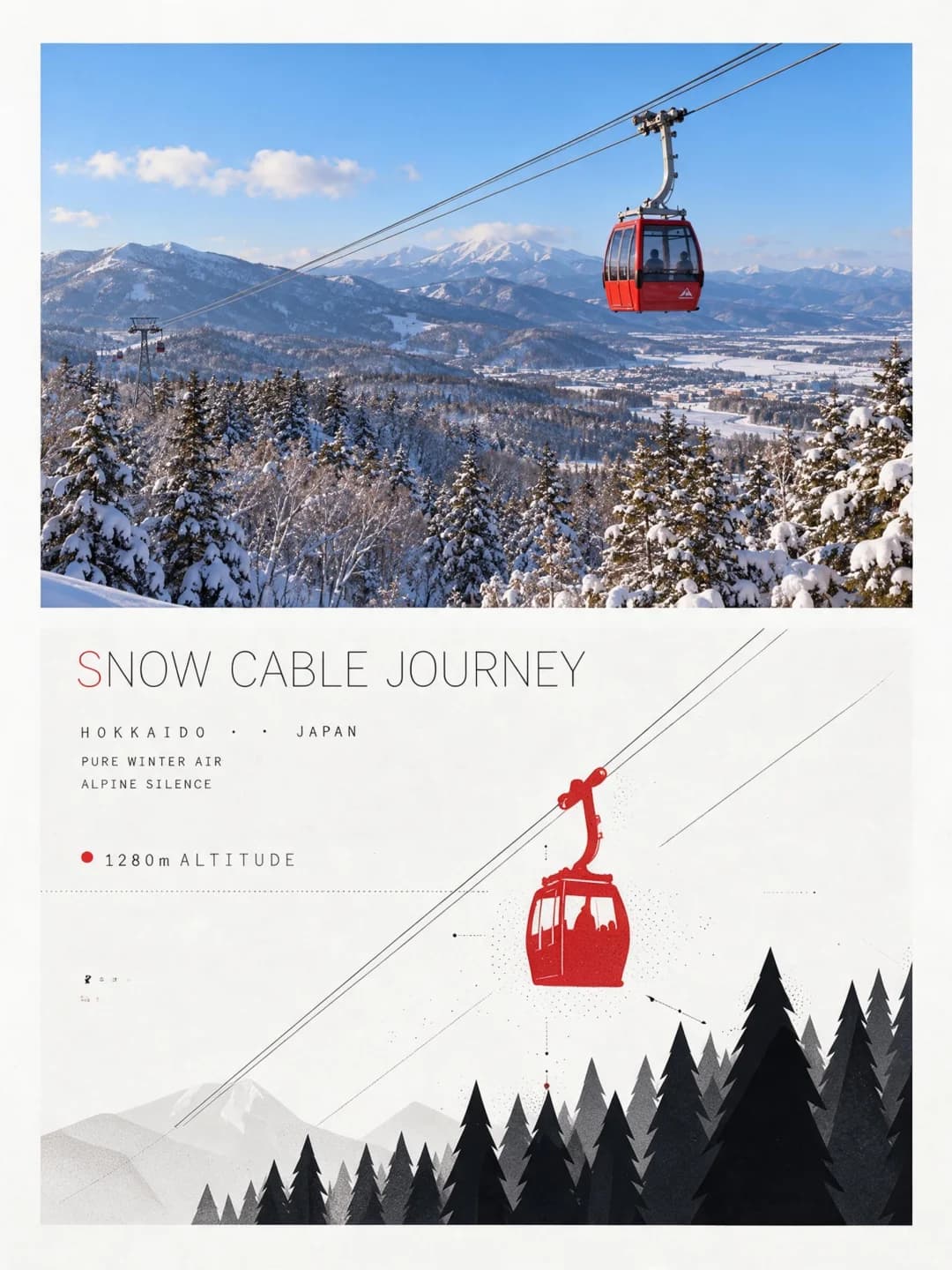
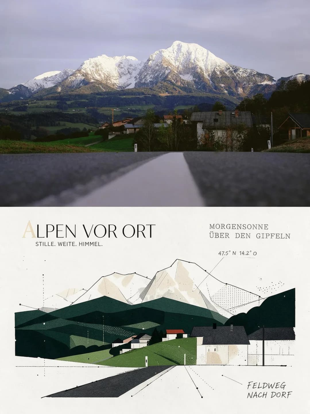
Every image below was made with the prompt on this page.
What is a editorial magazine poster?
An editorial magazine poster splits a 3:4 frame into two equal halves. The top half is your photograph, graded lightly towards the look of an art magazine but otherwise untouched. The bottom half is bright off-white card carrying the same scene redrawn as appliqué illustration — the subjects reduced to clean geometric silhouettes with hairline outlines, dot screens and annotation leader lines, coloured with the two most vivid shades pulled from your photo and desaturated towards grey. Over it sits editorial typography: a fine headline, small typewriter-style annotations, and white space used as a design element.
Works well with
Works best on photos with strong, readable shapes: architecture, a vehicle against open sky, a treeline, a figure in motion, a storefront. Anything whose silhouette survives being reduced to a few flat blocks will come back looking deliberate.
Struggles with
Struggles with low-contrast or cluttered scenes, close-up portraits where the likeness lives in fine facial detail, and photos that are mostly texture with no clear edges. The illustration needs shapes it can cut cleanly.
The prompt behind this tool
This is the full prompt, translated into English. Copy it and use it with any image model that accepts a reference photo.
Turn the uploaded photo into a single high-end editorial design poster. Use a vertical 3:4 composition split into two zones of strictly equal height, 50% each.

Top zone — the photograph
Keep the subject's structure, posture, real texture, natural light and original colour. Grade it only lightly, towards the look of an art magazine, an independent publication or an exhibition print. The environment may be extended naturally to fit the frame, but the subject must not be stretched, distorted or altered. Note the two most prominent colours in the photo and carry them down as the source palette for the zone below.

Bottom zone — appliqué editorial illustration
Take the most recognisable contours, postures and narrative relationships from the photo and redraw them as an appliqué-style editorial illustration: the subjects condensed into clean, crisp, well-shaped geometric silhouettes, like colour chips laid onto a magazine layout. Hairline ink strokes outline contours only — light, restrained, broken and decisive, with no hatching and no build-up. Suggest space with a little dot screen, dashed rules and annotation leader lines. Strip out the complex background and keep only the few structures and features that confirm what we are looking at.

Colour — laid on like a magazine, with shape and hierarchy
The paper is clean, bright, slightly-warm off-white editorial card stock — warm white, never yellowed. Take the two most vivid, most emotive colours from the photo and set them against each other as a restrained, desaturated magazine pairing. The colour must have shape and must read as laid on: geometric silhouettes, abstract forms, colour chips or banded zones, with crisp, confident edges and no soft fills. Pull the hues towards the grey axis — desaturate overall, lift the value, avoid harsh saturated colour, and win with clear form plus gentle internal variation. Three levels of hierarchy: off-white ground, then the subject in black and greys, with the accent colour appearing only on emphasised letters in the title, a core symbol, a banded zone or a dot marker — sparing, purposeful, and echoing the photo above.

Composition — editorial rhythm
Follow the layout logic of a good magazine or an infographic: subject and type mixed freely but with order, allowed to sit off-centre, be cropped or interleave. Build rhythm from contrasts of scale, deliberate misalignment, tight margins, and density punctuated by sudden white space. Keep the marks of the hand while landing on a magazine-grade grid and alignment, and let the negative space act as a colour block in its own right.

Typography — editorial faces first, typewriter second
Set the main title in a fine editorial or handwritten face, optionally picked out with the accent colour. Set supporting annotations in a small, narrow, slightly worn and misaligned old typewriter face, keeping the uneven letter-spacing and drifting baseline. Place the type alongside, through or along the edge of the illustration, so the whole reads as one finished design page.
Frequently asked questions
- Will it change the people or the subject in my photo?
- The top half is your photograph. The prompt allows only light grading and natural extension of the background to fit the frame — the subject itself must not be stretched, distorted or altered. The bottom half is a deliberate redrawing, so there the subject is simplified into flat shapes by design.
- Can I choose the headline?
- Yes, and it is worth doing. Type your own headline and annotation line and the model sets them as written. Leave them blank and it writes its own copy from what it sees in the photo.
- What language can the headline be in?
- Any. The samples include English, German and Chinese headlines — the model sets whatever string you give it.
- Where do the colours come from?
- From your photo. The prompt tells the model to take the two most vivid colours in the image and desaturate them into a magazine palette, so every poster is keyed to its own source.
- What size do I get?
- 2K is 1792 × 2400 pixels, which prints cleanly at poster size. 4K doubles that and costs 200 credits instead of 100.
- How long does it take?
- Usually 60 to 90 seconds. It is a large image and the model is doing two quite different jobs in one frame.
- Can I use my own prompt instead?
- Not in this tool — it runs one fixed prompt. The full text is published on this page, so you can copy it and run your own variations anywhere that accepts image prompts.
- What happens to my photo?
- It is stored privately so the generator can read it, and deleted on a schedule. It is never made public, never shown to other users, and never used to train a model.