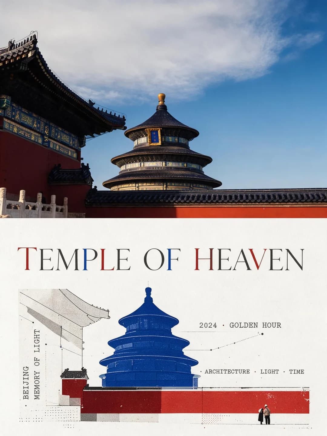
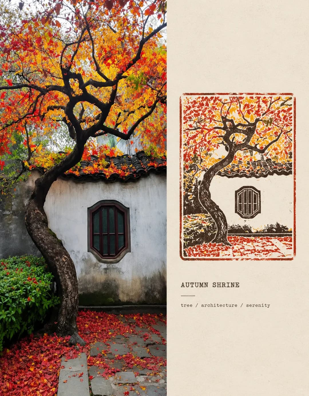
Pixel Mosaic Poster
Your photo on top, the same scene rebuilt from shell-like tiles below
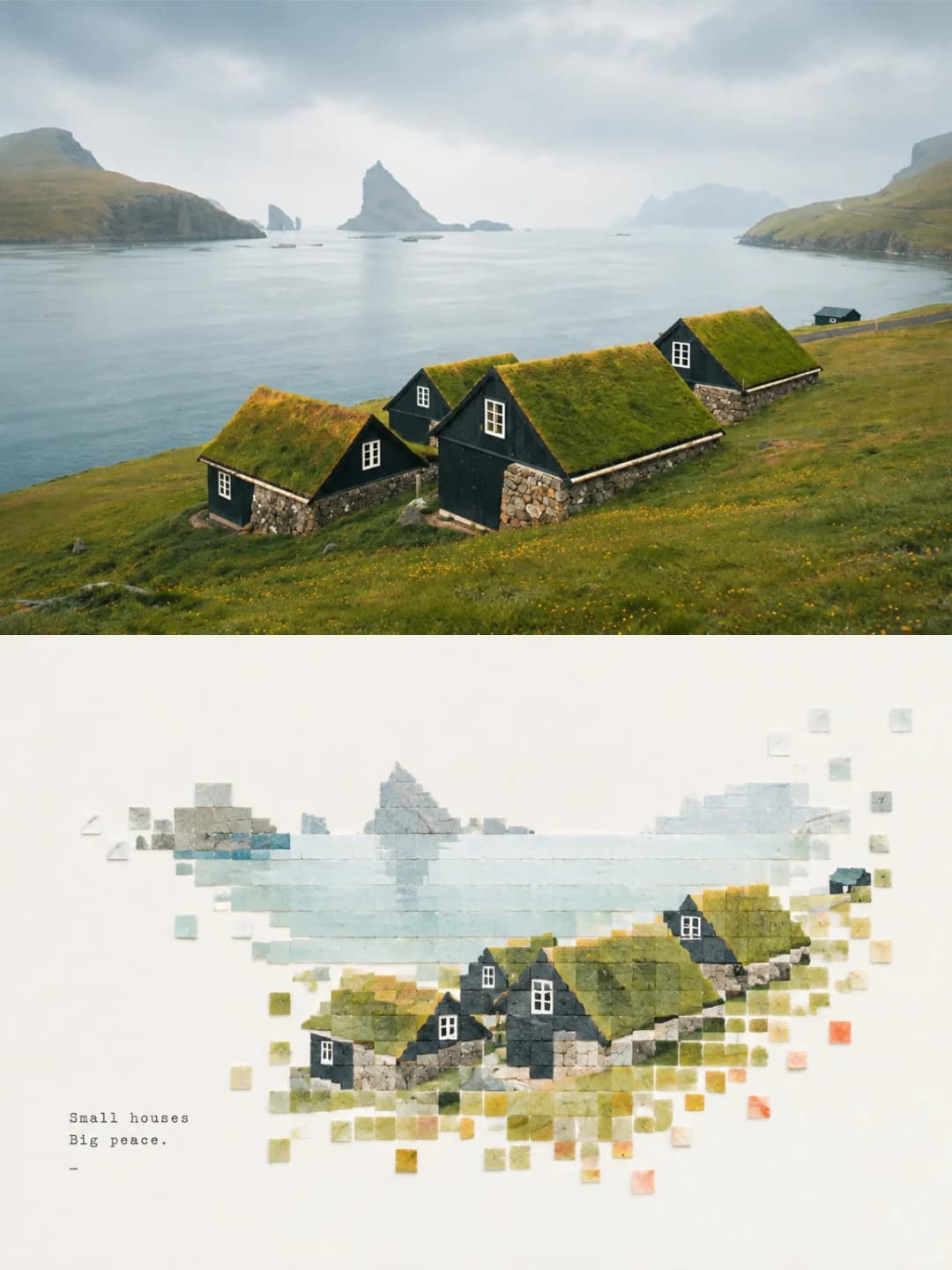
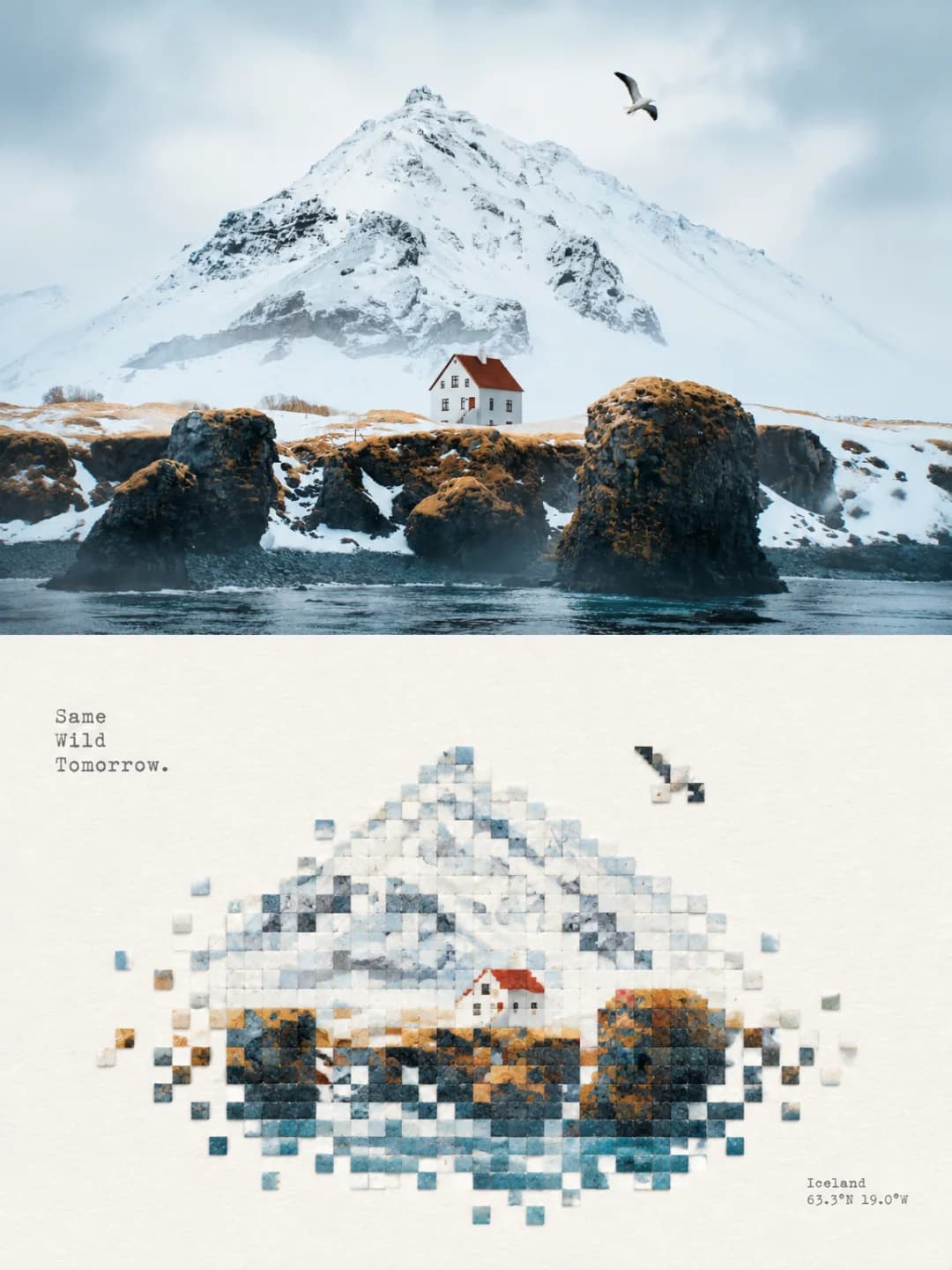
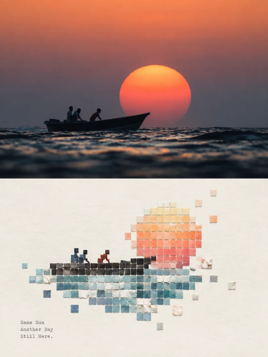
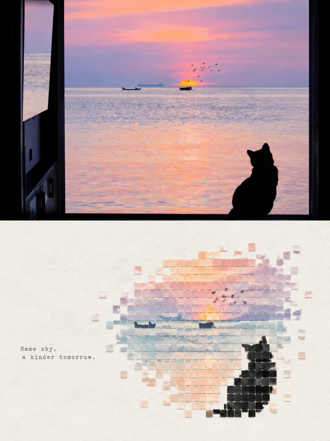
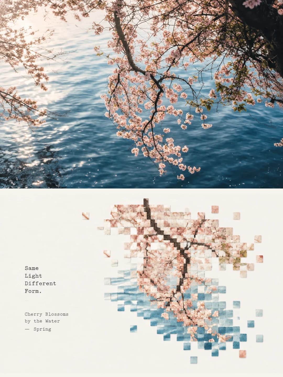
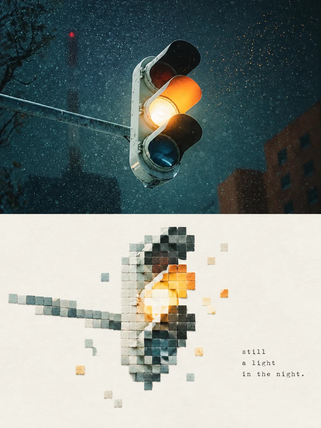
Upload a photo and get back a 3:4 poster: your photograph across the top, the same scene rebuilt underneath from small square tiles with the grain of cut shell — dense where the subject is, breaking up and scattering into blank paper at the edges.
100 credits per image · about a minute · New accounts get 500 credits — 5 free images.
Try it with your own photo
New accounts get 500 credits — 5 free images.
Examples
Every image below was made with the prompt on this page.
What is a pixel mosaic poster?
A pixel mosaic poster splits a 3:4 frame into two equal halves. The top half is your photograph, lightly graded and otherwise left alone. The bottom half is warm off-white paper carrying the same scene rebuilt as a low-resolution mosaic: small square tiles on a strict grid, each with the matte grain, chipped edges and faint layering of cut shell or mineral. Tiles cluster where the subject is and thin out towards the edges until they break apart and float free into blank paper. The palette is lifted from the photo and brightened, and a short typewriter caption sits quietly in the white space.
Works well with
Works best on photos with one clear silhouette against open space: a house on a hillside, a boat on water, a mountain, a lone tree, a cat in a window, a traffic light against night sky. If the scene is still recognisable at roughly thirty squares across, it will come back looking deliberate — and the simpler the subject, the sparser and more stamp-like the mosaic.
Struggles with
Struggles with crowds, busy street scenes, close-up portraits, and anything whose subject reads only through fine detail. A face or a logo will not survive being reduced to squares, and a scene with no dominant shape turns into a rectangle of coloured tiles with nothing to recognise. Busy scenes also tend to fill the lower half rather than leaving the wide field of blank paper the effect is built around.
The prompt behind this tool
This is the full prompt, translated into English. Copy it and use it with any image model that accepts a reference photo.
Make a single standalone poster from the uploaded photo — not a collage of two images. Split it strictly 1:1 top to bottom, each half taking 50% of the frame.

Top half: keep the identity, structure, posture, real texture, natural light and colour mood of the original photograph. Grade it only lightly, towards the look of an art magazine or an exhibition print. The background may be extended to fit the frame, but the subject must not be stretched, distorted or altered.

Bottom half: first read the photograph for its most memorable subject, composition, perspective, structural movement and atmosphere, then rebuild that as a minimal pixel landscape with the feel of a material collage. Drop every irrelevant detail. Keep only the structure and the lines of movement that stand for the original, and restate them through the order of regular squares and the texture of natural material, so that it is recognisable at a glance as the photograph above. The pixel modules should look like small square fragments cut from coarse shell, thin shell flakes or layered mineral: a geometric grid order, edges allowed to chip slightly, surfaces carrying natural layering, powdery grain and faint relief — matte, natural, gentle. Modules cluster densely at the core of the subject and progressively thin out, drop away, break apart and float free towards the edges, dispersing naturally into the white space. No more than 200 modules in total, all the same size or close to it. Hold the relationship between a small-scale seal mark and a large field of blank paper: arrange it freely according to the subject's direction, proportion and visual weight — off-centre, against an edge, suspended or cropped are all allowed. The subject should occupy roughly 30% of the lower half, and the rest stays empty. That emptiness is not a blank background; it is a compositional element on equal footing with positive and negative shape, density and dispersal, and asymmetric balance. Cut information rather than fill the frame, so the subject reads like a material seal set down on a sheet of paper.

For colour, take the brightest, liveliest, most alive colours out of the original photograph and remix them — do not average the image and do not copy hex values. Lift value, purity and clarity moderately, deriving from the source a bright composite palette of clear sky blue, lake teal, fresh green, warm yellow, coral orange and peach pink, and let the crisp play of warm against cool set a calming rhythm. Use a large amount of pure warm white, or a near-white matched to the colour temperature, as breathing space. Keep the dominant colours bright but not glaring, with small accents of warm orange, gold, coral red or soft pink. Preserve the natural colour variation and layering of shell. Avoid going grey, dirty or aged; rule out muddy greys, faded tones, gloomy earth colours, fluorescents and cheap candy brightness.

Text — generated
Set the type in a vintage typewriter face with only the lightest editorial touch: distil a few words or a short phrase from the subject, the place, the action, the mood or its metaphor, and set it quietly in the white space or along the edge of the subject, never competing with the image.

Overall this should read as a high-end visual built from natural material collage, shell-textured pixels, regular geometric order, progressive dissolution, a small-scale seal mark, a large field of artistic white space and modern editorial typesetting — a poster as a contemporary material-art studio would reconstruct it. Avoid copying the photograph, complex backgrounds, realistic detail, flat solid colour fills, smooth vector shapes, plastic mosaic, strong pearlescence, game UI, a filled frame, too much text and anything that looks templated.
Frequently asked questions
- Will it change the people or the subject in my photo?
- Not in the top half — that is your photograph, and the prompt allows only light grading and natural extension of the background to fit the frame. The bottom half is a deliberate rebuild, so there the subject is reduced to squares on purpose: recognisable as the same scene, but not the same pixels.
- Can I choose the headline?
- Yes, and it is the more reliable path. Type your own headline and annotation line and the model transcribes them exactly as written. Leave them blank and it writes its own short phrase from what it sees in the photo, which is a coin toss on wording.
- What language can the headline be in?
- Any. The samples are English, but the model sets whatever string you hand it — Chinese, Japanese and European languages all work. A typewriter face suits short lines, so three or four words reads better than a sentence.
- Where do the colours come from?
- From your photo. The prompt tells the model to pull the liveliest colours out of the source and remix them brighter and cleaner, rather than sampling hex values, so a snow scene comes back in pale blues and a sunset in coral and gold. The paper underneath is always a warm off-white.
- Why does the mosaic look unfinished at the edges?
- That is the effect. Tiles are dense where the subject is and deliberately thin out, break apart and float free towards the edges — the blank paper is meant to do as much work as the squares. The prompt asks for at most 200 tiles filling about 30% of the lower half, and how close you get depends on the photo: a simple subject comes back sparse and stamp-like, a busy scene comes back denser and closer to full width.
- What size do I get?
- 2K is 1792 × 2400 pixels, which prints cleanly at poster size. 4K doubles that and costs 200 credits instead of 100.
- Can I use my own prompt instead?
- Not in this tool — it runs one fixed prompt. The full text is published on this page, so you can copy it and run your own variations anywhere that accepts image prompts.
- What happens to my photo?
- It is stored privately so the generator can read it, and deleted on a schedule. It is never made public, never shown to other users, and never used to train a model.