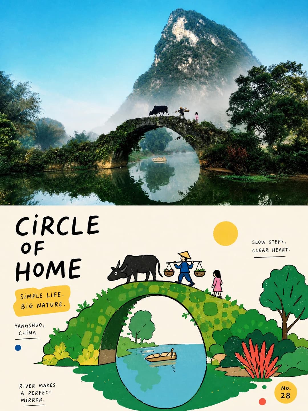
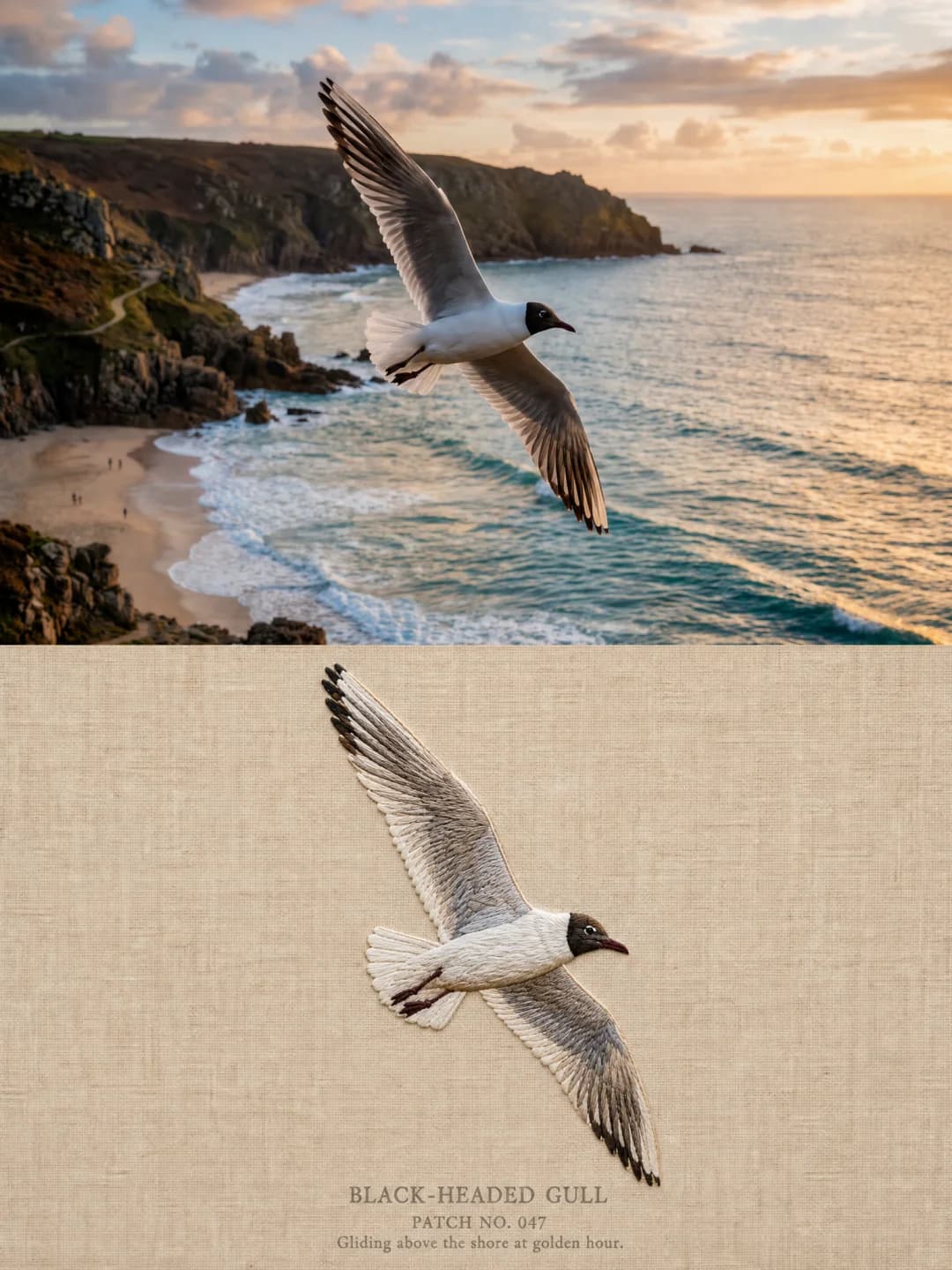
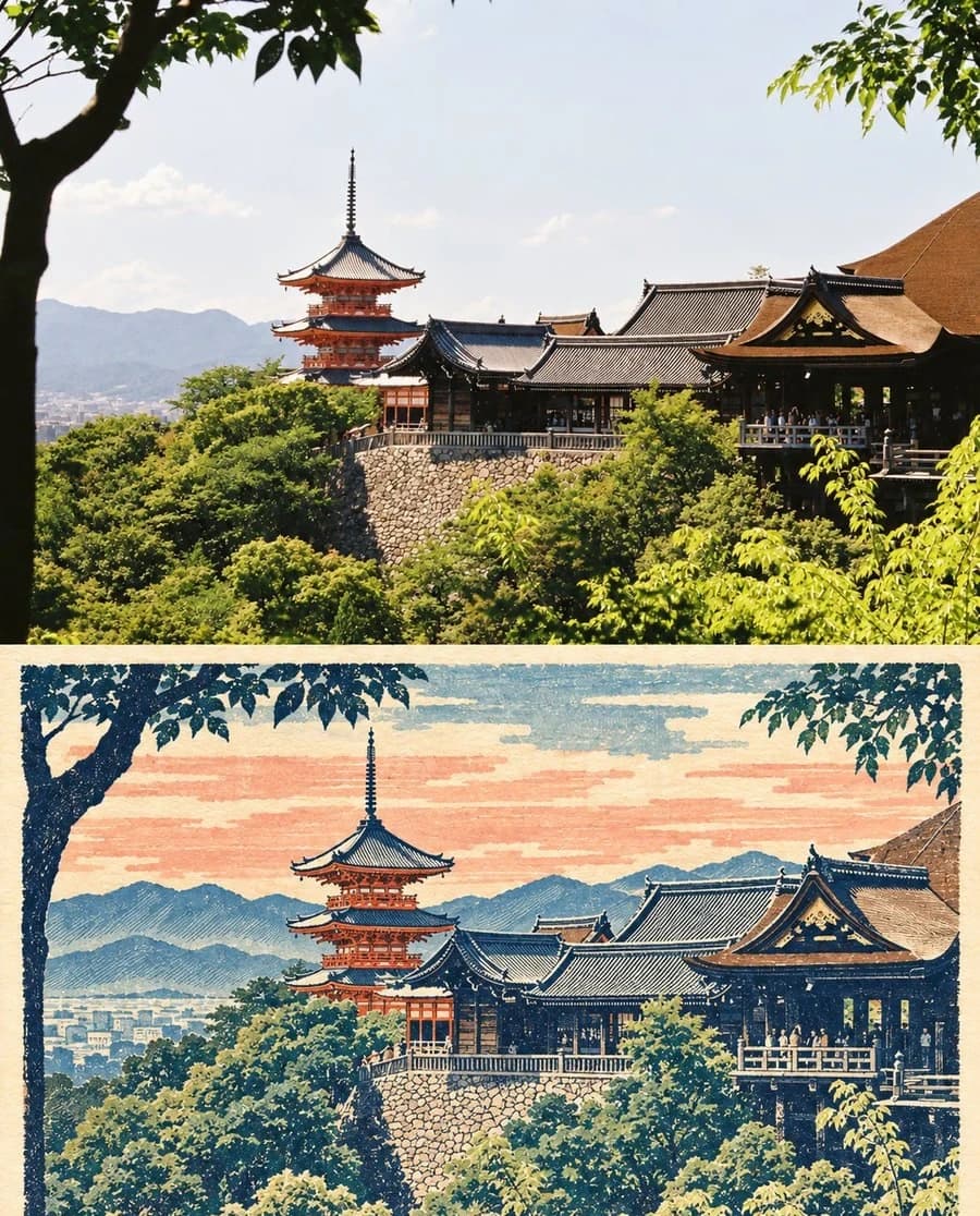
Watercolor Travel Print
Your photo on top, the same view below as a watercolour travel-journal print
Upload a coastal or architectural photo and get back a 4:5 page: your photograph on top, the same view below as a minimalist travel-journal print — ink outlines, soft watercolour washes and faded pigment on warm ivory paper, captioned in small typewriter type.
100 credits per image · about a minute · New accounts get 500 credits — 5 free images.

Try it with your own photo
New accounts get 500 credits — 5 free images.
Examples
Every image below was made with the prompt on this page.
What is a watercolor travel print?
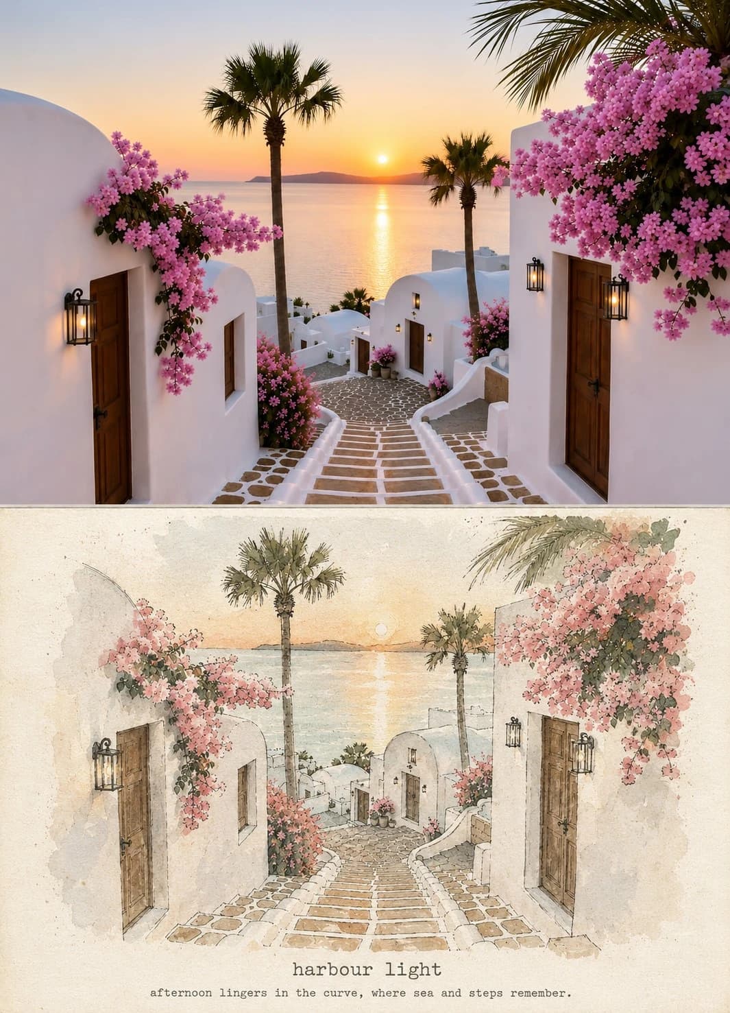
A watercolor travel print stacks two panels in a 4:5 frame, separated by a very fine rule. The upper panel is your photograph, which the prompt forbids redrawing, cropping, stylising or recolouring in any way. The lower panel reimagines the same view as an editorial travel-journal art print: delicate imperfect ink outlines, simplified elegant shapes, soft watercolour washes, screen-print texture, faded pigment, dry-brush marks and slight ink misregistration on warm ivory handmade paper. The viewpoint, architecture and proportions must match exactly, and two lines of small typewriter type sit near the foot of the artwork.
Works well with
Coastal and architectural scenes — whitewashed buildings, a cove, steps down to water, a harbour, a terrace with umbrellas. The prompt was written around exactly this, and legible architecture with a clear horizon is what ink outline and watercolour wash handle best.
Struggles with
Portraits, interiors, food and anything without architecture or a horizon. The palette is also prescribed rather than sampled from your photo, so a scene whose character depends on its own colours — autumn foliage, neon, a red car — comes back in Mediterranean blues and sand regardless.
The prompt behind this tool
This is the full prompt, translated into English. Copy it and use it with any image model that accepts a reference photo.
Use the uploaded reference photograph as the exact visual source. Create a single vertical 4:5 image containing two clearly separated panels, stacked vertically.

Upper panel — the original. Keep the uploaded photograph completely unchanged and recognisable. Do not redraw, crop, stylise, alter colours, or modify any person, building, sea, umbrella, staircase, plant or the composition. This is the original reference.

Lower panel — the artistic result. Reimagine the same scene from the upper panel as an original minimalist editorial travel-journal art print. Keep the same viewpoint, architecture, shoreline, curving path, sea, steps, umbrellas, pedestrians, plants, proportions and overall composition, so that the connection between the two panels is immediately obvious. Do not invent a different location or rearrange the scene.

Change only the visual treatment, into a refined handmade illustration: delicate imperfect ink outlines, simplified elegant shapes, soft watercolour washes, subtle screen-print texture, faded pigment, dry-brush marks, slight ink registration imperfections, natural paper texture, and a lightly weathered vintage print quality.

Use a restrained palette of dusty ocean blue, soft sea green, warm sand, creamy ivory, gentle stone grey, and a small amount of faded terracotta as an accent. Keep the important colours and characteristics of the original scene while giving them a refined vintage travel-poster treatment.

Set the lower artwork on warm ivory handmade paper, with generous breathing space and a subtle tactile fibre. Keep the architecture clearly legible and maintain the original visual balance. Add soft afternoon light and a quiet coastal nostalgia.

Near the lower part of the lower panel, add elegant, understated typewriter-style typography: first a short lowercase English title distilled from the photograph's place, light or mood; below it, in a much smaller size, one short English descriptive line.

Add a very subtle thin dividing line between the two panels. Let the whole image look like a carefully photographed before-and-after page from a high-end independent travel art journal.

Important: the upper panel must remain the untouched original photograph. The lower panel must be an artistic reinterpretation of that exact photograph. Both panels must show the same viewpoint of the same scene. The lower panel must have no photorealistic reproduction, no major compositional change, no new buildings, no excessive detail, no glossy digital effects and no oversaturated colour.
Frequently asked questions
- Will it change anything in my photo?
- It is not supposed to. The upper panel is the strictest in this whole set: the prompt forbids redrawing, cropping, stylising, altering colours, or modifying any person, building, sea, umbrella, staircase, plant or the composition. The lower panel is a reinterpretation, but even there it must keep the same viewpoint, architecture and proportions, and is explicitly barred from inventing a different location.
- Can I choose the two lines of text?
- Yes. Type your own title and description line and the model sets them exactly as written, in small typewriter type near the foot of the lower panel. Leave them blank and it writes its own pair from the place, light or mood of your photograph.
- Why do both sample images have the same caption?
- Because the prompt this effect is based on hard-coded its two lines — every image made with the original carries 'harbour light' and the same description. That is precisely what we turned into fields, so your version says what you want it to say rather than repeating someone else's caption.
- What kind of photo works best?
- Coastal and architectural scenes, which is what the prompt was written around: whitewashed buildings, a cove, steps down to water, a harbour, a terrace with umbrellas. Anything with legible architecture and a clear horizon translates well into ink outline and watercolour wash.
- Where do the colours come from?
- The palette is fixed by the prompt — dusty ocean blue, soft sea green, warm sand, creamy ivory, gentle stone grey, with a little faded terracotta — and your photo's important colours are mapped into it. This is one of the few effects in the set with a prescribed palette rather than one sampled from your image, so expect a Mediterranean register regardless of the source.
- What size do I get?
- This effect is 4:5 rather than the 3:4 most of the set uses, so 2K comes back at 1856 × 2304 pixels. 4K doubles that and costs 200 credits instead of 100.
- Can I use my own prompt instead?
- Not in this tool — it runs one fixed prompt. The full text is published on this page, so you can copy it and run your own variations anywhere that accepts image prompts.
- What happens to my photo?
- It is stored privately so the generator can read it, and deleted on a schedule. It is never made public, never shown to other users, and never used to train a model.