Storybook Illustration Poster
Your photo on top, the same scene redrawn below as a picture-book illustration
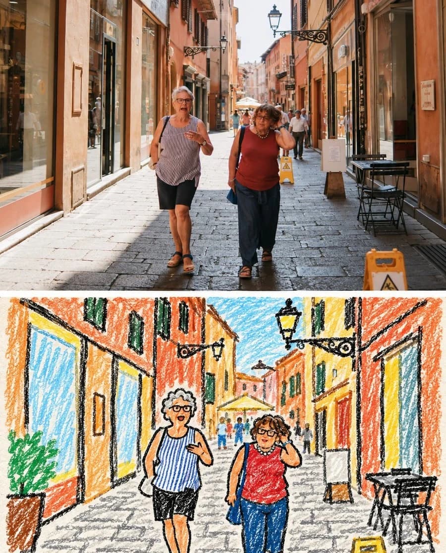
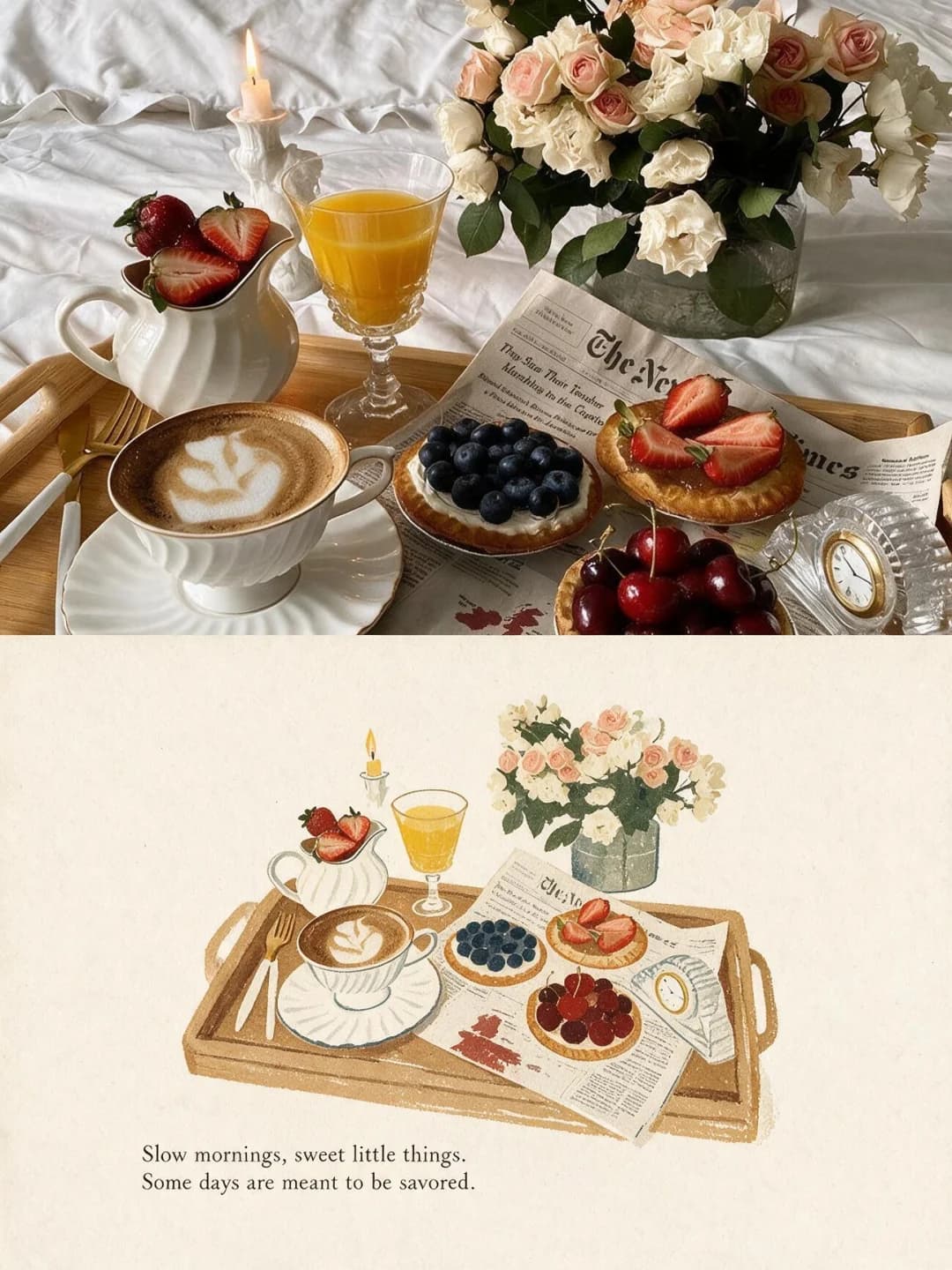
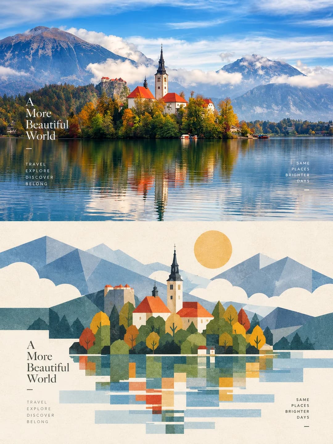
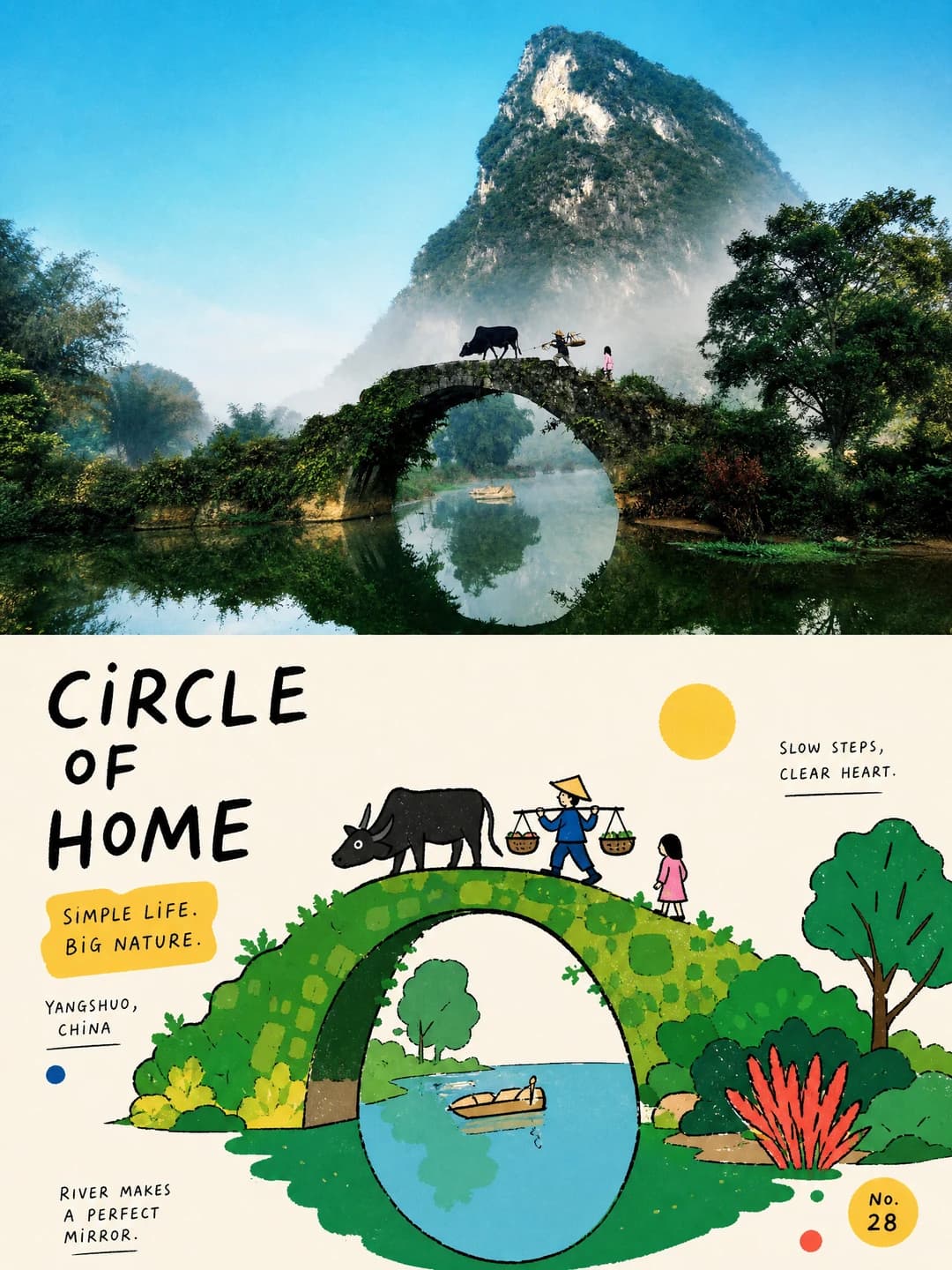
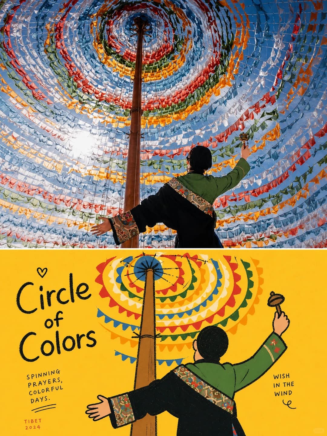
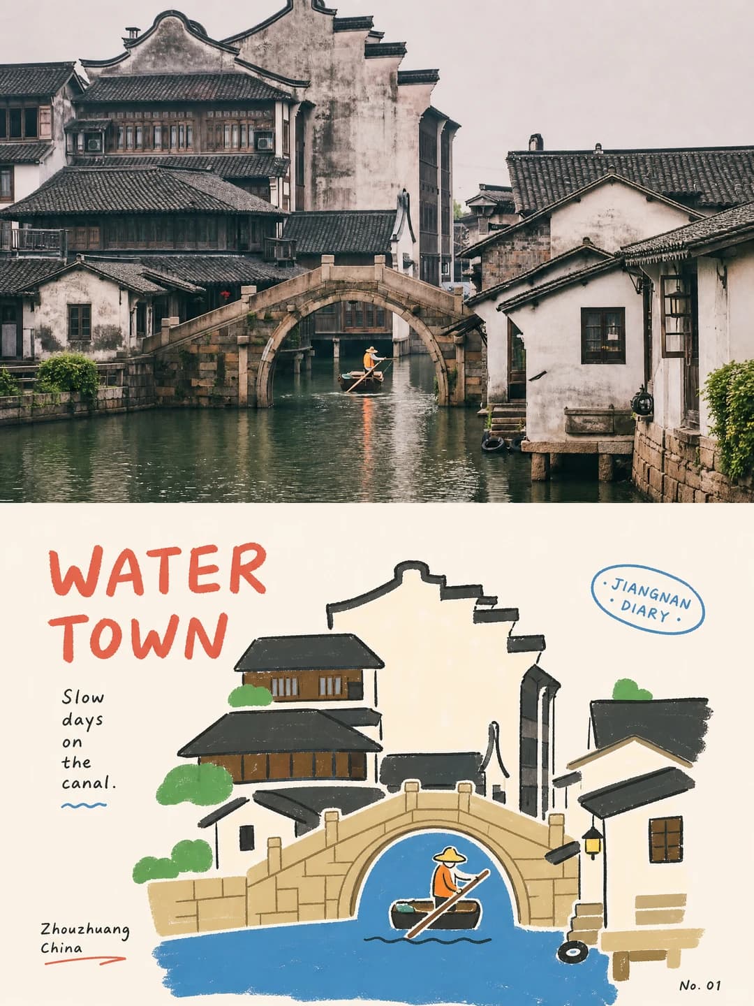
Upload a travel photo and get back a 3:4 poster: your photograph across the top, the same scene redrawn underneath in bold wobbly outlines and flat bright colour, captioned in hand-lettered type that sits inside the illustration rather than on top of it.
100 credits per image · about a minute · New accounts get 500 credits — 5 free images.
Try it with your own photo
New accounts get 500 credits — 5 free images.
Examples
Every image below was made with the prompt on this page.
What is a storybook illustration poster?
A storybook illustration poster splits a 3:4 frame into two zones of equal height. The top is your photograph, subtly graded towards an art-magazine look and otherwise unaltered. The bottom rebuilds the same scene as a loose, deliberately clumsy flat editorial illustration: realistic light, perspective and material detail stripped out, the subjects simplified into rounded, slightly exaggerated shapes with rough wobbling black outlines and solid fills. Large areas of bright flat colour carry the background, and a hand-lettered headline plus small annotations are arranged along the shapes so the type reads as part of the drawing.
Works well with
Travel scenes with one clear visual centre and a story you can read at a glance: a bridge over water, a boat in a canal, a figure against a big sky, a market stall, an animal in a landscape. The illustration needs a silhouette it can cut into flat shapes.
Struggles with
Cluttered scenes and close-up portraits. The prompt explicitly avoids busy compositions, and a face reduced to rounded shapes with a wobbly outline becomes a character rather than a likeness. Photos that are mostly texture with no clear centre give the illustration nothing to build around. Be aware too that the small decorative annotations are unreliable — see the FAQ; your own headline and phrase are set exactly, but roughly a third of runs garble one of the extra labels.
The prompt behind this tool
This is the full prompt, translated into English. Copy it and use it with any image model that accepts a reference photo.
Make a standalone high-end design poster from the photograph I upload — no multi-image collage. Use a vertical 3:4 composition, with the upper and lower zones strictly 1:1 in height, each taking 50% of the frame.

The upper zone keeps the original photograph: its main structure, realistic texture, natural light and shadow, and original colour mood, with only subtle high-end photographic grading to give it the feel of an art magazine, an independent publication or exhibition photography. You may extend the surrounding environment naturally to suit the frame, but do not stretch, distort or alter the subject.

The lower zone takes the most recognisable subject, contours, poses and narrative relationships from the photograph and rebuilds them as a loose, clumsy Korean-style flat editorial illustration. Keep the overall layout, the relationships between objects and the core action of the original, but remove realistic light and shadow, perspective and material detail. Simplify the subjects into rounded, clean, slightly exaggerated geometric shapes, with rough, wobbling, partly broken hand-drawn black outlines and solid colour fills, so the image stays instantly recognisable without becoming realistic.

Hold one clear visual centre, with the other elements as supporting accents. Build a playful rhythm from differences of scale, misalignment, occlusion, slight cropping and imperfect symmetry. Support the subject with large areas of bright solid colour and negative space in the background, keeping whole colour blocks to the left and right, or in part, as buffer space. Avoid cluttered scenes, so the image reads like a carefully designed children's picture book or an independent editorial illustration rather than a cartooned photograph.

For the palette, take the most vivid, most recognisable colours from the photograph above and turn them into a limited number of high-chroma, high-purity flat colour blocks. You may use vivid blue, red, yellow, green, white and other colour relationships with a childlike tension, but do not mechanically apply a fixed colour scheme. Set the background against the subject as a clear contrast of areas, avoiding gradients, shadows, muddy greys, complex blends and any plastic quality.

Text follows a clumsy but strongly design-conscious editorial logic. Distil a short English headline from the photograph's main subject, action, emotion or story, together with a few short phrases, objects, place names, numbers or playful annotations. The headline may use a slightly handwritten face with uneven weight or a tilt, while the small type stays clear and restrained. The text may align along the subject's contours, the edges of colour blocks, areas of negative space or the axes of the frame, and may be slightly rotated, misaligned, split or interwoven, so it feels like part of the illustration rather than typography added afterwards.

Overall: the visual atmosphere of real photography × clumsy flat illustration × light-hearted editorial design — bright, childlike, friendly and playful.
Frequently asked questions
- Will it change the people or the subject in my photo?
- Not in the top half — that is your photograph, with only subtle grading and, if the frame needs it, a natural extension of the surroundings. The lower half is a redraw: the prompt keeps the overall layout, the relationships between objects and the core action, but deliberately strips realistic light, perspective and material detail and simplifies everything into rounded shapes with wobbly black outlines.
- Can I choose the headline?
- Yes, and it is the more reliable path. Type your own headline and short phrase and the model sets them exactly as written. Leave them blank and it distils its own from the photograph, which is a coin toss on wording.
- Can I set the place name and the No. 01 badge?
- No — those are written by the prompt, and they are the weak point. The tool has two text fields, the headline and one short phrase, and those are set exactly as you type them. The small annotations, place names and numbers scattered around the illustration are generated fresh each run, and in our testing about a third of runs put something garbled in one of them — mixed scripts, a mangled Korean or Japanese phrase, or the short phrase repeated. Your own two lines were correct every time; it is the decoration that slips.
- What kind of photo works best?
- A scene with one clear visual centre and a readable story: a bridge over water, a boat in a canal, a figure against a big sky, a market stall, an animal in a landscape. The illustration needs a silhouette it can cut into flat shapes and one thing to build the composition around.
- Where do the colours come from?
- From your photo, then pushed hard. The prompt takes the most vivid, most recognisable colours from the original and turns them into a small number of high-chroma flat blocks, explicitly ruling out gradients, shadows and muddy greys. A soft, hazy photograph will come back much bolder than it went in.
- What size do I get?
- 2K is 1792 × 2400 pixels, which prints cleanly at poster size. 4K doubles that and costs 200 credits instead of 100.
- Can I use my own prompt instead?
- Not in this tool — it runs one fixed prompt. The full text is published on this page, so you can copy it and run your own variations anywhere that accepts image prompts.
- What happens to my photo?
- It is stored privately so the generator can read it, and deleted on a schedule. It is never made public, never shown to other users, and never used to train a model.