Watercolor Painting Poster
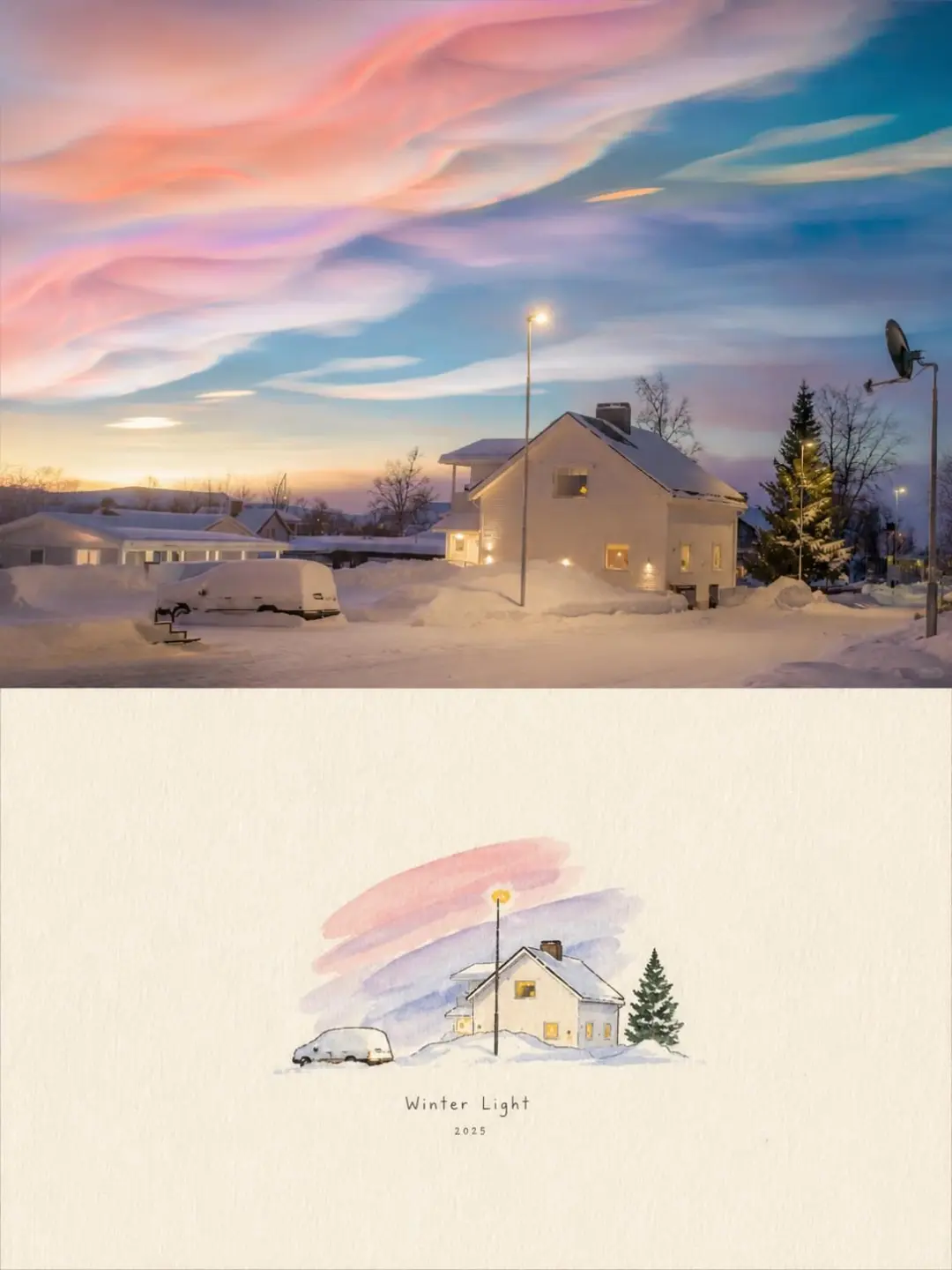
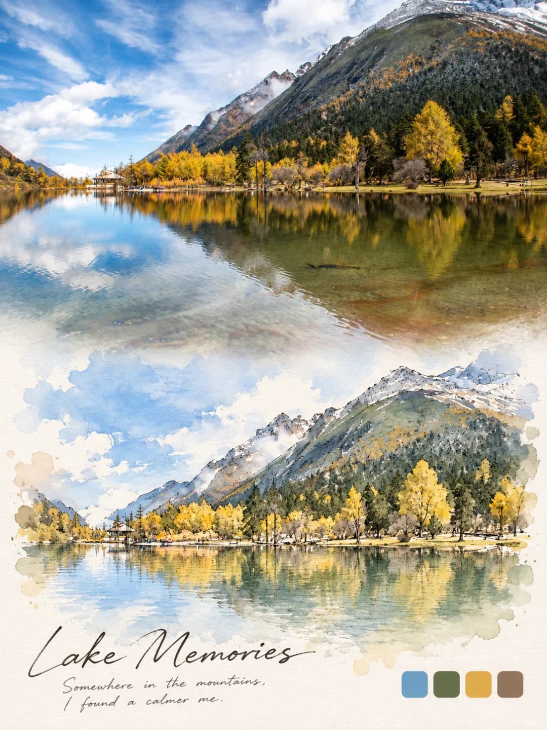
Your travel photo on top, and the same view painted in soft watercolour underneath
Upload a travel photo and get back a 3:4 poster: the photo across the top half, and underneath the same scene repainted in light, transparent watercolour, floating on warm ivory paper with one small handwritten line and a thin rule beneath it.
100 credits per image · about a minute · New accounts get 500 credits — 5 free images.

Try it with your own photo
New accounts get 500 credits — 5 free images.
Examples
Every image below was made with the prompt on this page.
What is a Watercolor Painting Poster?
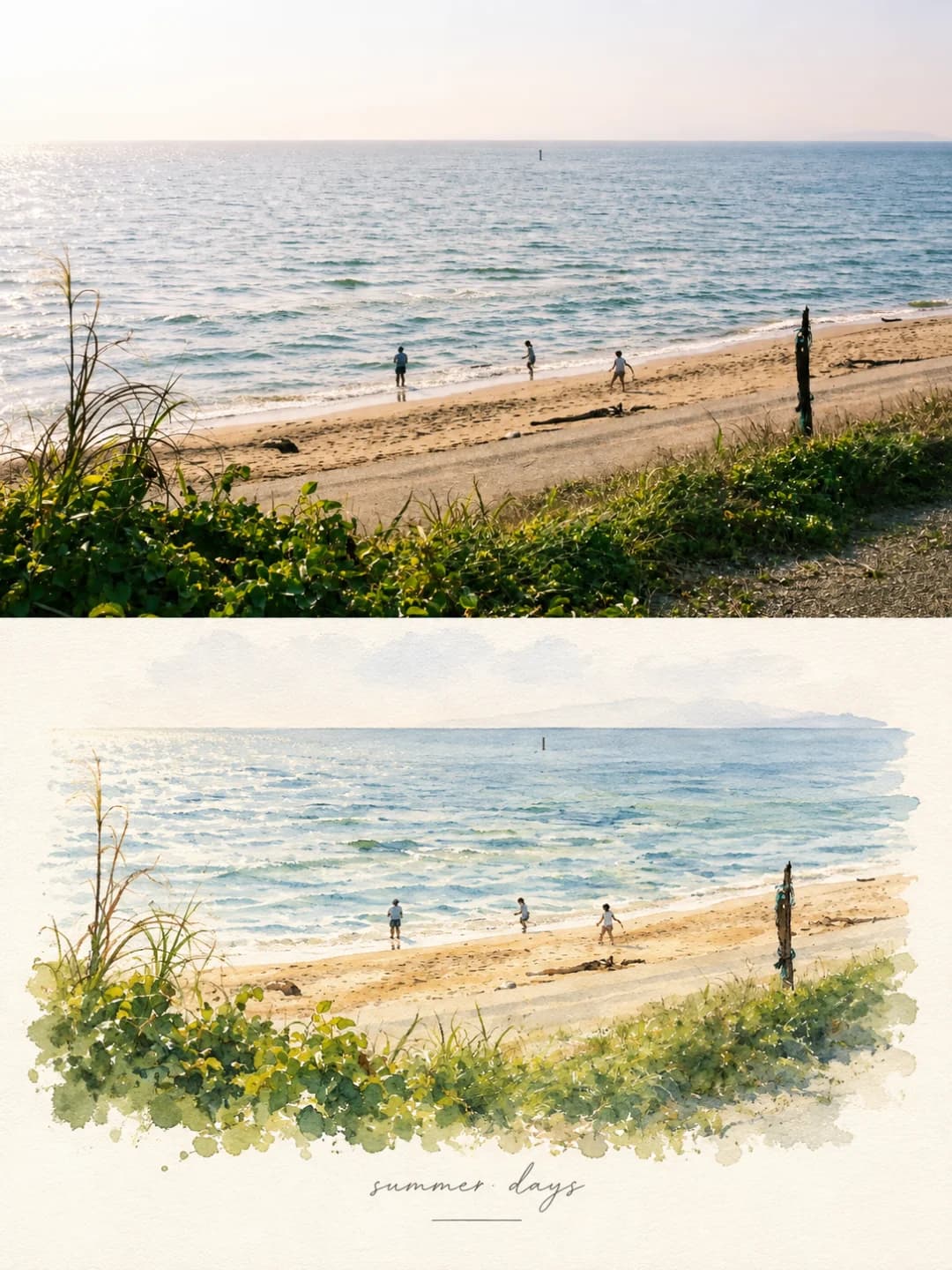
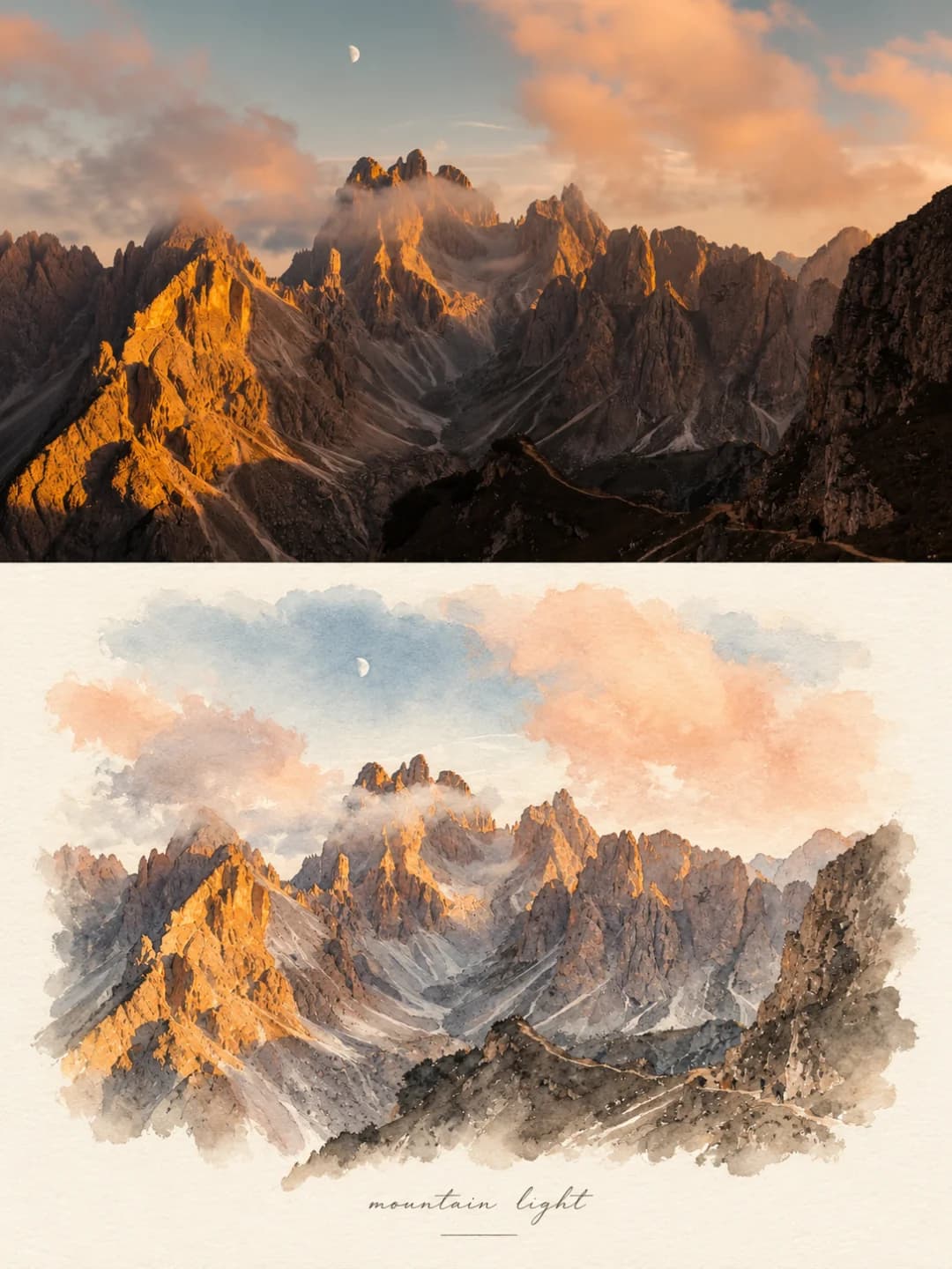
A watercolor painting poster splits a 3:4 vertical frame into two stacked halves showing the same scene. The top is your photo, kept as natural daylight travel photography. The bottom repaints it as a pale watercolour: the same composition, building outlines, number of people and poses, and perspective, rendered in transparent washes with fine ink detail and soft pastel colour. The painting fills most of the lower half and fades out at its edges into a generous margin of textured ivory paper, and a single small handwritten English phrase with a thin line under it sits near the bottom, like a fine-art postcard.
Which photos work well?
Landscape-shaped travel photos with a clear scene and daylight: a mountain range at golden hour, a beach with a few people on it, a café or shop interior, a street, a harbour. Scenes with recognisable shapes and a few figures come across best, because the painting keeps their outlines and positions.
Which photos struggle?
Close-up portraits, and dusk or night shots — the prompt asks for daylight, and in testing it once relit a dusk photo into day. The painting keeps poses and head counts, not likenesses, and the pale pastel palette washes out neon and dark scenes. It also wants a landscape-shaped photo: a tall portrait gets cropped hard to fit the top half. If you want the painting small with more white space, the Japanese minimal watercolor print suits better; for ink outlines and colour swatches, the watercolor journal poster.
How to turn a photo into a Watercolor Painting Poster
- 1
Pick an effect
Browse the samples on each tool page to see exactly what you will get before you spend anything.
- 2
Upload your photo
JPEG, PNG or WebP, up to 12 MB. Your photo stays private and is never used to train anything.
- 3
Add your own caption
Most effects let you set the text that appears in the final image, in any language.
- 4
Download the result
You get a high-resolution image, yours to use. 2K is 100 credits, 4K is 200.
The prompt behind this tool
This is the full prompt, translated into English. Copy it and use it with any image model that accepts a reference photo.
Using the reference photo I provide, create a refined editorial travel-art comparison piece.
The whole image is split vertically into two stacked zones:
Top half: realistic travel photography
Bottom half: the same scene turned into a hand-painted watercolour illustration
Both halves show exactly the same scene; the bottom half must clearly carry on the content and composition of the top half.
1. Top half: real travel photography
The top half shows a real, natural, cinematic travel photograph:
Keep the authenticity of candid travel photography
Use natural daylight
With soft shadows
A composition with a documentary feel
2. Bottom half: the same scene in watercolour
The bottom half turns exactly the same scene into a delicate, minimal watercolour with an obvious handmade quality.
It must keep, from the top half:
The main composition
The outlines of the buildings
The number of people and their poses
The perspective
The main visual elements of the scene
So that anyone can see at a glance: this is a hand-painted version of the same scene
The illustration style is:
Light, transparent watercolour washes
Fine, restrained ink-line detail
Visible paper texture
Full of air and empty space
Soft, low-saturation pastel tones
The whole should feel artistic but still believable
Not a cartoon, not flat commercial illustration, not digital thick paint
3. White space and paper in the bottom half
Around the watercolour, leave a large area of warm ivory / off-white paper
The paper should have a clear but fine handmade / watercolour-paper texture
The whole should look like a fine watercolour travel postcard or an art travel-journal page
Leave generous white space; the mood should be light, restrained and quiet
4. Typography
Near the bottom of the lower half, add one small, elegant handwritten English phrase, for example:
"summer days"
"a quiet afternoon"
The text should:
Look like natural handwriting
Be small and delicate, never competing with the image
Feel elegant, restrained and relaxed
Add a thin, minimal horizontal line beneath the text to give the layout structure.
5. Overall aesthetic
The piece should feel like:
A luxury travel journal
A fine-art watercolour postcard
With a gentle touch of nostalgia
6. Overall requirements
Vertical composition
Clean, simple composition
No clutter
No border
Not too much extra decoration
Natural proportions
The photograph must be real and finely detailed
The illustration must be light, airy and full of white space
The whole should read as a real travel photo passing naturally into a fine hand-painted watercolour.
Frequently asked questions
Will it change my photo?
- The top half is meant to stay your photo, and in daylight shots it does. But the prompt asks for natural daylight and soft shadows, and with a dusk or night photo the model sometimes relights the top half into day — it did in one of two dusk test runs. For evening scenes, pick a different effect. All the painting happens in the bottom half.
How close is the painting to the photo?
- Close. The prompt tells the model to keep the main composition, the outlines of buildings, the number of people and their poses, the perspective and the main elements, so that the painting reads at a glance as the same scene. Fine detail is simplified into washes, and faces are not likenesses.
Can I choose the handwritten line?
- Yes, and that is the more reliable route. Type a short phrase and it is written exactly as given, with a thin line under it. Leave it blank and the model picks its own short English phrase, like summer days or a quiet afternoon.
What language can the line be in?
- The samples use lowercase English in a light script hand, and that looks best. Other languages are written as given, but keep it to a few words — it is meant to be small.
Where do the colours come from?
- From your photo, pulled down to soft, low-saturation pastels. Golden light turns peach, sea turns pale blue, wood turns warm ochre. The paper is always warm ivory.
What size do I get, and how long does it take?
- A 3:4 vertical poster: 2K (1792 × 2400) for 100 credits or 4K for 200. Most images come back in 60 to 90 seconds.
Can I use my own prompt instead?
- Not on this page. The full prompt is shown above, though, so you can copy it and use it elsewhere.
What happens to my photo?
- It is stored privately, used only to make your image, deleted on a schedule, and never used for training.