Calligram Word Art Poster
Your photo on top, the same subject rebuilt entirely out of words below
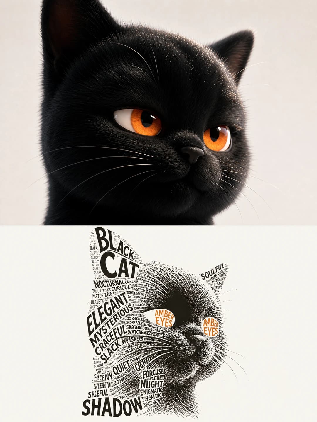
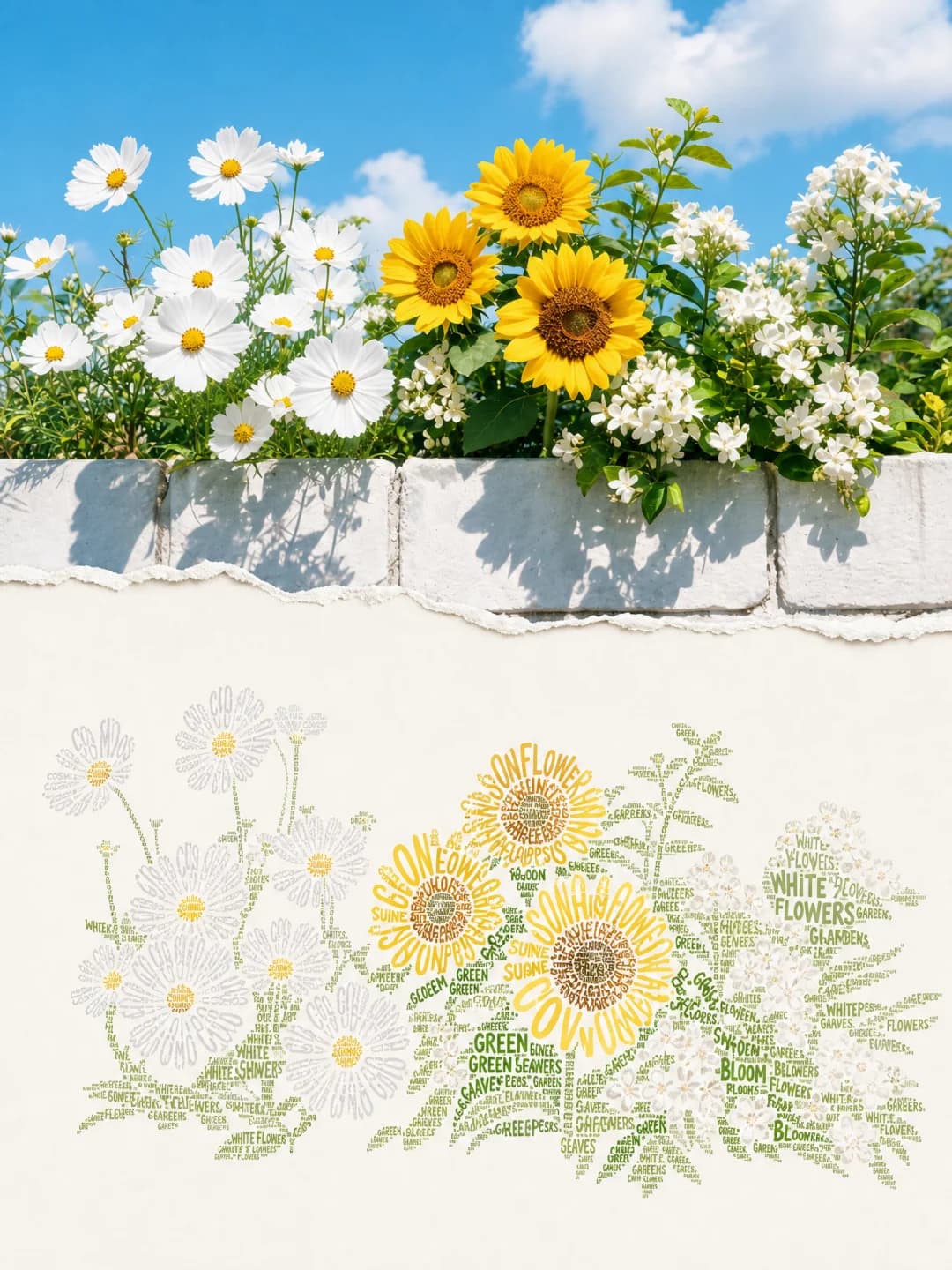
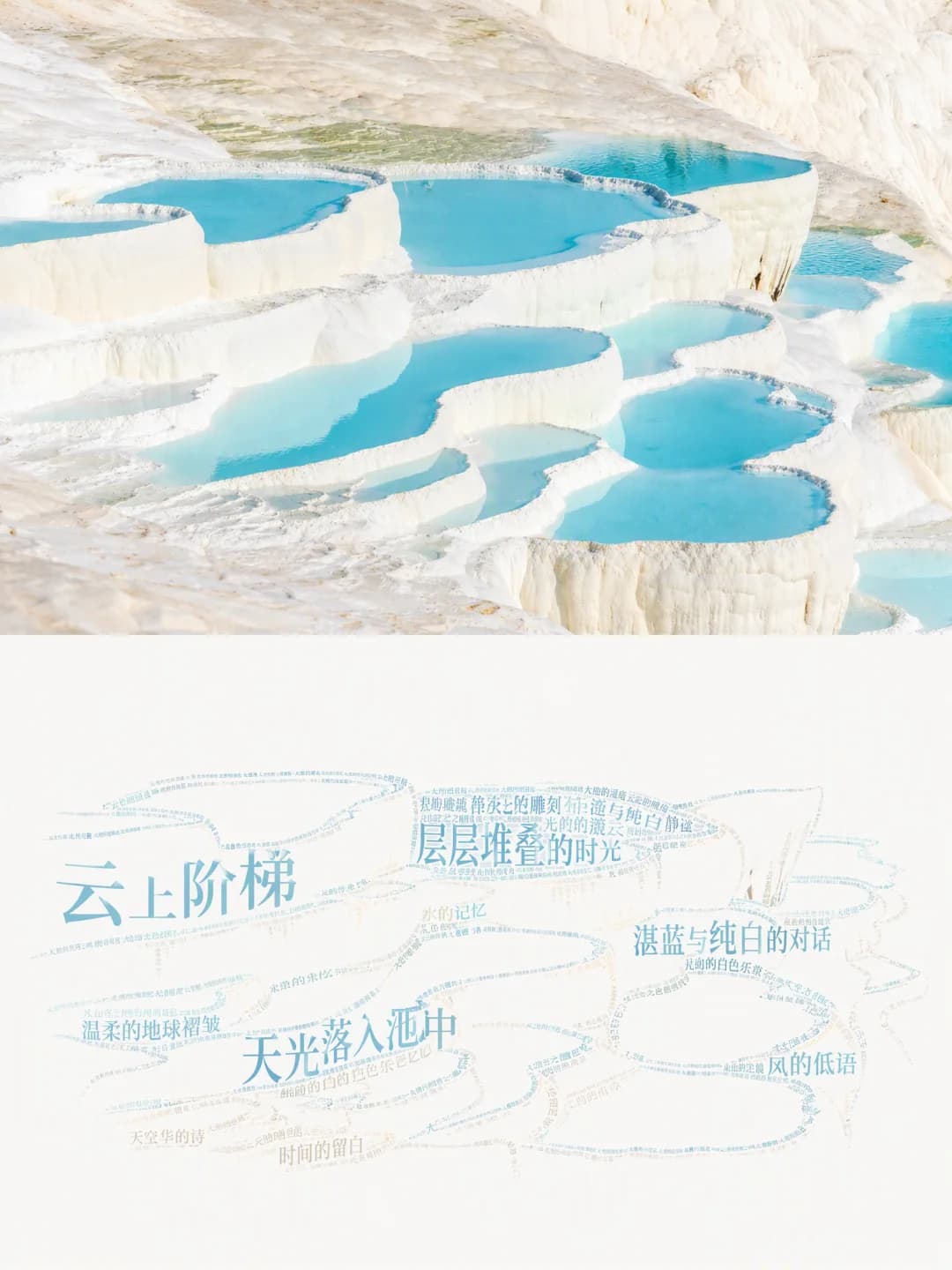
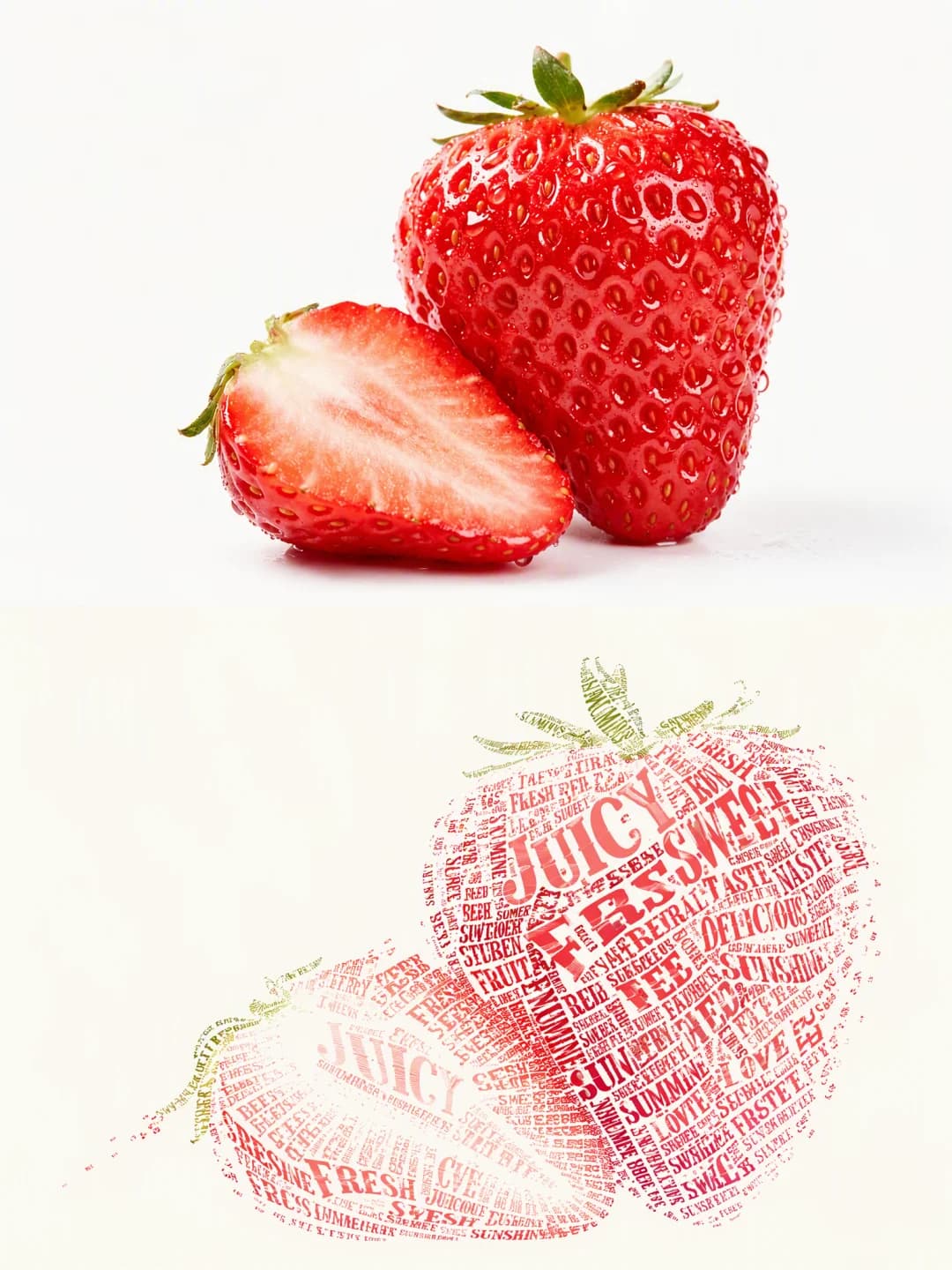
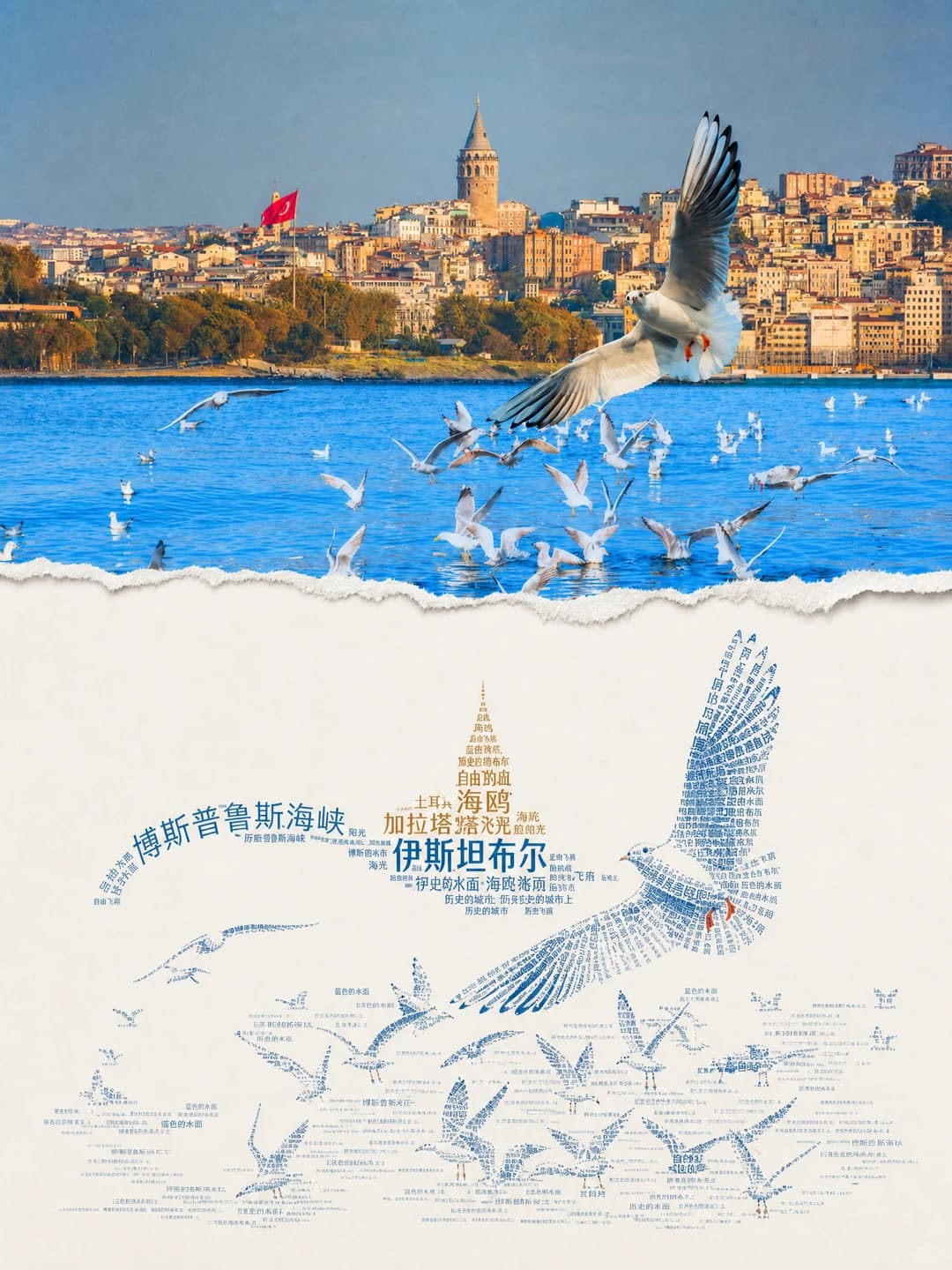
Upload a photo and get back a 3:4 poster: your photograph across the top, the same subject below drawn entirely in type — large words for the outline, dense text for the shadows, scattered words dissolving at the edges. This is the least predictable effect in the set; expect to run it more than once.
100 credits per image · about a minute · New accounts get 500 credits — 5 free images.
Try it with your own photo
New accounts get 500 credits — 5 free images.
Examples
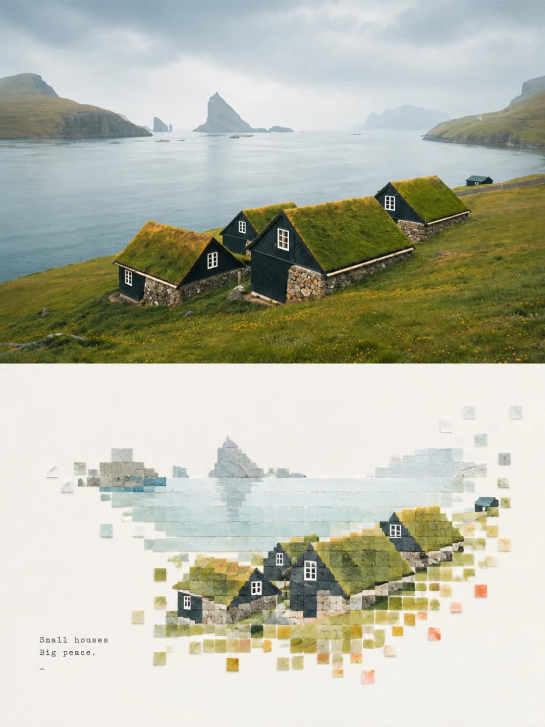
Every image below was made with the prompt on this page.
What is a calligram word art poster?
A calligram word art poster splits a 3:4 frame in half. The top is your photograph, lightly graded and otherwise untouched. The bottom is a calligram: a figure in which the text is the form rather than an overlay. Large words construct the outline and skeleton, dense dark type builds the volume of the shadows, and sparse words dissolve the highlight edges, so the shape reads as your subject from across the room and resolves into readable words up close. The vocabulary comes from the photograph, the colour from two to four of its dominant tones, and a great deal of the sheet is deliberately left blank.
Works well with
Subjects with a strong, readable silhouette against a simple background: a domed skyline, a single animal, a piece of fruit, a bird in flight, a flowering branch, a terraced landscape. The form is built from massed type, so it needs a clear outline and a clear light-and-shadow structure to build from.
Struggles with
Busy scenes, portraits of people, and anything whose interest lies in fine texture. The prompt strips the background entirely and rebuilds only the subject, so a cluttered photo loses most of itself. Faces are a poor fit: type massed at this scale cannot hold a likeness. And be aware of the hit rate before you start — see the FAQ; roughly two runs in three go wrong in some way.
The prompt behind this tool
This is the full prompt, translated into English. Copy it and use it with any image model that accepts a reference photo.
Produce one poster from the uploaded photograph. No multi-image collage. Vertical 3:4, the frame divided strictly in half top to bottom, each part taking 50% of the height.

Upper half: keep the original subject's pose, structure, real texture and native light and colour, with only light high-end grading, to the image quality of an art-exhibition publication. The background may be extended naturally to fit the frame, but the subject must not be stretched or distorted.

Lower half: a calligram — a typographic figure illustration in which the text itself is the form, not a decorative overlay. Strip out every redundant background detail and do not copy the original picture. Build the form through the scaling, rotation, path arrangement and massing of the words: large words construct the outline and skeleton, dense dark text builds the volume of the shadows, sparse text makes the dissolving highlight edges. Push the tonal and colour contrast of the type, keep the boundaries of the form crisp, and never let the text merge into the ground. From a distance it reads as the subject from the photograph; up close the whole form is made of readable words. Leave a great deal of deliberate white space, keep the lettered form small-to-medium in the frame, allow it to sit off-centre, run to an edge or be partly cropped, and build breathing room from the contrast of positive and negative shape and of dense against sparse.

Colour: take two to four dominant colours from the original, purify and deepen them, raise the contrast, and use them for the type. The ground is near-white, or an extremely pale tint matched to the original's colour temperature. Rule out thin grey-looking text, muddy greys, garish over-saturation and multicoloured clutter.

Forbidden: text floating on top of the image, ordinary typesetting, realistic painting, a background filled edge to edge, commercial templates, superfluous ornament, text unrelated to the reference photograph, and weak tonal contrast that blurs the form.

The vocabulary must match the subject, action, mood and objects of the reference photograph above; draw the words from the photograph itself, and reject unrelated text, garbled characters and mechanical repetition.
Frequently asked questions
- Will it change my photo?
- Not the top half. The prompt keeps the subject's pose, structure, texture and native light and colour, allowing only light grading and a natural extension of the background to fit the frame. The lower half is not a version of your photo at all — it is the subject rebuilt out of words.
- Can I choose the words?
- Yes, and this is the one control that matters here. Type the words you want and the model builds the form primarily from them, repeating, scaling and rotating them to make the shape. Leave the field blank and it draws its own vocabulary from what it sees in the photograph.
- Why is there only one text field?
- Because in this effect the text is not a caption — it is the drawing. Every other effect in this set puts a headline beside the artwork; here the words are the medium, so a title-and-subtitle pair would not mean anything. You get one field: the vocabulary.
- Can the words be in Chinese?
- Yes. The source examples include both English and Chinese calligrams. Chinese characters carry more ink per glyph, so they mass into solid shadow areas more readily; English words give longer strokes for outlines and edges.
- How often does it actually work?
- About a third of the time, on our own testing — 4 of 6 runs had a real problem. Two flooded the frame with type instead of building the subject, one laid words over a posterised copy of the photo rather than drawing with them, and one misspelled a word in the largest type. When it lands it is the most striking effect in the set, which is why it is here, but treat it as generate-several-and-pick rather than one-and-done. Each attempt costs credits, so that is worth knowing before you start.
- Where do the colours come from?
- From your photo. The prompt takes two to four dominant colours out of the original, purifies and deepens them, and uses them for the type on a near-white ground. It explicitly rules out thin grey text and garish saturation, because a calligram collapses the moment the contrast drops.
- What size do I get?
- 2K is 1792 × 2400 pixels, which prints cleanly at poster size. 4K doubles that and costs 200 credits instead of 100 — worth it here, because the small type benefits from the resolution.
- What happens to my photo?
- It is stored privately so the generator can read it, and deleted on a schedule. It is never made public, never shown to other users, and never used to train a model.