Doodle Icon Grid Poster
Your photo above, and below it the nine things worth remembering, drawn in crayon
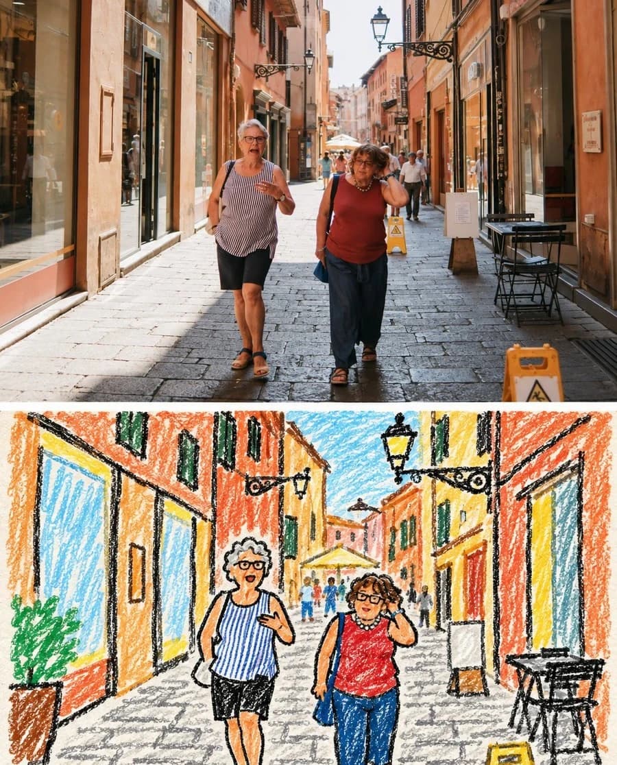
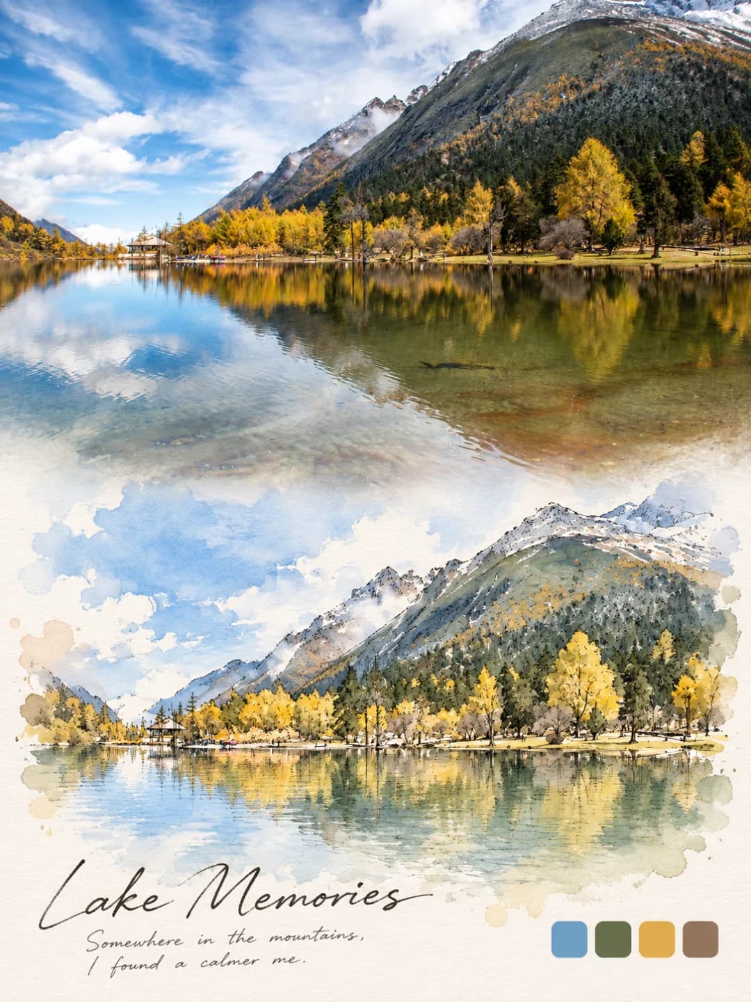
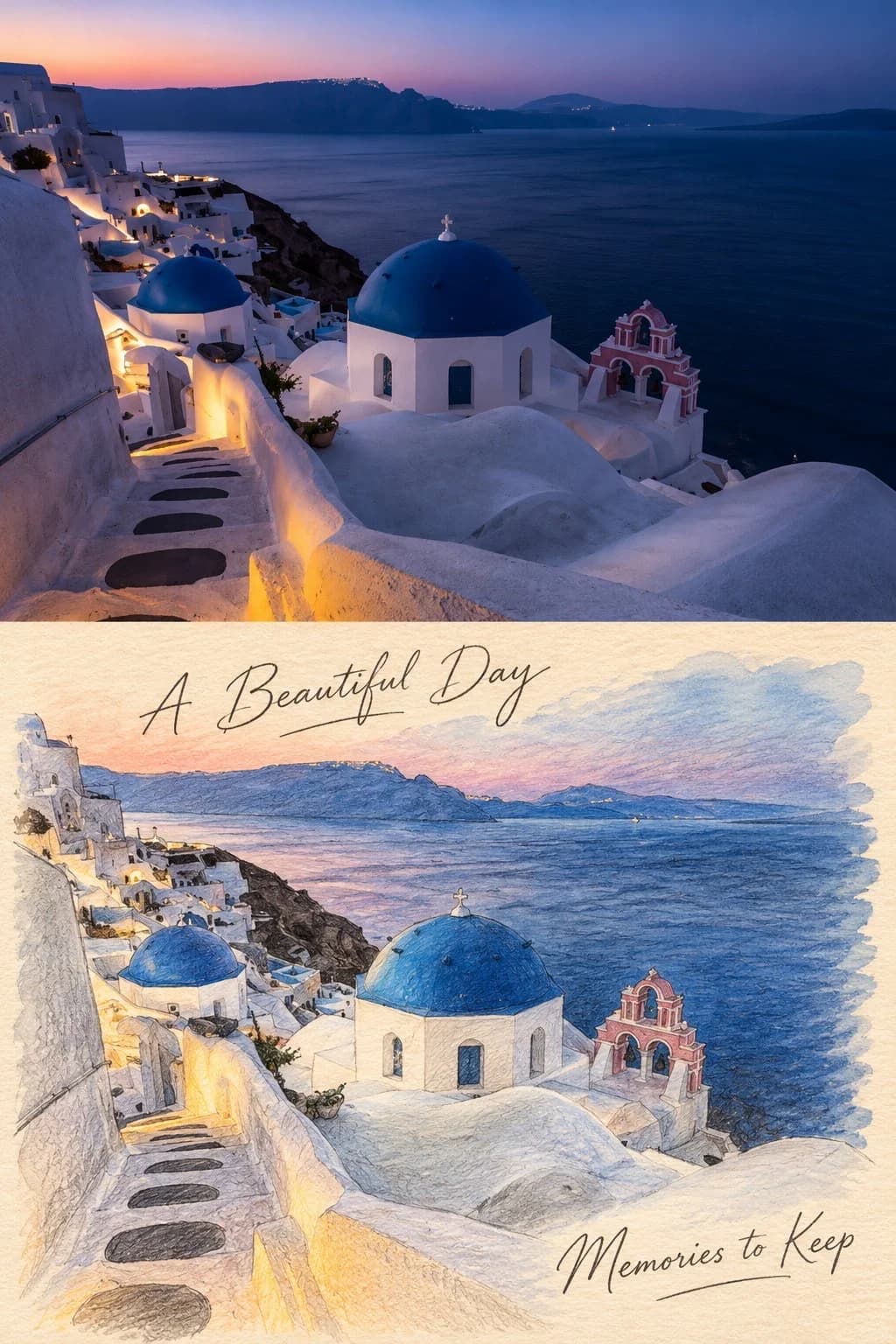
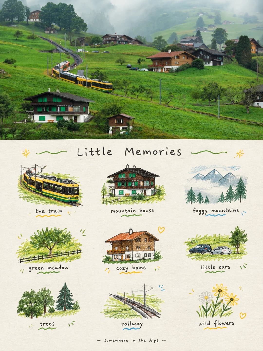
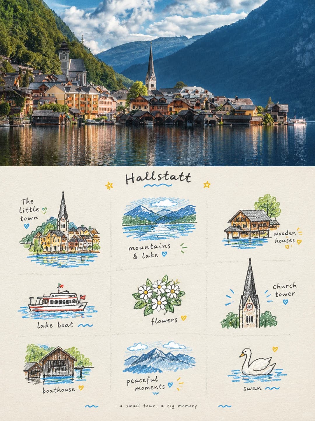
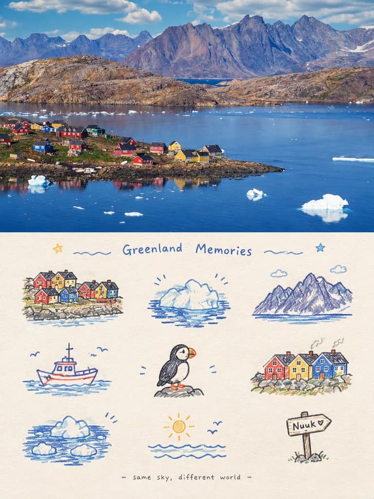
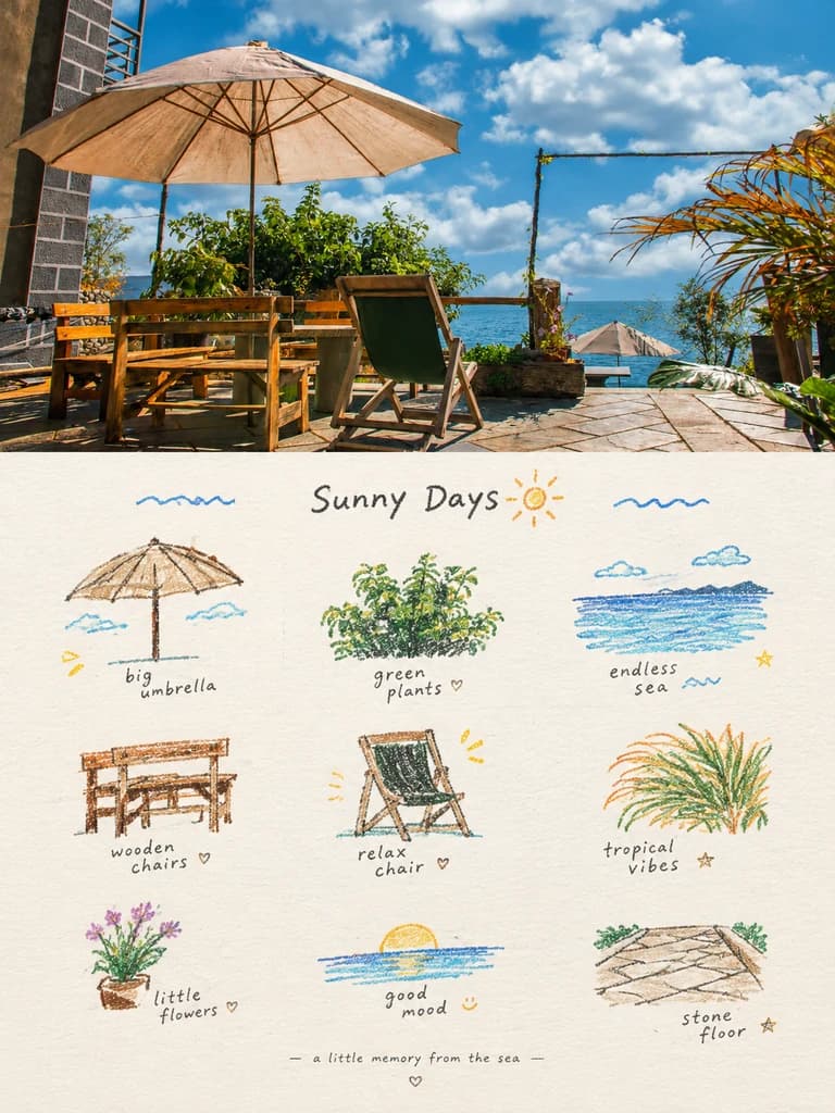
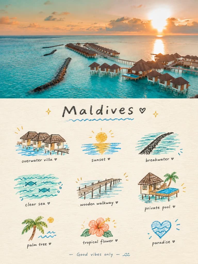
Upload a travel photo and get back a 3:4 poster: the photo across the top half, and underneath a page of nine small crayon doodles pulled from it — the boat, the church spire, the flowers by the path — set on a loose 3×3 grid like a page from a travel journal, under your handwritten title.
100 credits per image · about a minute · New accounts get 500 credits — 5 free images.
Try it with your own photo
New accounts get 500 credits — 5 free images.
Examples
Every image below was made with the prompt on this page.
What is a Doodle Icon Grid Poster?
A doodle icon grid poster is a 3:4 vertical frame split exactly in half. The top half is your photo with a light, magazine-style grade. The bottom half is a cream paper page holding nine hand-drawn icons, each one a piece of the scene above: the main subject, a detail, a vehicle, a plant, a sign, a mood. They are drawn naïvely — wobbly outlines, crayon and coloured-pencil fill with paper grain showing — and placed on a loose 3×3 grid that drifts rather than lines up. A short handwritten title runs across the top, a tiny caption sits at the foot, and some icons get small handwritten labels.
Which photos work well?
Travel photos with several distinct things in them: a village with a church, boats and a lake; a resort with villas, a pier and palm trees; a harbour with coloured houses and icebergs; a terrace with an umbrella, chairs and the sea. The more separate objects the photo holds, the better the nine icons get.
Which photos struggle?
Photos with a single thing and nothing else — a close-up face, one dish, a plain sky — because the grid needs nine different pieces and will pad them with generic suns and hearts. Portraits also lose the person: the icons are small, simplified doodles, not likenesses. It wants a landscape-shaped photo; a tall portrait gets cropped hard to fill the top half.
How to turn a photo into a Doodle Icon Grid Poster
- 1
Pick an effect
Browse the samples on each tool page to see exactly what you will get before you spend anything.
- 2
Upload your photo
JPEG, PNG or WebP, up to 12 MB. Your photo stays private and is never used to train anything.
- 3
Add your own caption
Most effects let you set the text that appears in the final image, in any language.
- 4
Download the result
You get a high-resolution image, yours to use. 2K is 100 credits, 4K is 200.
The prompt behind this tool
This is the full prompt, translated into English. Copy it and use it with any image model that accepts a reference photo.
Turn the photo I upload into one standalone, high-end designed poster — not a collage of several images. Use a 3:4 vertical frame split top and bottom at exactly 1:1, each half taking 50% of the picture.
Top half: keep the original photo. Preserve the subject's identity, structure, pose, real texture, natural light and original colour mood, with only a light, refined grade, so it reads like an image from an art magazine, an independent publication or an exhibition. To fit the frame the background may be extended naturally, but never stretch, distort or change the subject.
Bottom half: pull out the most recognisable subject, details, hints of movement, objects and story from the photo and rebuild them as one visual system: a 3×3 modular icon grid + naïve hand-drawn doodle illustration + crayon / coloured-pencil grain + handwritten words. Don't trace the whole photo and don't make a realistic illustration; compress the scene into the 9 things most worth remembering — the subject itself, a detail, something carried, a plant, a food, a way of getting around, a pose, a mood symbol or a small moment in the scene. Every unit should grow out of the same picture above, so at a glance they read as that one photo's "memory list".
Lay it out on an implied, loose 3×3 grid. The nine squares are only an underlying order and need not be drawn neatly; each icon's position, size, angle and footing can drift a little, giving a loose grid / organic grid that is ordered but not mechanical.

A short handwritten title can sit at the top with a few light wavy lines, sparkles or symbols, and a tiny handwritten caption can sit at the bottom, so the whole thing feels like a page from a private journal, a visual diary or a collection sheet.

Leave plenty of white space; the layout should be relaxed, cute and restrained, never cluttered.

Draw it as naïve hand-drawn doodle illustration: simple shapes with a slightly childlike feel, outlines that wobble a little, vary in weight and don't quite close, keeping a deliberate imperfection. Don't fill the colour in too solidly — let the paper grain, white specks and rough edges show. Mix fine black outlines, coloured-pencil / crayon fill and a few small patches of flat colour; build the shapes with flat colour / spot colour rather than realistic light and shadow. If grid guide lines appear at all, they should be very faint, like a light pencil underdrawing, not a computer-drawn table.
Frequently asked questions
Will it change my photo?
- The top half is meant to stay your photo — the prompt asks for the subject's identity, structure, pose, light and colour to be kept, with only a light grade and, if needed, an extended background. All the drawing happens in the bottom half.
How does it choose the nine icons?
- It looks for the things that make the photo recognisable — the main subject, then details, objects, vehicles, plants, food or a mood — and draws each as its own small doodle. When a photo has fewer than nine clear things, it fills the gaps with small mood icons like a sun or a heart, so photos with more going on give better grids.
Can I choose the title?
- Yes, and it is the more reliable route. Type a title, and optionally a caption for the bottom, and those are handwritten exactly as given. Leave them blank and the model writes its own short title and caption to suit the photo. Small labels next to the icons are optional: the model adds them on some runs and not others, and writes them itself.
What language can the text be in?
- The samples use short English words in a loose handwriting style, and that reads best. A title in another language is written as given, but keep it short — it is meant to be two or three words across the top of the page.
Why do the drawings look childlike?
- On purpose. The prompt asks for naïve doodles — wobbly, uneven outlines that don't quite close, crayon fill that lets the paper show — so the page feels like a personal journal rather than clip art. If you want precise, realistic drawing, a sketch or watercolour effect suits better.
Where do the colours come from?
- From your photo. Each icon is coloured after the thing it came from, in crayon or coloured pencil, with fine black outlines and a few flat patches of colour. The paper is always a light cream.
What size do I get, and how long does it take?
- A 3:4 vertical poster: 2K (1792 × 2400) for 100 credits or 4K for 200. It usually takes 60 to 90 seconds.
What happens to my photo, and can I use my own prompt?
- Your photo is stored privately for the generator, deleted on a schedule and never used for training. You can't swap in your own prompt, but the full prompt is on this page if you want to run it elsewhere.