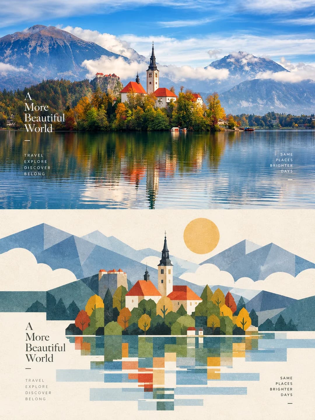
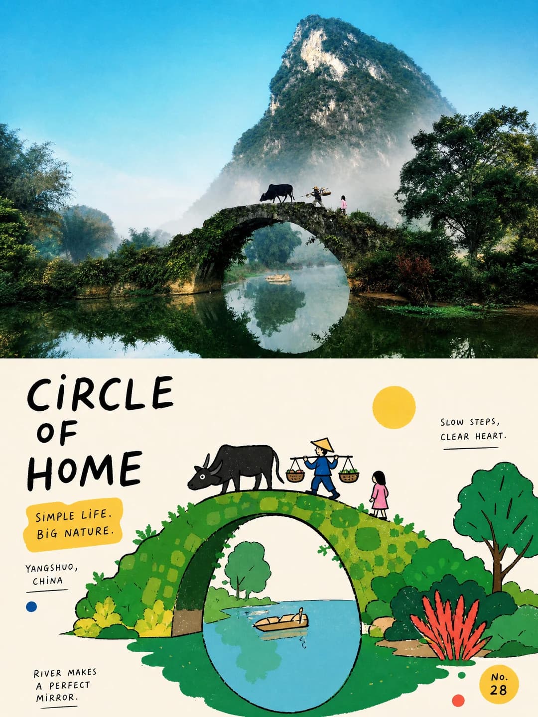
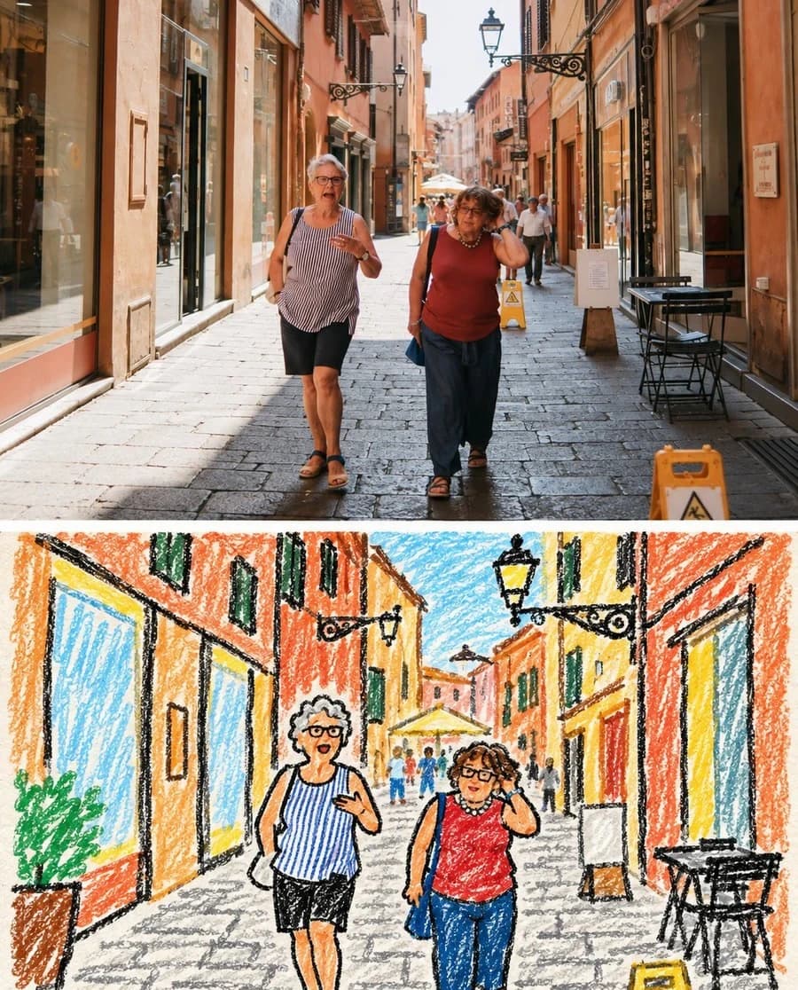
Marker Portrait Poster
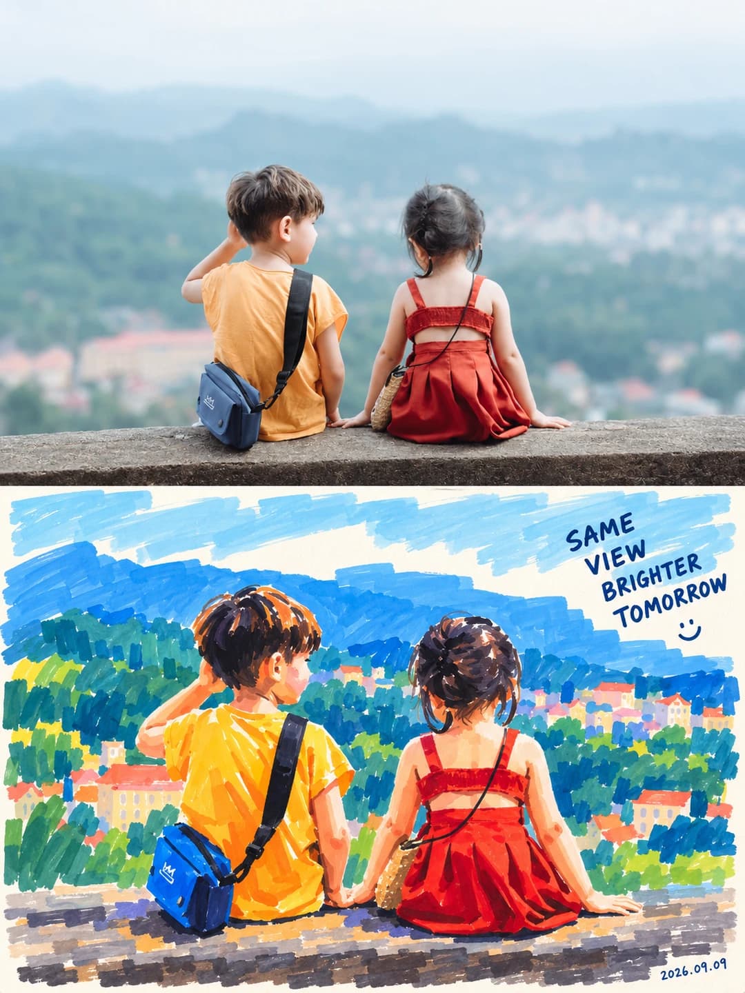
Your photo on top, the same person repainted below in bold marker
Upload a photo and get back a 3:4 poster: your photograph across the top, the same subject below repainted in four to six dense marker colours with visible chisel strokes, a handwritten line and the date in the corner.
100 credits per image · about a minute · New accounts get 500 credits — 5 free images.
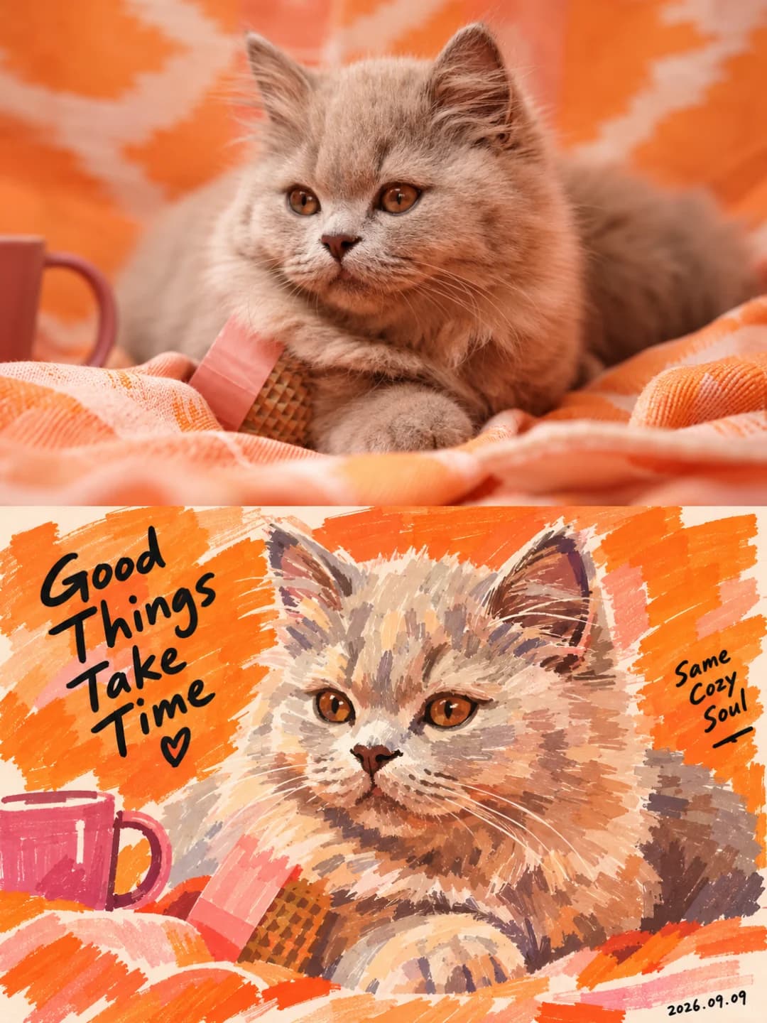
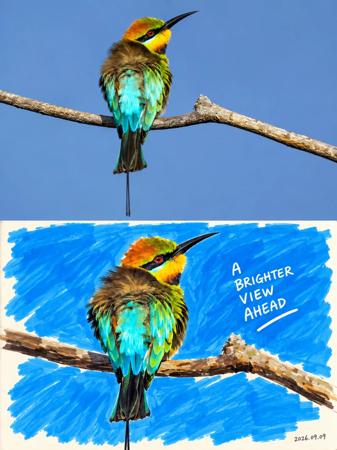
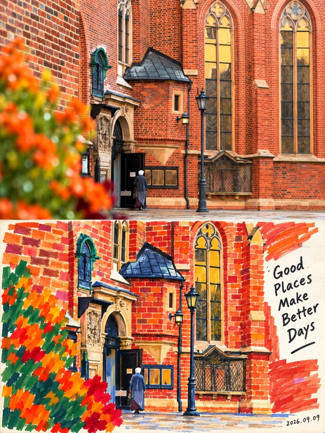
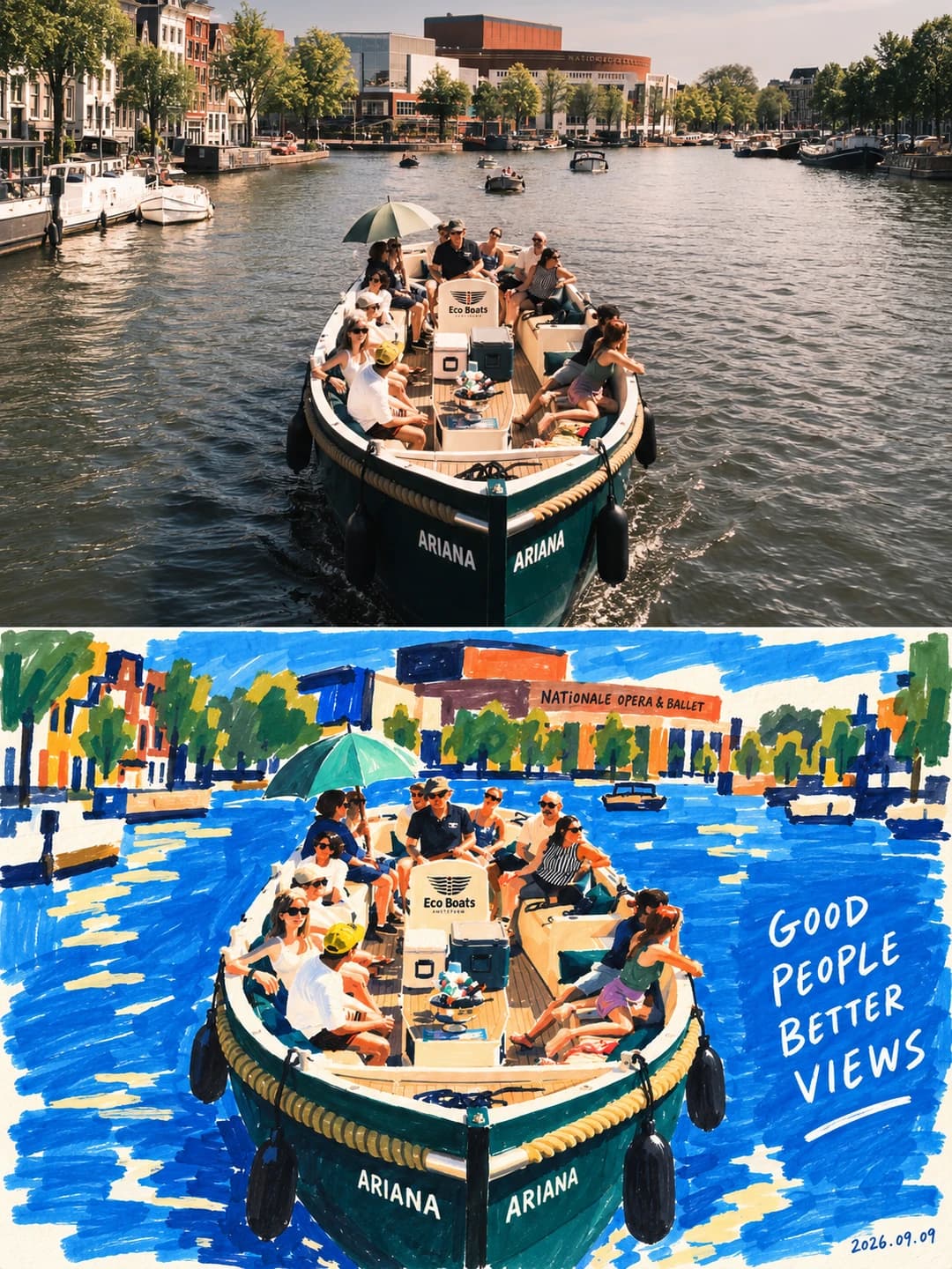
Try it with your own photo
New accounts get 500 credits — 5 free images.
Examples
Every image below was made with the prompt on this page.
What is a marker portrait poster?
A marker portrait poster splits a 3:4 frame into two equal zones. The top is your photograph, held to its identity, age, skin tone, expression, pose and head angle, with only light grading and no ornament added. The bottom repaints the same subject as a bold opaque acrylic-marker figure painting: hair, face, neck and clothing reduced to a few weighted colour fields, the face built from one base skin tone plus two or three structural blocks, backgrounds stripped to one or two flat areas. Four to six colours are drawn from the photo — one dominant, one counter-colour, a little accent — and a handwritten line plus a small date sit in the space beside the figure.
Works well with
One clear subject with a readable expression or posture, filling a decent part of the frame. It is written for people, but the source examples also cover a cat, a bird, a brick facade and a boat of passengers, and it handles them the same way — a few weighted colour fields with the clutter deleted.
Struggles with
Crowds and scenes where the setting carries the meaning. The prompt deletes bystanders, clutter and the photographic background outright, so a group shot comes back as one figure against a flat colour block. It also refuses to flatter: if you want a softened, brightened portrait, this is deliberately the wrong tool.
The prompt behind this tool
This is the full prompt, translated into English. Copy it and use it with any image model that accepts a reference photo.
Make one piece from the uploaded photograph; do not collage. Vertical 3:4, the two zones strictly 1:1 in height, 50% each.

Upper zone — keep the original photograph. Use the uploaded photo as the only reference for the person, preserving completely their identity, sense of age, depth of skin tone, expression, pose, head angle, hairstyle, the relationships between their features, clothing, accessories and key action. Apply only light high-end grading, to the image quality of an art magazine, an independent publication or an exhibition print; keep real skin, natural light and the original colour mood. The background may be extended naturally to fit the frame, but do not stretch, distort, slim the face, beautify or alter the subject. Closed eyes must not become open, a closed mouth must not become a toothy smile, a profile must not become a frontal view, and a back view must not be given a face. Add no illustration, stickers or ornament to the upper zone.

Lower zone — rebuild as a bold marker portrait. From the most recognisable characteristics of the person above — face shape, hairstyle, the placement of features, head angle, the direction of the shoulders, pose, the outline of the clothing, gesture, accessories and expression — rebuild the same person as a contemporary bold acrylic-marker figure painting. Not a filter, not a realistic copy: as though a painter had looked at this person and redrawn the moment with a few richly coloured broad-nib markers. It must read as painting at first glance, and as the same person at second glance.

Style: borrow only the top-and-bottom layout; the visual style must stay a bold marker figure painting. Take the vivid pure-colour relationships, simplified contours and rhythm of colour blocks from Matisse, but translate them into marker painting — never paper-cut, collage, pixel, shell material, vector or 3D. Take the relationship of "spare drawing plus handwritten line" from David Shrigley, but warmer in tone, never copying a specific work or sentence. One consistent language: dense colour, broad strokes, large colour fields, simplified form, a true expression, visible marks of the hand, and a little handwritten annotation.

The person: keep the face shape, the proportions of the features, the direction of the gaze, the hairstyle, the depth of skin tone, the expression, the action, the structure of the clothing and any important accessories. Preserve identifying features such as moles, freckles, glasses and a beard wherever possible. Detail may be simplified, but do not paint the person as a different face, and do not manufacture humour by exaggerating the features.

Medium and mark: the medium is opaque acrylic paint marker. Lay large colour fields with a wide chisel nib, establish the shapes with a medium nib, and use a little fine nib for the features, the direction of the hair and the lettering. The colour fields should be full, solid and covering. Keep real marker marks — swept bands, angular turns, seams where strokes overlap, slightly irregular edges, a few skips over the paper grain. No all-over noise texture, and never outline in uniform black before filling.

Form and colour: build the figure from a few weighted colour fields — hair, face, neck, top, arms and any necessary accessories all reduced to simple shapes. The face is one base skin-tone field, two or three structural colour blocks and a few strokes for the features, with the photograph's micro-texture and complex gradients removed. Complete the eyes with a few short strokes and a dark dot, keeping the gaze accurate; no anime-large eyes, exaggerated highlights or false lashes. The mouth keeps whatever opening and feeling it had.

Colour should be dense but not heavy, vivid but not noisy. Draw four to six main colours from the original: one dominant colour to set the mood, one counter-colour for tension, and a little accent to lift the image. Cobalt, ultramarine, vermilion, tomato red, ochre, deep grass green, peacock green, aubergine, wine red and warm ivory are all available, but choose only the set that suits each picture. Skin may be translated artistically into ochre, terracotta, apricot or warm brown, but the person's original relative depth of skin tone must be preserved — no bleaching, no shattering into rainbow fragments. Soft-focus gradients, airbrushed shadow, watercolour bleed, candy pastels and plastic skin are all forbidden.

Lower-zone composition: delete the irrelevant background, bystanders and clutter, keeping only the figure and the few objects that genuinely matter, reduced to marker colour blocks in the same way. The figure may be enlarged, cropped or set to one side to leave room for the text, but the logic of the action must not change. The background is one whole block of the dominant colour, two large colour areas, or the dominant colour combined with warm white space. The picture should be relaxed and full of air; do not add meaningless plants, hearts, stars, stickers or templated ornament.

Handwritten text: from the real action, expression, objects or atmosphere in the photograph, write one related, humorous short line that feels like something only someone who had seen this photograph would think of. Mainly English, with optionally a very short line of Chinese; keep the main line to three to eight English words, with an optional aside of one to three words, at most two groups of text. The lettering must look marker-written: letters slightly uneven in size, the baseline gently rising and falling, spacing naturally irregular but clearly readable, of the same material as the picture and never like type added afterwards. A short underline or a small arrow may accompany it; do not scrawl over the whole page.

Signature: in the lower right of the lower zone, or in the white space, note the actual generation date in smaller, lighter handwriting, in the format YYYY.MM.DD. Add no invented signature, logo or watermark.

Final control: the result must be an authentic original photograph in the upper zone plus a bold marker figure painting in the lower zone. Borrow only the top-and-bottom structure; do not render it as pixel, shell, collage or material-seal styles.

Avoid: realistic AI oil painting, watercolour, pixel, collage, shell mosaic, vector, 3D cartoon, anime-large eyes, uniform heavy black outlines, complex backgrounds, too much text, too much ornament, and over-detailed hair and fabric texture.

Target: bold and forceful colour blocks from across the room, real tactile marks up close, and — looking again — unmistakably the same person as in the photograph above.
Frequently asked questions
- Will it flatter or change the person?
- It is written hard against that. The upper zone must keep identity, sense of age, depth of skin tone, expression, pose and head angle, and explicitly forbids slimming the face or beautifying. Closed eyes stay closed, a closed mouth does not gain teeth, a profile is not turned to face front, and a back view is not given a face. The lower zone simplifies into colour blocks but must not paint a different face or make jokes by exaggerating features.
- Can I choose the handwritten line?
- Yes, and it is the more reliable path. Type your main line and an optional short aside and the model letters them into the painting. Leave them blank and it writes its own from something visible in the photo, aiming for a line that only someone who had seen the picture would think of.
- Why is there a date in the corner?
- The prompt asks for one in small, light handwriting in the lower right, format YYYY.MM.DD. Be aware it is decorative, not real: the model has no clock, and across our test runs it wrote six different dates, none of them the actual day. Treat it as part of the drawing. The prompt does forbid adding an invented signature, a logo or a watermark, so the date is the only mark that appears.
- Does it only work on people?
- It is written for people — the whole middle of the prompt is about faces, features and gaze. But the source examples also run it on a cat, a bird, a church facade and a boat full of passengers, and it handles them well by treating the subject the same way: a few weighted colour fields and the clutter deleted. Expect a portrait effect that tolerates other subjects rather than a general-purpose one.
- Where do the colours come from?
- From your photo, then concentrated. The prompt draws four to six main colours from the original — one dominant, one counter-colour, a little accent — from a named palette of cobalt, ultramarine, vermilion, ochre, deep green, aubergine, wine red and warm ivory. Skin may shift to ochre or terracotta, but the original relative depth of skin tone has to survive.
- What size do I get?
- 2K is 1792 × 2400 pixels at this effect's 3:4 shape. 4K doubles that and costs 200 credits instead of 100.
- Can I use my own prompt instead?
- Not in this tool — it runs one fixed prompt. The full text is published on this page, so you can copy it and run your own variations anywhere that accepts image prompts.
- What happens to my photo?
- It is stored privately so the generator can read it, and deleted on a schedule. It is never made public, never shown to other users, and never used to train a model.