Risograph Print Poster
Your photo above, and below it the same place pared down to one subject in two or three inks
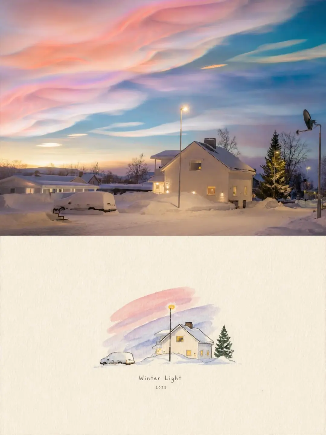
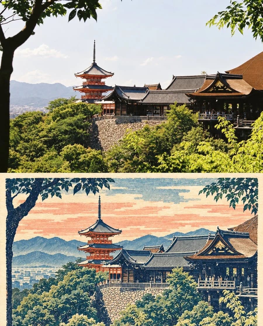
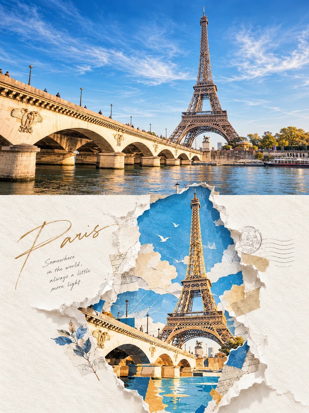
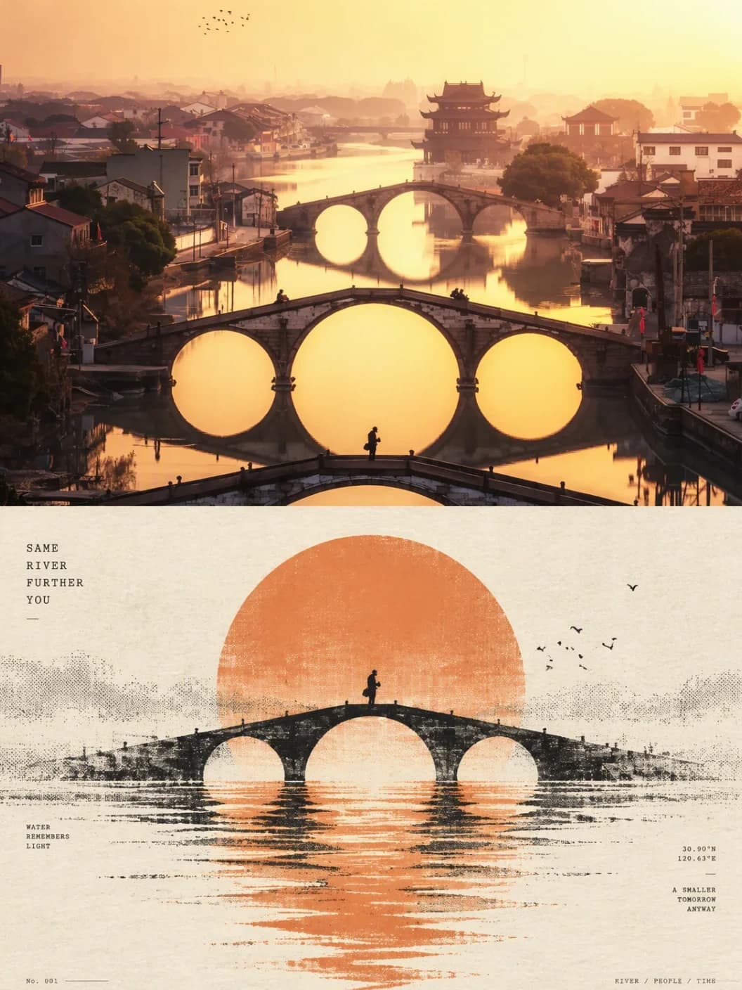
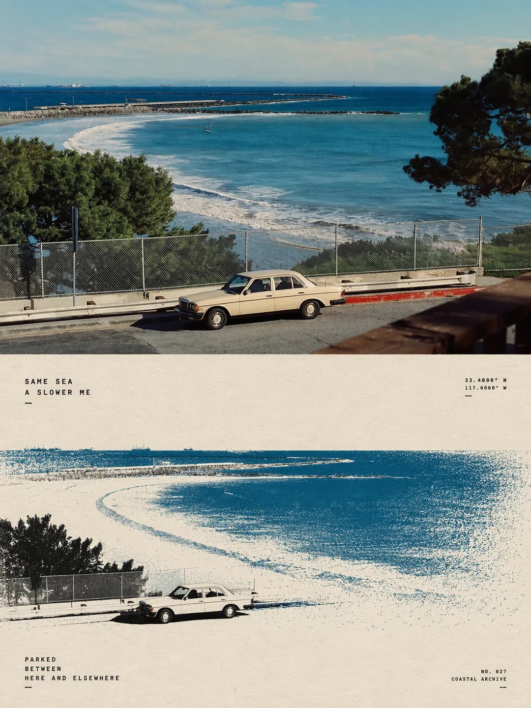
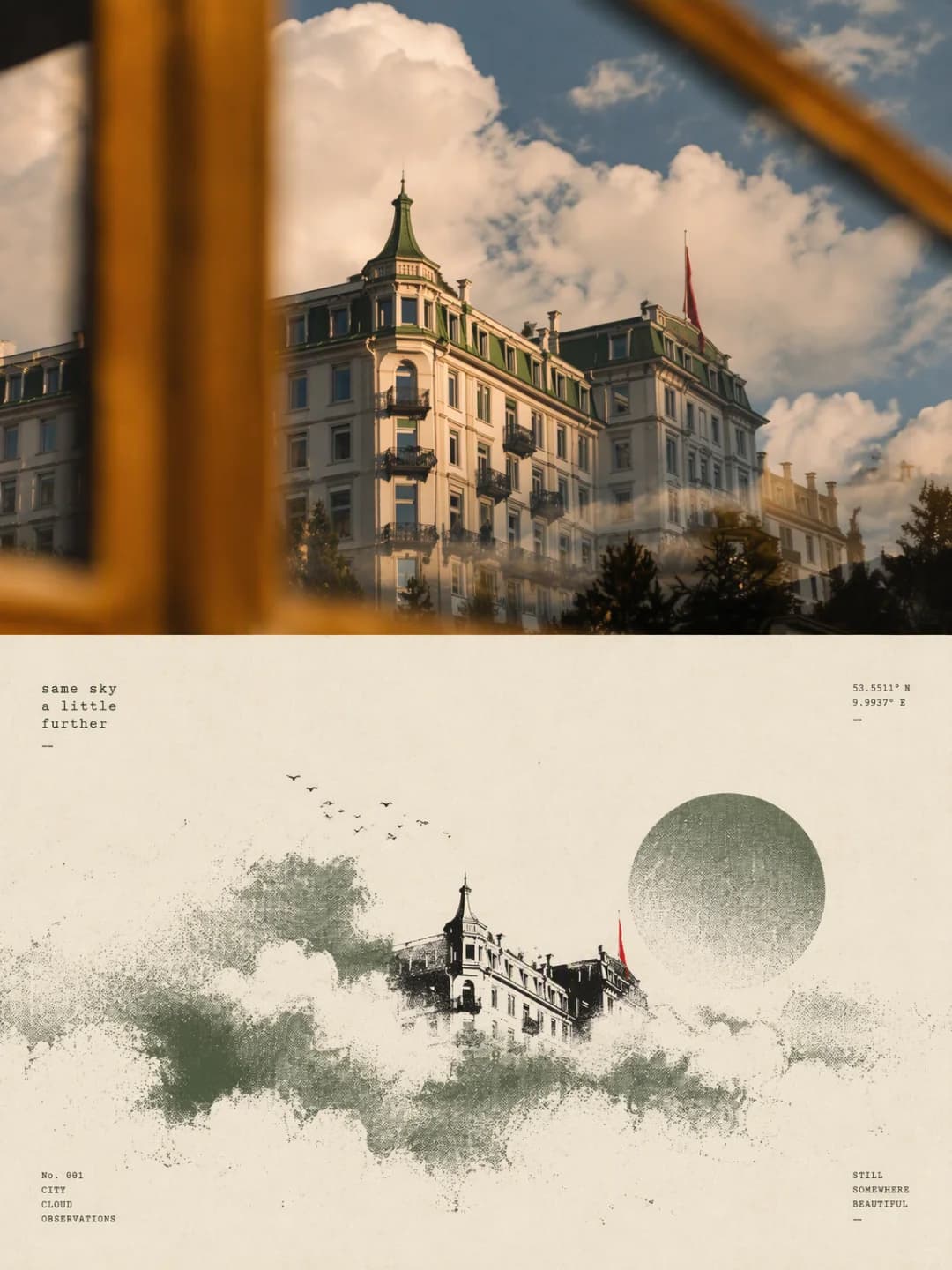
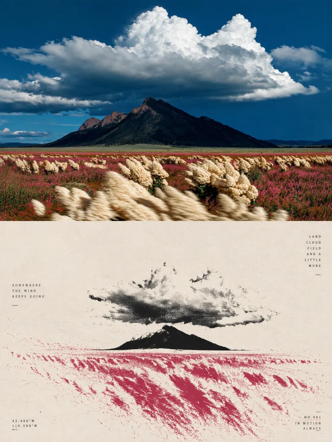
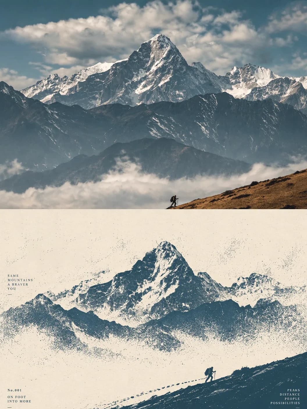
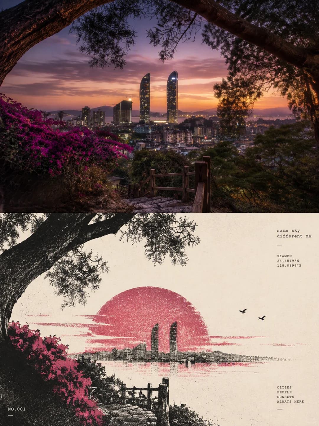
Upload a landscape, a city view or a travel photo and get back a 3:4 poster: the photo across the top half, and underneath a minimalist print of the same scene — one small subject in a lot of empty paper, with its motion spun out in halftone dots and grain. A few lines of tiny typewriter-style text sit in the margins.
100 credits per image · about a minute · New accounts get 500 credits — 5 free images.
Try it with your own photo
New accounts get 500 credits — 5 free images.
Examples
Every image below was made with the prompt on this page.
What is a Risograph Print Poster?
A Risograph print poster is a 3:4 vertical frame split exactly in half. The top half is your photo with a light, magazine-style grade. The bottom half is a surreal minimalist print on warm ivory paper: the most recognisable subject from the photo — a mountain, a bridge, a car, a building — shrunk into a small anchor inside wide negative space, with the photo's light or movement turned into a field of halftone dots, fine lines and particles that thin out towards the edges. It uses only two or three colours: the photo's most vivid hue, paper white and a little black, with grain and slight misregistration like a real Risograph or screen print. Small English phrases, coordinates and serial numbers finish it.
Which photos work well?
Landscapes and travel photos with one clear subject and one clear colour: a peak under cloud, a sun behind a bridge, a car parked above a bay, a hotel against the sky, a hiker on a ridge. Sunsets, strong single-colour skies and wide scenes with space around the subject work best, because the print keeps the one colour and the one shape.
Which photos struggle?
Portraits, crowds, food and anything that depends on detail. The print shrinks the subject to a small silhouette and throws away texture on purpose, so faces, text on signs and busy streets disappear. Photos whose appeal is many colours at once also lose it — the print keeps only one main ink. It wants a landscape-shaped photo; a tall portrait gets cropped hard to fill the top half.
How to turn a photo into a Risograph Print Poster
- 1
Pick an effect
Browse the samples on each tool page to see exactly what you will get before you spend anything.
- 2
Upload your photo
JPEG, PNG or WebP, up to 12 MB. Your photo stays private and is never used to train anything.
- 3
Add your own caption
Most effects let you set the text that appears in the final image, in any language.
- 4
Download the result
You get a high-resolution image, yours to use. 2K is 100 credits, 4K is 200.
The prompt behind this tool
This is the full prompt, translated into English. Copy it and use it with any image model that accepts a reference photo.
Make a single standalone poster from the uploaded image — not a collage. Split it strictly 1:1 top to bottom, each half taking 50% of the frame.
Top half: keep the photo's subject — its identity, structure, pose, real texture, natural light and colour mood — with only a light, refined colour grade, so it reads like an image from an art magazine or an exhibition. The background may be extended to fit the frame; never stretch, distort or change the subject.
Bottom half: make a surreal minimalist print. Take the most recognisable subject, outline, pose and story from the photo and rebuild them as a surreal, minimal printed image. Reduce the subject to a clear, restrained visual anchor, set small inside a vast negative space, keeping only its most basic outline and posture. Don't copy the fine detail; instead turn the photo's movement, direction, light or spatial relationships into a field of motion around the subject. Let the subject's own nature choose one main logic of motion: sinking from above, rising straight up, flowing in one direction, spreading out from a core, or breaking into irregular ripples and echoes. Show the motion with many fine lines, broken trails, rough halftone dots and changing particle density — densest and strongest near the core, thinning and fragmenting towards the edges until it fades into the negative space. Don't stack several effects at once; let "one subject, one movement, one vast spatial relationship" be the heart of the image.
Colour is a strict 2–3 colour system: take the most distinctive, most vivid main colour from the photo above, and pair it with warm white, ivory or a natural paper tone, plus a minimum of black. The main colour may be cleaned up and intensified so it is vivid and strong, but never too digital. Build depth with halftone density, overprinted ink and the paper's negative space rather than ordinary gradients, and keep the look of screen printing and Risograph: coarse grain, paper fibre, uneven ink coverage and slight misregistration.

Set the type as restrained, experimental art-book typography with no large headline. Draw a few minimal English phrases from the photo's movement, distance, state, mood or metaphor, and pair them with 2–4 tiny text elements, freely mixing phrases, state words, place or object notes, serial numbers, coordinate-style figures, directions, archive labels or observation notes.

The type can align to the horizon, a motion trail, the subject's axis or the edge of the negative space; it can also run vertically, rotate, stagger, sit inside the particle field or be lightly crossed by lines, so the typography takes part in the space and the movement instead of floating on top of the image.
Frequently asked questions
Will it change my photo?
- The top half is meant to stay your photo — the prompt asks for the subject's identity, structure, pose, light and colour to be kept, with only a light grade and, if needed, an extended background. The bottom half is deliberately not a copy: it keeps one subject, small, and drops most of the detail.
Which colours will the print use?
- Two or three at most. The prompt picks the single most vivid, most recognisable colour in your photo — the orange of a sunset, the blue of a bay — and pairs it with ivory paper and a little black. A photo with no strong colour gets a muted print, so it helps to choose one with a clear hue.
Why is the subject so small?
- That is the point of the style. The prompt asks for one subject, one movement and a vast space around it, so the subject becomes a small anchor and the rest of the page is paper and dots. If you want the subject to fill the frame, this is the wrong effect.
Can I choose the text?
- Yes, and it is the more reliable route. Type a main phrase and an optional tiny annotation and only those are printed, exactly as given, in small type with no headline. Leave them blank and the model writes its own few English phrases, coordinates and serial numbers to suit the photo.
What language can the text be in?
- The style is built around small English phrases and numbers set like typewriter or archive labels, so short English reads best. Anything you type is set as given, but keep it to a few words — there is no large headline in this layout.
Is it a real Risograph print?
- No — it is an image generated to look like one: halftone dots, coarse grain, paper fibre, uneven ink and slight misregistration between colours. If you want a physical print, the limited palette means it separates cleanly into two or three layers.
What size do I get, and how long does it take?
- A 3:4 vertical poster: 2K (1792 × 2400) for 100 credits or 4K for 200. It usually takes 60 to 90 seconds.
What happens to my photo, and can I use my own prompt?
- Your photo is stored privately for the generator, deleted on a schedule and never used for training. You can't swap in your own prompt, but the full prompt is on this page if you want to run it elsewhere.