Particle Dispersion Poster
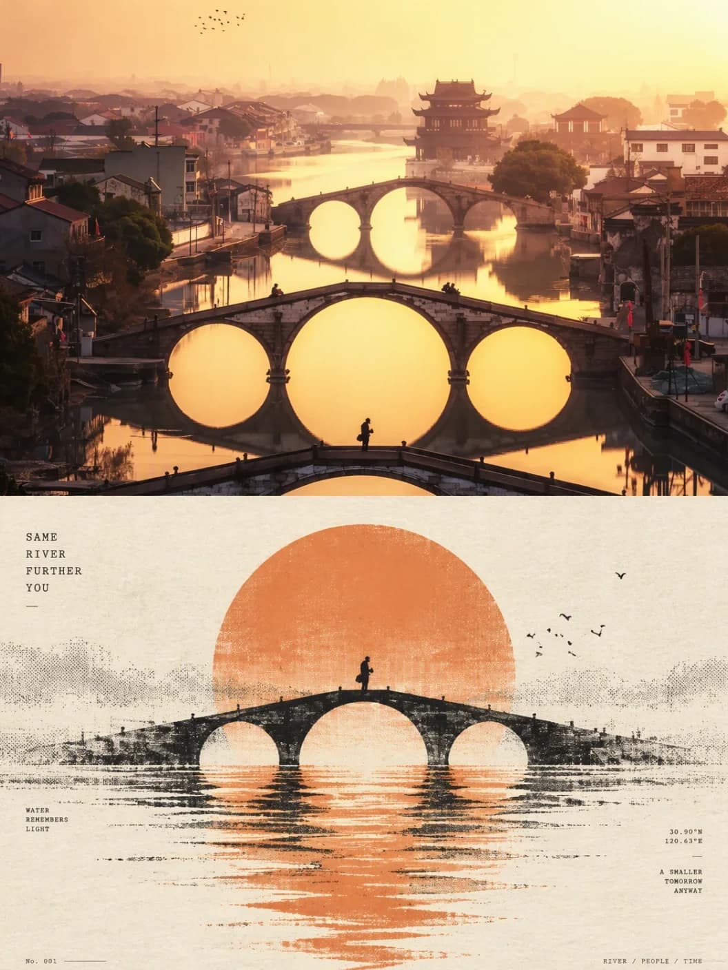
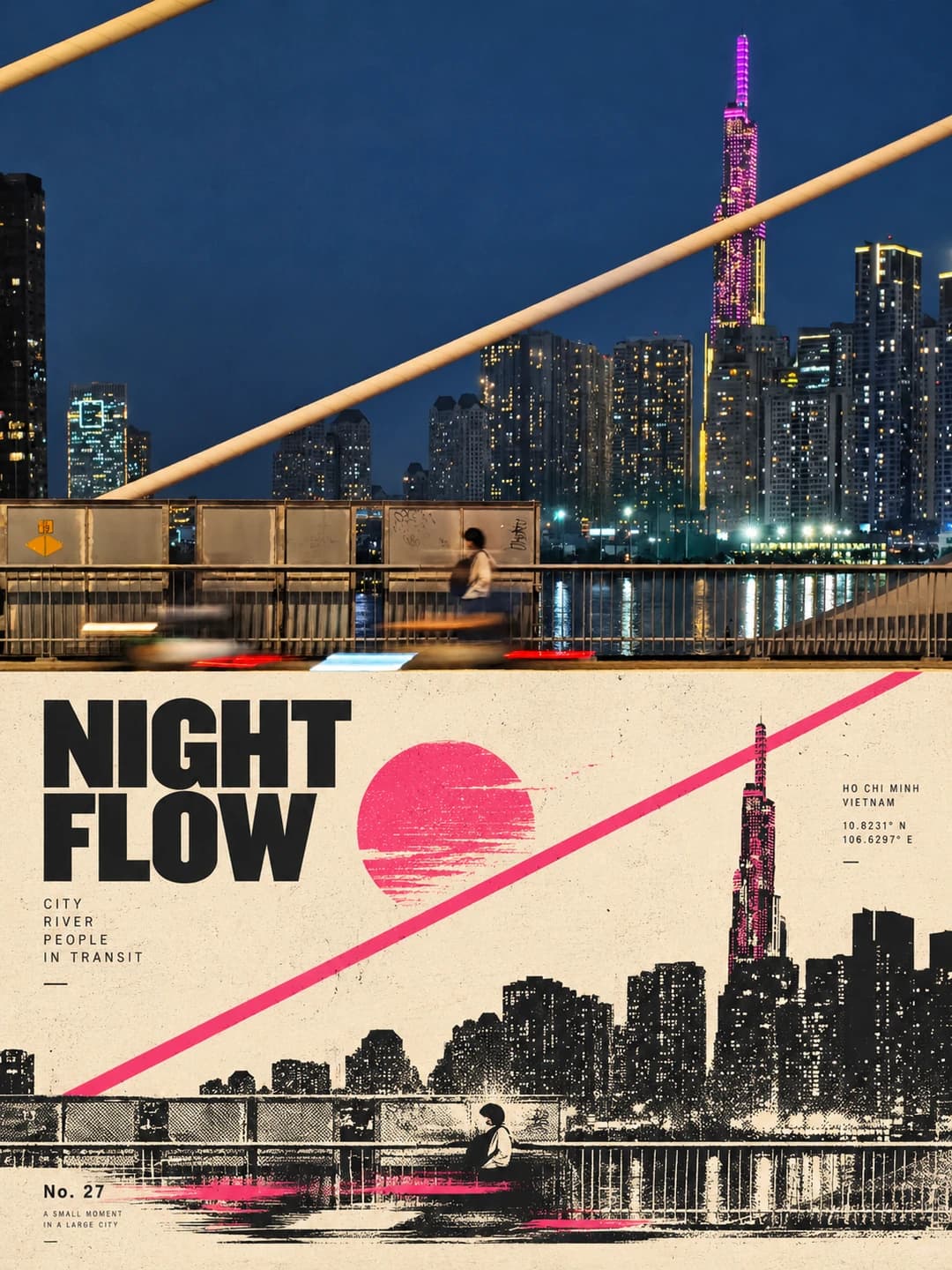
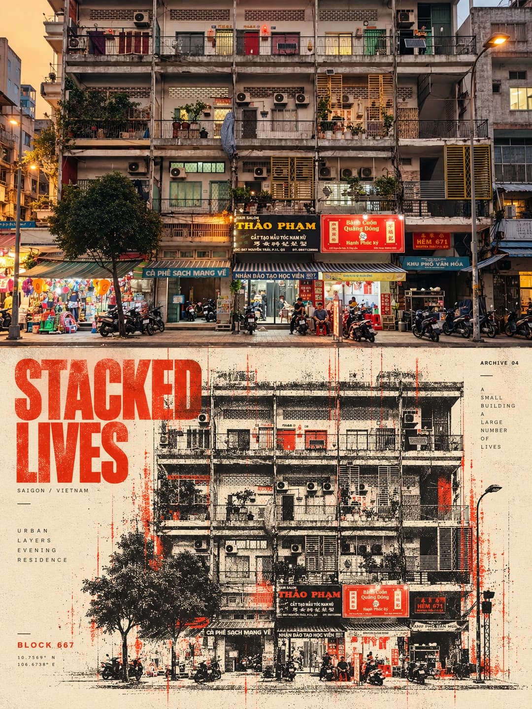
Your photo above, and below it the same scene breaking into halftone particles under a bold headline
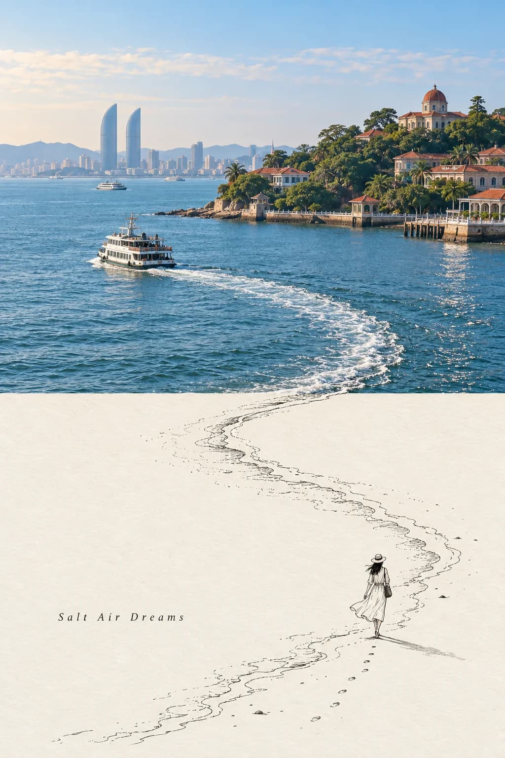
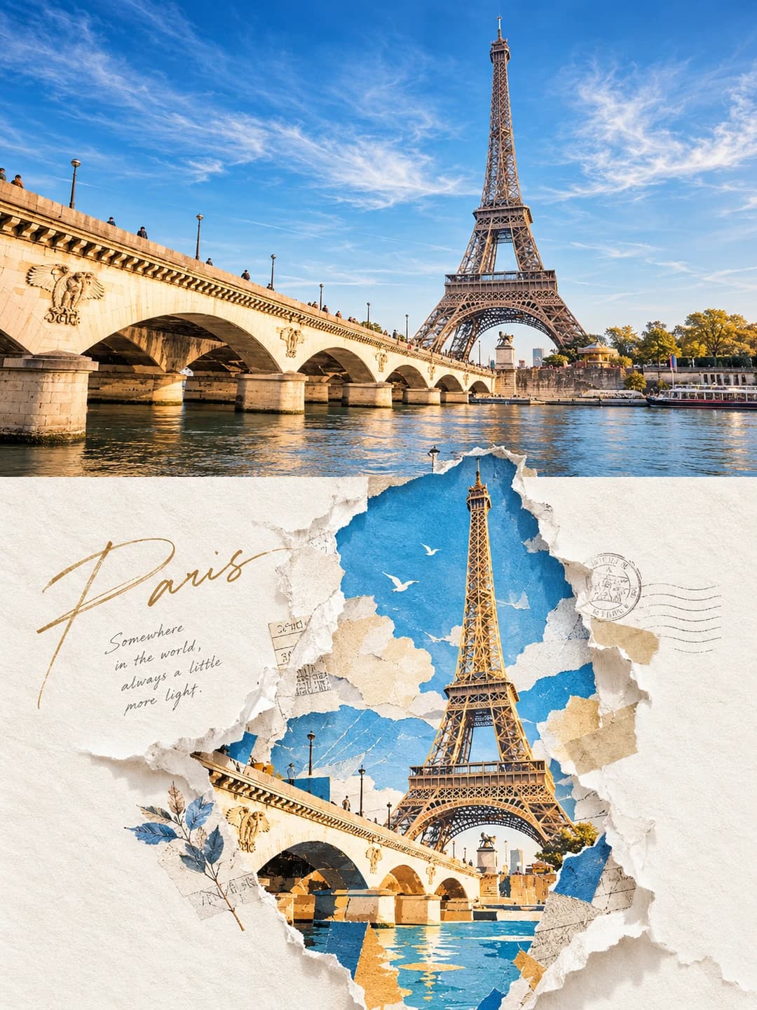
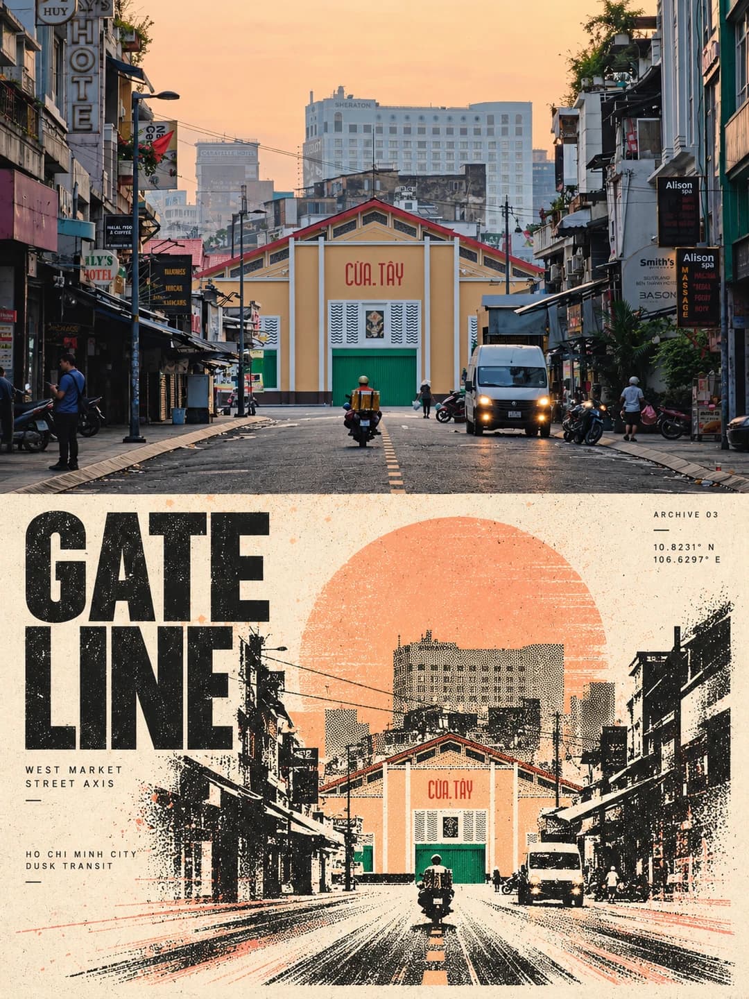
Upload a street, a skyline or a travel photo and get back a 3:4 poster: the photo across the top half, and underneath the same scene as a two- or three-ink print whose edges dissolve into particles, fine lines and halftone dots. A heavy English headline and a few tiny labels complete it.
100 credits per image · about a minute · New accounts get 500 credits — 5 free images.
Try it with your own photo
New accounts get 500 credits — 5 free images.
Examples
Every image below was made with the prompt on this page.
What is a Particle Dispersion Poster?
A particle dispersion poster is a 3:4 vertical frame split exactly in half. The top half is your photo with a subtle magazine-style grade. The bottom half re-draws its most recognisable subject — a market hall, a tower, a row of balconies — as a minimalist print on ivory paper, and turns the photo's movement or light into a dynamic field: dense lines and particles near the subject that thin and scatter towards the edges. It uses two or three colours only, taken from the photo's most vivid hue plus black and paper, with grain and slight misregistration like a screen print. Unlike a quiet art print, it carries one large, bold English headline and two to four micro labels — coordinates, serial numbers, short notes — woven into the particle field.
Which photos work well?
City and travel photos with one strong subject and one strong colour: a street leading to a landmark, a lit tower over a river, a weathered apartment block, a beach with a bright board or boat. Scenes with clear lines — roads, railings, cables, horizons — give the particle field something to run along.
Which photos struggle?
Close portraits and group photos, because the print reduces people to small halftone figures and recognisable faces are lost or distorted. Photos that rely on many colours at once lose them — only one main ink survives. Tall portrait-shaped photos get cropped hard to fill the landscape top half.
How to turn a photo into a Particle Dispersion Poster
- 1
Pick an effect
Browse the samples on each tool page to see exactly what you will get before you spend anything.
- 2
Upload your photo
JPEG, PNG or WebP, up to 12 MB. Your photo stays private and is never used to train anything.
- 3
Add your own caption
Most effects let you set the text that appears in the final image, in any language.
- 4
Download the result
You get a high-resolution image, yours to use. 2K is 100 credits, 4K is 200.
The prompt behind this tool
This is the full prompt, translated into English. Copy it and use it with any image model that accepts a reference photo.
Turn the uploaded photo into one standalone high-end design poster, output on its own, not a multi-image collage.
Use a 3:4 vertical layout split into two zones, top and bottom, exactly 1:1 in height, 50% each.
Top zone — the original photo
Keep the original photo: its main structure, real texture, natural light and shadow and its colour mood all stay unchanged. Apply only a subtle, high-end photographic colour grade, so it reads like an art magazine, an independent publication or exhibition photography. To fit the frame you may extend the sky, ground or surroundings naturally, but never stretch, distort or alter the subject.
Bottom zone — surreal minimalist print
Take the most recognisable subject, outline, pose and narrative relationship from the photo and rebuild them as a surreal minimalist print:
- Compress the subject into a clear, restrained visual anchor at a small scale, set inside a wide negative space, keeping only its essential outline and posture.
- Do not copy complex detail; instead turn the movement, direction, light or spatial relationships of the original into a dynamic field that unfolds around the subject.
Dynamic field
- Let the subject's own character choose one main logic of motion: sinking from above, rising vertically, flowing in one direction, spreading outward from a core, or forming irregular ripples and echoes.
- Express the motion with many fine lines, broken trails, coarse halftone dots and changing particle density: denser and stronger near the core, sparser and more fragmented towards the edges, fading out into the negative space.
- Avoid stacking several effects at once; make "one subject, one action, one vast spatial relationship" the heart of the image.
Colour — a strict 2-3 colour system
- Take the most recognisable, most vivid main colour from the photo above and combine it with warm white / ivory or a natural paper tone, plus a minimal black, as a strict 2-3 colour system.
- The main colour may be cleaned up and strengthened so it is vivid and forceful, but not overly digital.
- Build depth through halftone density, overprinted ink and the paper's negative space rather than ordinary gradients; keep the screen-print and Risograph character — coarse grain, paper fibre, uneven ink coverage and slight misregistration.
Type — restrained experimental art-book typography
- From the photo's action, distance, state, mood or metaphor, distil one minimal English headline, paired with 2-4 micro text elements, freely combining phrases, state words, place or object information, serial numbers, coordinate-style figures, direction words, archive labels or field notes.
- Text may align to the horizon, the motion trails, the subject's axis or the edges of the negative space; it may also be set vertically, rotated, staggered, embedded in the particle field or lightly cut through by lines, so the typography takes part in the space and the motion instead of floating separately on top of the image.
Frequently asked questions
How is this different from the Risograph Print Poster?
- Both share the same lower-half print — one small subject, a field of halftone particles, two or three inks. This one adds a large, bold English headline set across the paper, the way the original posts show it, so the result reads as a finished poster rather than a quiet art print. If you want only tiny margin text and no headline, use the Risograph Print Poster instead.
Will it change my photo?
- The top half is meant to stay your photo: structure, texture, light and colour are kept, with only a subtle grade and, where the frame needs it, a little extra sky or ground. The bottom half is a deliberate reinterpretation, not a copy.
Can I choose the headline?
- Yes, and it is the more reliable route. Type a headline and an optional micro line and exactly those are printed — the headline large and bold, the line in tiny type. Leave both blank and the model invents a two-word headline and a few labels, which is where spelling slips are most likely.
What language can the headline be in?
- The layout is designed around short English headlines in heavy capitals, two or three words that break over two lines. Other scripts are set as typed, but long headlines or CJK text crowd the print and are less tested.
Where do the colours come from?
- From your photo. The prompt takes its single most vivid colour — the red of a paddleboard, the pink of a lit tower, the orange of a dusk sky — and prints everything in that ink, black and paper ivory. A photo without one strong colour gives a quieter print.
What size do I get, and how long does it take?
- A 3:4 vertical poster at 2K (1792 × 2400) for 100 credits or 4K for 200 credits. It usually takes 60 to 90 seconds.
Can I use my own prompt instead?
- Not on this page — the effect always sends the prompt shown below. The full text is published here, so you can take it to another tool if you want to change it.
What happens to my photo?
- It is stored privately for the generation only, deleted on a schedule and never used for training.