Mid-Century Illustration Poster
Your photo on top, and the same scene redrawn as a vintage two-colour diagram underneath
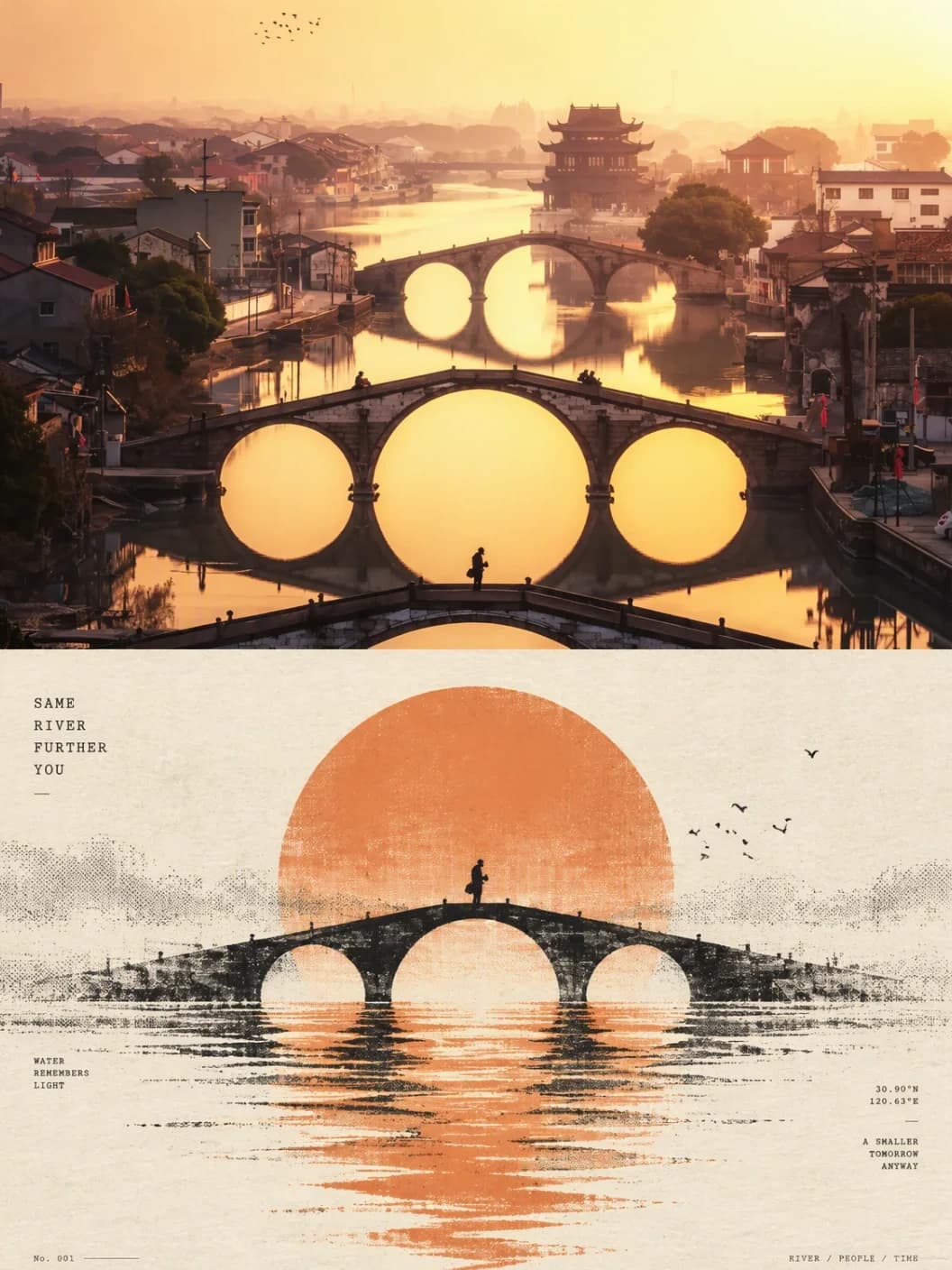
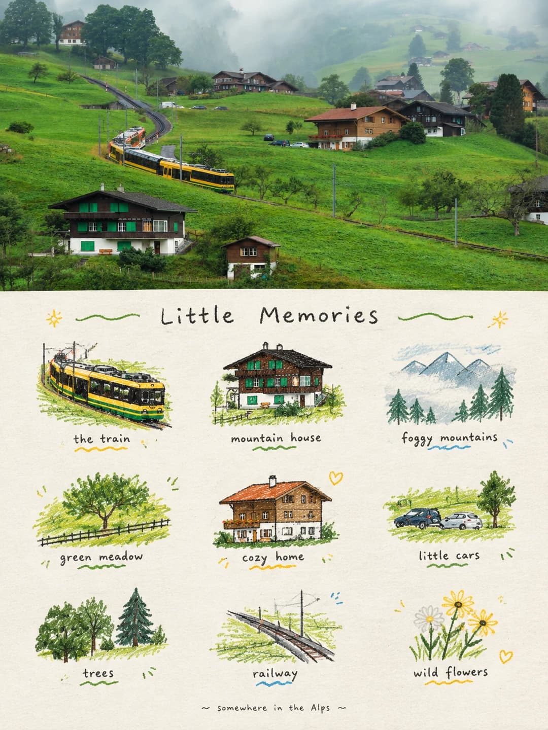
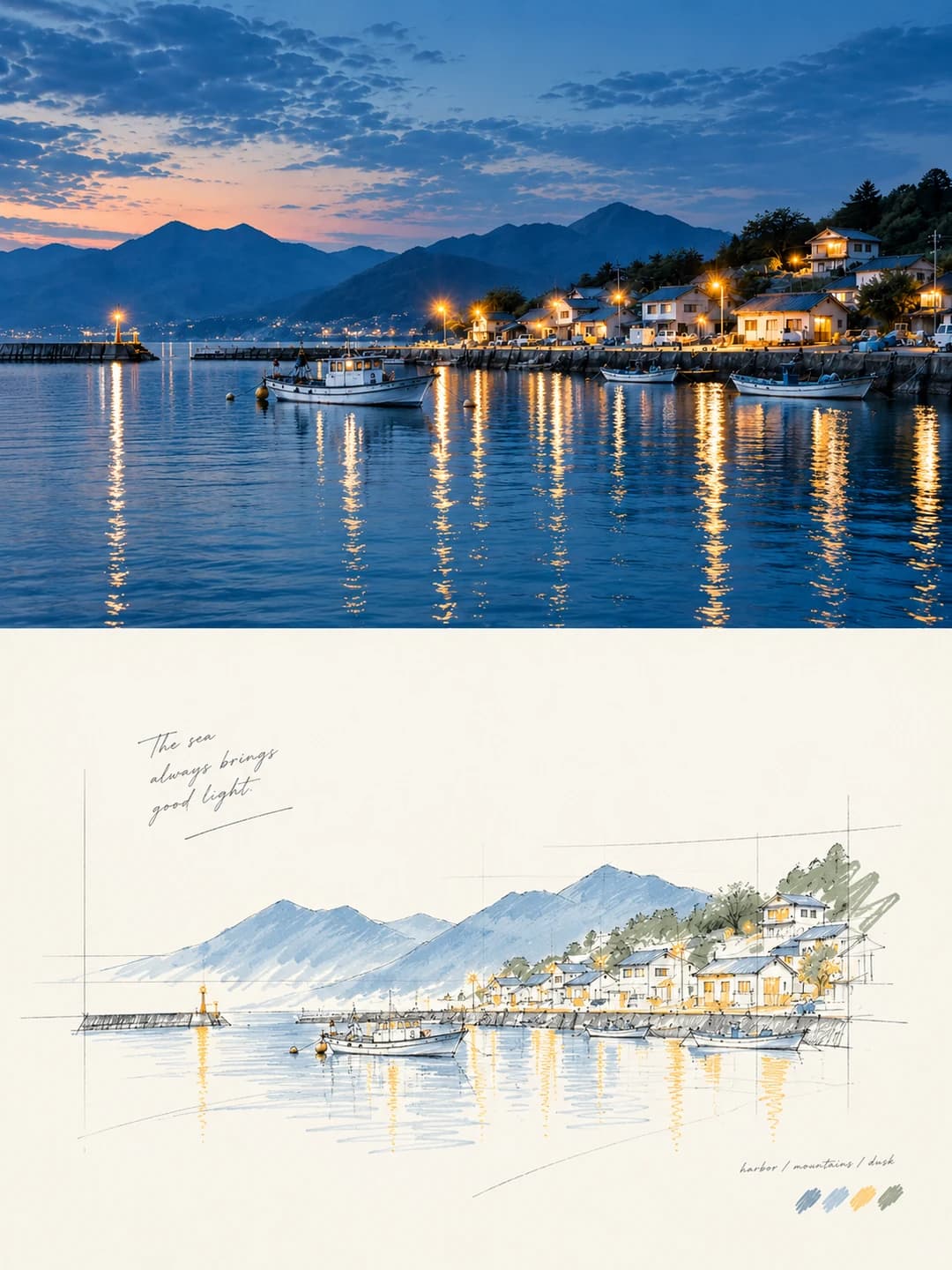
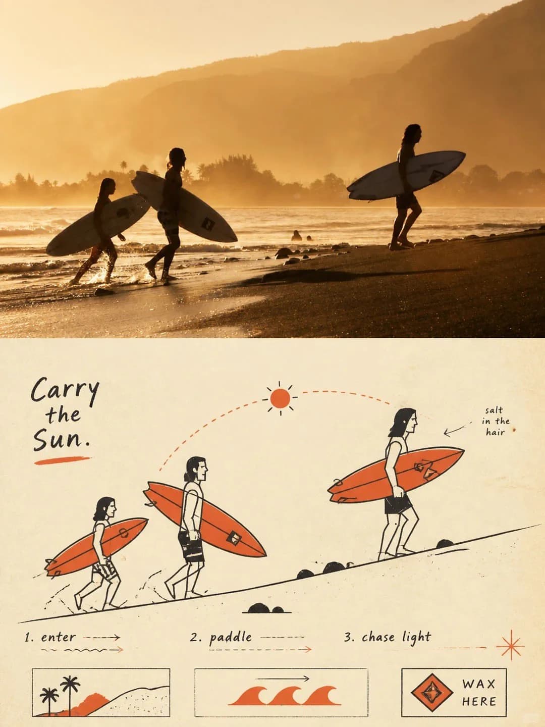
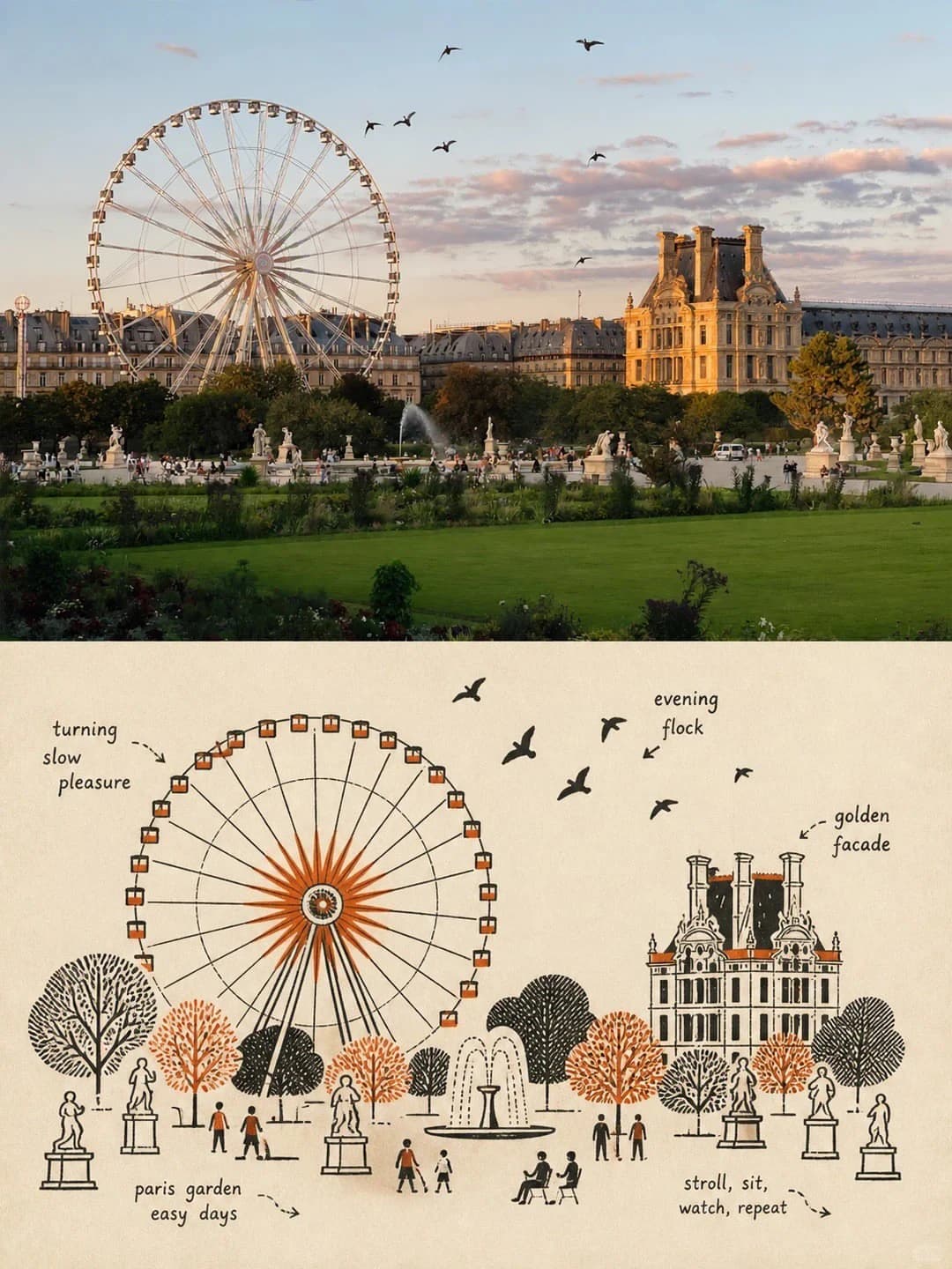
Upload a travel photo and get back a 3:4 poster: the photo across the top half, lightly graded, and underneath the same scene rebuilt as a mid-century schematic illustration — economical black pen lines, simple geometric shapes and a second spot colour, like a picture from an old instruction manual.
100 credits per image · about a minute · New accounts get 500 credits — 5 free images.
Try it with your own photo
New accounts get 500 credits — 5 free images.
Examples
Every image below was made with the prompt on this page.
What is a Mid-Century Illustration Poster?
A mid-century illustration poster splits a 3:4 vertical frame exactly in half. The top half is your photo, kept as it is apart from a restrained colour grade. The bottom half redraws the same scene in the style of mid-century vernacular graphic illustration: schematic black line drawing, flat diagram-like space and two-colour spot printing. Instead of tracing the photo, it reduces people, buildings and objects to a few clear shapes — boxes, circles, diamonds, single lines — and adds guide lines, arrows or symbols that explain what is happening, the way an old manual, advertising card or technical label would.
Which photos work well?
Landscape-shaped photos where something is happening or where one subject has a strong outline: people carrying things along a beach, a Ferris wheel in a park, a tram on a street, a harbour with boats, a cyclist on a road. Scenes with a clear main subject and a simple story come out best, because the drawing is built around that one relationship.
Which photos struggle?
Close-up portraits and faces — the drawing turns people into simple figures, not likenesses. Busy scenes with no clear main subject tend to come back cluttered. It also wants a landscape-shaped photo: the top half is 3:2, so a tall portrait gets cropped hard. If you want a textured two-colour print of the whole scene rather than a diagram, the risograph print poster suits better; for a grid of doodled icons, the doodle icon grid poster.
How to turn a photo into a Mid-Century Illustration Poster
- 1
Pick an effect
Browse the samples on each tool page to see exactly what you will get before you spend anything.
- 2
Upload your photo
JPEG, PNG or WebP, up to 12 MB. Your photo stays private and is never used to train anything.
- 3
Add your own caption
Most effects let you set the text that appears in the final image, in any language.
- 4
Download the result
You get a high-resolution image, yours to use. 2K is 100 credits, 4K is 200.
The prompt behind this tool
This is the full prompt, translated into English. Copy it and use it with any image model that accepts a reference photo.
Using the uploaded photo, design one poster with a refined, high-end finish. Use a vertical 3:4 frame, split strictly 1:1 top to bottom, each half taking exactly 50% of the total height.

[Top half | The original photo]

Keep the original photo itself, preserving as far as possible the subject's identity, structure, pose, real texture, natural light and original colour mood.

Apply only a delicate, restrained and sophisticated colour grade, so the image carries the look of an art magazine, an independent publication or a gallery exhibition piece.

To fit the 3:4 frame, the background around the photo may be extended naturally, but the subject itself must not be stretched, distorted or altered.

[Bottom half | Vintage diagram illustration]

From the original photo, extract the most recognisable subjects, outlines, structures and poses, and the narrative relationship between the subjects, and rebuild them in this style:

"Mid-century vernacular graphic illustration + schematic line drawing + two-colour spot printing".

Do not trace the photo in full or copy it mechanically. Use diagrammatic abstraction instead, compressing complex objects into a few clear geometric shapes, functional outlines and only the most essential structural elements.

The result should look like the illustrations in an old instruction manual, a vintage advertising card, a technical label or a piece of folk printing: the original subject is recognisable at a glance, but it is more direct, more humorous, and more symbolic and diagrammatic than the real thing.

[Line and form]

Stress economy and simplicity of line.

If a structure can be said with one line, do not add another stroke.

Use direct, simple black pen-like outlines, combined with rectangles, circles, diamonds, straight lines and simple flat shapes to render objects.

People, animals and objects may have exaggerated proportions; machinery, buildings and complex structures should be generalised into clear boxes, openings, panels and overall outline relationships.

[Space and perspective]

Use a flat, diagram-like treatment of space rather than chasing real light and shadow or strictly accurate depth.

The visual language as a whole should sit between "illustration" and "technical diagram", and hold that distinct character across the whole poster.

[Composition and narrative]

Reorganise the composition of the bottom half around the most important narrative relationship in the original photo.

Keep one clear main subject, and add a few supporting objects, guide lines, directional relationships or structural symbols to strengthen the story the image tells.

Focus on visual hierarchy, geometric order, contrast of scale, positive and negative space, and deliberate white space.

The image may have a slight naivety, a not-quite-regular feel, or the texture of hand-made folk printing, but it must never be messy.

Every visual element in the image should serve the purpose of "explaining what is happening", not merely decoration.
Frequently asked questions
Will it change my photo?
- The top half is meant to stay your photo. The prompt asks the model to keep the subject's identity, structure, pose, texture, light and colour, and only apply a restrained colour grade. It may extend the background a little to fit the frame, but it should not reshape the subject. In testing it did not always hold: one of seven runs redrew the top half as a different scene, so check it before you use the poster, and simply run it again if that happens.
How close is the drawing to the photo?
- Recognisable, not faithful. The prompt tells the model not to trace the photo but to boil it down to a few geometric shapes and key outlines, and to exaggerate people's proportions where that helps. You will see the same subjects in roughly the same places, drawn like a diagram.
Can I add my own headline or labels?
- Not on this effect. The original prompt says nothing about text, so there is no text box. The model usually adds a few small English labels or notes of its own, as in the samples, and sometimes none. They were spelled correctly in every test run, but because the model is guessing, an arrow sometimes points at the wrong thing — a label for the park pointing at a tower, say.
Where do the colours come from?
- The drawing is black line plus a spot colour, in the manner of old two-colour printing. The prompt does not name the second colour; in the samples it is a warm orange on cream paper, and the model usually picks something close to that from the photo's mood.
Why does it want a landscape photo?
- The frame is 3:4 and the photo gets exactly the top half, which is a 3:2 landscape shape. A landscape photo fills it with little cropping; a portrait one loses most of its height.
What size do I get, and how long does it take?
- A 3:4 vertical poster: 2K (1792 × 2400) for 100 credits or 4K for 200. Most images come back in 60 to 90 seconds.
Can I use my own prompt instead?
- Not on this page. The full prompt is shown above, though, so you can copy it and use it elsewhere.
What happens to my photo?
- It is stored privately, used only to make your image, deleted on a schedule, and never used for training.