Hand-Drawn Travel Postcard
Your photo redrawn as the front of an old travel postcard
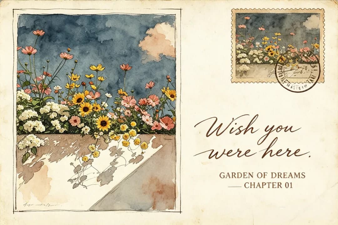
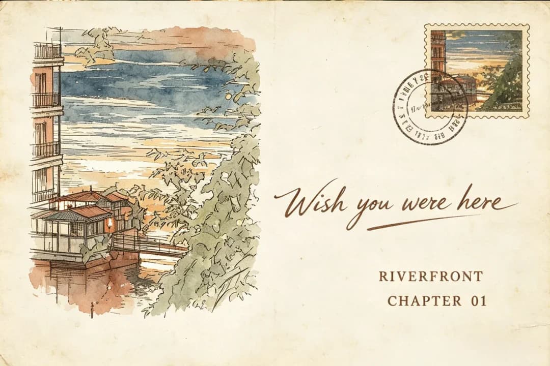
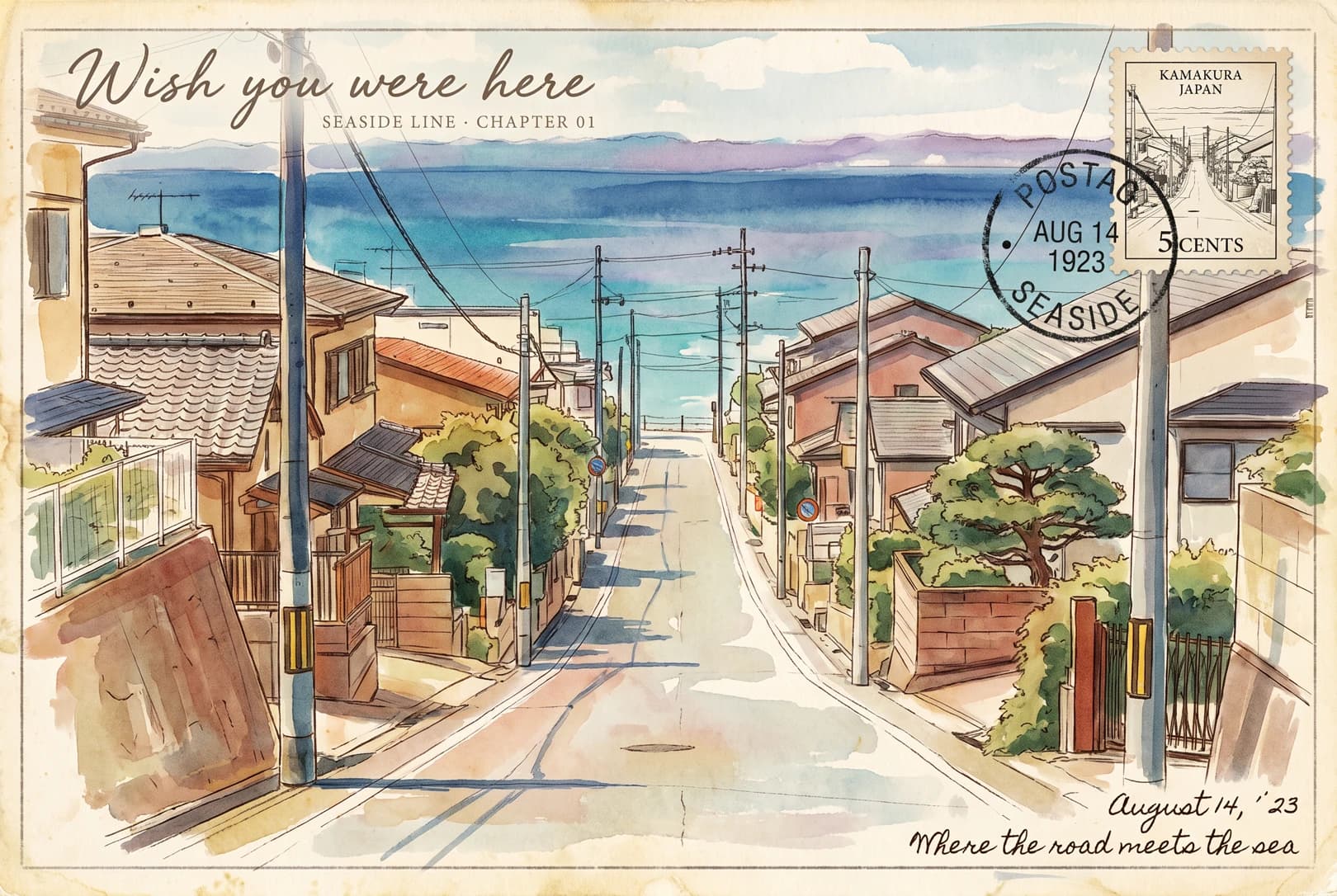
Upload a landscape photo and get back a postcard front: the scene redrawn in watercolour washes over pen line work, printed on aged ivory card with a perforated stamp and a smudged postmark in the corner. You set the handwritten greeting and the place name.
100 credits per image · about a minute · New accounts get 500 credits — 5 free images.
Try it with your own photo
New accounts get 500 credits — 5 free images.
Examples
Every image below was made with the prompt on this page.
What is a Hand-Drawn Travel Postcard?
A hand-drawn travel postcard redraws a photograph as the illustrated front of a vintage postcard. The scene is rebuilt in watercolour and pen line work across three depth layers — far, middle and near — rather than traced, so the recognisable shapes survive while the detail is loosened. Around it sits an aged ivory card edge, a perforated stamp holding a thumbnail of the same scene, and a circular postmark whose lettering is deliberately half-dissolved. A handwritten greeting and a small capitalised place name sit over the paper.
Which photos work well?
Wide scenes with a clear foreground, middle and distance: a street running down to the sea, a train at a crossing, a riverbank at dusk, a flower bed against a wall. The three-layer treatment needs that depth to work, and large flat areas of sky or water give the watercolour somewhere to breathe.
Which photos struggle?
Close-up portraits and faces. The illustration loosens detail on purpose, so a face comes back as an approximation rather than a likeness. Photos that are already flat — a wall, a texture, a tight object shot — give the depth layers nothing to separate, and the result reads as a sketch rather than a postcard.
How to turn a photo into a Hand-Drawn Travel Postcard
- 1
Pick an effect
Browse the samples on each tool page to see exactly what you will get before you spend anything.
- 2
Upload your photo
JPEG, PNG or WebP, up to 12 MB. Your photo stays private and is never used to train anything.
- 3
Add your own caption
Most effects let you set the text that appears in the final image, in any language.
- 4
Download the result
You get a high-resolution image, yours to use. 2K is 100 credits, 4K is 200.
The prompt behind this tool
This is the full prompt, translated into English. Copy it and use it with any image model that accepts a reference photo.
Rebuild the photo I upload into the complete front of a vintage hand-drawn travel postcard. Take the core scene of the photograph as the subject and reinterpret it with watercolour washes over pen line work, in the manner of an old illustrated postcard — keep the subject's most recognisable outline, posture and narrative relationships rather than copying detail mechanically. Translate the spatial relationships into three illustrated planes — distance, middle ground and foreground — building the hierarchy through aerial perspective, warm and cool colour, the density of the line work and large areas of empty paper, so the subject reads at a glance with the lyricism and restraint of an old European travel postcard.

A narrow aged ivory card border runs around the postcard, its corners slightly yellowed with age and showing paper fibre. In the top right sits a vintage perforated stamp frame holding a thumbnail of the most representative small scene from the photograph; beside the stamp, a blurred circular black postmark carries a date and a destination (the lettering half-dissolved, not clearly legible). The overall palette is drawn from the photograph and shifted toward faded, low-saturation postcard colour: an aged cream or ivory paper ground, with ochre, ink green, navy and brick red as the old printing colours, and only a trace of gilt or vermilion. Avoid saturated digital colour, plastic gradients and the look of a social-media filter.

Typography
Headline: a short handwritten script greeting in English, drawn from the photograph's place, subject or mood (for example, Wish you were here), placed upper or lower left, slightly tilted with a sense of bleeding ink.
Subhead: one line of very small serif capitals naming the place or the scene.
Postmark text: a date and a blurred city name, in a circular postmark.
On the stamp: one line of very small type — a serial number or a country name.
Corner: a line of small handwriting, a date or one poetic phrase, loosely letter-spaced, in dark brown or navy ink.

All of the type overlaps the illustration, the border and the postmark naturally, and may tilt along the paper edge, cross a block of colour or sit on top of a paper layer, so the card looks written on, stamped and posted rather than cleanly typeset. The headline carries the feeling and the sense of keepsake; the small type carries order and period.

Use a fine matte card texture throughout, with visible paper fibre, slight creasing, worn corners and a soft contact shadow, lit by natural diffuse light from above, so the thickness of the paper and the warmth of an old object come through. Avoid plastic 3D effects, cheap card, neon colour, glossy digital gradients and over-polished vector work.
Frequently asked questions
Will it keep my photo exactly?
- No, and it is not meant to. The prompt asks for the scene to be redrawn rather than traced: the outlines, the arrangement and the depth are kept, the fine detail is loosened into watercolour and pen. It reads as an illustration of your photo, not a filter over it.
Can I choose the handwritten greeting?
- Yes, and you should. Type it into the greeting field and it is transcribed exactly. Left blank, the model writes its own — which is where this style goes wrong most often, so setting it is the single best thing you can do for the result.
What can the place name line say?
- Anything short. It is set in small capitals under the greeting, so a place, a date or a chapter-style label all work. Long lines crowd the card — a few words is the right length.
Why is the postmark unreadable?
- Deliberately. The prompt asks for the date and city on the circular postmark to be half-dissolved, the way ink spreads on real card. Legible postmark text would look printed rather than stamped.
Where do the colours come from?
- From your photograph, then faded. The palette is pulled from the photo and pushed toward old print colours — ochre, ink green, navy, brick red on an ivory ground — with only a trace of gold. Saturated digital colour is explicitly ruled out.
What size do I get?
- 2K is 100 credits and 4K is 200. Both come back as a 3:2 landscape image, which is the shape of a postcard.
How long does it take?
- Usually 60 to 90 seconds. A 4K render is a larger job and can run a little longer.
What happens to my photo?
- It is stored privately so the generator can read it, deleted on a schedule, never shown to other users, and never used to train a model.