
2Slides Logo
Preview

Uber Investor Update February 2024

82 slides

Uber Investor Update February 2024 - Comprehensive corporate presentation covering company overview, mobility, delivery, economic impact, and financial performance

68 likes
0 downloads

Quick Navigation

Tags

Investor update
Corporate presentation
Uber
Rideshare
Mobility

Share the slides

Description

Main Topic

Uber Investor Update February 2024 - Comprehensive corporate presentation covering company overview, mobility, delivery, economic impact, and financial performance

Key Benefits

  • Professional investor presentation design with clean data visualization and corporate branding
  • Comprehensive 82-slide deck covering all major business segments and financial metrics
  • High-quality photography and infographics with consistent Uber brand identity
  • Detailed financial reconciliations and forward-looking growth projections
  • Multi-section structure ideal for corporate earnings presentations and investor relations

Target Audience

  • Investor relations professionals
  • Corporate finance teams
  • Business analysts and equity researchers
  • C-suite executives preparing board presentations
  • Startup founders seeking investor deck inspiration

Use Cases

  • Investor day presentations and earnings calls
  • Corporate annual review and strategy presentations
  • Board of directors reporting
  • Equity research and analyst briefings
  • Business school case studies on platform economics

Unique Value Propositions

  • Real-world Fortune 500 investor presentation from one of the world's largest tech platforms
  • Masterclass in data-driven storytelling with charts, KPIs, and growth algorithms
  • Professional section dividers with cinematic photography
  • Demonstrates best practices for presenting complex financial data clearly
  • Covers full business lifecycle: company overview, segment deep-dives, financials, and appendix

Slide Pages (82)

Detailed view of each slide page, including layout, key content and visual elements.

Page 1
title slide

Cover - Investor Update February 2024

Content

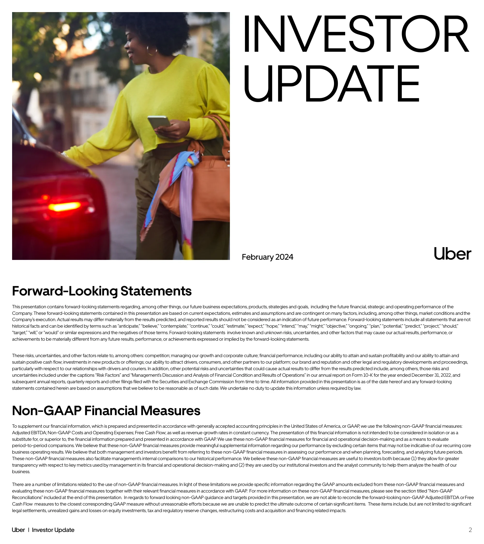
Title slide with lifestyle photography of a woman using Uber, featuring the Uber brand logo and date

Layout Structure

Split layout with half-page photo left and large typography right

Key Visual Elements

  • lifestyle photography
  • bold serif typography
  • Uber logo
  • minimal design
Page 2
disclaimer

Forward-Looking Statements & Non-GAAP Measures

Content

Legal disclaimers about forward-looking statements and explanation of non-GAAP financial measures used throughout

Layout Structure

Full-page text with two main sections and footnotes

Key Visual Elements

  • dense text layout
  • section headers
  • professional formatting
Page 3
section divider

Company Overview - Section Divider

Content

Section divider introducing the Company Overview segment

Layout Structure

Split layout with black background text left and dramatic night road photography right

Key Visual Elements

  • night photography with light trails
  • Uber pin icon
  • large white typography on black
Page 4
mission statement

Mission Statement

Content

Uber's mission: We reimagine the way the world moves for the better

Layout Structure

Full-bleed cinematic photo with centered white text overlay

Key Visual Elements

  • portrait photography
  • italic typography
  • warm tones
Page 5
data visualization

Platform Growth Since IPO

Content

Key metrics comparison from IPO (2018) to 2023: 150M MAPCs, $138B Gross Bookings, $4.1B Adjusted EBITDA

Layout Structure

Roadmap infographic with milestone markers comparing IPO vs. current metrics

Key Visual Elements

  • road/journey metaphor
  • green accent numbers
  • milestone markers
  • desert landscape background
Page 6
team slide

Management Team

Content

Profiles of 10 senior executives including CEO Dara Khosrowshahi and leadership team

Layout Structure

Grid of circular headshot photos with name, title, and tenure

Key Visual Elements

  • circular photo frames
  • blue accent text for join dates
  • clean grid layout
Page 7
strategy overview

Platform Power

Content

Four pillars of platform strength: breadth of offerings, marketplace tech, brand/membership, operational excellence

Layout Structure

Hub-and-spoke diagram with Uber logo center, black pillars top, blue impact metrics bottom

Key Visual Elements

  • Uber logo centerpiece
  • black and blue color blocks
  • checkmark icons
  • dual impact sections
Page 8
data visualization

Multi-Product Consumer Growth

Content

34% of monthly consumers are multi-product; multi-product consumers spend 3.4x more

Layout Structure

Dual chart layout with bar chart trend and comparison bars

Key Visual Elements

  • blue bar charts
  • trend line from 21% to 34%
  • comparison multiplier callouts
Page 9
data visualization

Cross-Promotion Efficiency

Content

31% of Delivery first trips from Mobility app; 22% vice versa; CRM acquisition cost is 50% of paid channels

Layout Structure

Split layout with photo statistics left and comparison bar chart right

Key Visual Elements

  • lifestyle photos with overlay stats
  • green comparison bars
  • arrow showing cost reduction
Page 10
product feature

Uber One Membership

Content

19M members, 30% total gross bookings coverage, 3.4x member vs non-member monthly spend

Layout Structure

Metrics grid left with app screenshot right showing Uber One features

Key Visual Elements

  • gold/amber color theme
  • membership icons
  • phone mockup
  • large metric callouts
Page 11
data visualization

Driver & Courier Engagement

Content

Single driver app leads to higher retention (+19pp delivery, +1pp mobility) and engagement (1.7x delivery, 1.1x mobility)

Layout Structure

Dual bar chart comparison showing retention and engagement metrics

Key Visual Elements

  • green/blue/black bar groups
  • percentage point callouts
  • multiplier annotations
Page 12
data visualization

Low Cost Supply Acquisition

Content

Courier acquisition via upsell is 50% of new driver cost; ~20% of Mobility drivers come from courier pool

Layout Structure

Split with bar comparison left and two phone mockups right

Key Visual Elements

  • blue bar comparison
  • Uber driver app screenshots
  • cost reduction arrow
Page 13
product showcase

Business Platform

Content

Five B2B offerings: Uber for Business, Uber Health, Uber Direct, Uber Connect, Advertising

Layout Structure

Five equal-width illustrated cards in a row

Key Visual Elements

  • custom illustrations per product
  • large bold labels
  • warm color palette
Page 14
product feature

Advertising Ecosystem

Content

Full-funnel advertising from awareness to action across Uber and Uber Eats apps

Layout Structure

Timeline flow from Uber awareness to Uber Eats action with 4 device mockups

Key Visual Elements

  • connected timeline dots
  • 4 phone/tablet mockups
  • Uber and Uber Eats logos
  • Nissan ad examples
Page 15
architecture diagram

Shared Technical Platform

Content

10 platform capabilities (Identity, Dispatching, Infrastructure, etc.) serving 12+ product lines

Layout Structure

Two-tier grid: capabilities matrix top, product icons bottom with connecting arrow

Key Visual Elements

  • blue header labels
  • emoji/icon product identifiers
  • downward flow arrow
Page 16
technology showcase

AI Capabilities

Content

20K models trained/month, 10M peak predictions/second across marketplace, personalization, safety, GenAI

Layout Structure

Split with dark gradient stats left and 6 AI use case cards right

Key Visual Elements

  • dark gradient background
  • large metric numbers
  • app screenshot cards
  • AI category labels
Page 17
strategy diagram

Business Adjacencies

Content

Core business extending to Reserve (~10x), Grocery & Retail (~2x), Hailables (~4x), plus advertising, enterprise, travel

Layout Structure

Bubble chart showing relative size of business lines flowing from core to adjacencies

Key Visual Elements

  • varying circle sizes
  • color-coded segments
  • growth multiplier labels
Page 18
financial outlook

3-Year Earnings Outlook

Content

Gross Bookings mid-high teens CAGR, Adjusted EBITDA high 30s-40% CAGR, FCF 90%+ of EBITDA

Layout Structure

Three-row table with metrics, targets, and context columns

Key Visual Elements

  • blue gradient target cells
  • black header bar
  • clean table design
Page 19
value proposition

What Sets Us Apart

Content

Three differentiators: leading global platform, sustainable growth, financial inflection

Layout Structure

Three equal columns on black background with icons and descriptions

Key Visual Elements

  • white icons on black
  • bold white headers
  • dark dramatic layout
Page 20
section divider

Mobility - Section Divider

Content

Section divider for Mobility segment with tagline: Make every journey better

Layout Structure

Split layout with black text panel left and business traveler photography right

Key Visual Elements

  • car icon
  • large white serif typography
  • corporate photography
Page 21
data visualization

Mobility Scale Overview

Content

~$70B Gross Bookings (+32% YoY), ~$5B Adjusted EBITDA, 10/10 category leader in top countries

Layout Structure

Three-column metrics: Growth chart, Profitability chart, Market Leadership stat

Key Visual Elements

  • blue bar chart
  • line+bar combo chart
  • large 10/10 statistic
Page 22
data visualization

Mobility Momentum

Content

Supply up +75% drivers +56% vehicles; Demand up +39% consumers +13% trips per consumer; plus new geographies and use cases

Layout Structure

Split with blue metrics grid left and text highlights on black right

Key Visual Elements

  • large blue percentage numbers
  • white-on-black text blocks
  • supply/demand segmentation
Page 23
framework diagram

Mobility Growth Algorithm

Content

Formula: Consumers x Trips per Consumer x Gross Bookings per Trip = Mobility Gross Bookings

Layout Structure

Horizontal equation diagram with blue cards and gray supply/demand bars

Key Visual Elements

  • blue gradient cards
  • multiplication symbols
  • supply-demand feedback loop arrows
Page 24
data visualization

Driver Growth Engine

Content

+75% driver base growth through operational execution and tech innovation (upfront fares, earnings tools, safety)

Layout Structure

Split with bar chart growth trend left and feature list with phone mockup right

Key Visual Elements

  • blue bar chart showing growth
  • driver app screenshot
  • feature bullet list with plus icons
Page 25
data visualization

Driver Supply Sources

Content

Uber preferred by multi-app drivers; Taxi partnership growing 2.5x; Fleet partnerships provide 18% of supply hours

Layout Structure

Three-column comparison: gig economy, taxi integration, fleet partnerships

Key Visual Elements

  • bar chart comparison
  • checkmark city list
  • pie chart for fleet share
Page 26
data visualization

Consumer Growth Runway

Content

Consumer penetration still low globally; UK-level penetration in US = +$13B annual gross bookings

Layout Structure

Bar chart showing penetration rates by country with Reserve callout box

Key Visual Elements

  • stacked bars by penetration period
  • arrow annotations for upside
  • blue/light blue comparison
Page 27
market opportunity

Key Use Case Headroom

Content

Airports $10B business <10% penetrated; Uber for Business 170K orgs <10% of SAM

Layout Structure

Split with airport metrics left and Uber for Business SAM concentric circles right

Key Visual Elements

  • large blue statistics
  • Venn/concentric circle diagram
  • Fortune 500 reference
Page 28
product feature

New Demographics

Content

Teens product could add 30M consumers; Uber Health and Call-to-Ride for older adults

Layout Structure

Split with teen safety features mockups left and health platform screenshots right

Key Visual Elements

  • multiple phone mockups
  • safety app screenshots
  • health dashboard interface
Page 29
data visualization

New Country Growth

Content

Unlock markets grew from $1B to $3B annual run rate; massive growth in Spain, Japan, Argentina, Germany, South Korea, Italy

Layout Structure

Six country mini bar charts showing 2021 vs 2023 growth with multipliers

Key Visual Elements

  • country flags
  • growth multiplier labels
  • blue comparison bars
Page 30
data visualization

Engagement Opportunity

Content

~50% of consumers take only 1-2 trips/month; converting 1x to 2x = +$4B annual gross bookings

Layout Structure

Frequency distribution bar chart with upside callout

Key Visual Elements

  • blue frequency bars
  • arrow showing conversion opportunity
  • dollar value annotation
Page 31
strategy overview

Multi-Product Strategy

Content

Expanded from UberX/Black to 12+ products; 2+ product consumers spend 3x more; non-UberX trips grew from 15% to 30%

Layout Structure

Three-part layout: product grid, gross bookings comparison, trend stats

Key Visual Elements

  • product icon grid
  • blue comparison bars
  • large percentage callouts
Page 32
data visualization

Low Cost Products

Content

850M annual Moto+Auto trips (+90% YoY); Shuttle/Moto/XShare users take 10+ trips/month

Layout Structure

Split with cost structure left and frequency bar chart right

Key Visual Elements

  • vehicle illustrations
  • blue horizontal bars
  • large metric numbers
Page 33
product matrix

Product Portfolio & Pricing

Content

Product matrix from low-cost (Moto/Shuttle) to premium (SUV/Black) with India case study

Layout Structure

Venn diagram of price tiers left and stacked bar chart right

Key Visual Elements

  • overlapping circles by tier
  • India gross bookings stacked bars
  • fare vs comfort axes
Page 34
framework diagram

Autonomous Vehicles TAM Expansion

Content

AV lowers cost/mile, which lowers average fare, driving more consumers and engagement

Layout Structure

Growth algorithm diagram with AV as additional supply factor

Key Visual Elements

  • gray gradient cards
  • blue AV callout
  • numbered cause-effect flow
Page 35
partnership overview

AV Partnerships

Content

10 live AV partnerships across Mobility, Delivery, Freight with Waymo, Motional, Aurora, Nuro, etc.

Layout Structure

Partnership matrix table by segment with company logos

Key Visual Elements

  • company logos grid
  • three-column segment table
  • blue header bar
Page 36
summary slide

Mobility Key Takeaways

Content

Five takeaways: compounding growth, supply engine, new geographies, balanced portfolio, AV platform partner

Layout Structure

Five equal columns on black background with icons and descriptions

Key Visual Elements

  • white icons
  • bold headers
  • dark layout
  • five-column grid
Page 37
section divider

Delivery - Section Divider

Content

Section divider for Delivery segment with tagline: Deliver a better day

Layout Structure

Split with black text panel left and Uber Eats courier photography right

Key Visual Elements

  • delivery bag icon
  • courier photography
  • green Uber Eats bag
Page 38
data visualization

Delivery Scale Overview

Content

~$65B Gross Bookings (+15% YoY), ~$1.5B Adjusted EBITDA, 7 leading positions in top 10 countries

Layout Structure

Three-column metrics: Growth chart, Profitability chart, Market Leadership stat

Key Visual Elements

  • green bar chart
  • green line+bar combo chart
  • large 10/10 statistic
Page 39
data visualization

Delivery Operational Metrics

Content

+8% consumers, +11% trips/consumer, +19% merchants, +29% couriers; expanding use cases and membership

Layout Structure

Split with green metrics grid left and text highlights on black right

Key Visual Elements

  • large green percentage numbers
  • white-on-black text
  • operational KPI layout
Page 40
data visualization

Delivery Profit Expansion

Content

Consumer incentives down ~200bps, courier cost per trip down ~5%, operating costs down ~200bps

Layout Structure

Three side-by-side bar comparisons showing Q4'21 vs Q4'23 improvements

Key Visual Elements

  • black and green comparison bars
  • downward arrows showing improvement
  • basis point annotations
Page 41
framework diagram

Delivery Growth Algorithm

Content

Formula: Consumers x Trips per Consumer x Gross Bookings per Trip = Delivery Gross Bookings

Layout Structure

Horizontal equation with green gradient cards

Key Visual Elements

  • green gradient cards
  • multiplication symbols
  • supply bar below
Page 42
data visualization

Monthly Consumer Headroom

Content

Only 35% of annual consumers engage monthly; lower penetrated countries at 2% monthly vs 7% annual

Layout Structure

Split comparison charts for higher vs lower penetrated countries

Key Visual Elements

  • green bars with penetration overlay
  • black bars for lower penetration
  • percentage annotations
Page 43
data visualization

Merchant Growth Opportunity

Content

Active merchants growing across all markets; still early in capturing total merchant TAM globally

Layout Structure

Multi-country bar chart comparing active merchants to TAM

Key Visual Elements

  • green active bars vs black TAM bars
  • country comparison
  • percentage penetration labels
Page 44
data visualization

Membership Driving Engagement

Content

Delivery membership coverage grew from 23% to 45%; positive correlation between membership and trips/consumer

Layout Structure

Split with trend line chart left and scatter plot right

Key Visual Elements

  • green growth curve
  • scatter plot with trend line
  • positive correlation visual
Page 45
product feature

Consumer Experience Investments

Content

In-app UX improvements, -420bps fee reduction, ~25% reduction in incomplete deliveries

Layout Structure

Three columns: app UX mockup, affordability bars, reliability stat

Key Visual Elements

  • annotated app screenshot
  • green declining bars
  • large percentage callout
Page 46
product feature

Grocery & Retail Expansion

Content

World-class grocery product with seamless search, brand placement, personalization; retention up +580bps

Layout Structure

Split with app mockups left and retention bar chart right

Key Visual Elements

  • grocery app screenshots
  • green retention bars
  • feature callouts
Page 47
data visualization

Grocery Cross-Sell Impact

Content

Food+Grocery consumers do 3x trips; Food+Grocery+Member consumers do 3.7x trips

Layout Structure

Split with bundled order mockups left and indexed bar chart right

Key Visual Elements

  • app order screenshots
  • green indexed bars
  • multiplier labels
Page 48
product feature

Uber Direct

Content

18 active markets, ~3.5x increase in Direct trips, >60% non-restaurant deliveries

Layout Structure

Split with three phone mockups left and large green statistics right

Key Visual Elements

  • parcel/bulky/returns mockups
  • large green numbers
  • dark background right panel
Page 49
product feature

Merchant Marketing Tools

Content

Sponsored listings, search ads, merchant offers, CPG ads; ~5% of Gross Bookings, >8x ROAS

Layout Structure

Split with four ad format mockups left and green statistics right

Key Visual Elements

  • ad format screenshots
  • large green percentage
  • ROAS metric
Page 50
summary slide

Delivery Key Takeaways

Content

Five takeaways: accelerating top line, ample opportunity, competitive gains, engagement levers, platform growth

Layout Structure

Five equal columns on black background with icons

Key Visual Elements

  • white icons
  • bold headers
  • dark layout
Page 51
section divider

Economic Impact & Regulatory Progress - Section Divider

Content

Section divider for economic impact and regulatory segment

Layout Structure

Split with black text left and sunset city photography right

Key Visual Elements

  • globe icon
  • large white typography
  • warm city lights photography
Page 52
data visualization

Global Economic Impact

Content

6.8M drivers/couriers, 70+ countries, $280B+ earnings since 2016, $61.9B in 2023

Layout Structure

Split with blue metrics left and flexible work messaging with photo right

Key Visual Elements

  • large blue numbers
  • driver photography
  • flexibility messaging
Page 53
product feature

Driver Experience Innovation

Content

Platform of choice for flexible work with upfront fares, Record My Ride, and deactivation review features

Layout Structure

Left text with three phone mockups showing driver features

Key Visual Elements

  • three app screenshots
  • italic statement text
  • feature labels below each
Page 54
vision statement

Future of Work

Content

Defining flexibility with benefits and protections across global markets

Layout Structure

Three city photographs (New York, Rio, Sydney) with header text

Key Visual Elements

  • iconic city skyline photos
  • minimal text
  • global diversity emphasis
Page 55
case study

Taxi Driver Earnings

Content

235,000 taxi drivers in 33 countries earning on Uber; $1.6B global taxi earnings in 2023

Layout Structure

Three photo cards with city-specific earnings stories

Key Visual Elements

  • taxi photography from three cities
  • earnings statistics
  • story-based layout
Page 56
teaser

Coming Soon Teaser

Content

Coming soon placeholder with London black cab photograph

Layout Structure

Full-bleed photo with centered white text overlay

Key Visual Elements

  • London black cab photo
  • large coming soon text
  • street scene photography
Page 57
data visualization

Zero-Emission Vehicle Platform

Content

World's largest ZEV rideshare platform; monthly active ZEV drivers grew ~7x from 18K to 126K

Layout Structure

Split with text/description left and bar chart growth trend right

Key Visual Elements

  • blue bar chart showing 7x growth
  • quarterly progression
  • bold claim statement
Page 58
statement slide

EV Adoption

Content

Uber drivers going electric 7x faster than regular motorists

Layout Structure

Full-bleed photo with centered text overlay of EV charging

Key Visual Elements

  • EV charging photography
  • bold 7x statistic
  • green overlay tone
Page 59
data visualization

Sustainability Business Case

Content

62% Gen Z prefer sustainable brands; 54% willing to pay 10% more; environment is top concern for Alpha/Gen Z

Layout Structure

Split with green statistics left and youth protest photography right

Key Visual Elements

  • green percentage numbers
  • protest/activism photography
  • environmental messaging
Page 60
overview slide

Stakeholder Focus

Content

Three stakeholder groups: Cities, Earners, Taxis

Layout Structure

Three equal-width photo panels with single word labels

Key Visual Elements

  • cinematic photography triptych
  • minimal bold labels
  • city/people/taxi themes
Page 61
section divider

Delivering Profitable Growth - Section Divider

Content

Section divider for financial performance segment

Layout Structure

Split with black text left and desert highway photography right

Key Visual Elements

  • growth chart icon
  • large white typography
  • dramatic landscape photography
Page 62
investment thesis

Why Uber - Investment Thesis

Content

Four quadrants: digital-physical intersection, positive impact, marketplace technology, profitable growth

Layout Structure

Four-quadrant layout with central Why Uber circle

Key Visual Elements

  • four photo quadrants
  • white circle hub
  • icons per quadrant
Page 63
data visualization

Growth Since IPO

Content

Gross Bookings 2.8x from $50B to $138B; Adjusted EBITDA +$6B improvement to $4.1B

Layout Structure

Dual chart: stacked bar (Gross Bookings by segment) and bar+line (EBITDA + margin)

Key Visual Elements

  • multi-color stacked bars
  • EBITDA margin trend line
  • green growth annotations
Page 64
financial milestone

Financial Track Record

Content

20%+ Gross Bookings CAGR; achieved EBITDA profitability Q3'21, positive FCF Q2'22, GAAP profitability Q2'23

Layout Structure

Split with large CAGR stat left and milestone checkmarks right

Key Visual Elements

  • large blue 20%+ number
  • green checkmark milestones
  • quarter annotations
Page 65
financial outlook

3-Year Earnings Outlook (Repeat)

Content

Same as slide 18: Gross Bookings mid-high teens CAGR, EBITDA high 30s-40% CAGR, FCF 90%+

Layout Structure

Three-row table with targets

Key Visual Elements

  • blue gradient cells
  • clean table design
Page 66
strategy diagram

Platform Power Driving Growth

Content

Platform pillars unlock 7 growth vectors leading to operating leverage and higher investment returns

Layout Structure

Flow diagram from platform pillars to growth vectors to financial outcome

Key Visual Elements

  • four-quadrant platform box
  • arrow flow to growth list
  • outcome box right
Page 67
framework diagram

Key Growth Drivers Formula

Content

Gross Bookings = Consumers (MAPCs) x Engagement (Trips/MAPC) x Spend (GB/Trip)

Layout Structure

Horizontal equation with blue/gradient cards and up arrows

Key Visual Elements

  • blue gradient cards
  • multiplication crosses
  • directional arrows
Page 68
data visualization

TAM Penetration

Content

MAPC growth 15% CAGR to 140M; still <5% monthly consumer penetration

Layout Structure

Split with MAPC bar chart left, penetration stat center, future drivers box right

Key Visual Elements

  • blue bar chart
  • large <5% stat
  • future drivers callout box
Page 69
data visualization

Engagement Deepening

Content

Monthly Trips/MAPC grew 6% CAGR to 5.6; <50% of MAPCs use Uber only once or twice monthly

Layout Structure

Split with bar chart left, opportunity stat center, future drivers box right

Key Visual Elements

  • blue bar chart
  • large <50% stat
  • future drivers list
Page 70
data visualization

GAAP Operating Profitability

Content

Quarterly GAAP operating income and Adjusted EBITDA from Q1'22 to Q4'23 with margin expansion

Layout Structure

Dual bar chart with GAAP income and EBITDA bars plus margin line

Key Visual Elements

  • light/dark blue bars
  • margin trend line
  • quarterly progression
Page 71
data visualization

Market Profitability

Content

85% of top countries profitable; 85% improved margins since FY'21; continued headroom for expansion

Layout Structure

Scatter plot of Mobility/Delivery countries by margin with improvement quadrant

Key Visual Elements

  • scatter plot
  • quadrant overlay
  • green/blue dots by segment
Page 72
data visualization

Bottom Line Improvement

Content

Support costs down ~80bps, payment costs down ~100bps, R&D+G&A down ~280bps; 3% headcount CAGR

Layout Structure

Four-column bar charts showing cost reduction plus future drivers box

Key Visual Elements

  • declining blue bars
  • basis point annotations
  • future initiatives callout
Page 73
data visualization

Free Cash Flow Inflection

Content

FCF improved from -$10.4B (2018-2020) to +$3B (2021-2023); targeting 90%+ FCF conversion 2024-2026

Layout Structure

Three-period bar comparison with FCF conversion annotation

Key Visual Elements

  • blue EBITDA and black FCF bars
  • green conversion percentage
  • period groupings
Page 74
financial breakdown

FCF Drivers

Content

Five drivers of FCF as % of EBITDA: EBITDA growth, interest/taxes, working capital, insurance, capex

Layout Structure

Five-row table with blue header blocks and arrow descriptions

Key Visual Elements

  • blue/lilac header cells
  • arrow bullet points
  • clean table format
Page 75
capital allocation

Capital Allocation Framework

Content

Prioritize growth, optimize liquidity (~2x leverage), long-term return; $7B inaugural share repurchase

Layout Structure

Three-row strategy table left with large buyback announcement right

Key Visual Elements

  • blue/lilac rows
  • icon column
  • bold $7B callout box
Page 76
summary slide

Investment Highlights Summary

Content

Four pillars: track record, growth CAGR, operational rigor, disciplined capital allocation

Layout Structure

Four equal columns on black background with icons and descriptions

Key Visual Elements

  • white icons
  • vertical separator lines
  • dark layout
Page 77
section divider

Non-GAAP Reconciliations - Section Divider

Content

Section divider for appendix with aerial road and ocean photography

Layout Structure

Full-bleed aerial photography with large white text overlay

Key Visual Elements

  • dramatic aerial drone photography
  • road meets ocean
  • large white typography
Page 78
financial data

Adjusted EBITDA Reconciliation (Annual)

Content

Annual EBITDA reconciliation from net income 2018-2023; EBITDA improved from -$1.8B to +$4.1B

Layout Structure

Detailed financial table with blue highlighted rows for key metrics

Key Visual Elements

  • multi-year data table
  • blue highlighted summary rows
  • dense financial data
Page 79
financial data

Adjusted EBITDA Reconciliation (Quarterly)

Content

Quarterly EBITDA reconciliation Q1'22 through Q4'23

Layout Structure

Detailed quarterly financial table with blue highlighted rows

Key Visual Elements

  • eight-quarter data table
  • blue highlighted rows
  • quarterly progression
Page 80
financial data

Free Cash Flow Reconciliation

Content

Annual FCF reconciliation 2018-2023; FCF improved from -$2.1B to +$3.4B

Layout Structure

Simple three-row financial table with blue highlighted FCF row

Key Visual Elements

  • clean minimal table
  • blue FCF row
  • multi-year comparison
Page 81
financial data

Non-GAAP Costs & Operating Expenses Reconciliation

Content

R&D and G&A cost reconciliations as % of Gross Bookings 2019-2023

Layout Structure

Two detailed financial tables stacked vertically

Key Visual Elements

  • dual tables
  • blue highlighted metric rows
  • percentage of GB calculations
Page 82
closing slide

Closing - Uber Logo

Content

Simple closing slide with centered Uber wordmark

Layout Structure

Centered logo on white background

Key Visual Elements

  • Uber wordmark
  • white space
  • minimal design

Frequently Asked Questions

Common questions about this slide and the underlying presentation content.

What type of presentation is this Uber Investor Update template best suited for?

This template is ideal for corporate investor presentations, earnings calls, annual reviews, and board reporting. Its structure covers company overview, business segment deep-dives (Mobility and Delivery), economic impact, and detailed financial performance with Non-GAAP reconciliations - making it a comprehensive reference for any investor-facing communication.

How many slides does this presentation contain and how is it organized?

The presentation contains 82 slides organized into 6 major sections: Cover & Disclaimers (2 slides), Company Overview (17 slides), Mobility (17 slides), Delivery (14 slides), Economic Impact & Regulatory Progress (10 slides), Delivering Profitable Growth (16 slides), and Non-GAAP Reconciliations appendix (6 slides).

What design style does this investor presentation use?

The presentation uses Uber's corporate brand design: a black-white-blue primary palette with green for Delivery metrics, bold sans-serif typography for data callouts, cinematic photography for section dividers, clean data visualizations (bar charts, scatter plots, flow diagrams), and consistent page headers with section labels and page numbers.

Can I use this template for my own company's investor presentation?

This template serves as excellent inspiration for structuring your own investor deck. The section flow (overview, segment deep-dives, financials, appendix), data visualization styles, and storytelling techniques are universally applicable. Replace the content, data, and branding with your own while keeping the proven structure.

What key financial metrics and KPIs are showcased in this presentation?

The presentation covers Gross Bookings ($138B), Adjusted EBITDA ($4.1B), Free Cash Flow ($3.4B), Monthly Active Platform Consumers (150M), Trips per Consumer, EBITDA margins, FCF conversion rates, cost reduction metrics (support, payments, R&D, G&A as % of Gross Bookings), and a 3-year financial outlook with CAGR targets.

How does this presentation handle data visualization?

Data is presented through diverse chart types: bar charts for trends, scatter plots for market profitability, flow diagrams for growth algorithms, comparison bars for period-over-period metrics, bubble charts for business adjacencies, and concentric circles for TAM analysis. Each chart uses consistent color coding by business segment (blue for Mobility, green for Delivery).

Is this presentation suitable for studying platform business strategy?

Absolutely. The deck provides a masterclass in platform economics: marketplace flywheel effects, cross-promotion efficiency, multi-product engagement multipliers, supply-demand algorithms, TAM penetration analysis, and margin expansion levers. It is an excellent case study for business schools and strategy professionals.

What makes the section divider slides effective in this presentation?

Each section divider uses a consistent split-layout with bold white typography on a black panel paired with high-quality cinematic photography. A small icon identifies the section theme. This creates clear visual breaks between segments while maintaining a premium, professional feel throughout the 82-slide deck.

2slides

Create Your Own Slides

Turn your ideas into professional presentations in seconds with 2slides AI.

Create World-Class Slides in Seconds

Reference professional designs, choose your style, and generate slides with perfect text rendering. Powered by Nano Banana—start creating your presentation now.

© 2026 2slides. All rights reserved.


