2Slides Team
12 min read

Quick answer: Upload a daylight travel or landscape photo to an AI watercolor generator and pick the look first. Watercolor Painting Poster gives a full, soft painting of the whole view. Watercolor Travel Print suits coastal architecture. Watercolor Journal Poster is a pen-and-wash sketchbook page. Japanese Minimal Watercolor Print paints a small, quiet vignette on empty paper.
"Make it watercolor" covers very different pictures. A loose, wet landscape, an inked travel sketch and a tiny vignette floating on white paper are all watercolor, and each one suits a different photo. On 2Slides there are four separate watercolor effects, each a fully written image prompt with its own layout, palette and paper.
All four make the same kind of image: a vertical poster with your original photo on top and the same scene painted in watercolor underneath. Your photo is kept, with at most a light grade. This guide compares the four looks, says which photo suits each, and reports how each one did in our own regression tests.
The four effects differ in how much of the lower panel the painting fills, whether the scene is inked, and where the colors come from. One fills the panel with a soft painting, one prints a coastal scene in a fixed palette, one draws a pen-and-wash journal page, and one keeps the painting deliberately small.
Watercolor Painting Poster repaints the whole scene in light, transparent washes with fine ink detail and soft pastel color. The prompt tells the model to keep the main composition, building outlines, the number of people and their poses, and the perspective, so the painting reads at a glance as the same place. It fills most of the lower half and fades into a margin of warm ivory paper, with one small handwritten phrase and a thin rule under it.
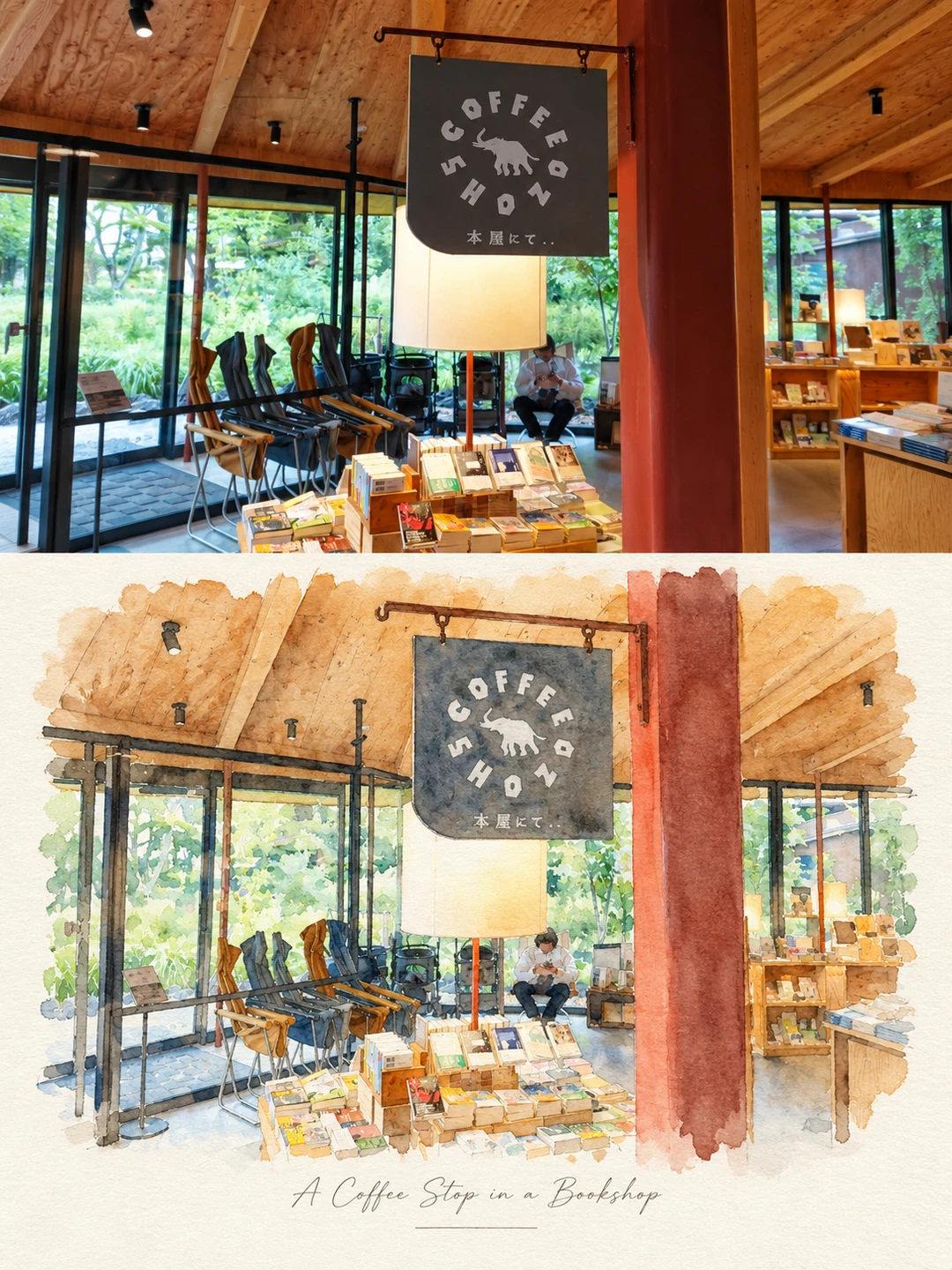
Watercolor Painting Poster: the timber roof, the hanging COFFEE SHOP sign, the lounge chairs, the reader and the red pillar all keep their places.
Watercolor Travel Print is an editorial travel-journal print. It uses delicate, imperfect ink outlines, soft washes, faded pigment, dry-brush marks and slight ink misregistration on warm ivory paper, with two lines of small typewriter type near the foot. It is the only one of the four with a prescribed palette, so your colors are mapped into Mediterranean blues and sand whatever the photo. It is 4:5, not 3:4, and its rule against changing your photo is the strictest of the four.
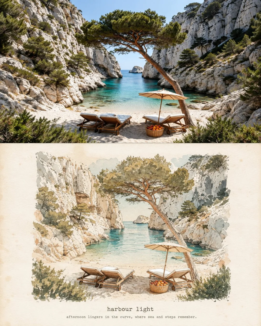
Watercolor Travel Print: a pine over a limestone cove. The turquoise water drops to two flat washes and the rock keeps its ledges.
Watercolor Journal Poster looks like a page from a travel sketchbook: thin black pen outlines, pale low-saturation washes, and ragged blooms of color that fade into the paper instead of stopping at a border. The paper tone follows the photo, warm for a sunny scene and cool for snow. Four rounded swatches in the corner hold the four main colors of your photo, and a handwritten title and short line sit in the open space.
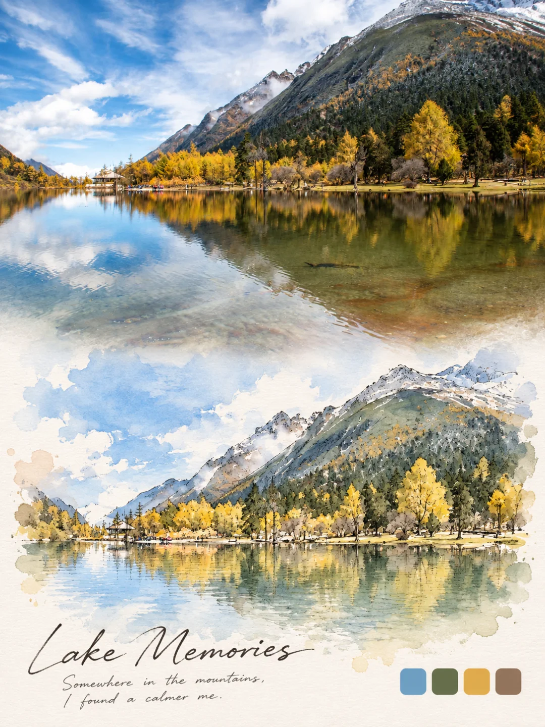
Watercolor Journal Poster: the larches, the ridge and the reflection come through in pen and wash, and the swatches pick out sky blue, pine green, gold and earth.
Japanese Minimal Watercolor Print does the opposite of filling the space. The prompt pins the painting to roughly 28–40% of the image width and forbids it from filling the lower panel. The result looks like a gallery art print or a travel keepsake: a small, pale painting with colors sampled from your photo and lightened, a lot of ivory paper, and a few words of small type underneath.
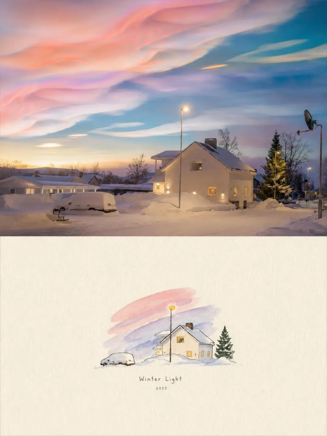
Japanese Minimal Watercolor Print: the pastel sky survives as three loose bands of wash; the house keeps its lit windows and little else.
Pick by the photo you have and by how much painting you want on the page. Use the full painting for most daylight travel shots, the travel print for coast and whitewashed buildings, the journal for scenic views with a strong palette, and the Japanese minimal print for simple scenes you want to feel quiet.
| Watercolor Painting | Watercolor Travel Print | Watercolor Journal | Japanese Minimal Watercolor | |
|---|---|---|---|---|
| Look | Full soft painting, fine ink detail | Ink outline, faded print texture | Black pen plus pale wash and blooms | Small vignette on wide empty paper |
| Best photo | Daylight travel scene: mountains, beach, street, café | Coast and architecture: coves, steps, harbors, whitewashed towns | Scenic views: lakes, coastlines, lighthouses, winding roads | Simple scenes: a house against the sky, one cloud, a snowy path |
| Avoid | Portraits, dusk and night | Portraits, interiors, food, scenes without a horizon | Portraits, crowds, very dark shots | Busy scenes, faces, anything that relies on detail |
| Colors | From your photo, softened to pastels | Fixed palette: ocean blue, sea green, sand, ivory | From your photo, plus four swatches | From your photo, lightened |
| Text | One handwritten phrase | Title plus one descriptive line, typewriter | Handwritten title plus short line | One line, optional second |
| Shape at 2K | 3:4, 1792 × 2400 | 4:5, 1856 × 2304 | 3:4, 1792 × 2400 | 4:5, 1856 × 2304 |
| Clean test runs | 7/8 | 5/6 | 5/5 | 0/6* |
* See the test results section below. This number comes from a strict scoring rule on a small test photo, not from failed paintings.
Before publishing, we ran each prompt several times on fixed test photos and scored every output against written rules. Three of the four were mostly clean. The fourth scored zero under a strict rule, for a reason that is about the test photo rather than the painting. These are small samples, so read them as a guide, not as precise odds.
Across our full set of 35 effects, 176 of 213 test runs (83%) were clean. Our comparison of all 35 AI photo-to-art styles has every effect's numbers.
You can, and you will get a watercolor. But a one-line prompt leaves the palette, paper, layout and text to the model, so the result tends to be a generic filtered copy of the photo. Each of these effects pins those choices down in writing, which is why the four look so different from each other.
The travel print, for example, does not let the model choose colors. It says: "Use a restrained palette of dusty ocean blue, soft sea green, warm sand, creamy ivory". The Japanese minimal print controls scale instead: the painting "must be noticeably small — about 28-40% of the total image width". The prompts also say what to preserve (composition, outlines, head counts) and what to rule out (glossy digital effects, heavy outlines, garish color).
Every effect page publishes its full prompt. You can copy it into an image-to-image model that accepts a reference photo, such as Nano Banana or GPT Image 2, and adapt it.
New accounts get 500 free credits, enough for five 2K images. Your photo is stored privately, deleted on a schedule, never shown publicly and never used for training.
Watercolor keeps outlines and big color areas and drops fine texture, so the best photos have a clear scene, readable shapes and daylight. Coasts, mountains, lakes, old towns, streets and cafés all suit at least one of the four effects.
Not well with these four. All four list close-up portraits as a poor fit. The full painting keeps the number of people and their poses, but faces are not likenesses. The journal's pen lines and pale washes lose a face's likeness, and the Japanese minimal print shrinks everything to a third of the frame.
If you are searching for an AI watercolor portrait generator because the photo is of a person, use Marker Portrait Poster instead. It is written for people. Its prompt holds identity, age, skin tone, expression and pose in the photo half, and the painted half must still read as the same person. It is bold acrylic marker, not watercolor, but it was clean in all six test runs on an adult portrait.
For most daylight travel photos, start with Watercolor Painting Poster, which paints the whole view and keeps people, buildings and perspective in place. For coastal towns and harbors, Watercolor Travel Print is written around exactly that kind of scene. For a sketchbook look with ink lines, use Watercolor Journal Poster.
A 2K image costs 100 credits, about $0.25, and a 4K image costs 200 credits. New accounts get 500 free credits, enough for five 2K images, and credits start at $5 for 2,000. Failed generations are refunded.
Yes. Every one of the four has a caption field, and typed text is the more reliable route. When the field is blank, the model writes its own line, and in our tests the full painting reused the example phrases from its prompt.
Yes. A 2K poster is 1792 × 2400 pixels (3:4) or 1856 × 2304 (4:5), which prints sharply at about 6 × 8 inches and looks good on a wall at about 12 × 16. 4K doubles each side for larger prints. The images you generate are yours to use, including commercially.
Choose the watercolor look before you choose the photo. Most daylight travel photos suit the full painting, coastlines suit the travel print, scenic views with a strong palette suit the journal, and simple scenes suit the Japanese minimal print. Keep portraits for the marker effect. If you want one place to start, try the Watercolor Painting Poster with a daytime photo and a caption of your own.
Create stunning AI-powered presentations in seconds. Transform your ideas into professional slides with 2slides AI Agent.
Try For Free© 2026 2slides。全著作権所有。



