Ink Stamp Poster
Your photo on top, and the same scene printed as a small worn colour stamp below
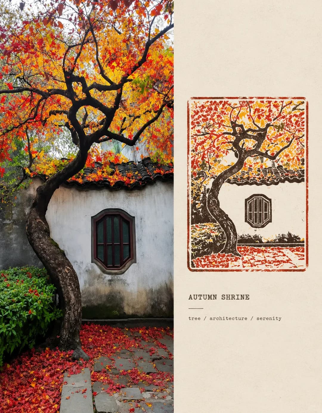
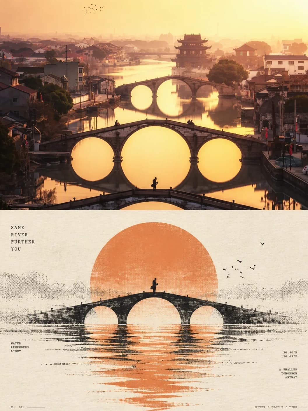
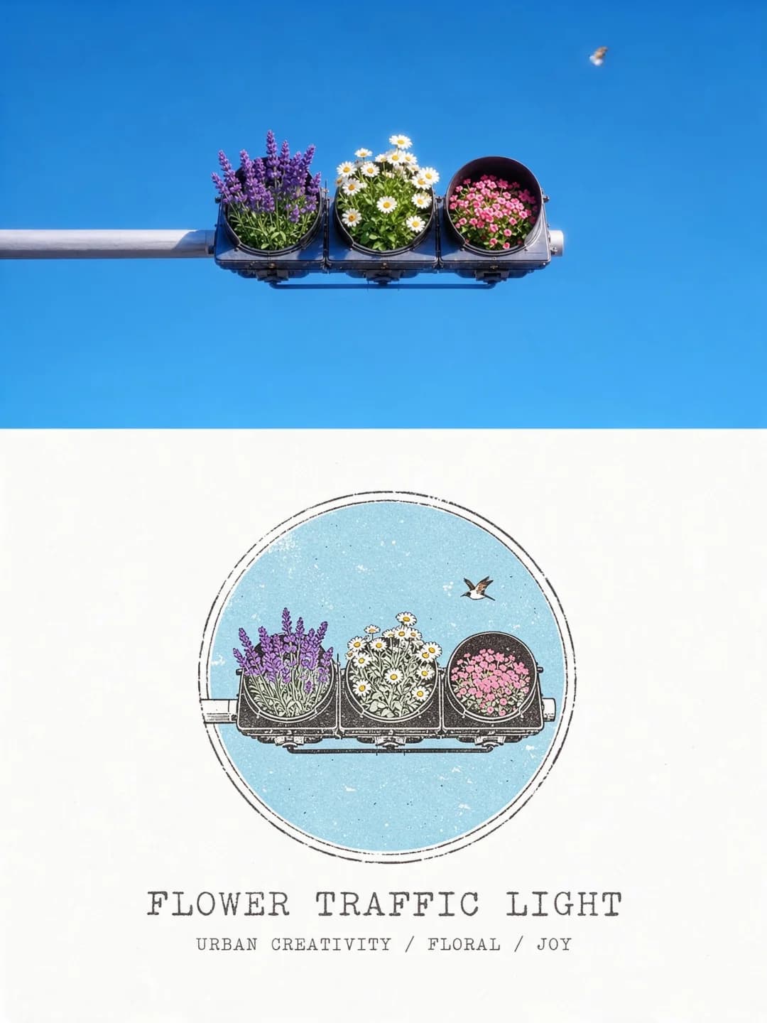
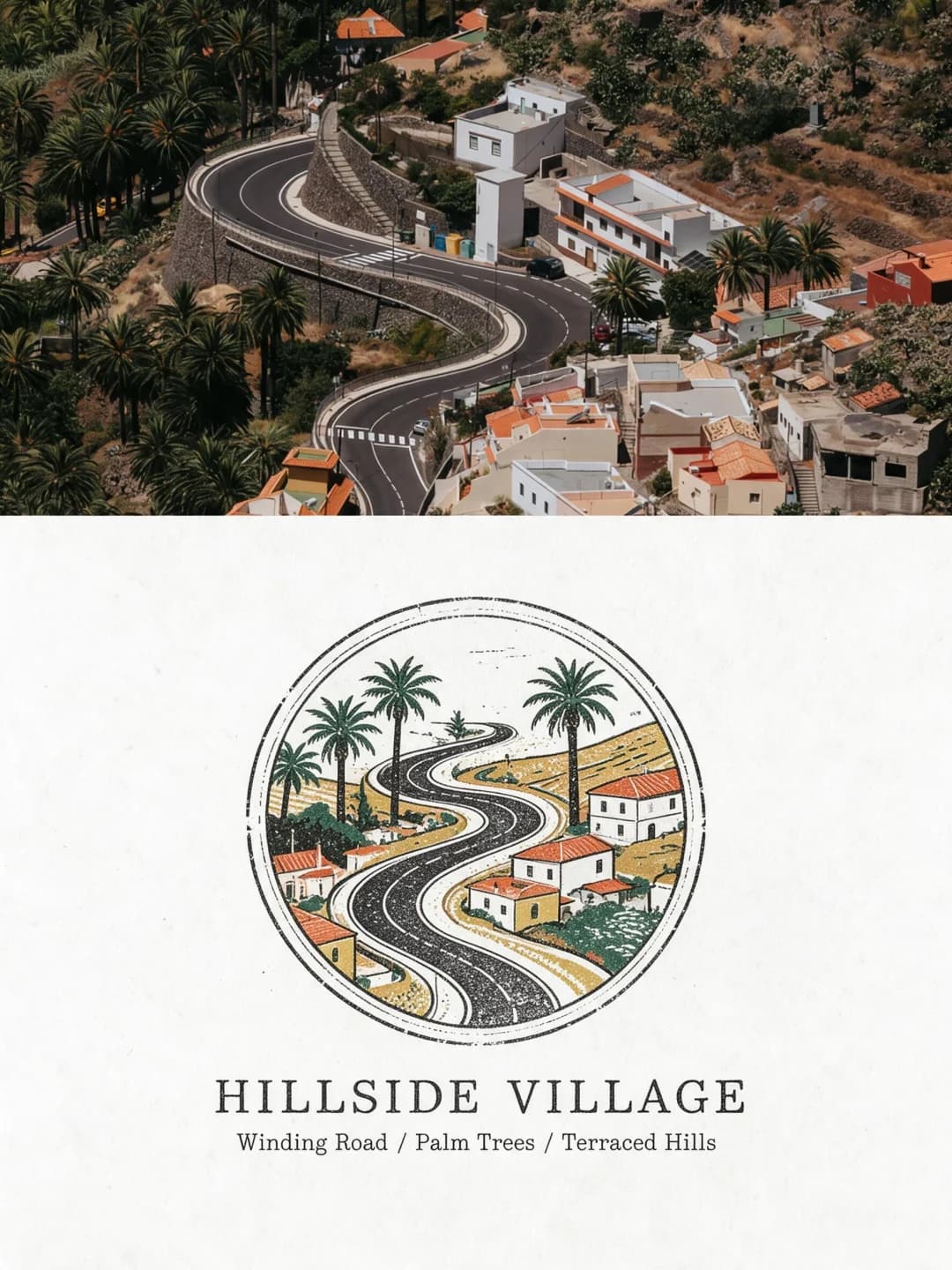
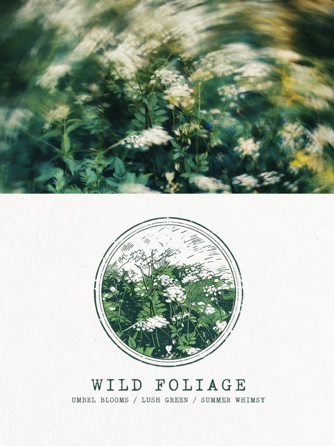
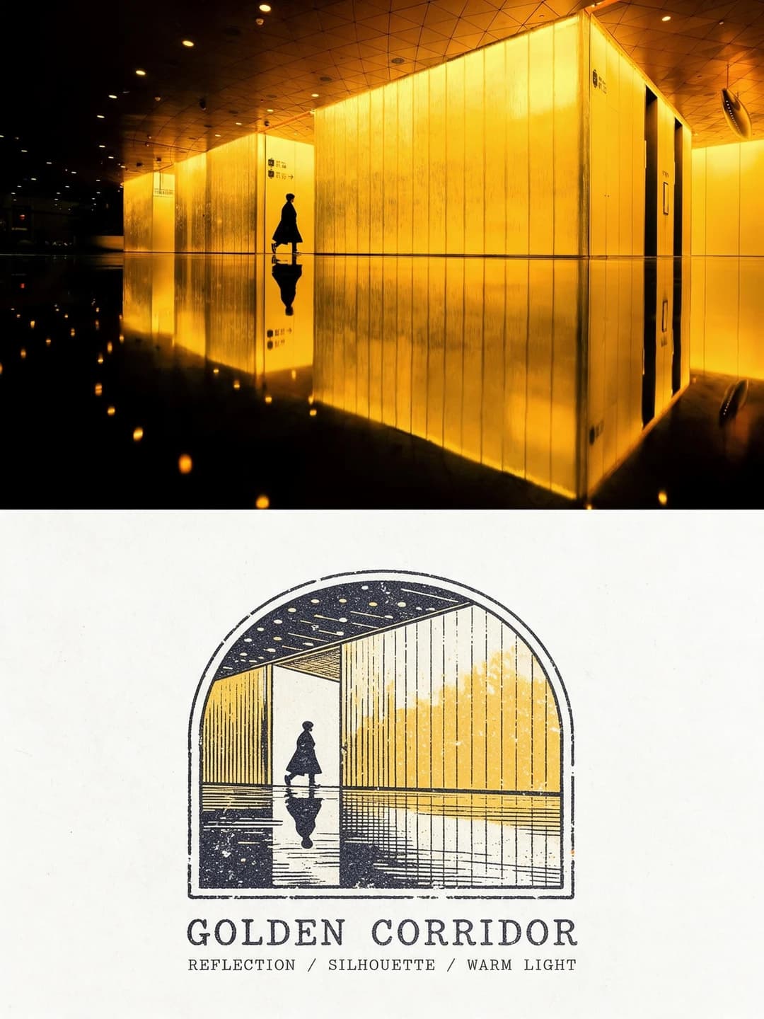
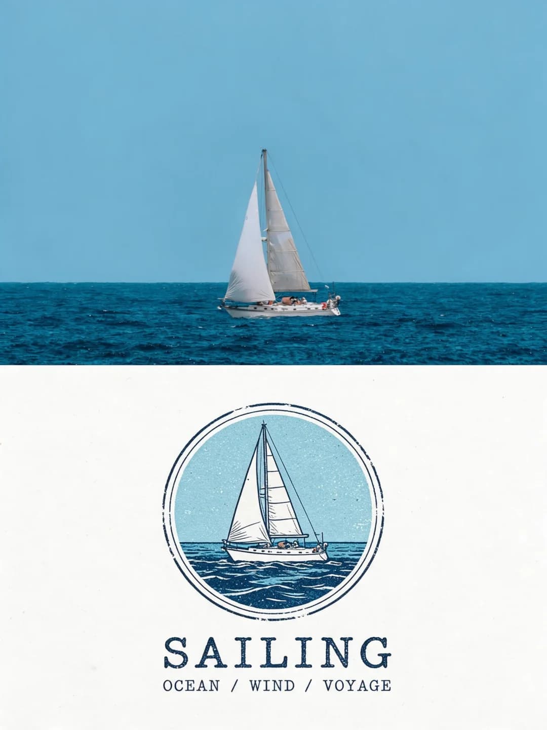
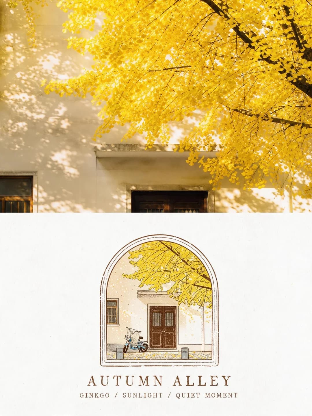
Upload a photo and get back a 3:4 poster. The top is your photo, full width. Underneath, on clean paper, the same scene is redrawn as one small colour-ink stamp inside a fine arch, oval or circle, with a typewriter title and three keywords.
100 credits per image · about a minute · New accounts get 500 credits — 5 free images.
Try it with your own photo
New accounts get 500 credits — 5 free images.
Examples
Every image below was made with the prompt on this page.
What is a Ink Stamp Poster?
An ink stamp poster is a 3:4 vertical image with your photo across roughly the top half and soft paper white below. In the middle of the paper sits a single small stamp — about a quarter to a third of the frame's width — that redraws the same scene in fine lines, flat colour and a few dots of engraving, printed with two to four inks taken from the photo. Its frame is picked from the composition: an arch for tall spaces, an oval for a single object, a circle for groups and wide views. The print is deliberately imperfect, with pinholes and broken lines, but the paper stays clean. Under it go an all-caps typewriter title and a line of three keywords.
Which photos work well?
Photos with a clear subject and a recognisable shape: a building or clock tower, a boat on open water, a road winding through a village, a tree in autumn colour, a figure in a lit corridor, a patch of wildflowers. Strong, distinct colours give the inks something to work with. Landscape-shaped photos fit the top best, since it is a wide slot.
Which photos struggle?
Crowded scenes where every detail matters: the stamp is small and the prompt tells the model to simplify, so a busy market or a large group comes back as a few shapes. Portrait-shaped photos get cropped hard to fill the top. Close-up portraits of people are not what this was built for. For a bigger, warmer, deliberately aged round stamp, the vintage stamp postcard suits better; for a side-by-side archive layout, try the photo memory stamp.
How to turn a photo into a Ink Stamp Poster
- 1
Pick an effect
Browse the samples on each tool page to see exactly what you will get before you spend anything.
- 2
Upload your photo
JPEG, PNG or WebP, up to 12 MB. Your photo stays private and is never used to train anything.
- 3
Add your own caption
Most effects let you set the text that appears in the final image, in any language.
- 4
Download the result
You get a high-resolution image, yours to use. 2K is 100 credits, 4K is 200.
The prompt behind this tool
This is the full prompt, translated into English. Copy it and use it with any image model that accepts a reference photo.
Using the uploaded photo, make a 3:4 vertical "photograph + vintage colour stamp specimen" poster whose content follows the photo.

[Layout]
The photo takes roughly the top 55% of the frame, full width, keeping its real light, colour, subject and point of view; crop without cutting into anything important.
Below it, a soft paper white close to #FAF9F5 with a fine, faint fibre — not yellowed, not aged. The two parts meet at a clean horizontal edge.
Centre one small stamp illustration on the paper, 25%–36% of the frame's width, its height following its shape. Leave wide empty space left, right and above it, and set a short title under the image.

[Distilling the content]
Identify the photo's core theme, its characteristic colours, its signature shapes and movement, and reduce them to a motif that still reads at small size.
For a scene, keep the main layers of space; for a single subject, bring out its outline and drop the cluttered background; for a group, keep the key arrangement and simplify repeated detail. Keep each main subject's pose, direction, pattern and relationships. Do not add species, buildings or props that are not there.

[Frame]
Choose the frame from the composition — flat-bottomed arch, upright rounded oval or circle: an arch for vertical space, an oval for a single object or something hanging, a circle for groups and wide scenes. Use only one.
The border is one or two fine ink lines, naturally broken and ink-starved in places. The motif is composed inside the frame and may touch its line. The whole thing is printed straight onto the paper — no thickness, shadow or sticker edge.

[Print style]
Redraw the subject in fine lines, flat colour areas, a little engraved hatching and fine dots. Clear structure, selective detail.
Colour areas carry small pinholes of paper white, uneven inking and the odd missed patch; lines break now and then and the edges are slightly worn. Keep the wear fine and natural, never over the subject, with no large cracks, scratches or stains. Matte surface, no realistic gradients or 3D lighting.

[Colour]
Take 2–4 representative coloured inks from the photo, plus a neutral dark and the paper white. Lower the saturation a little but keep clear hues, the warm–cool relationship and real colour strength — do not let it all fade to grey-brown.
The dark ink draws the outlines, the paper white stands in for light areas, and the surroundings keep only the small colour areas they need.

[Text]
Centre a short title under the image: a brief English theme word or phrase drawn from the photo, without guessing the place or the species.
Set it in a slightly ink-starved vintage typewriter serif, all caps, generously letterspaced, in a colour taken from the illustration.
An optional subtitle gives three theme keywords separated by " / ", in a smaller size. Keep a safe margin at the bottom.

Avoid: an oversized motif, crowded type, stamp perforations, wavy postmark lines, extra stamps, thick black cartoon outlines, 3D badges, watercolour bleeds, heavy fading, noise across the whole page, yellowed old paper, invented information, watermarks.
Frequently asked questions
Will it change my photo?
- The top should be your photo as taken — same subject, light and colour, cropped to fit a wide slot. Image models occasionally redraw a photo anyway, so check the top before you use the poster and run it again if it is not your picture.
Does the stamp add things that were not in my photo?
- It is told not to add species, buildings or props, and to simplify rather than invent. It sometimes still does — in one of the creator's own examples a figure appeared in the stamp that was not in the photo — so check the stamp against the photo.
Can I choose the frame shape?
- No. The prompt picks it from the composition: an arch for tall spaces like a doorway or corridor, an oval for a single object, a circle for groups and wide views such as a village or a boat at sea.
Can I write the title myself?
- Yes, and it is more reliable than letting the model invent one. The title takes up to 32 characters and is transcribed exactly as typed, so type it in capitals if you want the usual look. You can add a keyword line too; leave it empty and the model writes three keywords.
What language can the title be in?
- Any. The typewriter serif is designed around short English capitals, and without your input the model writes English, but a Chinese or Japanese title works; keep it short so it sits under the small stamp.
Where do the colours come from?
- From your photo: two to four of its characteristic colours become the inks, toned down slightly, plus one dark ink for outlines. A yellow building under blue sky gives yellow and navy; a green meadow can come out in a single green.
What size do I get and how long does it take?
- A 3:4 vertical image: 2K (1792×2400) for 100 credits or 4K for 200 credits. It usually takes under a minute, occasionally up to a minute and a half. You cannot swap in your own prompt, but the full prompt is shown on this page.
What happens to my photo?
- It is stored privately, used only to make your image, deleted on a schedule and never used for training.