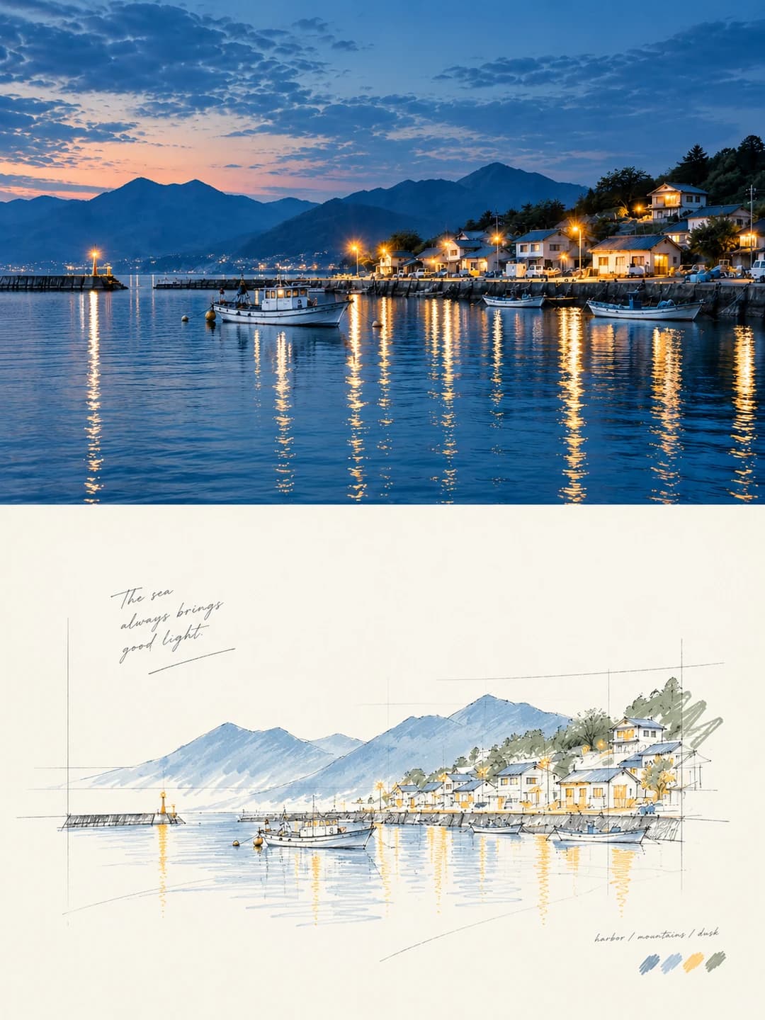
ちぎり絵コラージュポスター
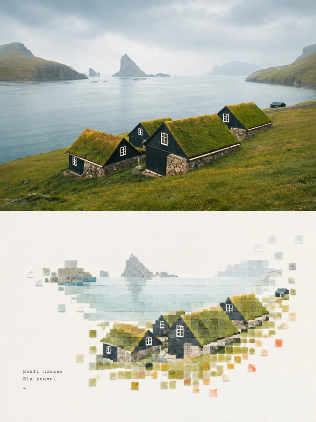
上部に元の写真、下部に手ちぎりの紙で再現された風景を配置
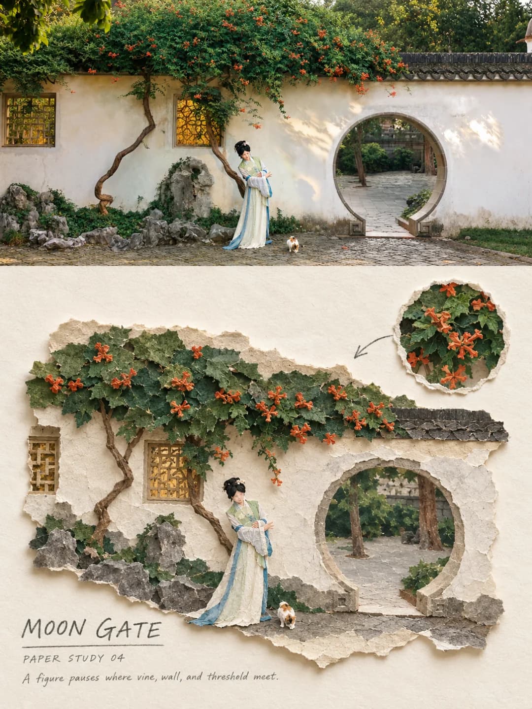
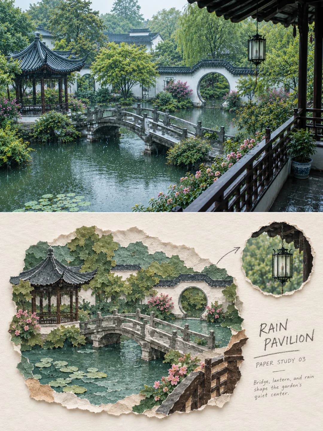
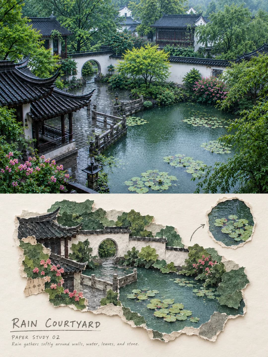
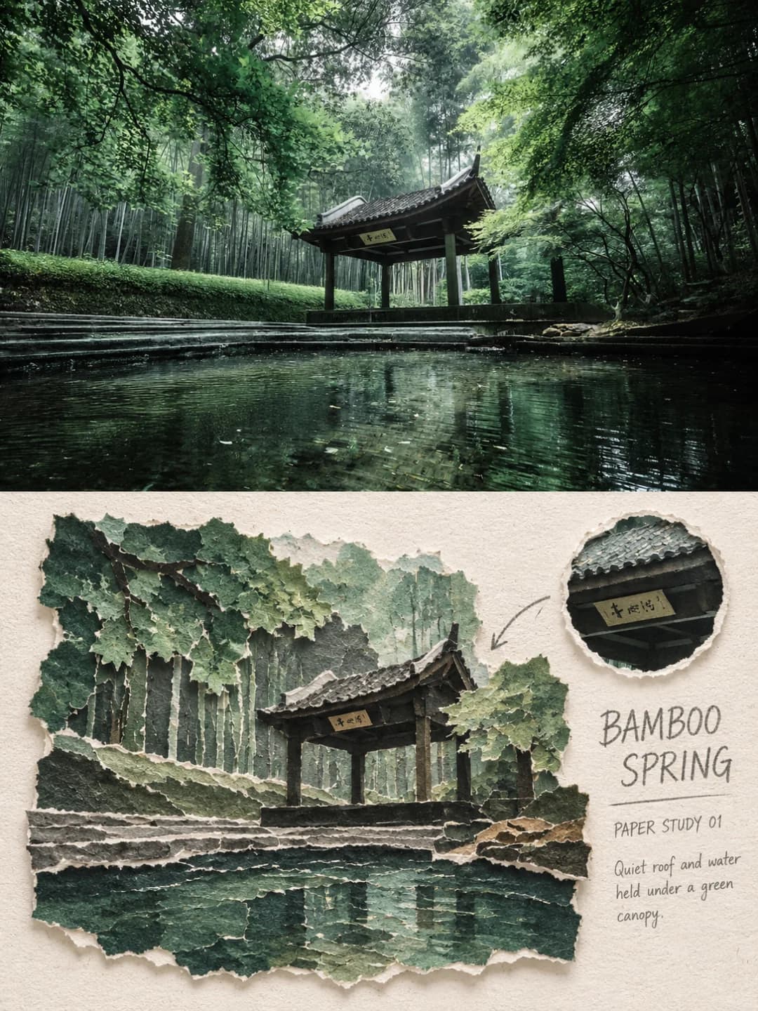
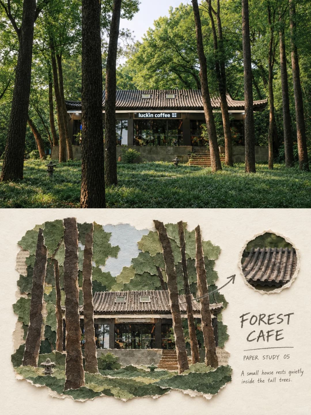
写真をアップロードするだけで、3:4のポスターを作成します。上半分には元の写真、下半分にはその風景を手ちぎりの紙(繊維質の断面、紙の厚み、短い影)で再現した立体的なコラージュを配置し、細部を拡大した円形のインセットを添えます。
画像1枚あたり100クレジット · 約1分 · 新規アカウント登録で500クレジット — 無料画像5枚分。
あなたの写真を試す
新規アカウント登録で500クレジット — 無料画像5枚分。
例
下記の画像はすべて、このページのプロンプトを使用して作成されました。
ちぎり絵コラージュポスターとは?
ちぎり絵コラージュポスターとは、3:4のフレームを上下2つの帯に分割したアート作品です。上段(高さの半分弱)には元の写真が配置され、アングルや建物、人物、光の加減を忠実に保ちつつ、旅行雑誌のような軽い色調補正が施されます。下段では、同じ風景を物理的なコラージュとして再構築します。外壁、屋根、道路、植物、人物などを、マットな繊維紙、和紙、段ボール、クラフト紙からちぎり出し、繊維の毛羽立ちや重なり、リアルな影を表現します。さらに、細部を拡大した円形の切り抜きと、そこを指し示す鉛筆描きの矢印が加わります。配色は、写真から抽出した5〜7色の落ち着いたトーンに整理されます。
どんな写真が向いている?
奥行きと構造のある風景に適しています。建物の間の路地、中庭、寺院の屋根、橋、店先、庭の壁など。コラージュを構成するために、はっきりとした消失線と、提灯、傘、人物、看板といった特徴的なオブジェクトが含まれていることが理想的です。
どんな写真が苦手?
ポートレートや接写には向きません。ちぎり絵にすると顔が単なる図形になってしまうためです。また、奥行きのない平面的な被写体や、群衆も苦手です。このプロンプトは窓の繰り返しや混雑したグループを意図的に省略するため、密度が魅力のシーンは予想以上に寂しい仕上がりになります。
ちぎり絵コラージュポスターの作り方
- 1
エフェクトを選ぶ
各ツールのページにあるサンプルを閲覧し、クレジットを使う前にどのような結果が得られるかを確認できます。
- 2
写真をアップロードする
JPEG、PNG、またはWebP形式で、最大12 MBまで。お客様の写真はプライバシーが保護され、いかなる学習にも使用されません。
- 3
キャプションを追加する
ほとんどのエフェクトでは、最終画像に表示されるテキストを任意の言語で設定できます。
- 4
結果をダウンロードする
高解像度の画像が手に入り、自由にご利用いただけます。2Kは100クレジット、4Kは200クレジットです。
このツールのプロンプト
これは、英語に翻訳された完全なプロンプトです。コピーして、参照写真を受け入れる任意の画像モデルで使用できます。
Turn the uploaded photo into a single high-end torn-paper editorial art poster — not a collage of several images. Use a vertical 3:4 diptych composition: the top holds the real original photograph, clearly visible; the bottom rebuilds the same scene as a "torn-paper scene reconstruction". The two bands are close to equal in height, separated by a clean horizontal edge — no haze, no bleeding between them. Output the face of the poster only: no picture frame, no wall, no hand-held mockup.

The top band occupies roughly 47–50% of the frame and preserves the original photograph faithfully. Keep the viewing angle, the direction of the vanishing point, the slope of the road, the buildings on either side, the eaves, the doors and windows, the signage, the vehicles, the plants, the overhead wires, and the number and posture of any people, along with the original natural light and colour. Apply only light travel-magazine grading and the thinnest film grain; it must still read clearly as real photography. The sky, the road surface or quiet parts of the surroundings may be extended naturally to fit the frame, but do not repaint buildings, move people, alter vehicles, stretch, mirror or duplicate the subject.

In the lower band, do not simply put a paper filter over the same framing, and do not assemble rectangular photo fragments. First choose the single dominant vanishing line of the space, the main facades on either side, and one to three objects that best identify the place — a pedestrian, a vehicle, a lantern, an umbrella, overhead wires, a plant, a sign or a roof. Actively delete repeated window panes, complicated crowds, irrelevant small objects and photographic noise, then reorganise what remains into a smaller, clearly outlined, physical torn-paper scene.

The reconstructed scene fills about 60–82% of the lower band, centred or slightly offset, with roughly 20–35% of continuous ivory paper left around it. Re-judge the scale and visual hierarchy against the original so that the most recognisable building, object or figure becomes the anchor on the sheet; do not transcribe the photograph's full composition. A small torn circular window may be added in the white space, enlarging one real detail taken from the original, connected back to the main scene by a single graphite arrow.

Build the facades, road surface, eaves, plants, sky and figures piece by piece from hand-torn matte fibre paper, thin rice paper, corrugated card, kraft paper and a little old printed stock. Every major shape must show clearly visible fibrous torn edges, slight overlaps, real paper thickness, lifted corners and short, natural cast shadows. Torn edges may be irregular, but the outline of the scene, the direction of the space, the boundaries of the buildings and the identity of the subject must stay legible. No smooth vector slices, no laser-cut edges, no flat digital shadows.

Take the colour entirely from the photograph above, reducing its complexity to five to seven greyed paper tones. Build the skeleton from the true dominant colours of the walls, the road, the roofs, the planting and the people, and keep exactly one characteristic accent from the original — a rust red, a cobalt blue, an olive green or whatever the photograph actually offers. Do not apply a fixed Japanese-travel palette to every location.

Text — generated
Arrange a restrained group of handwritten editorial type in the ivory white space to the right or below: one all-capitals headline of two or three words distilled from the place, the subject or the mood; a fine rule beneath it; a small numbered note under the rule; and one descriptive line of no more than twelve words. The type sits quietly on the blank paper and never covers the torn-paper scene.
よくある質問
写真に写っている人物や被写体は変わってしまいますか?
- 上段では変わりません。プロンプトではアングルや建物、看板、車両、人物の数や姿勢を維持するよう厳格に指定しており、改変を禁じています。下段は再構築されるため、窓の繰り返しや群衆、細かなノイズなどは意図的に整理されます。
見出しを自分で決めることはできますか?
- はい、可能です。その方が確実な結果を得られます。見出しや注釈を入力すれば、モデルはそれを正確に書き込みます。空欄にした場合は風景から2、3語を抽出しますが、言葉選びはAI任せになります。
見出しは何語に対応していますか?
- どの言語でも可能です。手書き風のエディトリアルタイポグラフィ(スモールキャピタル)スタイルなので、見出しは2、3語、注釈も短いフレーズにすると美しく収まります。
矢印のついた小さな円は何ですか?
- 余白部分に配置された円形の切り抜きで、元の写真から抽出した屋根瓦や提灯、花などの細部を拡大したものです。鉛筆描きの矢印で、メインの風景のどこに該当するかを示します。プロンプトに含まれていますが、必ず出現するとは限りません。
配色はどのように決まりますか?
- 元の写真から抽出されます。壁、道路、屋根、植物、人物などの色を5〜7色の落ち着いたトーンに整理し、アクセントとして1色(錆びた赤、コバルトブルー、オリーブグリーンなど)を保持します。決まりきった「日本風」の配色を押し付けることはありません。
ダウンロードできる画像のサイズは?
- 2Kは1792 × 2400ピクセルで、ポスターサイズでも綺麗に印刷できます。4Kはその2倍のサイズで、100 creditsではなく200 creditsが必要です。
自分のプロンプトを使うことはできますか?
- このツールでは固定のプロンプトを使用するためできません。ただし、このページにプロンプトの全文を公開していますので、コピーして他の画像生成AIで独自のバリエーションを試すことができます。
アップロードした写真はどのように扱われますか?
- 生成のために一時的に非公開で保存され、スケジュールに従って削除されます。公開されたり、他のユーザーに見られたり、モデルの学習に使用されることはありません。