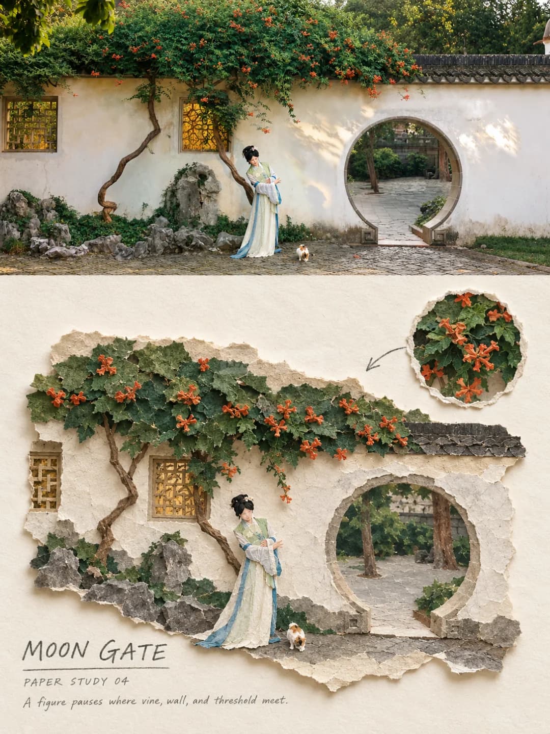
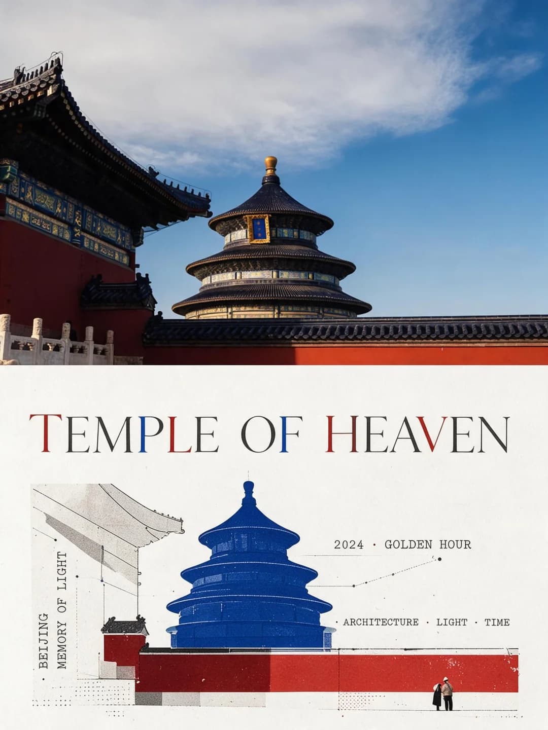
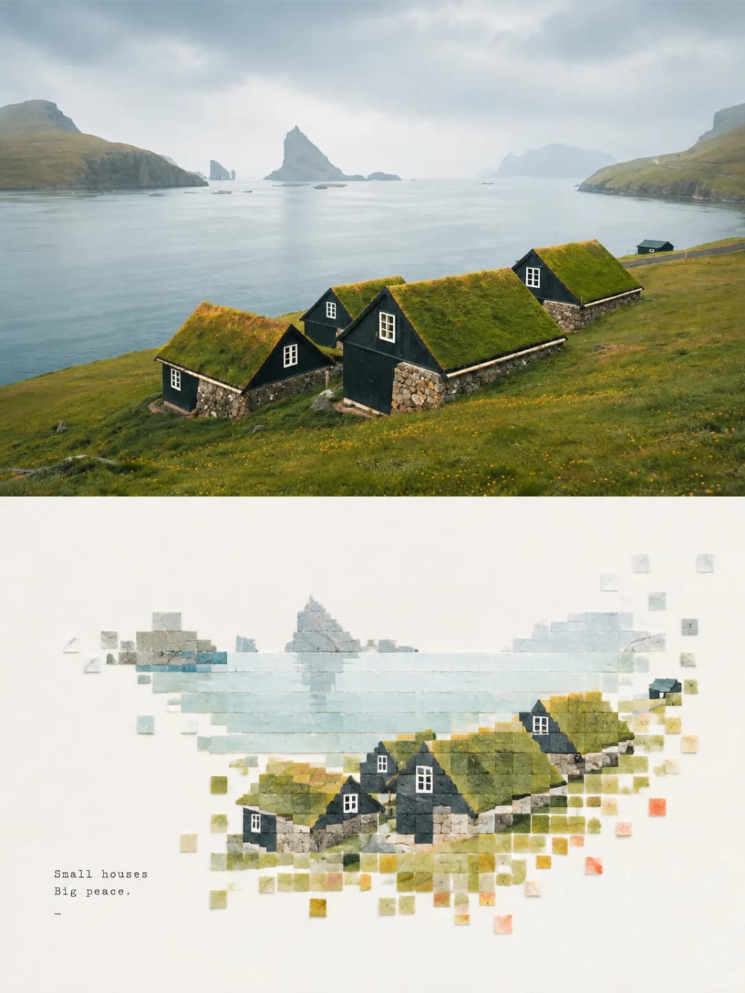
ジオメトリック・コラージュ・ポスター
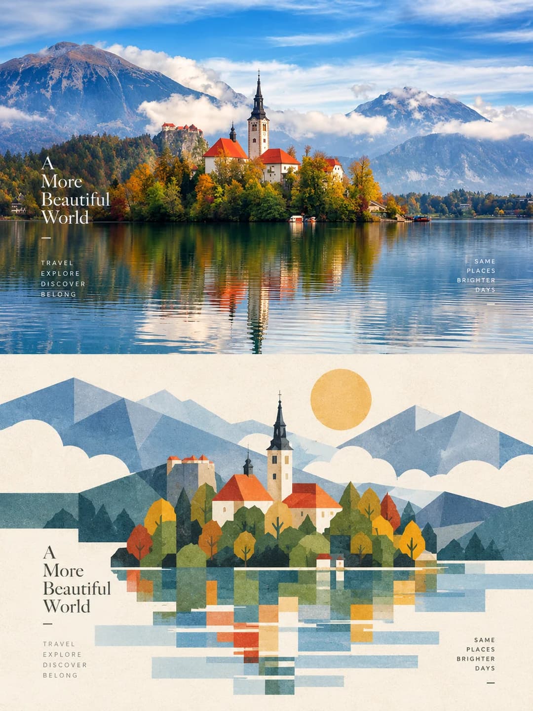
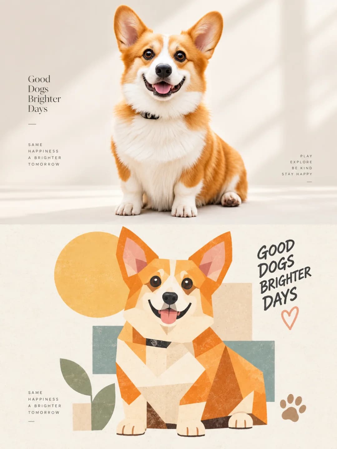
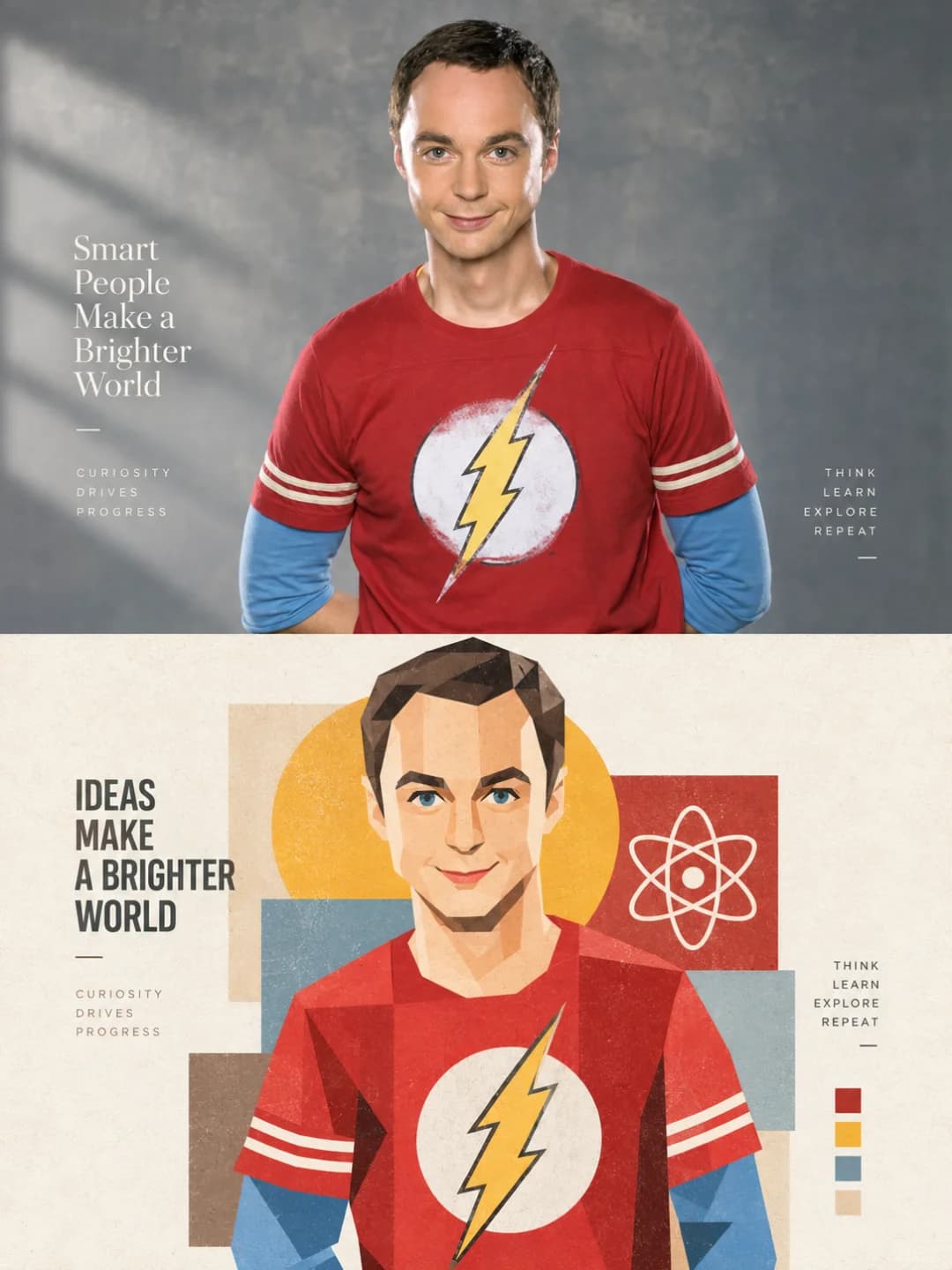
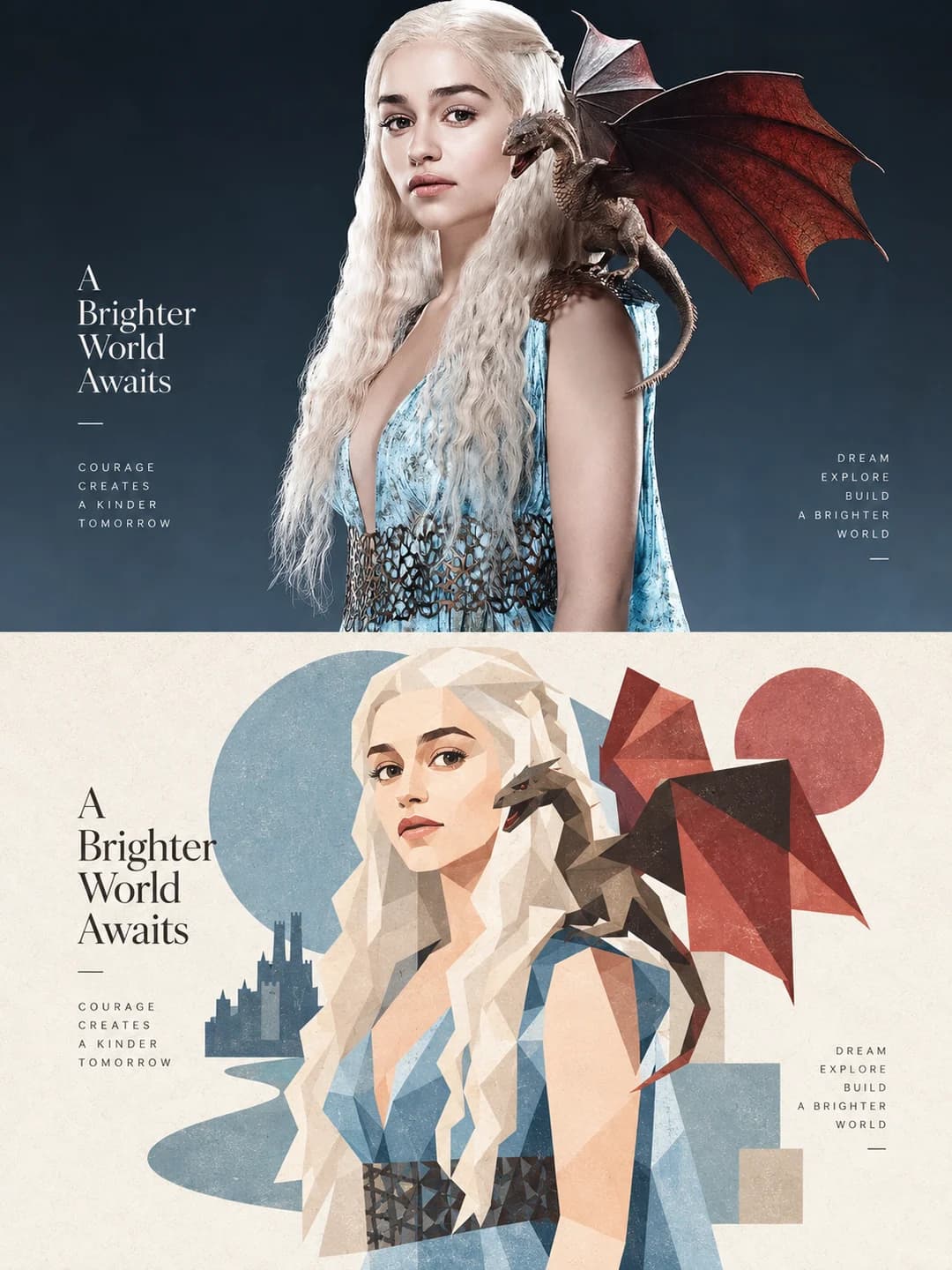
上半分に元の写真、下半分にその被写体を大きな図形で再構成したアートを配置
写真をアップロードするだけで、3:4のポスターが完成します。上半分には元の写真が配置され、下半分にはその被写体をモダンな幾何学的コラージュとして再構成したデザインが並びます。写真から抽出された柔らかな配色と、少数の大きな長方形、円、三角形が織りなすアートを楽しめます。
画像1枚あたり100クレジット · 約1分 · 新規アカウント登録で500クレジット — 無料画像5枚分。
あなたの写真を試す
新規アカウント登録で500クレジット — 無料画像5枚分。
例
下記の画像はすべて、このページのプロンプトを使用して作成されました。
ジオメトリック・コラージュ・ポスターとは?
ジオメトリック・コラージュ・ポスターとは、3:4のフレームを上下に等分し、上半分に元の写真を、下半分にその被写体を幾何学的な図形で再構成したアートを配置するデザイン手法です。上半分は、被写体、ポーズ、比率、服装、背景を維持しつつ、控えめな色調補正のみを施した元の写真です。下半分は、同じ被写体をモダンな幾何学的解体とペーパーコラージュとして再構築したもので、細かく断片化するのではなく、少数の大きな図形(長方形、円、角丸四角形、三角形、楕円)をリズムよく重ね合わせて表現します。背景は1〜3つの象徴的な要素に絞り込まれ、配色は写真から抽出した2〜4色を使用し、余白には短い見出しが添えられます。
どんな写真が向いている?
このエフェクトは非常に汎用性が高いのが特徴です。風景や建築物はもちろん、人物やペットにも適しています。下半分が細かな断片ではなく、少数の大きな面で再構成されるため、顔や動物の構造が損なわれにくいからです。シンプルな背景に対してシルエットがはっきりしている被写体が、最も美しく仕上がります。
どんな写真が苦手?
細部や密度が重要なシーン(群衆、生い茂る葉、複雑なパターン、物が溢れた室内など)には向きません。プロンプトによって背景は1〜3つの要素にまで削ぎ落とされ、被写体を細かな色の断片に分けることも禁止されているため、テクスチャのみで構成された写真では再構成するための要素がほとんど残らなくなってしまいます。
ジオメトリック・コラージュ・ポスターの作り方
- 1
エフェクトを選ぶ
各ツールのページにあるサンプルを閲覧し、クレジットを使う前にどのような結果が得られるかを確認できます。
- 2
写真をアップロードする
JPEG、PNG、またはWebP形式で、最大12 MBまで。お客様の写真はプライバシーが保護され、いかなる学習にも使用されません。
- 3
キャプションを追加する
ほとんどのエフェクトでは、最終画像に表示されるテキストを任意の言語で設定できます。
- 4
結果をダウンロードする
高解像度の画像が手に入り、自由にご利用いただけます。2Kは100クレジット、4Kは200クレジットです。
このツールのプロンプト
これは、英語に翻訳された完全なプロンプトです。コピーして、参照写真を受け入れる任意の画像モデルで使用できます。
From the single photograph I upload, create one high-end art design poster in a vertical 3:4 format. Each photo produces its own separate piece; never collage several images together. Divide the frame horizontally into two zones of strictly equal height, 50% each, setting up a visual contrast between "real image × geometric artistic reconstruction".

Top zone — the real image
Work from the original photograph as the only source. Preserve as completely as possible the subject, the identifying features, the posture, the proportions, the clothing, the architectural structure, the animal's form, the relationships between objects and the character of the setting. Do not redesign the subject and do not casually add or remove important elements. Keep the quality of real photography, the natural light and the original colour mood, applying only restrained high-end grading so the image carries the feel of an art magazine, travel photography or an exhibition print. The edges of the scene may be extended naturally to suit the 3:4 composition, but stretching, distorting, replacing or reshaping the subject is forbidden.

Bottom zone — geometric visual echo
Take the most recognisable contours, posture, structure and visual hooks from the photograph above and redesign them as modernist geometric deconstruction plus paper-collage illustration. Do not reproduce the photograph realistically, and do not let it become ordinary cartoon or vector illustration. Instead, rebuild the subject from a small number of large, whole shapes — rectangles, circles, rounded squares, triangles, ellipses and irregular geometric blocks. Emphasise blockiness, modularity, overlapping shapes, the relationship between positive and negative form, and visual rhythm. Avoid chopping the subject into many small fragments of colour.

Delete the complicated background and keep only one to three key elements that help identify the original scene. Keep the subject at a moderate scale with a large amount of clean white space around it. It may sit off-centre according to the original's centre of gravity, be partly cropped, or be arranged out of alignment, so the lower zone reads as an independent art poster rather than a filter over the photograph.

Material and colour
Use flat fields of colour, paper collage, a light printmaking grain and a high-end print texture, with edges that carry a slight natural handmade quality. Avoid smooth vector, 3D, plastic texture and over-retouching. Extract two to four core colours from the original photograph and build a unified colour system from them, lifted and purified a little, favouring soft modern tones — cream white, warm beige, misty blue, grey-green, coral orange, warm brown, soft violet. Colour should be clear but never harsh; avoid dirty greys, dark browns, fluorescents and cheap candy colours.

Typography
Type is not the subject. By default add just one short English headline plus one group of very small supporting text. Do not repeat the headline and do not write long passages of copy. Set it in a refined magazine-style serif or a minimal sans serif, keeping it away from the subject and using the white space to position it.

The final result: real photography × geometric visual echo, large-plane deconstruction, restrained collage, soft high-end colour, paper grain, generous white space, modern editorial design and the quality of an art magazine cover. The two halves must clearly correspond, while telling the same picture in two completely different visual languages.
よくある質問
人物や被写体は変わりますか?
- 上半分については変わりません。プロンプトでは、アイデンティティ、ポーズ、比率、服装、建築構造、動物の形態を可能な限り維持するよう指示されており、被写体の引き伸ばしや歪曲、置き換え、変形は禁止されています。下半分は定義上「再構成」されるため、被写体は大きな平面図形として描き直されます。
見出しは選べますか?
- はい、その方が確実です。ご自身で見出しと補足テキストを入力すれば、モデルはそれを一度だけ正確に配置します。空欄にすると、AIがシーンに合わせて短い英語の見出しを自動生成しますが、その内容は運任せになります。
見出しは何語に対応していますか?
- どの言語でも可能です。入力された文字列をそのまま配置します。ただし、空欄時のデフォルトは英語です。このスタイルには、見出しに3〜4単語、補足に数単語程度の短いフレーズが適しています。
顔写真にも使えますか?
- このセットの他のエフェクトよりも適しています。下半分が細かな断片ではなく少数の大きな面で再構成されるため、顔の構造が維持され、誰であるか判別可能です。写真のような写実性ではなく、ローポリゴンのポートレートのような雰囲気の似顔絵を期待してください。
色はどこから決まりますか?
- アップロードした写真から抽出されます。プロンプトは元の写真から2〜4つのコアカラーを抽出し、それらを洗練させて、クリーム、ウォームベージュ、ミスティーブルー、グレーグリーン、コーラルなどの柔らかなモダンカラーに統一します。濁ったグレー、暗い茶色、蛍光色、安っぽいキャンディカラーは明示的に除外されます。
サイズはどうなりますか?
- 2Kは1792 × 2400ピクセルで、ポスターサイズでも綺麗に印刷できます。4Kはその2倍の解像度で、100クレジットではなく200クレジットを消費します。
自分のプロンプトを使えますか?
- このツール内では固定のプロンプトを使用するため、変更はできません。ただし、このページにプロンプトの全文を公開していますので、画像プロンプトを受け付ける他の環境でコピーして独自のバリエーションを試すことができます。
写真はどう扱われますか?
- 生成AIが読み取れるようプライベートに保存され、一定期間後に削除されます。公開されたり、他のユーザーに表示されたり、モデルの学習に使用されたりすることはありません。