Marker Portrait Poster
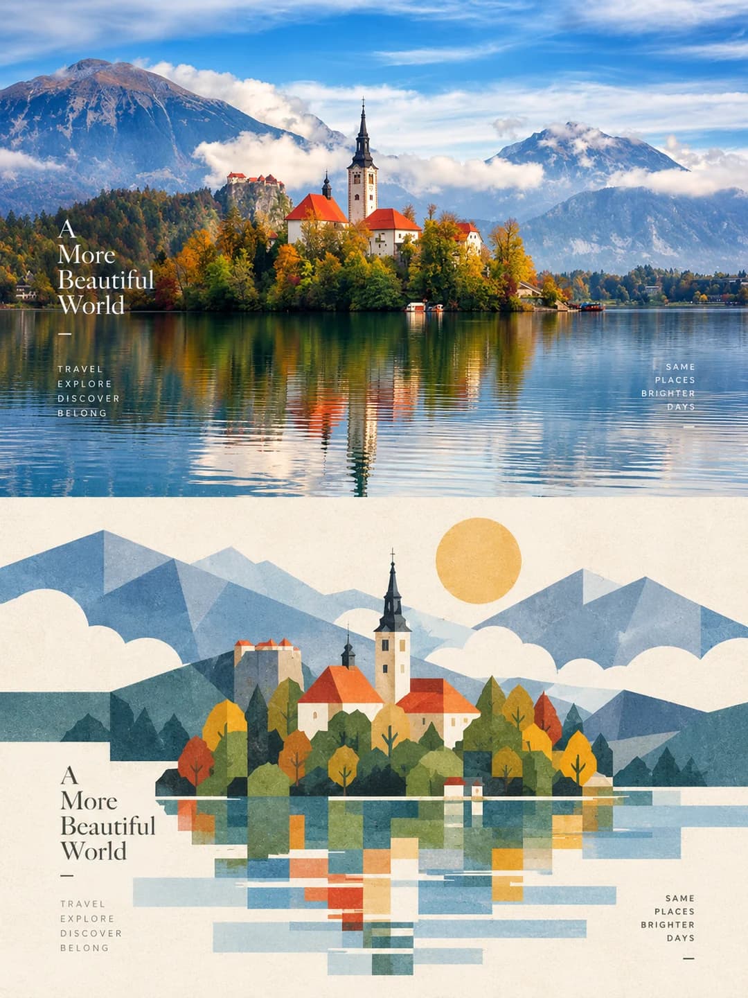
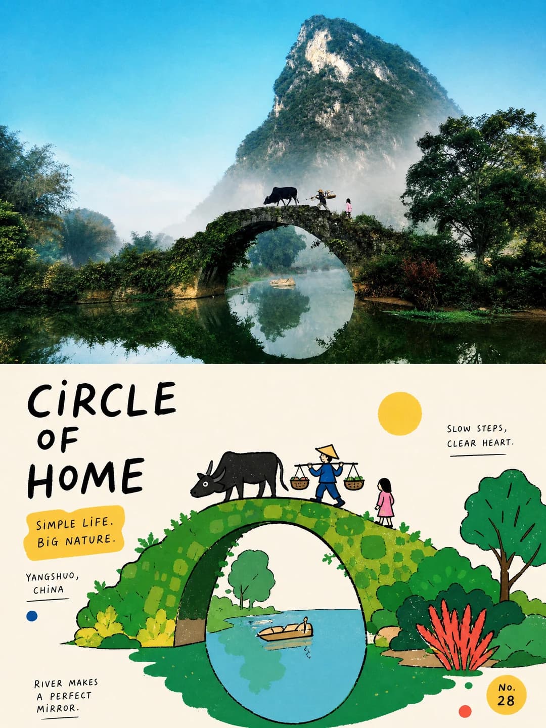
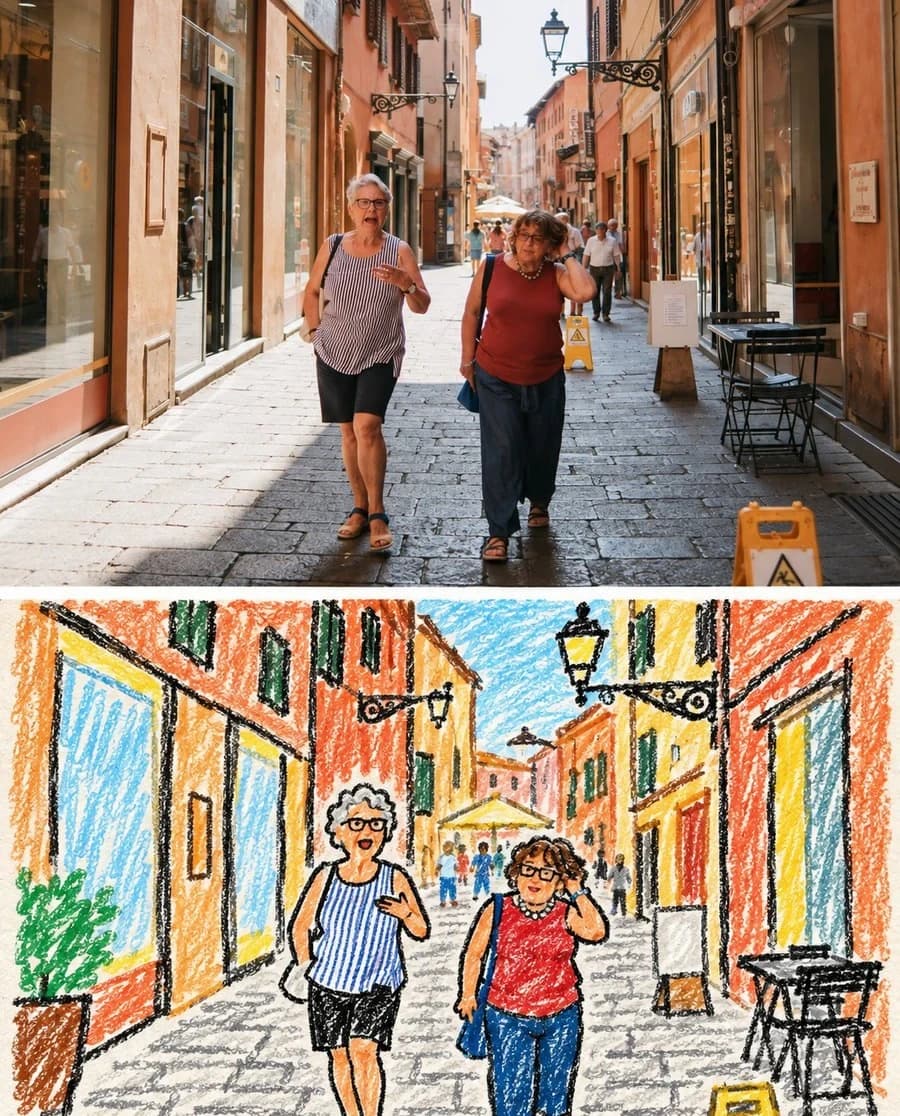
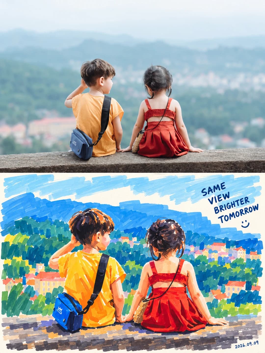
La tua foto sopra, lo stesso soggetto ridipinto sotto a colpi decisi di pennarello
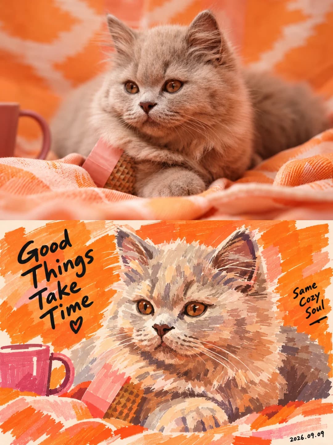
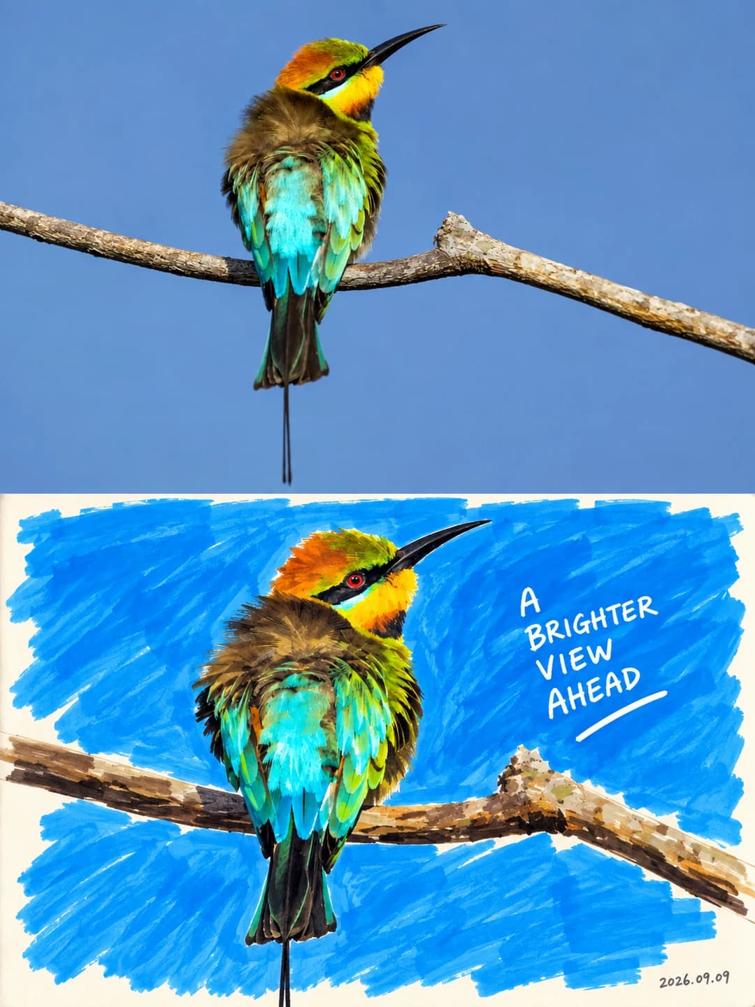
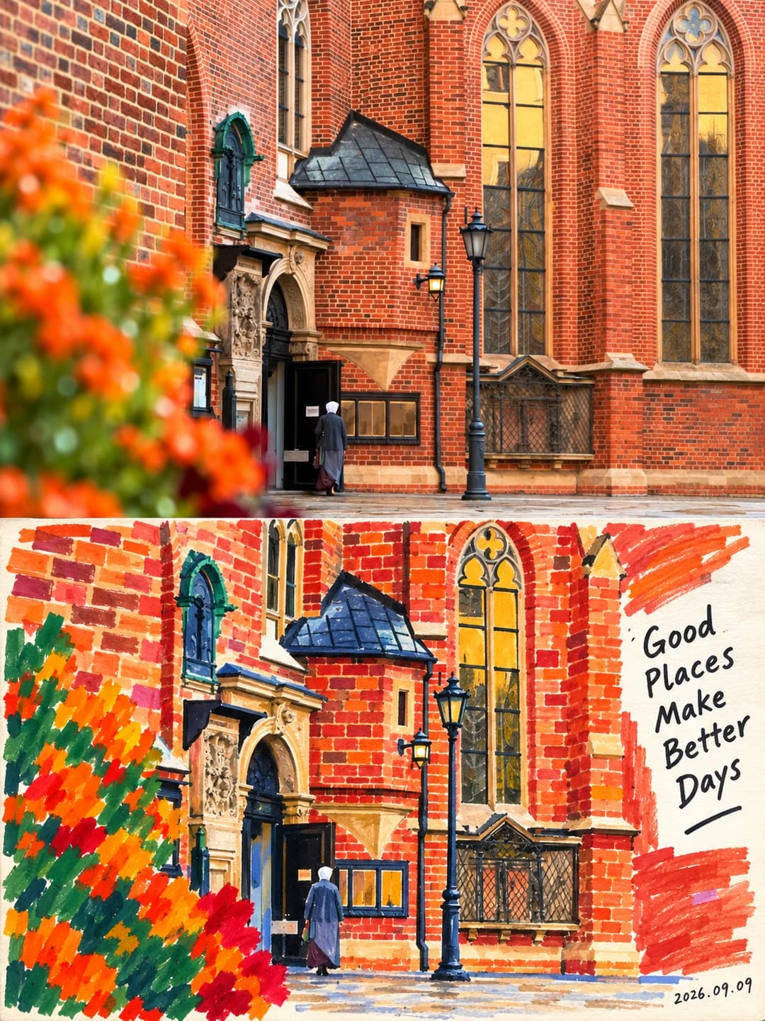
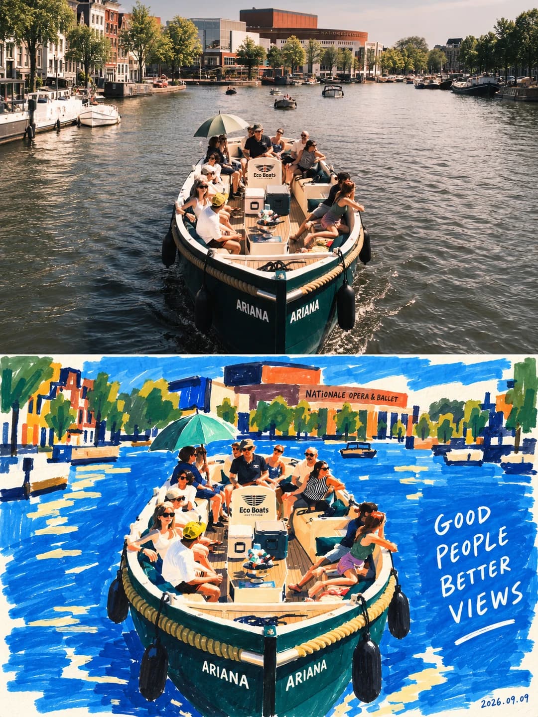
Carica una foto e ottieni un poster 3:4: la tua fotografia nella metà superiore, lo stesso soggetto sotto ridipinto con quattro-sei colori coprenti a pennarello, tratti a punta a scalpello ben visibili, una scritta a mano e la data nell'angolo.
100 crediti per immagine · circa un minuto · I nuovi account ricevono 500 crediti — 5 immagini gratuite.
Provalo con la tua foto
I nuovi account ricevono 500 crediti — 5 immagini gratuite.
Esempi
Ogni immagine qui sotto è stata creata con il prompt di questa pagina.
Che cos’è un Marker Portrait Poster?
Un marker portrait poster divide un'inquadratura 3:4 in due zone uguali. La parte superiore è la tua fotografia, fedele a identità, età, tonalità della pelle, espressione, posa e inclinazione del viso, con una leggera calibrazione cromatica e senza alcun orpello. La parte inferiore ridipinge lo stesso soggetto come un ritratto grafico a pennarelli acrilici: capelli, viso, collo e vestiti ridotti a pochi blocchi di colore calibrati, il volto costruito con una tinta di base più due o tre campiture strutturali, e lo sfondo semplificato in una o due aree piatte. I quattro-sei colori derivano dalla foto — un dominante, uno di contrasto, un piccolo accento — con una frase scritta a mano e una data sottile nello spazio accanto alla figura.
Quali foto funzionano bene?
Un unico soggetto ben definito, con un'espressione o una posa chiara e che occupi una porzione consistente dell'inquadratura. È studiato per le persone, ma gli esempi originali funzionano bene anche con un gatto, un uccello, una facciata in mattoni o un battello di passeggeri: l'approccio non cambia, pochi blocchi cromatici essenziali e via tutto il superfluo.
Quali foto danno problemi?
Folle e scene in cui il contesto è l'elemento chiave. Il prompt elimina all'istante passanti, elementi di disturbo e lo sfondo fotografico: uno scatto di gruppo si ridurrebbe a una sola figura isolata su un blocco di colore uniforme. Inoltre non è fatto per abbellire: se cerchi un ritratto levigato o radioso, questo è volutamente lo strumento sbagliato.
Come trasformare una foto in Marker Portrait Poster
- 1
Scegli un effetto
Sfoglia gli esempi su ogni pagina dello strumento per vedere esattamente cosa otterrai prima di spendere qualsiasi cosa.
- 2
Carica la tua foto
JPEG, PNG o WebP, fino a 12 MB. La tua foto rimane privata e non viene mai utilizzata per addestrare nulla.
- 3
Aggiungi la tua didascalia
La maggior parte degli effetti ti permette di impostare il testo che appare nell'immagine finale, in qualsiasi lingua.
- 4
Scarica il risultato
Ottieni un'immagine ad alta risoluzione, tua da usare. 2K costa 100 crediti, 4K costa 200.
Il prompt dietro questo strumento
Questo è il prompt completo, tradotto in inglese. Copialo e usalo con qualsiasi modello di immagine che accetti una foto di riferimento.
Make one piece from the uploaded photograph; do not collage. Vertical 3:4, the two zones strictly 1:1 in height, 50% each.

Upper zone — keep the original photograph. Use the uploaded photo as the only reference for the person, preserving completely their identity, sense of age, depth of skin tone, expression, pose, head angle, hairstyle, the relationships between their features, clothing, accessories and key action. Apply only light high-end grading, to the image quality of an art magazine, an independent publication or an exhibition print; keep real skin, natural light and the original colour mood. The background may be extended naturally to fit the frame, but do not stretch, distort, slim the face, beautify or alter the subject. Closed eyes must not become open, a closed mouth must not become a toothy smile, a profile must not become a frontal view, and a back view must not be given a face. Add no illustration, stickers or ornament to the upper zone.

Lower zone — rebuild as a bold marker portrait. From the most recognisable characteristics of the person above — face shape, hairstyle, the placement of features, head angle, the direction of the shoulders, pose, the outline of the clothing, gesture, accessories and expression — rebuild the same person as a contemporary bold acrylic-marker figure painting. Not a filter, not a realistic copy: as though a painter had looked at this person and redrawn the moment with a few richly coloured broad-nib markers. It must read as painting at first glance, and as the same person at second glance.

Style: borrow only the top-and-bottom layout; the visual style must stay a bold marker figure painting. Take the vivid pure-colour relationships, simplified contours and rhythm of colour blocks from Matisse, but translate them into marker painting — never paper-cut, collage, pixel, shell material, vector or 3D. Take the relationship of "spare drawing plus handwritten line" from David Shrigley, but warmer in tone, never copying a specific work or sentence. One consistent language: dense colour, broad strokes, large colour fields, simplified form, a true expression, visible marks of the hand, and a little handwritten annotation.

The person: keep the face shape, the proportions of the features, the direction of the gaze, the hairstyle, the depth of skin tone, the expression, the action, the structure of the clothing and any important accessories. Preserve identifying features such as moles, freckles, glasses and a beard wherever possible. Detail may be simplified, but do not paint the person as a different face, and do not manufacture humour by exaggerating the features.

Medium and mark: the medium is opaque acrylic paint marker. Lay large colour fields with a wide chisel nib, establish the shapes with a medium nib, and use a little fine nib for the features, the direction of the hair and the lettering. The colour fields should be full, solid and covering. Keep real marker marks — swept bands, angular turns, seams where strokes overlap, slightly irregular edges, a few skips over the paper grain. No all-over noise texture, and never outline in uniform black before filling.

Form and colour: build the figure from a few weighted colour fields — hair, face, neck, top, arms and any necessary accessories all reduced to simple shapes. The face is one base skin-tone field, two or three structural colour blocks and a few strokes for the features, with the photograph's micro-texture and complex gradients removed. Complete the eyes with a few short strokes and a dark dot, keeping the gaze accurate; no anime-large eyes, exaggerated highlights or false lashes. The mouth keeps whatever opening and feeling it had.

Colour should be dense but not heavy, vivid but not noisy. Draw four to six main colours from the original: one dominant colour to set the mood, one counter-colour for tension, and a little accent to lift the image. Cobalt, ultramarine, vermilion, tomato red, ochre, deep grass green, peacock green, aubergine, wine red and warm ivory are all available, but choose only the set that suits each picture. Skin may be translated artistically into ochre, terracotta, apricot or warm brown, but the person's original relative depth of skin tone must be preserved — no bleaching, no shattering into rainbow fragments. Soft-focus gradients, airbrushed shadow, watercolour bleed, candy pastels and plastic skin are all forbidden.

Lower-zone composition: delete the irrelevant background, bystanders and clutter, keeping only the figure and the few objects that genuinely matter, reduced to marker colour blocks in the same way. The figure may be enlarged, cropped or set to one side to leave room for the text, but the logic of the action must not change. The background is one whole block of the dominant colour, two large colour areas, or the dominant colour combined with warm white space. The picture should be relaxed and full of air; do not add meaningless plants, hearts, stars, stickers or templated ornament.

Handwritten text: from the real action, expression, objects or atmosphere in the photograph, write one related, humorous short line that feels like something only someone who had seen this photograph would think of. Mainly English, with optionally a very short line of Chinese; keep the main line to three to eight English words, with an optional aside of one to three words, at most two groups of text. The lettering must look marker-written: letters slightly uneven in size, the baseline gently rising and falling, spacing naturally irregular but clearly readable, of the same material as the picture and never like type added afterwards. A short underline or a small arrow may accompany it; do not scrawl over the whole page.

Signature: in the lower right of the lower zone, or in the white space, note the actual generation date in smaller, lighter handwriting, in the format YYYY.MM.DD. Add no invented signature, logo or watermark.

Final control: the result must be an authentic original photograph in the upper zone plus a bold marker figure painting in the lower zone. Borrow only the top-and-bottom structure; do not render it as pixel, shell, collage or material-seal styles.

Avoid: realistic AI oil painting, watercolour, pixel, collage, shell mosaic, vector, 3D cartoon, anime-large eyes, uniform heavy black outlines, complex backgrounds, too much text, too much ornament, and over-detailed hair and fabric texture.

Target: bold and forceful colour blocks from across the room, real tactile marks up close, and — looking again — unmistakably the same person as in the photograph above.
Domande frequenti
La foto viene ritoccata o il soggetto snaturato?
- È programmato rigorosamente per evitarlo. La metà superiore deve preservare identità, età, incarnato, espressione, posa e angolazione del viso, con il divieto esplicito di snellire o abbellire i tratti. Gli occhi chiusi restano chiusi, una bocca serrata non mostrerà denti, un profilo non verrà girato di fronte e a una figura di spalle non spunterà un viso. La metà inferiore sintetizza le forme in blocchi di colore, ma senza mai cambiare fisionomia né scivolare nella caricatura esagerando i lineamenti.
Posso personalizzare la scritta a mano?
- Sì, ed è la scelta consigliata. Inserisci la frase principale e un'eventuale annotazione breve: il modello le integrerà nel disegno con un tratto a mano libera. Se lasci i campi vuoti, ne inventerà una basandosi su ciò che vede nello scatto, con una battuta che solo chi ha osservato la foto potrebbe concepire.
Perché compare una data nell'angolo?
- Il prompt prevede una data scritta a mano con tratto fine in basso a destra, nel formato AAAA.MM.GG. È un elemento puramente decorativo: il modello non ha un orologio interno e, durante i nostri test, ha generato date casuali diverse dal giorno effettivo. Va considerata parte dell'illustrazione. Il prompt vieta espressamente firme inventate, loghi o watermark, quindi la data resta l'unico segno grafico visibile.
Funziona solo con le persone?
- È ottimizzato per i ritratti: la struttura del prompt si concentra su volti, fisionomia e sguardi. Tuttavia, i test originali includono anche gatti, uccelli, facciate architettoniche e battelli carichi di passeggeri. Il risultato funziona altrettanto bene perché applica lo stesso principio: poche campiture decise e rimozione di ogni disordine. È un generatore di ritratti che gestisce con naturalezza anche altri soggetti, più che un filtro universale.
Da dove vengono scelti i colori?
- Direttamente dalla tua immagine, per poi essere sintetizzati. Il prompt ricava da quattro a sei tinte chiave dallo scatto originale — una dominante, una di contrasto e un piccolo accento — attingendo a una palette precisa: cobalto, oltremare, vermiglione, ocra, verde prato intenso, melanzana, rosso vino e avorio caldo. L'incarnato può virare artisticamente verso l'ocra o il terracotta, ma mantenendo sempre la tonalità relativa originaria della pelle.
Qual è la risoluzione del poster finale?
- La risoluzione 2K equivale a 1792 × 2400 pixel nel formato 3:4 di questo effetto. La versione 4K raddoppia queste dimensioni e richiede 200 crediti invece di 100.
Posso inserire un prompt personalizzato?
- Non all'interno di questo strumento, che utilizza un prompt preimpostato e ottimizzato. Il testo integrale è riportato per esteso su questa pagina: puoi copiarlo liberamente e sperimentare varianti su qualsiasi piattaforma che accetti prompt con immagini di riferimento.
Cosa succede alla mia foto dopo il caricamento?
- La tua foto viene salvata in uno spazio privato protetto per permettere al generatore di elaborarla, poi cancellata automaticamente secondo una pianificazione regolare. Non viene mai resa pubblica, mostrata ad altri utenti né usata per addestrare modelli di intelligenza artificiale.