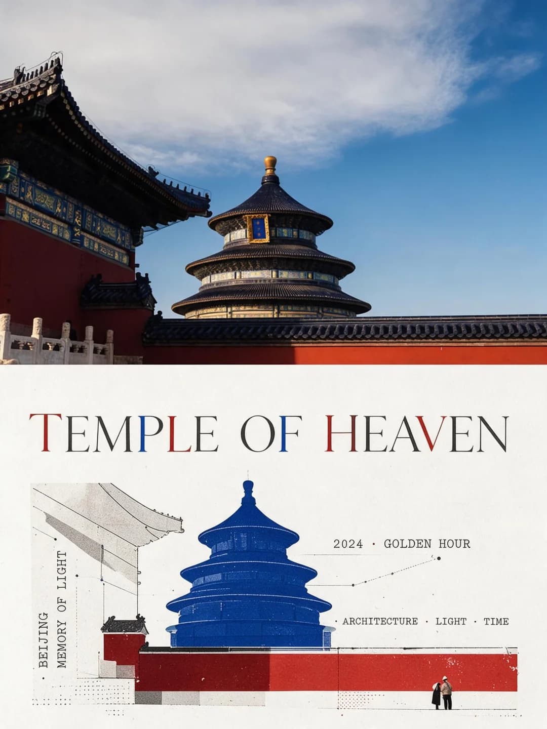
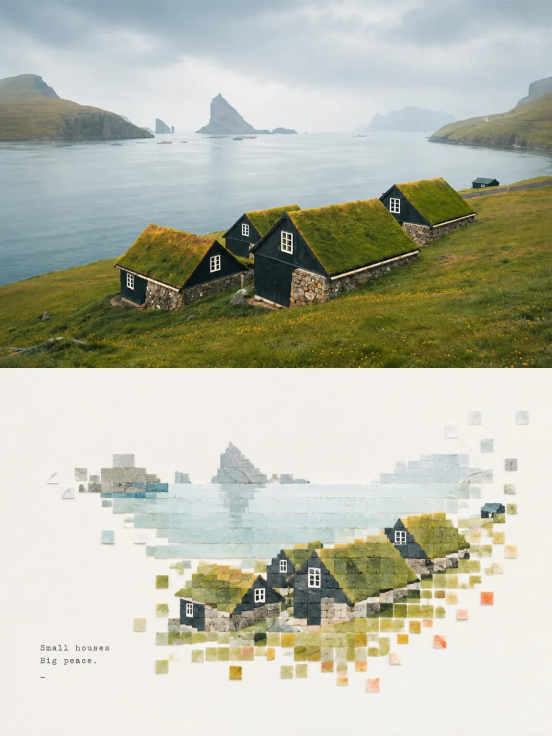
Architectural Sketch Poster
La tua foto in alto, la stessa scena ridisegnata sotto come bozzetto concettuale di un designer
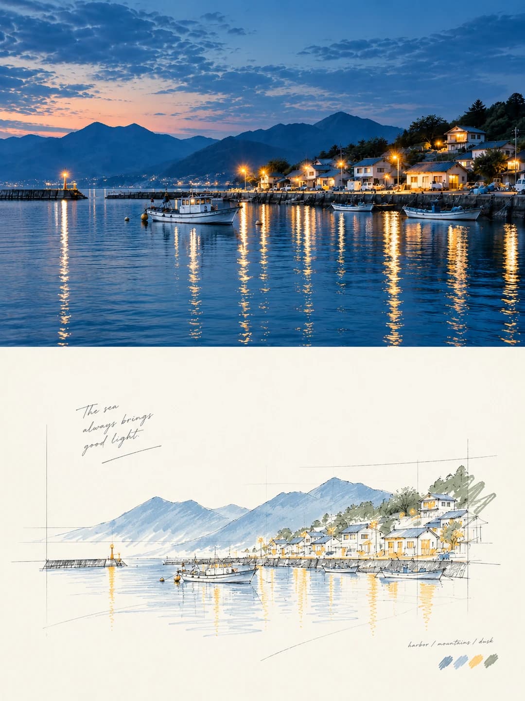
Carica una foto e ottieni un poster in formato 3:4: la tua fotografia in alto e la stessa scena ridisegnata sotto come uno schizzo prospettico a mano libera — con linee di costruzione a vista, colore solo dove serve davvero e un'ampia porzione di foglio bianco.
100 crediti per immagine · circa un minuto · I nuovi account ricevono 500 crediti — 5 immagini gratuite.
Provalo con la tua foto
I nuovi account ricevono 500 crediti — 5 immagini gratuite.
Esempi
Ogni immagine qui sotto è stata creata con il prompt di questa pagina.
Che cos’è un Architectural Sketch Poster?
Un poster in stile bozzetto architettonico divide una cornice 3:4 in due metà uguali. La metà superiore mostra la tua fotografia, con una leggera correzione colore e per il resto inalterata. La metà inferiore è carta bianco sporco con la stessa scena ridisegnata come prospettiva concettuale di architettura: un disegno a mano libera che mantiene visibili linee guida, prolungamenti e riferimenti geometrici, in modo da sembrare un progetto in fase di studio piuttosto che un rendering finito. Il colore compare solo dove ha una funzione specifica: sul soggetto, su un bordo strutturale o su un'ombra. Gran parte dell'immagine è lasciata volutamente vuota, con una breve dicitura che si inserisce discretamente nello spazio bianco.
Quali foto funzionano bene?
Soprattutto edifici: una via di case, un porticciolo, un tempio, un ponte, una facciata. Funziona bene anche su qualsiasi elemento con una struttura e una profondità definite: una barca, un veicolo, una scala o un paesaggio con un orizzonte marcato. Lo schizzo ha bisogno di bordi e prospettiva da tracciare.
Quali foto danno problemi?
Ritratti e primi piani. Uno schizzo con linee di costruzione valorizza l'architettura ma non si adatta ai volti. È poco efficace anche su scene basate solo su texture — vegetazione fitta, folla, specchi d'acqua senza strutture — perché manca la geometria a cui agganciare le linee guida.
Come trasformare una foto in Architectural Sketch Poster
- 1
Scegli un effetto
Sfoglia gli esempi su ogni pagina dello strumento per vedere esattamente cosa otterrai prima di spendere qualsiasi cosa.
- 2
Carica la tua foto
JPEG, PNG o WebP, fino a 12 MB. La tua foto rimane privata e non viene mai utilizzata per addestrare nulla.
- 3
Aggiungi la tua didascalia
La maggior parte degli effetti ti permette di impostare il testo che appare nell'immagine finale, in qualsiasi lingua.
- 4
Scarica il risultato
Ottieni un'immagine ad alta risoluzione, tua da usare. 2K costa 100 crediti, 4K costa 200.
Il prompt dietro questo strumento
Questo è il prompt completo, tradotto in inglese. Copialo e usalo con qualsiasi modello di immagine che accetti una foto di riferimento.
Turn the uploaded photo into a single high-end design poster — not a collage of several images. Use a vertical 3:4 composition split into two zones of strictly equal height, 50% each.

The top zone keeps the original photograph: the subject's identity, structure, posture, real texture, natural light and original colour mood all preserved, with only light high-end grading so it carries the feel of an art magazine or an exhibition print. The environment may be extended naturally to fit the frame, but the subject must not be stretched, distorted or altered.

The bottom zone takes only the most recognisable subject, contours, structure, posture and narrative relationships from the photograph and rebuilds them as an architectural concept perspective sketch — the kind of freehand drawing used to present a scheme. Do not preserve the scene in full and do not copy the photograph object by object. Actively delete most of the background, the secondary scenery and any irrelevant detail, keeping only the core forms, the spatial relationships and the visual hooks that stand for the original subject.

Make a fresh artistic judgement in the bottom zone. Even if the original is badly composed, has a cluttered background or a small subject, rescue it into a picture that stands up — through deletion, rearrangement, cropping, changes of scale and white space. The model genuinely has the authority to re-direct the frame.

The style is a free, hand-drawn perspective line drawing plus a small amount of selective colour. Lines are relaxed and restrained, with a slight sense of repetition and hesitation. A few auxiliary lines, extension lines, construction lines and the geometric reference lines of architectural hand-drawing may be left in, so the drawing reads clearly as design thinking in progress. Colour is laid in lightly and only at a few key places — to emphasise the subject, the structural hierarchy, a patch of shadow or a spatial focal point. Leave the rest of the surface undrawn.

Deliberate, generous white space must be the core of the image. The subject should be smaller and more distilled, with the rest of the space left largely empty. That emptiness is not a blank background; it is part of the composition, and it should work with the subject, the line work, the reference lines, the shadows and the few colour patches to produce breathing room, a sense of space and rhythm. The subject may sit off-centre, run to an edge, be partly cropped or reduced in scale. Draw too little rather than filling the frame.

A few geometric shadow blocks may be added to strengthen mass, depth and spatial layering, but avoid heavy rendering, complex surroundings and the look of a photorealistic architectural visualisation. Keep the background minimal, with only the faintest suggestion of a site.

For colour, take the two to four most recognisable and alive colours from the photograph above and reorganise them into a cleaner, more restrained, more durable sketch palette. The whole may be lifted, purified and de-greyed a little, built mainly on off-white, light grey, warm grey, soft green, pale wood and pale blue-grey, with a small amount of a brighter but never harsh accent colour retained in places. Avoid dirty greys, murkiness, an over-vintage look and cheap high saturation.

Text — generated
Type is an editorial intervention only, and kept to a minimum. Any language is allowed. Generate a few words, a short phrase or an annotation from the subject, the place, the action or the mood, and let it settle quietly into the white space, holding a restrained relationship between image and type.
Domande frequenti
Modificherà le persone o il soggetto nella mia foto?
- Non nella metà superiore: quella è la tua fotografia, e il prompt consente solo una leggera correzione e l'estensione naturale dello sfondo per adattarsi al formato. La metà inferiore ha invece la piena licenza di rielaborare la scena: elimina la maggior parte dello sfondo e conserva solo le forme rappresentative dell'originale, creando un'interpretazione anziché un ricalco.
Posso scegliere il titolo principale?
- Sì, ed è il metodo più sicuro. Se inserisci il tuo titolo e la riga di annotazione, il modello li trascriverà esattamente come scritti. Se li lasci in bianco, genererà una propria frase in base a ciò che vede nella foto, con un risultato meno prevedibile.
In che lingua può essere il titolo?
- Qualsiasi lingua: il prompt non impone alcuna restrizione e il modello inserisce il testo fornito. Le frasi brevi si adattano meglio allo stile: poche parole nello spazio bianco funzionano meglio di una frase lunga.
Da dove provengono i colori?
- Dalla tua foto. Il prompt istruisce il modello di estrarre da due a quattro colori rappresentativi dall'originale e riorganizzarli in una palette da schizzo più pulita — principalmente bianco sporco, grigi, verde tenue e blu-grigio chiaro, con un piccolo accento riservato ai punti chiave. La maggior parte del disegno rimane volutamente non colorata.
Perché ci sono tratti di matita sparsi nel disegno?
- Sono voluti. Il prompt richiede che le linee di costruzione, i prolungamenti e i riferimenti geometrici del disegno d'architettura rimangano visibili, in modo che il risultato sembri un'idea in fase di sviluppo e non un rendering finale. Rimuoverli renderebbe l'illustrazione molto più ordinaria.
Che dimensioni otterrò?
- Il formato 2K è 1792 × 2400 pixel, ideale per stampe formato poster. Il 4K raddoppia la risoluzione e costa 200 crediti invece di 100.
Posso usare un mio prompt personalizzato?
- Non all'interno di questo strumento, che esegue un prompt fisso. Il testo completo è pubblicato in questa pagina, così puoi copiarlo e utilizzarlo dove preferisci con i tuoi image prompt.
Cosa succede alla mia foto?
- Viene salvata in modo privato per consentire la generazione e poi eliminata programmasticamente. Non viene mai resa pubblica, né mostrata ad altri utenti o usata per addestrare modelli.