
World Maps Infographics PowerPoint Template
Quick Navigation
Tags
Share the slides
World Maps Infographics PowerPoint Template
Detailed view of each slide page, including layout, key content and visual elements.
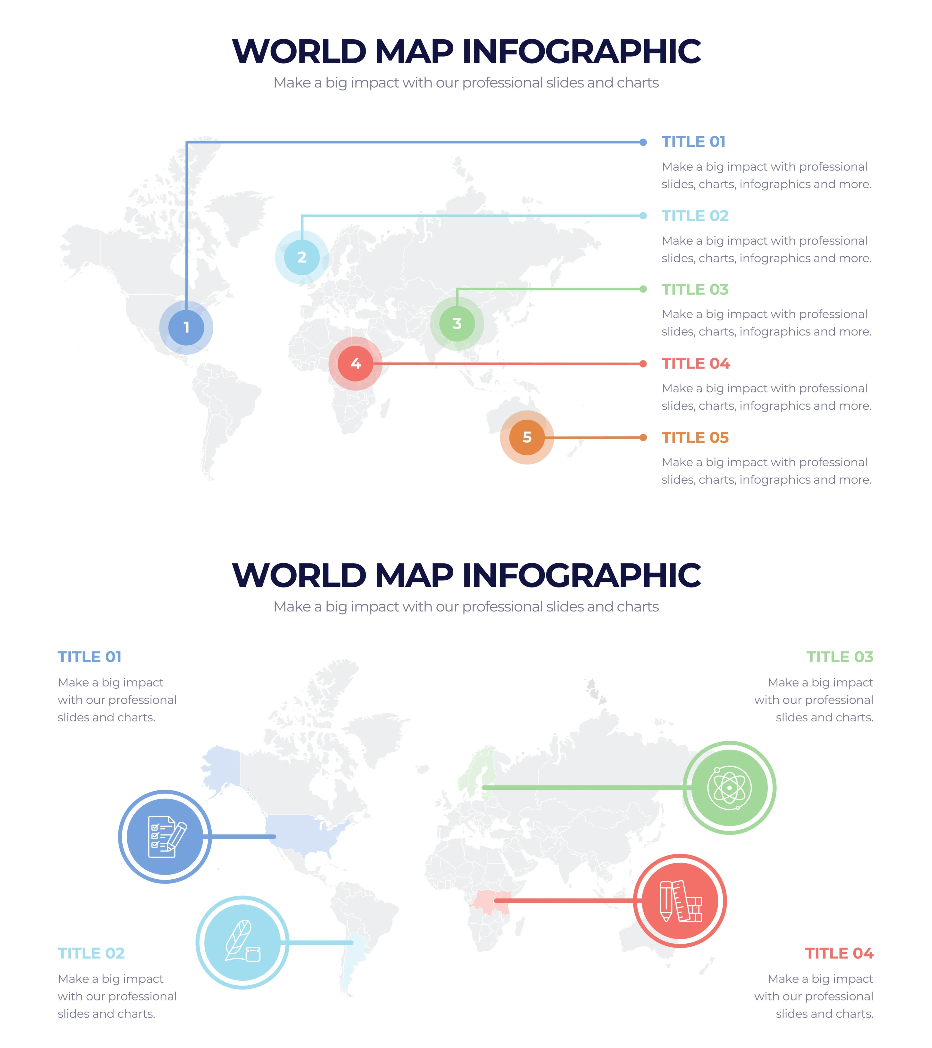
World map with 5 numbered circle markers connected by lines to text labels on the right side, showing hierarchical geographic data points
Full-width world map background with numbered markers (1-5) on left, connected via horizontal lines to title/description pairs on right
World map with 4 icon circles placed on key regions (North America, Europe, Asia, Southern Hemisphere) with labels on both sides
Centered world map with 4 icon circles connected by horizontal lines to descriptions positioned in corners
World map with colored dot pins and 3 category cards on the left featuring transport icons (airplane, truck, ship)
Right-aligned world map with colorful pin dots, left side has 3 stacked rounded-corner cards with transport icons
World map with 4 location pin markers featuring icons (building, landscape, mountains, beach) placed on different continents
Left side has numbered list (01-04) with descriptions, right side shows world map with themed location pins
World map with 4 data callout badges showing numeric values (500K, 169K, 250K, 789K) placed on different regions with icon circles
Left-aligned world map with callout badges, right side has gray panel with 4 titled legend items
World map with 5 color-coded continent regions paired with vertical bar charts showing values (22M, 500K, 800K, 750K, 500K)
Left side has numbered list (01-05), center/right shows color-shaded continents with bar chart indicators below
World map with 3 translucent bubble zones highlighting North America (805K), Asia (1.9M), and South America (465K)
Left side has 3 titled sections with color bars, right shows world map with proportional bubble overlays and value labels
World map with 5 colored title labels positioned across continents, connected by routing lines to sport/activity icons on the right
Centered world map with colored label bars positioned at different regions, connected to activity icons (microphone, volleyball, swimming, skating, gymnastics) on right
World map with 4 colored ray/beam shapes emanating from different regions, featuring healthcare-related icons
Four corner-positioned data blocks with healthcare icons, connected to central map by triangular ray shapes
World map with colored person icons (people figures) distributed across continents showing population or workforce distribution in 4 categories
Left side has 4 category cards with person icons, right shows world map with scattered colored person figures
World map with 4 airplane markers connected by dashed curved flight route arcs across different global routes
Centered world map with curved dashed arc paths, right side has 4 arrow-shaped legend items with titles
World map with 4 donut/gauge charts showing percentages (25%, 80%, 40%, 50%) placed over different regions
Left-aligned world map with gauge overlay charts, right side has 4 colored banner labels
World map with scattered colored hexagon markers and 4 agriculture-themed hexagon icons (rose, lettuce, broccoli, radish) in corners
Four corner positions with agriculture hexagon icons and titles, center has world map with scattered colored hexagonal markers
World map divided into 5 color-coded continent regions with chevron arrows and percentage progress bar overlays (87%, 47%, 95%, 20%, 10%)
Left side has 5 titled sections with chevron arrows, right shows color-shaded world map with percentage progress bars on each region
World map with numerous colored circle pin markers distributed globally in 4 categories with legend on the right
Left/center world map with pin markers, right side has 4-item legend with circle color indicators and descriptions
World map with 4 color-coded continent groups, pandemic/health themed icons, and a numbered process flow (01-04) at bottom
Four data blocks in corners with health/science icons, central colored continent map, bottom numbered process flow
World map with 3 rounded callout cards featuring finance icons (security, money, tools) positioned at key locations, plus a legend with percentage bars (27%, 35%, 89%, 54%)
Left side has title block and percentage legend bars, right shows world map with positioned finance-themed callout cards
World map with male/female person silhouettes distributed globally, showing 60%/40% gender split with two demographic circles
Left/center world map with person silhouettes in two shades of blue, right side has title and two large percentage circles
World map with 4 lettered categories (A, B, C, D) showing percentage callout badges (27%, 45%, 68%, 98%) on different regions
Top row has 4 titled columns (A-D) with descriptions, below shows world map with positioned percentage callout badges
World map with 4 regional bar chart indicators showing percentages (87%, 25%, 39%, 91%) with finance-themed icons (discount, money, wallet, piggy bank)
Left side has title and 4 horizontal color bars, right shows world map with vertical bar chart overlays and finance icon bubbles
Common questions about this slide and the underlying presentation content.
This template includes 20 unique world map infographic slide layouts, each featuring a different data visualization style such as pin maps, bubble charts, bar charts, donut gauges, flight route arcs, heat maps, demographic distributions, and more.
Yes, all slides feature fully editable placeholder text, numeric values, percentages, and icons. Simply click on any element to replace the sample data (like 500,000 or 87%) with your own real data and customize titles and descriptions.
The template covers a wide range of styles including numbered point maps, icon-based category maps, transport/logistics routing, location pin markers, value callout badges, color-coded continent regions, bubble zone overlays, flight route arcs, donut gauge charts, hexagonal scatter plots, progress bars, demographic distributions, and bar chart overlays.
The template uses a consistent 4-color pastel scheme: navy blue, light cyan/sky blue, sage green, and coral/salmon red. This professional palette works well in corporate and academic settings while maintaining clear visual differentiation between data categories.
These slides are versatile for many industries including international business strategy, logistics and supply chain, healthcare and demographics, finance and market analysis, travel and tourism, agriculture, and education. The template includes industry-specific icon sets that can be customized.
The template uses standard 16:9 widescreen format, making it compatible with modern displays and projectors. It is available as both PDF for preview and PPTX for editing in Microsoft PowerPoint, Google Slides, or Keynote.
Absolutely. Each of the 20 slides is self-contained with its own layout and visualization style. You can pick and choose individual slides that best match your data story and insert them into any existing presentation.
The template features a diverse range of thematic icons across slides including transport (airplane, truck, ship), healthcare (stethoscope, hospital), finance (wallet, piggy bank), agriculture (vegetables), sports (volleyball, swimming), and technology icons. These are built into the slide designs and can be swapped with your own icons.

Create Your Own Slides
Turn your ideas into professional presentations in seconds with 2slides AI.
Reference professional designs, choose your style, and generate slides with perfect text rendering. Powered by Nano Banana—start creating your presentation now.
Your AI Agent for slides. Save time, shine faster with intelligent presentation creation.




© 2026 2slides. All rights reserved.