2Slides Logo
Preview

GitHub 2026 Brand Guidelines

89 slide

GitHub 2026 Brand Guidelines - Comprehensive visual identity system covering brand attributes, logos, sub-branding, co-branding, illustration, color, mascots, icons, diagrams, typography, layout, and experiential design

108 thích
4 tải xuống

Điều Hướng Nhanh

Thẻ

Brand guidelines
GitHub
Design system
Visual identity
Tech brand

Chia sẻ slide

Mô Tả

Chủ Đề Chính

GitHub 2026 Brand Guidelines - Comprehensive visual identity system covering brand attributes, logos, sub-branding, co-branding, illustration, color, mascots, icons, diagrams, typography, layout, and experiential design

Lợi Ích Chính

  • Complete 89-page brand identity system from one of the world's most recognized developer platforms
  • Four major sections: Brand Visual Strategy, Visuals & Illustration, Graphic Devices, and Events & Experiential
  • Detailed sub-branding architecture for Copilot, Security, Actions, Spark, and other products
  • Rich 3D illustration system featuring isometric green cubes, contribution graph motifs, and dithering textures
  • Three beloved mascot characters (Mona, Copilot, Duckie) with detailed usage guidelines and 3D renders

Đối Tượng Mục Tiêu

  • Brand designers and creative directors at tech companies
  • Design system architects building scalable brand identity frameworks
  • Marketing teams creating developer-focused brand experiences
  • Event designers planning conference booths and experiential activations
  • Design students studying world-class brand guideline documentation

Trường Hợp Sử Dụng

  • Brand guidelines template and structural reference for tech companies
  • Design system documentation best practices
  • Sub-branding and product architecture strategy reference
  • Event and experiential design inspiration for developer conferences
  • Typography, color system, and icon library specification reference

Đề Xuất Giá Trị Độc Đáo

  • Masterclass in balancing nerdy developer culture with confident enterprise branding
  • Five brand attributes (Nerdy, Confident, Authentic, Imaginative, Empathetic) each with Copy, Design, and Experience guidelines
  • Innovative contribution graph illustration system that transforms a UI element into a full brand visual language
  • Comprehensive mark hierarchy decision tree for choosing between brand mark, sub-brand lockup, product icon, and expanded lockup
  • Detailed experiential design section with booth tiers, lighting, materials, and interactive installation guidelines

Trang Slide (89)

Xem chi tiết từng trang slide, bao gồm bố cục, nội dung chính và các phần tử trực quan.

Trang 1
title slide

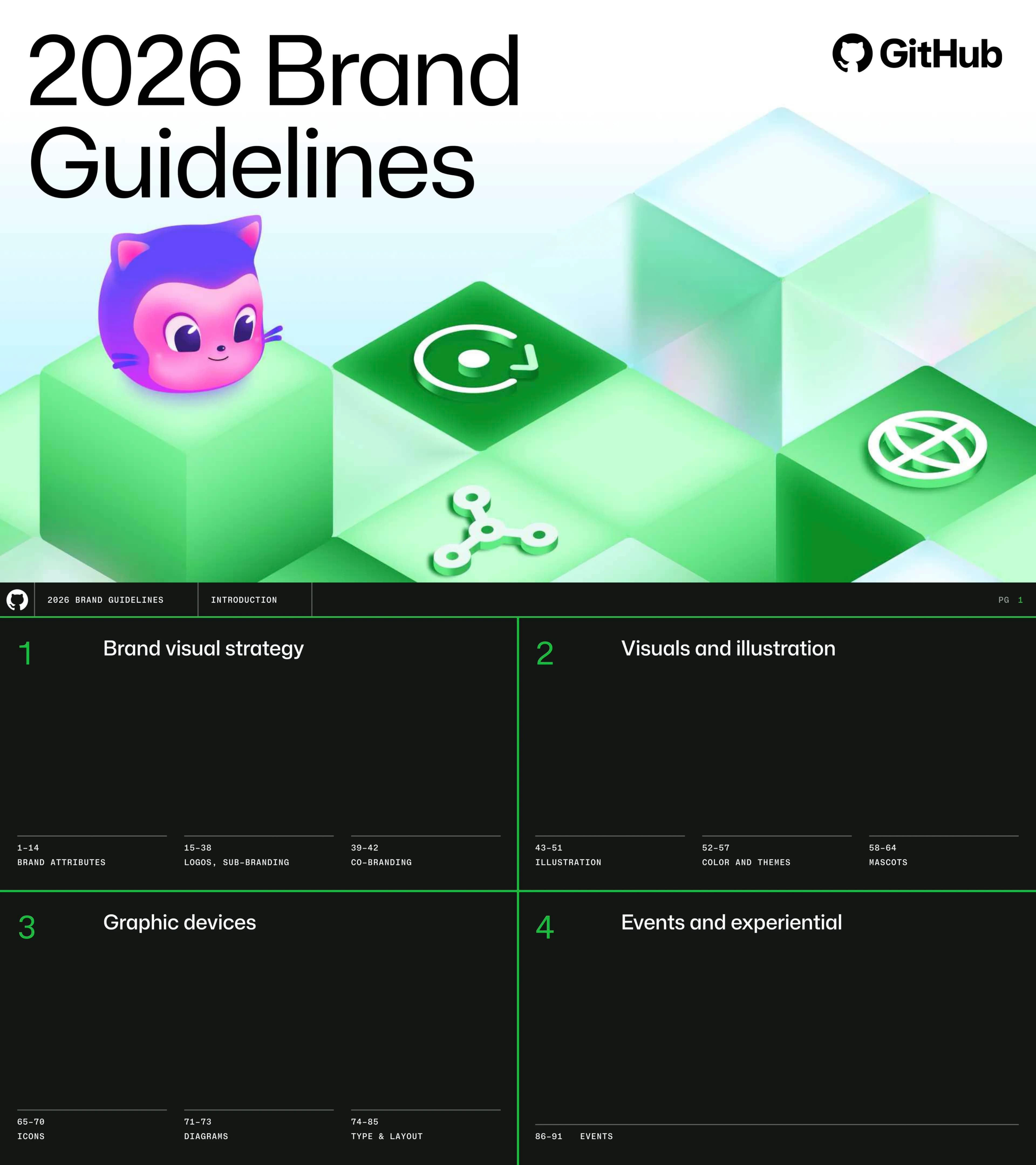
Cover - 2026 Brand Guidelines

Nội Dung

Cover with GitHub logo, 2026 Brand Guidelines title, 3D isometric green cubes with product icons, and Mona mascot

Cấu Trúc Bố Cục

Light gradient background with large black typography left, 3D illustration right

Phần Tử Trực Quan Chính

  • 3D isometric green cubes
  • Mona mascot
  • product icons
  • GitHub Invertocat logo
Trang 2
table of contents

Table of Contents

Nội Dung

Four sections: Brand Visual Strategy, Visuals and Illustration, Graphic Devices, Events and Experiential

Cấu Trúc Bố Cục

Dark background with four quadrants separated by green lines

Phần Tử Trực Quan Chính

  • dark green background
  • green accent lines
  • monospace typography
Trang 3
section divider

Brand Attributes - Section Divider

Nội Dung

Section title: Brand Attributes

Cấu Trúc Bố Cục

Full dark background with large white text bottom-left

Phần Tử Trực Quan Chính

  • dark background
  • oversized white typography
Trang 4
brand attributes

Brand Attributes Overview

Nội Dung

Five brand attributes with icons: Nerdy, Confident, Authentic, Imaginative, Empathetic

Cấu Trúc Bố Cục

Split: intro text left, five attribute rows right on dark background

Phần Tử Trực Quan Chính

  • five custom attribute icons
  • dark background
  • green accent line
Trang 5
brand attributes

Brand Attributes Application

Nội Dung

How attributes apply: GitHub Universe, Copilot, Shop, Enterprise contexts

Cấu Trúc Bố Cục

Four photo cards with attribute tags and descriptions

Phần Tử Trực Quan Chính

  • Universe event photo
  • Copilot UI
  • Shop merchandise
  • Enterprise visual
Trang 6
brand attributes

Nerdy - Visual Examples

Nội Dung

Nerdy attribute: passionate, engineered, technical with examples

Cấu Trúc Bố Cục

Attribute definition top-left, four photo examples spanning full width

Phần Tử Trực Quan Chính

  • Nerdy icon
  • custom keycaps
  • ASCII art
  • space illustration
  • CEO badge
Trang 7
brand guidelines

Nerdy - Application Guidelines

Nội Dung

Copy: precise, technical. Design: monospace, grids. Experiences: deep content, workshops

Cấu Trúc Bố Cục

Split: attribute intro left, three guideline sections right

Phần Tử Trực Quan Chính

  • monospace section headers
  • Copy/Design/Experiences categories
Trang 8
brand attributes

Confident - Visual Examples

Nội Dung

Confident attribute: ambitious, trustworthy, intelligent with examples

Cấu Trúc Bố Cục

Attribute definition top-left, five photo/illustration examples

Phần Tử Trực Quan Chính

  • keynote stage photo
  • Issues UI
  • Universe booth
  • 3D mascots
Trang 9
brand guidelines

Confident - Application Guidelines

Nội Dung

Copy: clear, authoritative. Design: colorful, striking. Experiences: deliver on promises

Cấu Trúc Bố Cục

Split: attribute intro left, three guideline sections right

Phần Tử Trực Quan Chính

  • clean text layout
  • monospace headers
Trang 10
brand attributes

Authentic - Visual Examples

Nội Dung

Authentic attribute: trustworthy, vibrant, bright with examples

Cấu Trúc Bố Cục

Attribute definition top-left, five photo examples

Phần Tử Trực Quan Chính

  • GitHub profile screenshot
  • sticker bomb
  • pixel art
  • neon UI
Trang 11
brand guidelines

Authentic - Application Guidelines

Nội Dung

Copy: conversational, plainspoken. Design: clean, expressive. Experiences: encourage interaction

Cấu Trúc Bố Cục

Split: attribute intro left, three guideline sections right

Phần Tử Trực Quan Chính

  • clean text layout
Trang 12
brand attributes

Imaginative - Visual Examples

Nội Dung

Imaginative attribute: playful, transformative, adaptable with examples

Cấu Trúc Bố Cục

Attribute definition top-left, three large photos

Phần Tử Trực Quan Chính

  • Mona illustration
  • 3D explosion art
  • Universe Central entrance
Trang 13
brand guidelines

Imaginative - Application Guidelines

Nội Dung

Copy: aspirational. Design: break conventions. Experiences: transform spaces

Cấu Trúc Bố Cục

Split: attribute intro left, three guideline sections right

Phần Tử Trực Quan Chính

  • clean text layout
Trang 14
brand attributes

Empathetic - Visual Examples

Nội Dung

Empathetic attribute: accessible, interconnected, pragmatic with examples

Cấu Trúc Bố Cục

Attribute definition top-left, photos and color swatches

Phần Tử Trực Quan Chính

  • green/red color scales
  • diverse team photo
  • RKO 26 event arch
Trang 15
brand guidelines

Empathetic - Application Guidelines

Nội Dung

Copy: accessibility first. Design: contrast, context. Experiences: clear wayfinding, diverse speakers

Cấu Trúc Bố Cục

Split: attribute intro left, three guideline sections right

Phần Tử Trực Quan Chính

  • clean text layout
Trang 16
section divider

Logo - Section Divider

Nội Dung

Section title: Logo

Cấu Trúc Bố Cục

Full dark background with large white text bottom-left, PG 15

Phần Tử Trực Quan Chính

  • dark background
  • oversized white Logo text
Trang 17
logo specification

Logo - Invertocat Overview

Nội Dung

Primary logo is the Invertocat (Mona the Octocat). 25% clear space rules

Cấu Trúc Bố Cục

Split: description left with spacing diagram, large Invertocat mark right

Phần Tử Trực Quan Chính

  • large Invertocat mark
  • 1.0X/0.25X spacing diagram
Trang 18
logo specification

Logo - Wordmark Lockup

Nội Dung

Full GitHub logo (Invertocat + wordmark) for external use. 50% height clear space

Cấu Trúc Bố Cục

Description left, large GitHub wordmark lockup center

Phần Tử Trực Quan Chính

  • GitHub wordmark lockup
  • clear space diagram
Trang 19
logo specification

Logo - Placement

Nội Dung

Logo placement: prominent but not predominant. Full logotype, solo Invertocat, corner placement

Cấu Trúc Bố Cục

Three placement examples with grid overlays

Phần Tử Trực Quan Chính

  • three grid overlay examples
  • green/yellow guide lines
Trang 20
logo specification

Logo - Color

Nội Dung

Logo color variants across Light, Light Grey, Dark themes with primary/secondary/accent colors

Cấu Trúc Bố Cục

Three-row grid showing nine logo color variants

Phần Tử Trực Quan Chính

  • nine logo variants
  • three background themes
  • green accent
Trang 21
logo specification

Logo - Unsuccessful Examples

Nội Dung

Don'ts: cropping, overlay, colored logo, altered proportions, effects, rotation

Cấu Trúc Bố Cục

Six prohibited examples with red prohibition icons

Phần Tử Trực Quan Chính

  • six red prohibition examples
Trang 22
brand guidelines

Brand Tagline - Let's build <3

Nội Dung

Tagline usage: standalone and with Invertocat lockup. Strategic placement only

Cấu Trúc Bố Cục

Description left, multiple tagline layout variants right

Phần Tử Trực Quan Chính

  • Let's build <3 variants
  • green heart symbol
Trang 23
section divider

Sub-branding - Section Divider

Nội Dung

Section title: Sub-branding

Cấu Trúc Bố Cục

Full dark background with large white text bottom-left, PG 23

Phần Tử Trực Quan Chính

  • dark background
  • oversized white text
Trang 24
brand architecture

Sub-branding - Brand Mark and Product Icons

Nội Dung

Brand mark hierarchy: GitHub logotype (default), sub-brand lockups, product icons for in-platform

Cấu Trúc Bố Cục

Description left, brand mark, lockups (Advanced Security, Copilot, Actions), product icon grid right

Phần Tử Trực Quan Chính

  • GitHub brand mark
  • sub-brand lockups
  • nine product icons
Trang 25
brand architecture

Sub-branding - Context-Dependent Lockups

Nội Dung

Lockup flexibility: Invertocat only, sub-brand lockup, expanded lockup based on context

Cấu Trúc Bố Cục

Three-column comparison with product UI examples

Phần Tử Trực Quan Chính

  • three lockup tiers
  • Copilot coding agent
  • Push Protection
Trang 26
brand architecture

Sub-branding - Mark Hierarchy

Nội Dung

Concentric hierarchy: GitHub Core, Sub-Brands, Events. All product lockup variants shown

Cấu Trúc Bố Cục

Venn diagram left, four-column lockup system right

Phần Tử Trực Quan Chính

  • concentric ring diagram
  • full product lockup listing
Trang 27
brand architecture

Sub-branding - Product Layer

Nội Dung

Sub-brand lockup (Mona Sans Display Medium) and expanded lockup variants for all products

Cấu Trúc Bố Cục

Two-tier layout showing lockups for Security, Copilot, Spark, Enterprise, Actions, Issues

Phần Tử Trực Quan Chính

  • sub-brand and expanded lockups
  • navigation example
Trang 28
decision tree

Sub-branding - How to Choose a Mark

Nội Dung

Decision tree: event? product within GitHub? standalone Copilot/Security? product marketing?

Cấu Trúc Bố Cục

Vertical flowchart with YES/NO branches

Phần Tử Trực Quan Chính

  • green YES arrows
  • five decision outcomes
Trang 29
product branding

Sub-branding - Copilot Hero

Nội Dung

Copilot section hero with 3D isometric green cubes and Copilot mascot

Cấu Trúc Bố Cục

Large Copilot title with full-width 3D isometric illustration, PG 30

Phần Tử Trực Quan Chính

  • 3D isometric cubes
  • Copilot mascot
  • product icons
Trang 30
product branding

Sub-branding - Copilot Identity

Nội Dung

Copilot Purple (#8534F3), product lockup, icon variants, 3D mascot illustration

Cấu Trúc Bố Cục

Description and color swatch left, lockup/icon/illustration right, PG 32

Phần Tử Trực Quan Chính

  • Copilot Purple swatch
  • 3D Copilot mascot on green cubes
Trang 31
product branding

Sub-branding - Copilot Color Theme

Nội Dung

Purple dithering texture, core theme fallback, 80/10/5/5 color ratio

Cấu Trúc Bố Cục

Multi-example layout showing dithering, core theme, no-branding approaches, PG 33

Phần Tử Trực Quan Chính

  • purple dithering texture
  • color ratio percentages
Trang 32
product branding

Sub-branding - Product Launches

Nội Dung

Ambient stable (dither + screenshots) vs loud (key art illustrations) for launches

Cấu Trúc Bố Cục

Side-by-side comparison, PG 34

Phần Tử Trực Quan Chính

  • Copilot Next Edit Suggestion UI
  • 3D key art
Trang 33
product branding

Sub-branding - Security Hero

Nội Dung

Security section with 3D isometric green cubes, blue shield icon

Cấu Trúc Bố Cục

Large Security title with 3D illustration, PG 35

Phần Tử Trực Quan Chính

  • 3D blue shield icon
  • green isometric cubes
Trang 34
product branding

Sub-branding - Security Identity

Nội Dung

Security Blue (#3094FF), product lockup, shield icon variants, 3D illustration

Cấu Trúc Bố Cục

Description and blue swatch left, lockup/icon/illustration right, PG 37

Phần Tử Trực Quan Chính

  • Security Blue swatch
  • 3D shield illustration
Trang 35
product branding

Sub-branding - Security Color Theme

Nội Dung

Blue dithering texture, core theme fallback, code scanning UI examples

Cấu Trúc Bố Cục

Multi-example showing blue dithering and no-branding approaches, PG 38

Phần Tử Trực Quan Chính

  • blue dithering texture
  • CodeQL UI
Trang 36
section divider

Co-branding - Section Divider

Nội Dung

Section title: Co-branding

Cấu Trúc Bố Cục

Full dark background with large white text, PG 39

Phần Tử Trực Quan Chính

  • dark background
  • oversized white text
Trang 37
co-branding

Co-branding - Microsoft Partnership

Nội Dung

Default (icons + separator), stacked, horizontal lockups. Equal optical size

Cấu Trúc Bố Cục

Three lockup variants with Microsoft + GitHub logos, PG 40

Phần Tử Trực Quan Chính

  • Microsoft + GitHub lockups
Trang 38
co-branding

Co-branding - Unsuccessful Examples

Nội Dung

Don'ts: extension lockups, overlay, sub-branding, mascots, stacking, Universe logo

Cấu Trúc Bố Cục

Six prohibited examples with red icons, PG 41

Phần Tử Trực Quan Chính

  • six red prohibition examples
  • WCAG AA note
Trang 39
FAQ

Co-branding - FAQ

Nội Dung

Six co-branding FAQs: social media, partnering language, presentations, product names, landing pages, swag

Cấu Trúc Bố Cục

Q&A list format, PG 42

Phần Tử Trực Quan Chính

  • clean Q&A layout
Trang 40
section divider

Illustration - Section Divider

Nội Dung

Section title: Illustration

Cấu Trúc Bố Cục

Full dark background with large white text, PG 43

Phần Tử Trực Quan Chính

  • dark background
  • oversized white text
Trang 41
illustration system

Illustration System Overview

Nội Dung

Three styles: Key illustrations (3D), Contribution graph (creative abstraction), Textures (bitmap)

Cấu Trúc Bố Cục

Three equal columns with examples, PG 44

Phần Tử Trực Quan Chính

  • 3D key art
  • contribution graph squares
  • bitmap texture
Trang 42
illustration system

Key Illustrations

Nội Dung

Detailed, 3D, isometric. Hero the contribution graph with product icons, dithering, mascots

Cấu Trúc Bố Cục

Description left, large 3D illustration right, PG 45

Phần Tử Trực Quan Chính

  • 3D rubber duck
  • isometric green cubes
  • rainbow cube
Trang 43
illustration system

Key Illustration Variations

Nội Dung

Flexible compositions with Mona, Duckie, green cubes in different arrangements

Cấu Trúc Bố Cục

Grid of six illustration variations, PG 46

Phần Tử Trực Quan Chính

  • multiple Mona poses
  • Duckie variations
Trang 44
illustration system

Contribution Graph Illustration

Nội Dung

Transforms contribution graph UI into brand visual. Green/grey/pink squares, mascots

Cấu Trúc Bố Cục

Full illustration with annotations, PG 47

Phần Tử Trực Quan Chính

  • contribution graph reference
  • green square variations
  • Mona mascot
Trang 45
illustration system

Contribution Graph Usage Rules

Nội Dung

Don'ts: isolate, use as background, over-scale, mix with dither. Do: animate, print

Cấu Trúc Bố Cục

Six usage examples with checkmarks/prohibitions, PG 48

Phần Tử Trực Quan Chính

  • prohibited examples
  • Universe t-shirt print
Trang 46
illustration system

Textures - Color Combinations

Nội Dung

Simpler dithering textures for backgrounds and surface patterns

Cấu Trúc Bố Cục

Description left, two application examples right, PG 49

Phần Tử Trực Quan Chính

  • dithering behind UI
  • 3D box mockup
Trang 47
illustration system

Texture Library

Nội Dung

Six dithering patterns: Circle, Heatmap, Gradient, Half Circle, Wave, Oval

Cấu Trúc Bố Cục

Six texture examples in 2x3 grid, PG 50

Phần Tử Trực Quan Chính

  • six dither patterns
Trang 48
illustration system

Texture Color and Contrast

Nội Dung

Two-tone textures: bold triadic/complementary pairs plus monochrome options

Cấu Trúc Bố Cục

Bold two-tone rows top, monochrome columns bottom, PG 51

Phần Tử Trực Quan Chính

  • color pair examples
  • eight monochrome options
Trang 49
section divider

Color - Section Divider

Nội Dung

Section title: Color

Cấu Trúc Bố Cục

Full dark background with large white text, PG 52

Phần Tử Trực Quan Chính

  • dark background
  • oversized white text
Trang 50
color system

Color Palette Overview

Nội Dung

Neutral brand with green accents. Primary (neutrals + green), secondary (6 color families)

Cấu Trúc Bố Cục

Description left, primary palette center, secondary grid right, PG 53

Phần Tử Trực Quan Chính

  • green gradient
  • grey gradient
  • secondary palette grid
Trang 51
color system

Primary Palette - Full Specification

Nội Dung

HEX/RGB/CMYK/Spot for White, Black, Gray 0-9, Green 1-6. 90% neutral, 10% green

Cấu Trúc Bố Cục

Full color swatch grid with specs, PG 54

Phần Tử Trực Quan Chính

  • ten gray swatches
  • six green swatches
  • 90/10 ratio
Trang 52
color system

Secondary Palette - Full Specification

Nội Dung

Theme palettes: DevX (green+pink), Copilot (purple), Security (blue+orange+lime)

Cấu Trúc Bố Cục

Large color grid with full specs, PG 55

Phần Tử Trực Quan Chính

  • six color families x six levels
Trang 53
color system

Text-Based Layout Themes

Nội Dung

Three themes: White, Light Grey, Black. Text on neutrals; color for icons/illustrations

Cấu Trúc Bố Cục

Three Copilot coding agent examples on different backgrounds, PG 56

Phần Tử Trực Quan Chính

  • three theme comparison
Trang 54
color system

Accessibility - Color Contrast

Nội Dung

All text WCAG AA compliant. Primary, Secondary, Accent text pass AA on all backgrounds

Cấu Trúc Bố Cục

Three accessibility panels with AA compliance, PG 57

Phần Tử Trực Quan Chính

  • AA compliance checkmarks
  • contrast ratio demo
Trang 55
section divider

Mascots - Section Divider

Nội Dung

Section title: Mascots

Cấu Trúc Bố Cục

Full dark background with large white text, PG 58

Phần Tử Trực Quan Chính

  • dark background
  • oversized white text
Trang 56
mascot design

Mascots Overview

Nội Dung

Three mascots: Mona (GitHub), Copilot (AI/innovation), Ducky (developers)

Cấu Trúc Bố Cục

Three columns with 3D mascot renders, PG 59

Phần Tử Trực Quan Chính

  • 3D Mona
  • 3D Copilot helmet
  • 3D rubber duck
Trang 57
mascot design

Mona - Character Sheet

Nội Dung

Main brand ambassador. Purple/pink palette. Five angle views

Cấu Trúc Bố Cục

Description left, five 3D renders right, PG 60

Phần Tử Trực Quan Chính

  • five Mona angle views
Trang 58
mascot design

Copilot - Character Sheet

Nội Dung

AI Pair Programmer. Purple/blue with pink. Five angle views

Cấu Trúc Bố Cục

Description left, five 3D renders right, PG 61

Phần Tử Trực Quan Chính

  • five Copilot angle views
Trang 59
mascot design

Duckie - Character Sheet

Nội Dung

Rubber duck debugging salute. Used less frequently. Five angle views

Cấu Trúc Bố Cục

Description left, five 3D renders right, PG 62

Phần Tử Trực Quan Chính

  • five Duckie angle views
Trang 60
mascot design

Mascot Usage Rules

Nội Dung

Do: community, internally, inspire. Don't: as logos, nudge/sell, serious topics

Cấu Trúc Bố Cục

Three-row do/don't grid, PG 63

Phần Tử Trực Quan Chính

  • green checkmarks
  • red prohibitions
Trang 61
mascot design

Alternate Mascot Styles

Nội Dung

Deprecated: Octocat 1.0, Octocat 2.0, Monamoji, Outline style

Cấu Trúc Bố Cục

Four quadrant grid with prohibition icons, PG 64

Phần Tử Trực Quan Chính

  • classic Octocat
  • Monamoji emoji grid
Trang 62
section divider

Icons - Section Divider

Nội Dung

Section title: Icons

Cấu Trúc Bố Cục

Full dark background with large white text, PG 65

Phần Tử Trực Quan Chính

  • dark background
  • oversized white text
Trang 63
icon system

Icons - Octicons and Spot Icons

Nội Dung

Octicons (24px) default. Spot Octicons (60px) larger marketing icons from gitline shapes

Cấu Trúc Bố Cục

Octicons grid bottom-left, Spot Octicons grid right, PG 66

Phần Tử Trực Quan Chính

  • ~75 Octicons
  • ~60 Spot Octicons
Trang 64
icon system

Icons - Size Guidelines

Nội Dung

16-30px Octicons, 31-54px dead zone, 55-96px Marketing icons, 128px+ illustrations

Cấu Trúc Bố Cục

Four size tiers with examples, PG 67

Phần Tử Trực Quan Chính

  • four size tiers
  • checkmarks/prohibitions
Trang 65
icon system

Icons - Spot Octicons Gallery

Nội Dung

Complete 60+ Spot Octicons set built from gitline shapes (timeline + commit circle)

Cấu Trúc Bố Cục

Full icon gallery grid, PG 68

Phần Tử Trực Quan Chính

  • 60+ spot icons in grid
Trang 66
icon system

Icons - Variants and Components

Nội Dung

Icon variants for dark, white, light green, light grey themes plus flat versions

Cấu Trúc Bố Cục

Four-column theme comparison, PG 69

Phần Tử Trực Quan Chính

  • four theme icon variants
Trang 67
icon system

Icons - Wondergraph Usage

Nội Dung

Building compositions with icons: ground subject matter, add sub-brand colors

Cấu Trúc Bố Cục

Description left, two blog card examples right, PG 70

Phần Tử Trực Quan Chính

  • blog card compositions
Trang 68
section divider

Diagrams - Section Divider

Nội Dung

Section title: Diagrams

Cấu Trúc Bố Cục

Full dark background with large white text, PG 71

Phần Tử Trực Quan Chính

  • dark background
  • oversized white text
Trang 69
diagram guidelines

Diagrams - Charts and Graphs

Nội Dung

Accurate, informative. Every line and color choice matters. Bar charts, scatter plots, partner grids

Cấu Trúc Bố Cục

Description left, three chart examples right, PG 72

Phần Tử Trực Quan Chính

  • purple bar charts
  • scatter plot
  • partner grid
Trang 70
diagram guidelines

Diagrams - Infographics

Nội Dung

Spot icons + type for non-comparative claims. Purple-themed for Copilot. Green accent border

Cấu Trúc Bố Cục

Three stat cards with annotations, PG 73

Phần Tử Trực Quan Chính

  • purple-themed stat cards
  • green accent border
Trang 71
section divider

Typography - Section Divider

Nội Dung

Section title: Typography

Cấu Trúc Bố Cục

Full dark background with large white text, PG 74

Phần Tử Trực Quan Chính

  • dark background
  • oversized white text
Trang 72
typography

Typography - Mona Sans

Nội Dung

Primary: Mona Sans (Regular + Medium). Companion: Mona Sans Mono for code/style

Cấu Trúc Bố Cục

Description left, alphabet specimens bottom, PG 75

Phần Tử Trực Quan Chính

  • Mona Sans specimen
  • Mona Sans Mono specimen
Trang 73
typography

Typography - Type Scale

Nội Dung

OPSZ axis V2.08+. H0 Display 110/110, Body Large 17/26, Pullquote Mono 58/68

Cấu Trúc Bố Cục

Type scale specimens with size/weight specs, PG 76

Phần Tử Trực Quan Chính

  • H0 display specimen
  • optical size toggle
Trang 74
typography

Typography - Headlines

Nội Dung

H0-H6 hierarchy (160px to 19px). Display Regular for larger, Medium for smaller

Cấu Trúc Bố Cục

Full headline hierarchy H0-H6 with bar chart, PG 77

Phần Tử Trực Quan Chính

  • seven headline specimens
  • green bar chart
Trang 75
typography

Typography - Body Styles

Nội Dung

Body XL through Footnote. Blockquote Mono 58/68. Caption, Eyebrow, Footnote styles

Cấu Trúc Bố Cục

Full body text specimen grid, PG 78

Phần Tử Trực Quan Chính

  • Blockquote monospace
  • body bar chart
Trang 76
typography

Typography - Type Pairing

Nội Dung

Pairings: Eyebrow+Headline, Medium+Medium, Eyebrow Justified, Headline+Body

Cấu Trúc Bố Cục

Six type pairing examples, PG 79

Phần Tử Trực Quan Chính

  • six pairing box examples
Trang 77
typography

Typography - Unsuccessful Examples

Nội Dung

Don'ts: other width styles, uppercase multiline mono, ligatures, manual tracking

Cấu Trúc Bố Cục

Four prohibited examples with comparisons, PG 80

Phần Tử Trực Quan Chính

  • four red/green comparison pairs
Trang 78
section divider

Layout - Section Divider

Nội Dung

Section title: Layout

Cấu Trúc Bố Cục

Full dark background with large white text, PG 81

Phần Tử Trực Quan Chính

  • dark background
  • oversized white text
Trang 79
layout system

Layout - Grid System

Nội Dung

Strict grid adherence. Grids/margins (red), proportions (1/3, 1/2, 2/3), accent border

Cấu Trúc Bố Cục

Grid overlay on Copilot example with annotations, PG 82

Phần Tử Trực Quan Chính

  • red/yellow grid overlay
  • green accent border
Trang 80
layout system

Layout - Borders

Nội Dung

Border default 2px, subtle 2px, accent 4px green. One accent per composition

Cấu Trúc Bố Cục

Universe attendee card with grid overlay, PG 83

Phần Tử Trực Quan Chính

  • border specifications
  • accent border annotation
Trang 81
layout system

Layout - The Grid in Practice

Nội Dung

Content floats to edges, big empty middle. Footer/header feel consistent and technical

Cấu Trúc Bố Cục

Two layout examples with alignment annotations, PG 84

Phần Tử Trực Quan Chính

  • ebook spread
  • Forrester quote
Trang 82
layout system

Layout - Unsuccessful Examples

Nội Dung

Don'ts: color mixing in headlines, hugging content

Cấu Trúc Bố Cục

Two prohibited examples with comparisons, PG 85

Phần Tử Trực Quan Chính

  • color mixing comparison
  • hugging content comparison
Trang 83
section divider

Experiential - Section Divider

Nội Dung

Section title: Experiential

Cấu Trúc Bố Cục

Full dark background with large white text, PG 86

Phần Tử Trực Quan Chính

  • dark background
  • oversized white text
Trang 84
experiential design

Experiential - Booth Design Principles

Nội Dung

Six principles: Brand forward, Material honesty, Interactive, Comfortable, Modular, Visionary

Cấu Trúc Bố Cục

Statement text top, six principle cards in 2x3 grid, PG 87

Phần Tử Trực Quan Chính

  • six custom principle icons
Trang 85
experiential design

Experiential - Build and Construction

Nội Dung

Do's: wood/metal materials, 3D details, LED. Don'ts: flat vinyl, generic furniture. Hero moment required

Cấu Trúc Bố Cục

Do/Don't list left, nine booth photos right, PG 88

Phần Tử Trực Quan Chính

  • nine booth reference photos
Trang 86
experiential design

Experiential - Interactive Installation

Nội Dung

Every booth needs at least one interactive element: inflatables, stickers, games, demos

Cấu Trúc Bố Cục

Description left, six interactive booth photos right, PG 89

Phần Tử Trực Quan Chính

  • inflatable flowers
  • peg board game
  • AR touchscreen
Trang 87
experiential design

Experiential - Lighting

Nội Dung

Tonal ambient lighting for visual separation. Color temperature sets mood

Cấu Trúc Bố Cục

Description left, four lighting photos right, PG 90

Phần Tử Trực Quan Chính

  • neon booth examples
  • color temperature guidance
Trang 88
experiential design

Experiential - Budget and Constraints

Nội Dung

Three tiers: Lightweight Presence, Mid-Tier Booth, Custom High-Impact

Cấu Trúc Bố Cục

Three tier columns with photos and descriptions, PG 91

Phần Tử Trực Quan Chính

  • three tier reference photos
Trang 89
closing slide

Closing - Questions?

Nội Dung

Contact: brand.github.com toolkit, brand-marketing-design@github.com

Cấu Trúc Bố Cục

Dark background with contact details, PG 92

Phần Tử Trực Quan Chính

  • contact information

Câu Hỏi Thường Gặp

Các câu hỏi phổ biến về slide này và nội dung trình bày cơ bản.

What type of document is the GitHub 2026 Brand Guidelines?

This is a comprehensive 89-page brand identity system covering all aspects of GitHub's visual identity for 2026. It is organized into four major sections: Brand Visual Strategy (brand attributes, logos, sub-branding, co-branding), Visuals and Illustration (illustration system, color, mascots), Graphic Devices (icons, diagrams, typography, layout), and Events and Experiential (booth design, construction, interactive installations, lighting).

What are GitHub's five brand attributes?

GitHub defines five brand attributes: 1) Nerdy (passionate about code, engineered, technical), 2) Confident (ambitious, trustworthy, intelligent), 3) Authentic (true to themselves and community), 4) Imaginative (playful, transformative, adaptable), 5) Empathetic (accessible, interconnected, pragmatic). Each includes Copy, Design, and Experiences guidelines.

What design system does this brand guideline use?

GitHub uses a dark-first design system with the Mona Sans typeface family (sans-serif + monospace), a neutral primary palette anchored by grays/blacks/whites with green accents (#0FBF3E), and product-specific secondary palettes (purple for Copilot, blue for Security). The visual system features 3D isometric illustrations, contribution graph motifs, dithering textures, and three 3D mascots (Mona, Copilot, Duckie).

How does GitHub handle sub-branding for products like Copilot?

GitHub uses a tiered mark hierarchy: Invertocat-only when context is clear, sub-brand lockups (Invertocat + product name) for standalone marketing, and expanded lockups (Invertocat + GitHub + product name) when audience may not know GitHub. Copilot has its own purple theme (#8534F3), Security has blue (#3094FF). A decision tree flowchart guides lockup selection.

What typography system does GitHub use?

Mona Sans with optical sizing (OPSZ V2.08+). Headlines use Display Regular (H0 at 110px) and Medium (H3-H6). Body uses Regular (15/25 main) and Medium (17/26 large). Mona Sans Mono for code, blockquotes, eyebrows, and footnotes. Ligatures must be off; manual tracking prohibited in favor of OPSZ.

What illustration styles does GitHub use?

Three styles: 1) Key illustrations - detailed 3D isometric scenes with green cubes, product icons, and mascots for big brand moments. 2) Contribution graph - creative abstraction of the GitHub profile grid using green/grey/pink squares. 3) Textures - bitmap dithering patterns (circle, heatmap, gradient, wave, oval, half circle) in various color combinations.

Who are GitHub's three mascots?

Mona - pink/purple Octocat (part cat, part octopus), the main brand ambassador. Copilot - blue/purple robot helmet representing AI and innovation. Duckie - yellow rubber duck saluting developer debugging tradition, used sparingly.

What makes the experiential design section unique?

It covers six design principles, three budget tiers (lightweight to custom fabrication), materials guidance (always include one non-printed premium element), lighting direction (tonal ambient + color temperature), and a mandate for at least one interactive installation at every booth.

2slides

Create Your Own Slides

Turn your ideas into professional presentations in seconds with 2slides AI.

Tạo Slide Đẳng Cấp Thế Giới Trong Vài Giây

Tham khảo thiết kế chuyên nghiệp, chọn phong cách của bạn và tạo slide với kết xuất văn bản hoàn hảo. Được hỗ trợ bởi Nano Banana—bắt đầu tạo trình bày của bạn ngay bây giờ.

© 2026 2slides. All rights reserved.