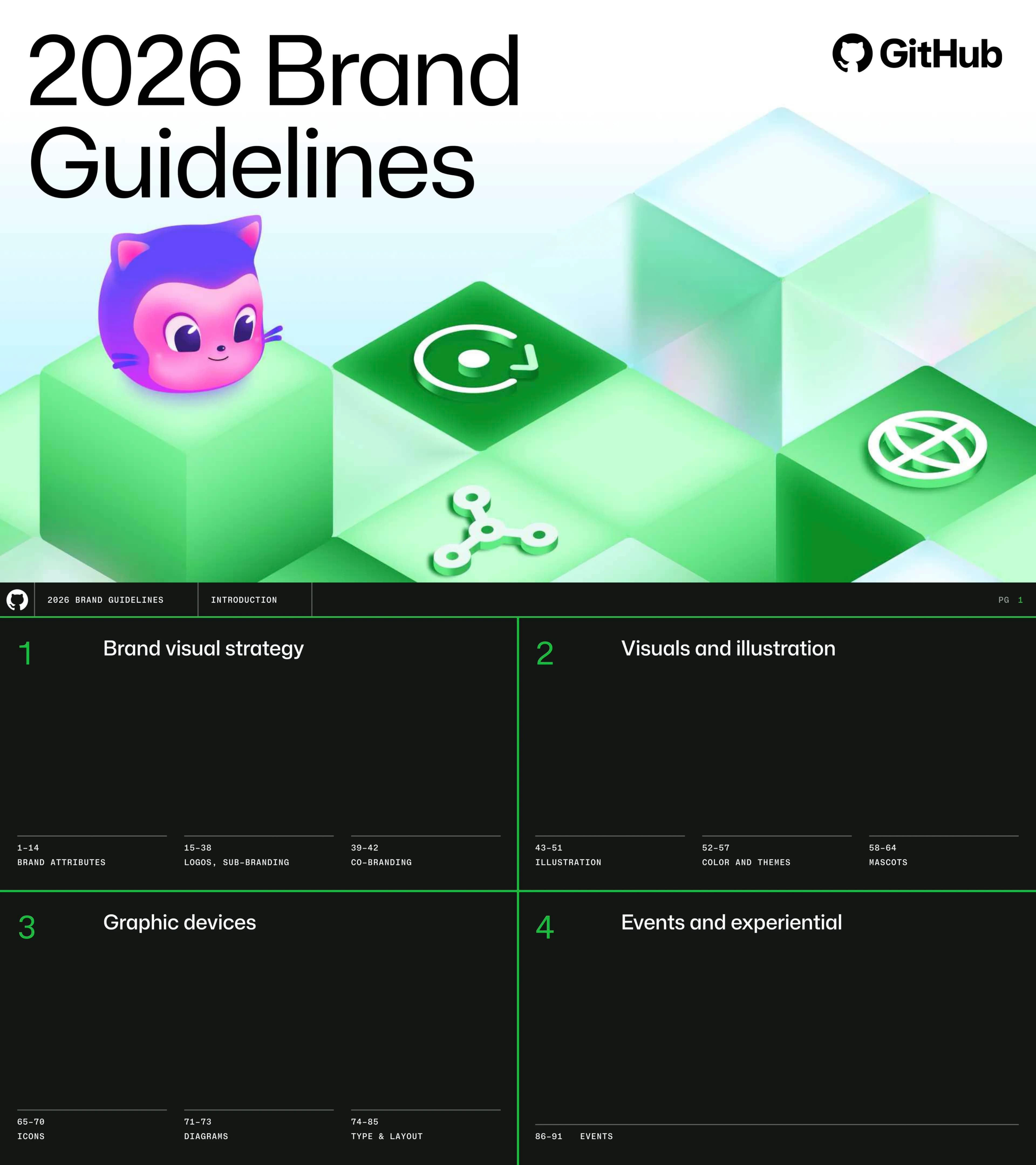
GitHub 2026 Brand Guidelines - Comprehensive visual identity system covering brand attributes, logos, sub-branding, co-branding, illustration, color, mascots, icons, diagrams, typography, layout, and experiential design
การนำทางด่วน
แท็ก
แชร์สไลด์
GitHub 2026 Brand Guidelines - Comprehensive visual identity system covering brand attributes, logos, sub-branding, co-branding, illustration, color, mascots, icons, diagrams, typography, layout, and experiential design
มุมมองรายละเอียดของแต่ละหน้าสไลด์ รวมถึงlayout เนื้อหาหลักและองค์ประกอบภาพ
Cover with GitHub logo, 2026 Brand Guidelines title, 3D isometric green cubes with product icons, and Mona mascot
Light gradient background with large black typography left, 3D illustration right
Four sections: Brand Visual Strategy, Visuals and Illustration, Graphic Devices, Events and Experiential
Dark background with four quadrants separated by green lines
Section title: Brand Attributes
Full dark background with large white text bottom-left
Five brand attributes with icons: Nerdy, Confident, Authentic, Imaginative, Empathetic
Split: intro text left, five attribute rows right on dark background
How attributes apply: GitHub Universe, Copilot, Shop, Enterprise contexts
Four photo cards with attribute tags and descriptions
Nerdy attribute: passionate, engineered, technical with examples
Attribute definition top-left, four photo examples spanning full width
Copy: precise, technical. Design: monospace, grids. Experiences: deep content, workshops
Split: attribute intro left, three guideline sections right
Confident attribute: ambitious, trustworthy, intelligent with examples
Attribute definition top-left, five photo/illustration examples
Copy: clear, authoritative. Design: colorful, striking. Experiences: deliver on promises
Split: attribute intro left, three guideline sections right
Authentic attribute: trustworthy, vibrant, bright with examples
Attribute definition top-left, five photo examples
Copy: conversational, plainspoken. Design: clean, expressive. Experiences: encourage interaction
Split: attribute intro left, three guideline sections right
Imaginative attribute: playful, transformative, adaptable with examples
Attribute definition top-left, three large photos
Copy: aspirational. Design: break conventions. Experiences: transform spaces
Split: attribute intro left, three guideline sections right
Empathetic attribute: accessible, interconnected, pragmatic with examples
Attribute definition top-left, photos and color swatches
Copy: accessibility first. Design: contrast, context. Experiences: clear wayfinding, diverse speakers
Split: attribute intro left, three guideline sections right
Section title: Logo
Full dark background with large white text bottom-left, PG 15
Primary logo is the Invertocat (Mona the Octocat). 25% clear space rules
Split: description left with spacing diagram, large Invertocat mark right
Full GitHub logo (Invertocat + wordmark) for external use. 50% height clear space
Description left, large GitHub wordmark lockup center
Logo placement: prominent but not predominant. Full logotype, solo Invertocat, corner placement
Three placement examples with grid overlays
Logo color variants across Light, Light Grey, Dark themes with primary/secondary/accent colors
Three-row grid showing nine logo color variants
Don'ts: cropping, overlay, colored logo, altered proportions, effects, rotation
Six prohibited examples with red prohibition icons
Tagline usage: standalone and with Invertocat lockup. Strategic placement only
Description left, multiple tagline layout variants right
Section title: Sub-branding
Full dark background with large white text bottom-left, PG 23
Brand mark hierarchy: GitHub logotype (default), sub-brand lockups, product icons for in-platform
Description left, brand mark, lockups (Advanced Security, Copilot, Actions), product icon grid right
Lockup flexibility: Invertocat only, sub-brand lockup, expanded lockup based on context
Three-column comparison with product UI examples
Concentric hierarchy: GitHub Core, Sub-Brands, Events. All product lockup variants shown
Venn diagram left, four-column lockup system right
Sub-brand lockup (Mona Sans Display Medium) and expanded lockup variants for all products
Two-tier layout showing lockups for Security, Copilot, Spark, Enterprise, Actions, Issues
Decision tree: event? product within GitHub? standalone Copilot/Security? product marketing?
Vertical flowchart with YES/NO branches
Copilot section hero with 3D isometric green cubes and Copilot mascot
Large Copilot title with full-width 3D isometric illustration, PG 30
Copilot Purple (#8534F3), product lockup, icon variants, 3D mascot illustration
Description and color swatch left, lockup/icon/illustration right, PG 32
Purple dithering texture, core theme fallback, 80/10/5/5 color ratio
Multi-example layout showing dithering, core theme, no-branding approaches, PG 33
Ambient stable (dither + screenshots) vs loud (key art illustrations) for launches
Side-by-side comparison, PG 34
Security section with 3D isometric green cubes, blue shield icon
Large Security title with 3D illustration, PG 35
Security Blue (#3094FF), product lockup, shield icon variants, 3D illustration
Description and blue swatch left, lockup/icon/illustration right, PG 37
Blue dithering texture, core theme fallback, code scanning UI examples
Multi-example showing blue dithering and no-branding approaches, PG 38
Section title: Co-branding
Full dark background with large white text, PG 39
Default (icons + separator), stacked, horizontal lockups. Equal optical size
Three lockup variants with Microsoft + GitHub logos, PG 40
Don'ts: extension lockups, overlay, sub-branding, mascots, stacking, Universe logo
Six prohibited examples with red icons, PG 41
Six co-branding FAQs: social media, partnering language, presentations, product names, landing pages, swag
Q&A list format, PG 42
Section title: Illustration
Full dark background with large white text, PG 43
Three styles: Key illustrations (3D), Contribution graph (creative abstraction), Textures (bitmap)
Three equal columns with examples, PG 44
Detailed, 3D, isometric. Hero the contribution graph with product icons, dithering, mascots
Description left, large 3D illustration right, PG 45
Flexible compositions with Mona, Duckie, green cubes in different arrangements
Grid of six illustration variations, PG 46
Transforms contribution graph UI into brand visual. Green/grey/pink squares, mascots
Full illustration with annotations, PG 47
Don'ts: isolate, use as background, over-scale, mix with dither. Do: animate, print
Six usage examples with checkmarks/prohibitions, PG 48
Simpler dithering textures for backgrounds and surface patterns
Description left, two application examples right, PG 49
Six dithering patterns: Circle, Heatmap, Gradient, Half Circle, Wave, Oval
Six texture examples in 2x3 grid, PG 50
Two-tone textures: bold triadic/complementary pairs plus monochrome options
Bold two-tone rows top, monochrome columns bottom, PG 51
Section title: Color
Full dark background with large white text, PG 52
Neutral brand with green accents. Primary (neutrals + green), secondary (6 color families)
Description left, primary palette center, secondary grid right, PG 53
HEX/RGB/CMYK/Spot for White, Black, Gray 0-9, Green 1-6. 90% neutral, 10% green
Full color swatch grid with specs, PG 54
Theme palettes: DevX (green+pink), Copilot (purple), Security (blue+orange+lime)
Large color grid with full specs, PG 55
Three themes: White, Light Grey, Black. Text on neutrals; color for icons/illustrations
Three Copilot coding agent examples on different backgrounds, PG 56
All text WCAG AA compliant. Primary, Secondary, Accent text pass AA on all backgrounds
Three accessibility panels with AA compliance, PG 57
Section title: Mascots
Full dark background with large white text, PG 58
Three mascots: Mona (GitHub), Copilot (AI/innovation), Ducky (developers)
Three columns with 3D mascot renders, PG 59
Main brand ambassador. Purple/pink palette. Five angle views
Description left, five 3D renders right, PG 60
AI Pair Programmer. Purple/blue with pink. Five angle views
Description left, five 3D renders right, PG 61
Rubber duck debugging salute. Used less frequently. Five angle views
Description left, five 3D renders right, PG 62
Do: community, internally, inspire. Don't: as logos, nudge/sell, serious topics
Three-row do/don't grid, PG 63
Deprecated: Octocat 1.0, Octocat 2.0, Monamoji, Outline style
Four quadrant grid with prohibition icons, PG 64
Section title: Icons
Full dark background with large white text, PG 65
Octicons (24px) default. Spot Octicons (60px) larger marketing icons from gitline shapes
Octicons grid bottom-left, Spot Octicons grid right, PG 66
16-30px Octicons, 31-54px dead zone, 55-96px Marketing icons, 128px+ illustrations
Four size tiers with examples, PG 67
Complete 60+ Spot Octicons set built from gitline shapes (timeline + commit circle)
Full icon gallery grid, PG 68
Icon variants for dark, white, light green, light grey themes plus flat versions
Four-column theme comparison, PG 69
Building compositions with icons: ground subject matter, add sub-brand colors
Description left, two blog card examples right, PG 70
Section title: Diagrams
Full dark background with large white text, PG 71
Accurate, informative. Every line and color choice matters. Bar charts, scatter plots, partner grids
Description left, three chart examples right, PG 72
Spot icons + type for non-comparative claims. Purple-themed for Copilot. Green accent border
Three stat cards with annotations, PG 73
Section title: Typography
Full dark background with large white text, PG 74
Primary: Mona Sans (Regular + Medium). Companion: Mona Sans Mono for code/style
Description left, alphabet specimens bottom, PG 75
OPSZ axis V2.08+. H0 Display 110/110, Body Large 17/26, Pullquote Mono 58/68
Type scale specimens with size/weight specs, PG 76
H0-H6 hierarchy (160px to 19px). Display Regular for larger, Medium for smaller
Full headline hierarchy H0-H6 with bar chart, PG 77
Body XL through Footnote. Blockquote Mono 58/68. Caption, Eyebrow, Footnote styles
Full body text specimen grid, PG 78
Pairings: Eyebrow+Headline, Medium+Medium, Eyebrow Justified, Headline+Body
Six type pairing examples, PG 79
Don'ts: other width styles, uppercase multiline mono, ligatures, manual tracking
Four prohibited examples with comparisons, PG 80
Section title: Layout
Full dark background with large white text, PG 81
Strict grid adherence. Grids/margins (red), proportions (1/3, 1/2, 2/3), accent border
Grid overlay on Copilot example with annotations, PG 82
Border default 2px, subtle 2px, accent 4px green. One accent per composition
Universe attendee card with grid overlay, PG 83
Content floats to edges, big empty middle. Footer/header feel consistent and technical
Two layout examples with alignment annotations, PG 84
Don'ts: color mixing in headlines, hugging content
Two prohibited examples with comparisons, PG 85
Section title: Experiential
Full dark background with large white text, PG 86
Six principles: Brand forward, Material honesty, Interactive, Comfortable, Modular, Visionary
Statement text top, six principle cards in 2x3 grid, PG 87
Do's: wood/metal materials, 3D details, LED. Don'ts: flat vinyl, generic furniture. Hero moment required
Do/Don't list left, nine booth photos right, PG 88
Every booth needs at least one interactive element: inflatables, stickers, games, demos
Description left, six interactive booth photos right, PG 89
Tonal ambient lighting for visual separation. Color temperature sets mood
Description left, four lighting photos right, PG 90
Three tiers: Lightweight Presence, Mid-Tier Booth, Custom High-Impact
Three tier columns with photos and descriptions, PG 91
Contact: brand.github.com toolkit, brand-marketing-design@github.com
Dark background with contact details, PG 92
คำถามทั่วไปเกี่ยวกับสไลด์นี้และเนื้อหาการนำเสนอพื้นฐาน
This is a comprehensive 89-page brand identity system covering all aspects of GitHub's visual identity for 2026. It is organized into four major sections: Brand Visual Strategy (brand attributes, logos, sub-branding, co-branding), Visuals and Illustration (illustration system, color, mascots), Graphic Devices (icons, diagrams, typography, layout), and Events and Experiential (booth design, construction, interactive installations, lighting).
GitHub defines five brand attributes: 1) Nerdy (passionate about code, engineered, technical), 2) Confident (ambitious, trustworthy, intelligent), 3) Authentic (true to themselves and community), 4) Imaginative (playful, transformative, adaptable), 5) Empathetic (accessible, interconnected, pragmatic). Each includes Copy, Design, and Experiences guidelines.
GitHub uses a dark-first design system with the Mona Sans typeface family (sans-serif + monospace), a neutral primary palette anchored by grays/blacks/whites with green accents (#0FBF3E), and product-specific secondary palettes (purple for Copilot, blue for Security). The visual system features 3D isometric illustrations, contribution graph motifs, dithering textures, and three 3D mascots (Mona, Copilot, Duckie).
GitHub uses a tiered mark hierarchy: Invertocat-only when context is clear, sub-brand lockups (Invertocat + product name) for standalone marketing, and expanded lockups (Invertocat + GitHub + product name) when audience may not know GitHub. Copilot has its own purple theme (#8534F3), Security has blue (#3094FF). A decision tree flowchart guides lockup selection.
Mona Sans with optical sizing (OPSZ V2.08+). Headlines use Display Regular (H0 at 110px) and Medium (H3-H6). Body uses Regular (15/25 main) and Medium (17/26 large). Mona Sans Mono for code, blockquotes, eyebrows, and footnotes. Ligatures must be off; manual tracking prohibited in favor of OPSZ.
Three styles: 1) Key illustrations - detailed 3D isometric scenes with green cubes, product icons, and mascots for big brand moments. 2) Contribution graph - creative abstraction of the GitHub profile grid using green/grey/pink squares. 3) Textures - bitmap dithering patterns (circle, heatmap, gradient, wave, oval, half circle) in various color combinations.
Mona - pink/purple Octocat (part cat, part octopus), the main brand ambassador. Copilot - blue/purple robot helmet representing AI and innovation. Duckie - yellow rubber duck saluting developer debugging tradition, used sparingly.
It covers six design principles, three budget tiers (lightweight to custom fabrication), materials guidance (always include one non-printed premium element), lighting direction (tonal ambient + color temperature), and a mandate for at least one interactive installation at every booth.

Create Your Own Slides
Turn your ideas into professional presentations in seconds with 2slides AI.
อ้างอิงการออกแบบมืออาชีพ เลือกสไตล์ของคุณ และสร้างสไลด์ด้วยการแสดงผลข้อความที่สมบูรณ์แบบ ขับเคลื่อนโดย Nano Banana—เริ่มสร้างการนำเสนอของคุณตอนนี้
Your AI Agent for slides. Save time, shine faster with intelligent presentation creation.


© 2026 2slides. All rights reserved.