2Slides लोगो
Preview

Morgan Stanley The BEAT Q4 2026 Global Market and Asset Allocation Guide

92 स्लाइड

Morgan Stanley Investment Management's The BEAT (Bonds | Equities | Alternatives | Transition), a 92-page quarterly global market and asset allocation guide for Q4 2026 (November edition). It pairs Top Views and tactical allocation grids with chart-driven sections on bonds, equities and alternatives, a data-heavy Market Monitor and full disclosures.

4 लाइक
0 डाउनलोड

आपके अपने कंटेंट से बनी स्लाइड्स के लिए इस प्रेज़ेंटेशन के कवर को स्टाइल रेफ़रेंस के रूप में इस्तेमाल करता है। या नीचे से कोई भी पेज चुनें और उसके लेआउट को रेफ़रेंस की तरह इस्तेमाल करें।

त्वरित नेविगेशन

टैग

Market outlook
Asset allocation
Quarterly report
Investment management
Financial presentation

स्लाइड साझा करें

विवरण

मुख्य विषय

Morgan Stanley Investment Management's The BEAT (Bonds | Equities | Alternatives | Transition), a 92-page quarterly global market and asset allocation guide for Q4 2026 (November edition). It pairs Top Views and tactical allocation grids with chart-driven sections on bonds, equities and alternatives, a data-heavy Market Monitor and full disclosures.

मुख्य लाभ

  • •A complete model for a quarterly market outlook: contents page, top views, allocation signals, thematic chart pages, data appendix and disclosures
  • •Reusable overweight/underweight signal grids with dot markers, a change-from-previous arrow and numbered Points of Focus panels
  • •Colour-coded sections (Top Views, Bonds, Equities, Alternatives, Transition, Market Monitor) that make a long deck easy to navigate
  • •Chart-plus-takeaway pages where a headline, one-sentence subtitle, titled chart and source footnote repeat on every page
  • •Dense table and heat-map layouts for yields, spreads, returns, valuations, correlations and fund flows
  • •Built-in compliance pages: index definitions, risk considerations and regional distribution notices

लक्षित दर्शक

  • •Asset managers and investment strategists writing quarterly outlooks
  • •Wealth managers and financial advisors preparing client market reviews
  • •Investment committee and research teams building asset allocation presentations
  • •Finance students and analysts studying how institutional market guides are structured
  • •Presentation designers creating data-dense financial reports

उपयोग के मामले

  • •Quarterly or monthly market outlook and asset allocation guide
  • •Client review meetings that summarise views across bonds, equities and alternatives
  • •Investment committee packs with tactical overweight/underweight grids
  • •Desk-reference market monitors with yield, spread, return and valuation tables
  • •Financial research reports that need a standard disclosure and index-definition appendix

अद्वितीय मूल्य प्रस्ताव

  • •A real institutional example of a 92-page 4:3 PowerPoint guide covering four asset-class pillars plus a data monitor
  • •Interactive-style contents page with coloured section boxes and page numbers for jump navigation
  • •Consistent header, section label, headline, source and footer system across more than 80 content pages
  • •Mix of line, bar, column, waterfall and quilt-style charts with matching table layouts, ready to repurpose
  • •Clear separation of commentary pages (Top Views to Transition) from the reference-style Market Monitor

स्लाइड पृष्ठ (92)

प्रत्येक स्लाइड पृष्ठ का विस्तृत दृश्य, लेआउट, मुख्य सामग्री और दृश्य तत्वों सहित।

पृष्ठ 1
title slide

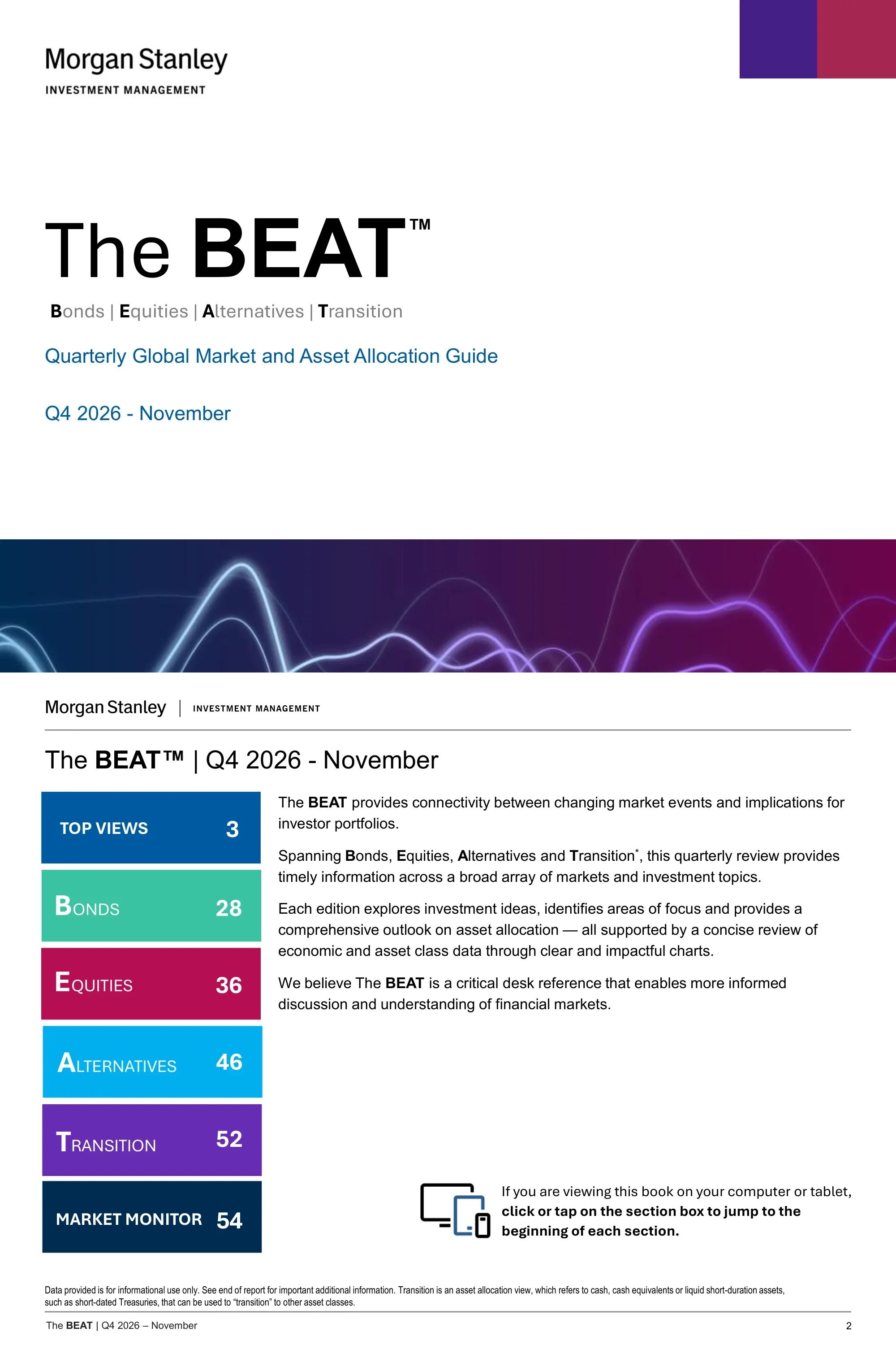
The BEAT Cover

सामग्री

Cover for the Quarterly Global Market and Asset Allocation Guide, Q4 2026 - November, expanding BEAT as Bonds | Equities | Alternatives | Transition.

लेआउट संरचना

Left-aligned title block with bottom banner

मुख्य दृश्य तत्व

  • •Large The BEAT wordmark
  • •Purple and crimson corner blocks
  • •Dark gradient banner with glowing wave lines
पृष्ठ 2
agenda

Contents and Introduction

सामग्री

Introduces The BEAT as a desk reference and indexes its sections: Top Views (p.3), Bonds (28), Equities (36), Alternatives (46), Transition (52) and Market Monitor (54).

लेआउट संरचना

Colour-box contents list beside intro text

मुख्य दृश्य तत्व

  • •Six stacked colour-coded section boxes with page numbers
  • •Intro paragraph with bold BEAT initials
  • •Device icon with click-to-jump instruction
पृष्ठ 3
section divider

Top Views Divider

सामग्री

Section divider opening the Top Views part of the guide.

लेआउट संरचना

Title-only divider

मुख्य दृश्य तत्व

  • •Section name over branded banner
  • •Guide title line
  • •Minimal layout
पृष्ठ 4
conclusion

Rates Are Up. Growth Is Strong. Stay Constructive.

सामग्री

Summarises the constructive stance: yields are rising largely because nominal growth is strong, with eight themes from equities to EM external debt.

लेआउट संरचना

Intro paragraph above two-column theme list

मुख्य दृश्य तत्व

  • •Blue intro paragraph
  • •Eight bold-label theme blocks in two columns
  • •Top Views section tag
पृष्ठ 5
conclusion

Top Active Views

सामग्री

Lists seven ranked active views, from overweight global equities versus fixed income to MBS/residential non-agency as the highest-conviction bond overweight.

लेआउट संरचना

Numbered list of seven views

मुख्य दृश्य तत्व

  • •Numbered markers 1 to 7
  • •Bold view headline with one-line rationale
  • •Abbreviation note in footer
पृष्ठ 6
table

Capital Markets Investment Framework

सामग्री

Allocation grid placing duration, corporate credit, equity risk level, private markets, hedge funds, commodities and cash on an underweight-to-overweight scale, with three points of focus.

लेआउट संरचना

Signal grid with side panel

मुख्य दृश्य तत्व

  • •Dot-matrix grid from -- to ++
  • •Arrow showing change from previous
  • •Shaded Points of Focus panel with numbered squares
पृष्ठ 7
comparison

Representative Allocations: Commentary

सामग्री

Commentary beside the asset allocation grid, noting U.S. 10-year yields back near 5% and a slightly underweight duration view.

लेआउट संरचना

Mini grid with commentary column

मुख्य दृश्य तत्व

  • •Row labels for Bonds, Equities and Alternatives
  • •Commentary paragraphs by asset class
  • •Disclosure footnote
पृष्ठ 8
table

Global Fixed Income Signals

सामग्री

Views grid for Treasuries, TIPS, eurozone government bonds, EM debt, municipals, IG, MBS/ABS, high yield and bank loans, with MBS/ABS as the highest-conviction fixed income overweight.

लेआउट संरचना

Signal grid with side panel

मुख्य दृश्य तत्व

  • •Dot markers on five-point scale
  • •Public Credit sub-header
  • •Five numbered Points of Focus
पृष्ठ 9
comparison

Global Fixed Income Commentary

सामग्री

Written rationale for each fixed income view, including slightly underweight U.S. duration and an overweight to inflation-linked bonds.

लेआउट संरचना

Row labels with commentary text

मुख्य दृश्य तत्व

  • •Asset-class labels in left column
  • •Bold view heading per paragraph
  • •Disclosure footer
पृष्ठ 10
table

Global Equity Signals

सामग्री

Views grid for U.S., eurozone, Japan, EM and style tilts such as growth versus value, with four points of focus including overweight U.S. and small/mid-cap.

लेआउट संरचना

Signal grid with side panel

मुख्य दृश्य तत्व

  • •Regional and Style group headers
  • •Dot markers with overweight/underweight legend
  • •Numbered focus panel
पृष्ठ 11
comparison

Global Equity Commentary

सामग्री

Region-by-region commentary: overweight U.S. on earnings strength, underweight Europe on energy headwinds, neutral Japan and neutral EM.

लेआउट संरचना

Row labels with commentary text

मुख्य दृश्य तत्व

  • •Regional labels
  • •Bold view heading per paragraph
  • •Tactical-views disclaimer
पृष्ठ 12
comparison

Our Top Investment Views

सामग्री

Maps top views into themes such as U.S. Productivity Boom, EU Renaissance, Japan's Revival, Global Power/Electrification and AI Winners.

लेआउट संरचना

Themed card grid

मुख्य दृश्य तत्व

  • •Theme cards with icons
  • •Country, global macro and market-specific groupings
  • •Overweight/underweight bullets
पृष्ठ 13
table

The Macro Narrative Highlights

सामग्री

Backdrop of resilient growth, sticky inflation, gradual Fed tightening and expansionary fiscal policy, leading to overweight equities, underweight duration and an oil supply shock as key risk.

लेआउट संरचना

Two stacked summary panels

मुख्य दृश्य तत्व

  • •Macro Backdrop rows
  • •Market Views row for equities, credit and duration
  • •Highlighted Key Risk box
पृष्ठ 14
data visualization

A High Nominal Growth World

सामग्री

Line chart of consensus nominal GDP growth for 2025, 2026 and 2027, with the 2026 estimate rising toward roughly 5.8%.

लेआउट संरचना

Headline, subtitle and full-width line chart

मुख्य दृश्य तत्व

  • •Three-line time series in blue shades
  • •Percent axis from 4.0% to 6.0%
  • •Source footnote
पृष्ठ 15
data visualization

Rate Recalibration Seeks Neutral

सामग्री

Compares Fed funds with nominal growth, noting that nominal growth is nearly 3% above the policy rate and past recessions followed over-tightening.

लेआउट संरचना

Headline, subtitle and line chart

मुख्य दृश्य तत्व

  • •Fed funds versus nominal growth lines
  • •Shaded or flagged over-tightening periods
  • •Source footnote
पृष्ठ 16
data visualization

Global Growth Remains Solid

सामग्री

Shows S&P Global World Services and Manufacturing PMIs, with activity accelerating rather than slowing despite higher energy prices and rates.

लेआउट संरचना

Headline, subtitle and line chart

मुख्य दृश्य तत्व

  • •Services and manufacturing PMI lines
  • •Date axis
  • •Source footnote
पृष्ठ 17
data visualization

Consumers Remain Resilient

सामग्री

Real core retail sales (control group, 3M moving average) keep growing despite the energy shock, with August sales beating expectations.

लेआउट संरचना

Headline, subtitle and line chart

मुख्य दृश्य तत्व

  • •Single line chart from Jun 2022 to Jun 2026
  • •YoY percent axis
  • •Control group definition in footnote
पृष्ठ 18
data visualization

Labor Markets Show Directional Firming

सामग्री

Monthly net change in nonfarm payrolls, with headline prints choppy but trends firming once one-off impacts are excluded.

लेआउट संरचना

Paired bar charts with callouts

मुख्य दृश्य तत्व

  • •Total nonfarm payrolls bars
  • •Payrolls ex Government, Leisure and Hospitality bars
  • •Two annotation callouts
पृष्ठ 19
data visualization

The Labor Market Is Not Overheating

सामग्री

Atlanta Fed wage growth and JOLTS-quit-rate-modelled wages show wage growth has stabilised even as labor demand firms.

लेआउट संरचना

Headline, subtitle and line chart

मुख्य दृश्य तत्व

  • •Wage growth lines
  • •Model versus actual comparison
  • •Source footnote
पृष्ठ 20
data visualization

Strong Productivity Supports Growth

सामग्री

U.S. nonfarm productivity YoY stays healthy, supporting growth without reigniting inflation.

लेआउट संरचना

Headline, subtitle and multi-year line chart

मुख्य दृश्य तत्व

  • •Productivity lines for 2026, 2023, 2020 and 2017
  • •Axis from -3 to 8
  • •Source footnote
पृष्ठ 21
data visualization

Inflation Above Targets but In Line

सामग्री

The Citi Inflation Surprise Index shows recent U.S. inflation releases have been in line with or slightly better than consensus.

लेआउट संरचना

Headline, subtitle and line chart

मुख्य दृश्य तत्व

  • •Surprise index line around zero
  • •Axis from (40) to 80
  • •Source footnote
पृष्ठ 22
data visualization

Core PCE Versus Trimmed Mean

सामग्री

Core PCE has surged to 3.3%, but trimmed mean inflation points to persisting disinflationary pressure, with inflation concentrated in AI and tariff-related categories.

लेआउट संरचना

Two side-by-side charts

मुख्य दृश्य तत्व

  • •Core PCE line chart
  • •Category breakdown chart
  • •Two-line headline
पृष्ठ 23
data visualization

Synchronized Tightening Priced In

सामग्री

Forwards price rate hikes from all four major central banks (Fed, ECB, BoJ, BoE) by mid-2027, driven by the energy shock.

लेआउट संरचना

Clustered column chart

मुख्य दृश्य तत्व

  • •Columns for Current, Dec-26 and Jun-27
  • •Four central bank groups
  • •Policy rate axis 0% to 5%
पृष्ठ 24
data visualization

Oil Prices Contained, Pressure Building

सामग्री

Crude prices have been rangebound while inventories decline, with the main risk in refined products due to lost refining capacity.

लेआउट संरचना

Two side-by-side charts

मुख्य दृश्य तत्व

  • •Oil spot price versus inventories chart
  • •Crude versus product price index chart
  • •Source footnote
पृष्ठ 25
data visualization

Europe's Outlook Tied to Energy

सामग्री

E.U. versus U.S. economic surprise moves with oil prices, and unusually low gas storage leaves Europe vulnerable entering winter.

लेआउट संरचना

Dual-chart page

मुख्य दृश्य तत्व

  • •Surprise-versus-oil overlay chart
  • •Gas storage chart
  • •Source footnote
पृष्ठ 26
data visualization

AI and Tech Drive Asia's Export Boom

सामग्री

AI and tech exports account for roughly 70% of Asia's export growth, led by Taiwan packaging, Korean memory and Chinese optical modules.

लेआउट संरचना

Stacked column chart with line

मुख्य दृश्य तत्व

  • •Monthly stacked columns Jan-23 to Aug-26
  • •AI/Tech versus Other exports
  • •Asia export YoY growth line
पृष्ठ 27
data visualization

China's Export Engine Enters a New Phase

सामग्री

China's manufacturing exports accelerate while imports lag, widening the trade surplus and marking a China Shock 2.0 period.

लेआउट संरचना

Long-run line chart with era labels

मुख्य दृश्य तत्व

  • •Exports, imports and trade balance lines from 1991
  • •China Shock 1.0 and 2.0 annotations
  • •USD trillion axis
पृष्ठ 28
section divider

Bonds Divider

सामग्री

Section divider opening the Bonds part of the guide.

लेआउट संरचना

Title-only divider

मुख्य दृश्य तत्व

  • •Section name over branded banner
  • •Guide title line
  • •Minimal layout
पृष्ठ 29
data visualization

The Lost Decade in U.S. Treasuries

सामग्री

Rolling 10-year annualised returns of the 10-year UST are near their lowest since the 1800s, but higher yields offer a more attractive starting point.

लेआउट संरचना

Headline, subtitle and long-history line chart

मुख्य दृश्य तत्व

  • •Rolling 10-year CAGR line from 1800 to 2020
  • •Percent axis 0% to 16%
  • •Source footnote
पृष्ठ 30
data visualization

Term Premiums Point to Fed Expectations

सामग्री

The UST 10-year term premium has moved sideways over the past year, while Japan's has risen and the U.S. and Germany stay broadly stable.

लेआउट संरचना

Headline, subtitle and multi-line chart

मुख्य दृश्य तत्व

  • •Term premium lines for U.S., Germany and Japan
  • •Percent axis
  • •Source footnote
पृष्ठ 31
data visualization

Higher Yields Reflect Stronger Nominal Growth

सामग्री

Two charts show 10-year UST yields reconnecting with nominal GDP running near 6% and nominal growth supporting S&P 500 EPS growth.

लेआउट संरचना

Two side-by-side line charts

मुख्य दृश्य तत्व

  • •Nominal GDP versus 10-year yield from 1966
  • •Dual-axis EPS growth versus nominal GDP from 1992
  • •Diamond marker for latest nominal GDP
पृष्ठ 32
data visualization

Broad EM Value Has Compressed

सामग्री

EM sovereign spreads are near historical tights, while Brazil's high real rates stand out across local bond markets.

लेआउट संरचना

Two charts side by side

मुख्य दृश्य तत्व

  • •EMBI spread percentile chart for IG and non-IG
  • •Local yield, inflation and real rate bars with diamonds
  • •Source footnote
पृष्ठ 33
data visualization

U.S. MBS as an Alternative to Corporate Credit

सामग्री

U.S. IG option-adjusted spreads are near historical tights, creating poor risk/reward versus MBS if growth slows.

लेआउट संरचना

Two charts side by side

मुख्य दृश्य तत्व

  • •MBS and IG OAS lines
  • •MBS-IG spread versus output gap chart
  • •Source footnote
पृष्ठ 34
data visualization

European Core-Periphery Convergence

सामग्री

Spain and Portugal are expected to keep outgrowing EU peers while running a primary surplus, supporting continued peripheral spread tightening.

लेआउट संरचना

Scatter or bar chart with commentary

मुख्य दृश्य तत्व

  • •2026-28 average primary balance versus real GDP growth
  • •Country-labelled points
  • •Source footnote
पृष्ठ 35
data visualization

High Yield Expensive Versus Credit Losses

सामग्री

High yield spreads remain tight relative to expected credit losses, leaving little margin of safety.

लेआउट संरचना

Dual-axis line chart

मुख्य दृश्य तत्व

  • •Credit loss line on left axis
  • •HY OAS line on right axis in basis points
  • •Data from 2006 to 2026
पृष्ठ 36
section divider

Equities Divider

सामग्री

Section divider opening the Equities part of the guide.

लेआउट संरचना

Title-only divider

मुख्य दृश्य तत्व

  • •Section name over branded banner
  • •Guide title line
  • •Minimal layout
पृष्ठ 37
data visualization

2026 YTD Upside Driven by Earnings, Not P/E

सामग्री

MSCI ACWI forward EPS is up 30% YTD while the forward P/E is down 14%, so returns reflect earnings rather than multiples.

लेआउट संरचना

Stacked column chart with line

मुख्य दृश्य तत्व

  • •EPS, multiple and dividend contribution columns
  • •Cumulative YTD total return line
  • •Monthly axis 01/2026 to 09/2026
पृष्ठ 38
data visualization

2026-27 Earnings Revisions Skew to Growth/Tech

सामग्री

Growth/Tech leads EPS revisions up about 29% for CY2026 and about 19% for CY2027, with upgrades widening into cyclicals.

लेआउट संरचना

Two side-by-side bar charts

मुख्य दृश्य तत्व

  • •CY2026 and CY2027 revision bars
  • •Growth/Tech, Cyclicals ex Energy, Defensives categories
  • •Source footnote
पृष्ठ 39
data visualization

AI Demand Accelerates With Agentic AI

सामग्री

OpenRouter token demand reached 113 trillion per week at end of August, up 25x YoY and 2x MoM.

लेआउट संरचना

Headline, subtitle and growth chart

मुख्य दृश्य तत्व

  • •Weekly token volume chart
  • •Month axis 1-Sep to 1-Aug
  • •Trillions-of-tokens axis 0 to 120
पृष्ठ 40
data visualization

Nvidia Benefits From Surging AI Demand

सामग्री

Nvidia's revenue guidance of 70% growth for fiscal 2028 beat consensus expectations of 45%.

लेआउट संरचना

Combo column and line chart

मुख्य दृश्य तत्व

  • •Trailing 12M revenue columns in millions
  • •YoY growth line on right axis
  • •Forecast period marked to Jan-28
पृष्ठ 41
data visualization

Cyclical Rebound or Data Deterioration?

सामग्री

Cyclicals have underperformed defensives since July after the U.S.-Iran MOU unraveled, though manufacturing data remains supportive.

लेआउट संरचना

Dual-axis line chart

मुख्य दृश्य तत्व

  • •Cyclical minus defensive 12-month return line
  • •Global manufacturing PMI change line
  • •Data from 10/2012 to 10/2025
पृष्ठ 42
data visualization

Underweight Europe, Japan Most Attractive

सामग्री

European equities show weaker EPS growth and are the only market more expensive since the start of the Iran war.

लेआउट संरचना

Chart set with headline and subtitle

मुख्य दृश्य तत्व

  • •Regional EPS and valuation charts
  • •Equities section tag
  • •Source footnote
पृष्ठ 43
data visualization

Upgrading Conviction in Japanese Banks

सामग्री

The forward market is warming to a 2% BoJ policy rate era, with higher rates and capital reforms expected to drive re-rating and ROE uplift.

लेआउट संरचना

Two charts with callout labels

मुख्य दृश्य तत्व

  • •BoJ policy rate versus forward swap line
  • •Topix Banks forward P/B versus ROE
  • •We Are Here marker and NIRP annotations
पृष्ठ 44
data visualization

EM Semiconductor Premium Has Unwound

सामग्री

EM semiconductor forward P/E is back roughly in line with the rest of EM even as earnings continue to soar.

लेआउट संरचना

Two stacked line charts

मुख्य दृश्य तत्व

  • •Semi versus ex-semi forward EPS rebased to 2010
  • •Semi versus ex-semi forward P/E
  • •ChatGPT Launched marker
पृष्ठ 45
data visualization

Underweight Indian Equities

सामग्री

India's forward EPS growth looks subpar versus EM while its P/E premium remains close to 100%.

लेआउट संरचना

Column chart with premium line

मुख्य दृश्य तत्व

  • •India and EM EPS CAGR columns by period
  • •Median P/E premium line
  • •Modi term period labels
पृष्ठ 46
section divider

Alternatives Divider

सामग्री

Section divider opening the Alternatives part of the guide.

लेआउट संरचना

Title-only divider

मुख्य दृश्य तत्व

  • •Section name over branded banner
  • •Guide title line
  • •Minimal layout
पृष्ठ 47
comparison

Private Markets: 4Q 2026 Positioning

सामग्री

Rates private equity Neutral to Positive and private credit Neutral, noting AI takes over two-thirds of U.S. VC dollars but under half of deals.

लेआउट संरचना

Rating labels with bulleted commentary

मुख्य दृश्य तत्व

  • •Private Equity and Private Credit rating tags
  • •Bulleted commentary
  • •PIK definition in footnote
पृष्ठ 48
data visualization

Private Equity

सामग्री

Stable view as valuations reset and distributions lag, with AI accounting for 70% of VC deal value and PE distribution yield at 13.2% versus 5.4% for VC.

लेआउट संरचना

Rating grid, focus panel and two charts

मुख्य दृश्य तत्व

  • •Shaded Buyout, Growth and Venture Capital rating grid
  • •Median EV/EBITDA clustered columns by deal size
  • •Distribution yield line chart
पृष्ठ 49
data visualization

Private Credit

सामग्री

Direct lending concerns are receding as the tech maturity wall extends and defaults stay concentrated in 2021 and 2022 vintages.

लेआउट संरचना

Rating grid, focus panel and two charts

मुख्य दृश्य तत्व

  • •Ratings for Direct Lending, Real Estate Debt, Special Situations and ABS
  • •Tech loan maturity chart
  • •Default rates by LMM versus MM
पृष्ठ 50
data visualization

Infrastructure

सामग्री

Positive on Energy, selective on Digital and Transport, with a potential 38 GW shortage between 68 GW of power needed and grid supply for U.S. datacenters.

लेआउट संरचना

Rating grid, focus panel and two charts

मुख्य दृश्य तत्व

  • •Ratings for Transport, Digital, Renewables and Power
  • •Waterfall chart of datacenter power shortfall
  • •Global EV/EBITDA multiples line
पृष्ठ 51
data visualization

Real Estate

सामग्री

Healthy fundamentals with selective sector and financing exposure: pipelines are declining and residential rent growth is reaccelerating.

लेआउट संरचना

Rating grid, focus panel and two charts

मुख्य दृश्य तत्व

  • •Ratings for Industrial, Residential, Office and Retail
  • •Under-construction pipeline chart
  • •Rental growth YoY lines
पृष्ठ 52
section divider

Transition Divider

सामग्री

Section divider opening the Transition part of the guide, covering cash and short-duration assets.

लेआउट संरचना

Title-only divider

मुख्य दृश्य तत्व

  • •Section name over branded banner
  • •Guide title line
  • •Minimal layout
पृष्ठ 53
table

Major Asset Classes Correlation Table

सामग्री

Correlation matrix across nine asset classes for the 5 and 10 years ended Oct 31, 2026, for example S&P 500 versus International at 0.83 over ten years.

लेआउट संरचना

Full-slide correlation matrix

मुख्य दृश्य तत्व

  • •Purple upper triangle for 10-year values
  • •Grey lower triangle for 5-year values
  • •Legend for the two periods
पृष्ठ 54
section divider

Market Monitor Divider

सामग्री

Section divider titled Market Monitor - November 2026, opening the data appendix.

लेआउट संरचना

Title-only divider

मुख्य दृश्य तत्व

  • •Section name over branded banner
  • •Date in title
  • •Minimal layout
पृष्ठ 55
data visualization

Sovereign Bond Yields

सामग्री

Bar charts compare 10-year yields for developed and emerging markets now, one month ago and 12 months ago.

लेआउट संरचना

Two side-by-side bar charts

मुख्य दृश्य तत्व

  • •Developed Markets 10-year yield bars
  • •Emerging Markets 10-year yield bars
  • •Oct '26, 1 Mo. Ago and 12 Mo. Ago series
पृष्ठ 56
table

Key Rates

सामग्री

Table of money market and sovereign rates, with the 10-year Treasury at 4.91 versus 4.09 twelve months earlier.

लेआउट संरचना

Full-width data table

मुख्य दृश्य तत्व

  • •Columns for Current, 12-Mo. Ago, Average, Minimum and Maximum
  • •SOFR, Treasury, Japan, Bund and Gilt rows
  • •Bloomberg index yield rows
पृष्ठ 57
data visualization

Monetary Policy

सामग्री

Central bank policy rates: Fed 4.00%, BOE 3.75%, BOJ 1.25% and ECB 2.65%, alongside market expectations and long-run history.

लेआउट संरचना

Charts with summary table

मुख्य दृश्य तत्व

  • •Expected rate path columns by horizon
  • •Policy rate history since 1998
  • •Current versus 1-month and 12-month table
पृष्ठ 58
data visualization

U.S. Treasury Yields

सामग्री

Treasury yield curve and a yields-and-total-return table, with the 10-year at 4.91% and the 30-year at 5.29%.

लेआउट संरचना

Curve chart above data table

मुख्य दृश्य तत्व

  • •Yield curve for Oct '26, 1-Mo. Ago and 12-Mo. Ago
  • •Yield and total return columns
  • •3-month to 30-year rows
पृष्ठ 59
table

Developed Market Currencies and Yields

सामग्री

Table of spot returns versus USD and EUR plus local interest rates for eleven currencies, with a long-run U.S. Dollar Index chart.

लेआउट संरचना

Matrix table with chart

मुख्य दृश्य तत्व

  • •Spot return columns by horizon
  • •Local interest rate column
  • •U.S. Dollar Index line from 1970
पृष्ठ 60
table

Characteristics and Performance Analysis

सामग्री

Bond index table: the Bloomberg U.S. Aggregate shows a 5.24% yield to worst, 32 bps spread and 5.8-year duration, with returns from 1 month to 10 years.

लेआउट संरचना

Grouped data table

मुख्य दृश्य तत्व

  • •Teal group header bands
  • •Averages and Total Returns column blocks
  • •U.S. High Grade, High Yield, EM and Global rows
पृष्ठ 61
data visualization

Spread Analysis (bps)

सामग्री

Spread ranges for Aggregate, MBS, ABS, CMBS, Corporate, Preferred, Loans, EM and High Yield, with most maximum spreads dated March 2020.

लेआउट संरचना

Range chart with date table

मुख्य दृश्य तत्व

  • •Ten-year spread range bars
  • •Max and Min Spread Date rows
  • •12/31/25 and 12/31/24 spread rows
पृष्ठ 62
table

Corporate Bond Market Update: Quality Detail

सामग्री

Corporate index table by rating: U.S. IG yields 5.79% at a 90 bps spread, while U.S. High Yield yields 8.30% at 344 bps.

लेआउट संरचना

Grouped data table

मुख्य दृश्य तत्व

  • •AAA to BBB and BB to CCC rows
  • •Averages and Total Returns blocks
  • •Group headers
पृष्ठ 63
data visualization

Corporate Bond Market Update: Spreads and Defaults

सामग्री

HY corporate spread is 344 bps versus 294 a year ago, with the HY annual default rate at 1.95% and loans at 0.55%.

लेआउट संरचना

Bar charts with summary tables

मुख्य दृश्य तत्व

  • •Average spread bars for HY, Loans and IG
  • •Annual default rate bars
  • •Current, 1-Mo. Ago, 12-Mo. Ago and Median tables
पृष्ठ 64
table

Municipal Bond Market Update: Index Table

सामग्री

Municipal table showing the Bloomberg Municipal Bond Index at a 4.21% yield to worst, with rating, maturity and high yield sub-indices.

लेआउट संरचना

Grouped data table

मुख्य दृश्य तत्व

  • •AAA to BBB rating rows
  • •5-year to 22+ year rows
  • •High Yield Municipal sector rows
पृष्ठ 65
data visualization

Municipal Bond Market Update: Ratios and Spreads

सामग्री

AAA muni-to-Treasury yield ratios of 63, 69 and 91 for 5Y, 10Y and 30Y, plus credit quality spreads versus AAA.

लेआउट संरचना

Two charts with data tables

मुख्य दृश्य तत्व

  • •Yield ratio history from 2016
  • •AA, A and BBB spread bars
  • •Current, 1-Mo. Ago, 12-Mo. Ago and Median tables
पृष्ठ 66
data visualization

Emerging Markets Bond Market Update

सामग्री

EM debt table and charts: the EMBI Global Diversified yields 7.09% with a 208 bps average spread, versus a 352 bps median.

लेआउट संरचना

Index table above three charts

मुख्य दृश्य तत्व

  • •Sovereign, corporate and local EMD summary boxes
  • •Index table with returns to 10Y
  • •Three history charts from 2016
पृष्ठ 67
data visualization

Local Sovereign Currency Yields

सामग्री

Bar charts of one-year local interest rates, current versus one year prior, for eleven developed and fourteen emerging market currencies.

लेआउट संरचना

Two side-by-side bar charts

मुख्य दृश्य तत्व

  • •Developed market rate bars
  • •Emerging market rate bars
  • •Current versus 1 yr prior series
पृष्ठ 68
data visualization

Asset Class Return Analysis: Bonds

सामग्री

Annual return rankings for bond asset classes from 2016 to YTD 2026, from high yield and EM local to Treasuries and bank loans.

लेआउट संरचना

Ranked quilt chart by year

मुख्य दृश्य तत्व

  • •Year columns from 2016 to YTD 2026
  • •Colour-coded asset class cells ranked high to low
  • •Index definitions in footnote
पृष्ठ 69
data visualization

Performance: Market Barometer

सामग्री

Heat maps of 1-month, 1-year and 3-year returns by size and style, for example Large Cap Value at 28.67% over one year versus Large Cap Growth at -2.59%.

लेआउट संरचना

Three heat-map grids with legend

मुख्य दृश्य तत्व

  • •Value, Core and Growth grids by cap size
  • •Global, U.S., International and EM tiles
  • •Six-step colour scale legend
पृष्ठ 70
data visualization

Dividend Yields and Volatility Analysis

सामग्री

Historical and current dividend yields for equity indices versus the 10-year Treasury at 4.91%, with S&P 500 correlation and VIX history.

लेआउट संरचना

Four-panel chart grid

मुख्य दृश्य तत्व

  • •Historical yield lines
  • •Current yield bars
  • •Correlation and VIX line charts
पृष्ठ 71
data visualization

Valuation Analysis: Regions and Styles

सामग्री

Current NTM P/E versus 10-year high, low and average for major regional and style indices, with high and low dates.

लेआउट संरचना

Range bars with date table

मुख्य दृश्य तत्व

  • •High-low range bars with current and average markers
  • •MSCI World reference line
  • •High Date and Low Date rows
पृष्ठ 72
data visualization

Valuation Analysis: S&P 500 Sectors

सामग्री

Current NTM P/E versus 10-year high, low and average for each S&P 500 sector, shown with high and low dates.

लेआउट संरचना

Range bars with date table

मुख्य दृश्य तत्व

  • •Eleven sector range bars
  • •S&P 500 current P/E reference
  • •Not to scale note
पृष्ठ 73
data visualization

Corporate Earnings Growth

सामग्री

Expected versus 2025 EPS growth by region, style and S&P 500 sector, shown as paired horizontal bars.

लेआउट संरचना

Two paired bar charts

मुख्य दृश्य तत्व

  • •Regions/Styles bars
  • •S&P 500 Sectors bars
  • •Expected and 2025 EPS growth series
पृष्ठ 74
data visualization

S&P 500 Index: 1-Month Return Analysis

सामग्री

Breakdown of the S&P 500's -0.9% one-month return by earnings growth, market cap, P/E, beta, ROE and dividend yield buckets.

लेआउट संरचना

Six small bar charts

मुख्य दृश्य तत्व

  • •Six factor panels
  • •S&P 500 reference bar in each
  • •Bucketed ranges in legend
पृष्ठ 75
data visualization

S&P 500 Index: YTD Analysis

सामग्री

The same six factor breakdowns applied to the S&P 500's 11.8% year-to-date return.

लेआउट संरचना

Six small bar charts

मुख्य दृश्य तत्व

  • •Six factor panels
  • •S&P 500 reference bar in each
  • •Bucketed ranges in legend
पृष्ठ 76
data visualization

Index Sectors: Return Analysis

सामग्री

Sector return bars for the S&P 500 and MSCI World over 1 month and 1 year.

लेआउट संरचना

Two side-by-side bar charts

मुख्य दृश्य तत्व

  • •S&P 500 sector bars
  • •MSCI World sector bars
  • •1 month and 1 year series
पृष्ठ 77
table

Current Characteristics and Sector Weights

सामग्री

Comparison table of ten equity indices (e.g. 503 S&P 500 holdings, 18.35 NTM P/E) with sector weights such as Information Technology at 30% of the S&P 500.

लेआउट संरचना

Characteristics table with weights

मुख्य दृश्य तत्व

  • •Index columns from S&P 500 to MSCI Asia Pac
  • •Holdings, valuation and growth rows
  • •Sector weight percentages
पृष्ठ 78
table

Asset Class Return Analysis: Equities

सामग्री

Return table for U.S., global and sector equities, e.g. S&P 500 +11.77% YTD, Russell 1000 Value +24.50% and Russell 1000 Growth -0.17%.

लेआउट संरचना

Grouped return table

मुख्य दृश्य तत्व

  • •U.S. Equities, Global Equities and Sectors groups
  • •1-Mo. to 10Y plus 2021-2025 columns
  • •Alternating row shading
पृष्ठ 79
data visualization

Asset Class Return Analysis: Calendar Years

सामग्री

Annual equity style and region return rankings from 2016 to YTD 2026.

लेआउट संरचना

Ranked quilt chart by year

मुख्य दृश्य तत्व

  • •Year columns 2016 to YTD 2026
  • •Ranked cells for small-cap, growth, value, EM and more
  • •Index definitions in footnote
पृष्ठ 80
table

Commodities Return Analysis

सामग्री

Commodity sub-index returns: the Bloomberg Commodity Index is up 32.75% YTD and 36.57% over one year, with Brent crude up 151.52% YTD.

लेआउट संरचना

Grouped return table

मुख्य दृश्य तत्व

  • •Agriculture, energy and metals sub-index groups
  • •1-Mo. to 5Y columns
  • •Individual commodity rows
पृष्ठ 81
data visualization

Asset Class Return Analysis: Alternatives

सामग्री

Annual return rankings for hedge fund strategies, MLPs and commodities from 2016 to YTD 2026, as of 9/30/2026 with a one-month lag on YTD data.

लेआउट संरचना

Ranked quilt chart by year

मुख्य दृश्य तत्व

  • •Year columns 2016 to YTD 2026
  • •Colour-coded strategy cells
  • •Index definitions in footnote
पृष्ठ 82
data visualization

Digital Assets: Growth and Correlation

सामग्री

Growth of $10K for Bitcoin, Ethereum and Solana indices from 7/1/2021, with a correlation table across S&P 500, Nasdaq, Gold, DXY, U.S. Agg and Bitcoin.

लेआउट संरचना

Bar chart beside correlation matrix

मुख्य दृश्य तत्व

  • •Growth of $10K horizontal bars
  • •Six-asset correlation matrix
  • •5-year and since-2016 periods
पृष्ठ 83
comparison

Digital Assets: Small Allocations Can Impact Portfolios

सामग्री

Hypothetical comparison of a 60/40 portfolio with 1% and 3% Bitcoin added, across return, volatility and Sharpe ratio for 1 to 10 years.

लेआउट संरचना

Three comparison tables

मुख्य दृश्य तत्व

  • •Return, Sharpe ratio and volatility blocks
  • •60/40, 1% Bitcoin and 3% Bitcoin rows
  • •1, 3, 5 and 10 year columns
पृष्ठ 84
table

Fund and ETF Flows by Category

सामग्री

Top and bottom ten mutual fund and ETF categories by monthly flows, with Nontraditional Bond leading mutual fund inflows at $1,647MM and Large Blend seeing -$23,027MM.

लेआउट संरचना

Four ranked flow tables

मुख्य दृश्य तत्व

  • •Top 10 and Bottom 10 mutual fund tables
  • •Top 10 and Bottom 10 ETF tables
  • •1 Mo., 3 Mo. and 12 Mo. flow columns
पृष्ठ 85
data visualization

Major Asset Class Return Analysis

सामग्री

Annual return rankings for major asset classes and a diversified Asset Allocation portfolio (25% S&P 500, 25% U.S. Aggregate and others), 2016 to YTD 2026.

लेआउट संरचना

Ranked quilt chart by year

मुख्य दृश्य तत्व

  • •Year columns 2016 to YTD 2026
  • •Colour-coded asset class cells
  • •Portfolio weights in footnote
पृष्ठ 86
conclusion

Portfolio Solutions Group

सामग्री

Introduces the multi-asset Portfolio Solutions Group, led by CIO Jim Caron, and its ten-person team.

लेआउट संरचना

Intro text beside headshot grid

मुख्य दृश्य तत्व

  • •Ten portrait photos
  • •Name and title captions
  • •Descriptive text column
पृष्ठ 87
conclusion

Asset Allocation Committee

सामग्री

Describes the independent Asset Allocation Committee of senior MSIM and Eaton Vance professionals that vets the Portfolio Solutions Group's ideas.

लेआउट संरचना

Description with name roster

मुख्य दृश्य तत्व

  • •Committee member list with titles
  • •Description text block
  • •Header and footer system
पृष्ठ 88
disclosure

Index Definitions

सामग्री

Glossary defining indices used in the guide, from the Bloomberg Commodity Index to the Bloomberg U.S. Aggregate Index.

लेआउट संरचना

Text-only glossary

मुख्य दृश्य तत्व

  • •Bold index names
  • •Definition paragraphs
  • •Single-column text
पृष्ठ 89
disclosure

Index Definitions, Terms and About Risk

सामग्री

Continues index definitions with MSCI, Morningstar LSTA, Nikkei 225, Russell and S&P indices.

लेआउट संरचना

Text-only glossary

मुख्य दृश्य तत्व

  • •Index name and definition paragraphs
  • •Single-column text
  • •Header and footer system
पृष्ठ 90
disclosure

Risk Considerations

सामग्री

Standard risk disclosures covering equity, foreign, EM, fixed income and alternative investment risks, stating that diversification does not eliminate the risk of loss.

लेआउट संरचना

Two-column disclosure text

मुख्य दृश्य तत्व

  • •Dense two-column legal text
  • •Bold key warnings
  • •Title with header rule
पृष्ठ 91
disclosure

Distribution and Legal Notices

सामग्री

Copyright, redistribution restrictions and issuing-entity notices for MSIM affiliates, including the EMEA section.

लेआउट संरचना

Text-only disclosure

मुख्य दृश्य तत्व

  • •Legal paragraphs
  • •Regional heading
  • •Footer with page number
पृष्ठ 92
disclosure

Asia Pacific Notices

सामग्री

Closing regional disclosures for Hong Kong, Singapore and Australia.

लेआउट संरचना

Text-only disclosure

मुख्य दृश्य तत्व

  • •ASIA PACIFIC heading
  • •Country-by-country legal paragraphs
  • •Footer with page number

अक्सर पूछे जाने वाले प्रश्न

इस स्लाइड और अंतर्निहित प्रस्तुति सामग्री के बारे में सामान्य प्रश्न।

What does this presentation cover?

It is Morgan Stanley Investment Management's The BEAT, a Quarterly Global Market and Asset Allocation Guide for Q4 2026 - November. It spans Top Views, Bonds, Equities, Alternatives, Transition and a Market Monitor of data tables and charts.

How many pages is the deck and what format is it?

The deck has 92 pages in 4:3 (720x540) format, made in PowerPoint.

Who is this deck suited for?

It suits investment strategists, wealth managers, advisors and research teams who produce market outlooks or asset allocation reviews. It is also a useful study example for analysts and presentation designers.

How are the charts and tables laid out?

Most commentary pages use a headline, a one-sentence subtitle, a titled chart and a source footnote. The Market Monitor uses full-width tables, heat maps and ranked quilt charts of annual returns.

Does the deck include allocation views?

Yes. Pages 6, 8 and 10 show grids that rate assets from high conviction underweight to high conviction overweight, with dot markers, a change-from-previous arrow and numbered Points of Focus.

Can I reuse the structure for my own quarterly report?

Yes. The contents page, section dividers, colour-coded section tags, chart pages, data tables and closing disclosure pages can be swapped for your own content and data.

Does it include disclosures and index definitions?

Yes. Pages 88 to 92 contain index definitions, risk considerations, distribution notices and Asia Pacific notices, and most chart pages carry source and disclaimer footnotes.

Is the content investment advice?

No. The slides state the views are those of the portfolio management team, may change, and are not an investment or research recommendation. Treat the deck as an example of structure and design.

स्रोत और अतिरिक्त पठन

  • The BEAT — Morgan Stanley Investment Management

    Publisher's series page for this quarterly market and asset allocation guide.

2slides

Create Your Own Slides

Turn your ideas into professional presentations in seconds with 2slides AI.

सेकंडों में विश्व-स्तरीय स्लाइड्स बनाएं

पेशेवर डिज़ाइन का संदर्भ लें, अपनी शैली चुनें, और सही टेक्स्ट रेंडरिंग के साथ स्लाइड्स जेनरेट करें। Nano Banana द्वारा संचालित—अभी अपना प्रेजेंटेशन बनाना शुरू करें।

2Slides logo

स्लाइड के लिए आपका AI एजेंट। बुद्धिमान प्रस्तुति निर्माण के साथ समय बचाएं, तेजी से चमकें।

AI के साथ सारांशित करें

ChatGPTClaudeGrokPerplexity
सभी सेवाएँ ऑनलाइन

उत्पाद

सुविधाएं

गैलरी

टेम्प्लेट

इंटीग्रेशन

संसाधन

तुलना

© 2026 2slides। सभी अधिकार सुरक्षित।