
2Slides लोगो
Preview

a16z Growth State of Markets September 2026

90 स्लाइड

a16z Growth State of Markets September 2026 is a 90-page investor-grade market review covering the tech-driven equity cycle, the multi-trillion-dollar AI capex buildout, the rotation from software (bits) to hardware and infrastructure (atoms), the so-called SaaSpocalypse, private-market value creation, the post-ZIRP startup landscape, and the macro signals now coming from private company data. Every page pairs a bold editorial headline with sourced charts from S&P Capital IQ, Bloomberg, JPMAM, Goldman Sachs, Morgan Stanley, PitchBook, Carta, OpenRouter, Stripe and a16z portfolio companies.

3 लाइक
0 डाउनलोड

त्वरित नेविगेशन

टैग

State of markets
A16z
A16z growth
Andreessen Horowitz
Venture capital

स्लाइड साझा करें

विवरण

मुख्य विषय

a16z Growth State of Markets September 2026 is a 90-page investor-grade market review covering the tech-driven equity cycle, the multi-trillion-dollar AI capex buildout, the rotation from software (bits) to hardware and infrastructure (atoms), the so-called SaaSpocalypse, private-market value creation, the post-ZIRP startup landscape, and the macro signals now coming from private company data. Every page pairs a bold editorial headline with sourced charts from S&P Capital IQ, Bloomberg, JPMAM, Goldman Sachs, Morgan Stanley, PitchBook, Carta, OpenRouter, Stripe and a16z portfolio companies.

मुख्य लाभ

  • •Dense, chart-first layout: 2-4 sourced data visualizations per page with a one-line takeaway headline, ideal for analysts who need to show evidence rather than opinion
  • •Clear eight-section narrative arc (Tech cycle, AI platform shift, Capex is working, Atoms are back, SaaS prove-it, Private markets, Startups, Private-co macro data) that models how to structure a long-form market thesis
  • •Premium editorial design system: cream background, dark green navy sidebars, serif display headlines, consistent chart cards with source footnotes and brand lockup
  • •Shows how to blend macro data, sector performance, company earnings quotes, and portfolio case studies into one coherent investment narrative
  • •Reusable section divider and closing-opportunities layouts for any venture, growth equity, or public-market outlook deck

लक्षित दर्शक

  • •Venture capital and growth equity investors preparing LP updates or market outlooks
  • •Public market analysts, portfolio managers and equity researchers covering technology, semiconductors, software and AI infrastructure
  • •Startup founders and operators benchmarking growth, profitability and fundraising conditions
  • •Corporate strategy, FP&A and investor-relations teams building quarterly market context decks
  • •MBA students, economists and journalists studying the AI capex cycle and its market impact

उपयोग के मामले

  • •Quarterly or annual State of the Market presentations for LPs, boards or investment committees
  • •Macro and sector briefing decks on AI infrastructure, hyperscaler capex and the semiconductor supply chain
  • •Investment thesis memos arguing for or against an AI bubble using earnings versus multiples data
  • •Fundraising narrative decks that position a startup within the broader tech and AI cycle
  • •Teaching material for finance and venture courses on power laws, private-for-longer, and capital-heavy versus capital-light rotations
  • •Template for chart-heavy research reports with editorial headlines and source attribution

अद्वितीय मूल्य प्रस्ताव

  • •Published by a16z Growth, one of the most-cited voices in venture capital, giving the deck instant credibility as a reference
  • •Combines public-market, private-market and proprietary portfolio data (OpenRouter tokens, Stripe SaaS revenue, Kalshi GPU pricing, Waymo rides) in a single narrative
  • •Argues a contrarian, evidence-backed thesis on every page: hard to call it a bubble, GPU obsolescence is exaggerated, SaaS is prove-it not apocalypse
  • •Closes with a forward-looking map of seven untapped opportunity areas, giving readers an actionable takeaway
  • •Sophisticated yet readable visual language that works as both a presentation and a standalone read

स्लाइड पृष्ठ (90)

प्रत्येक स्लाइड पृष्ठ का विस्तृत दृश्य, लेआउट, मुख्य सामग्री और दृश्य तत्वों सहित।

पृष्ठ 1
title slide

State of Markets, September 2026

सामग्री

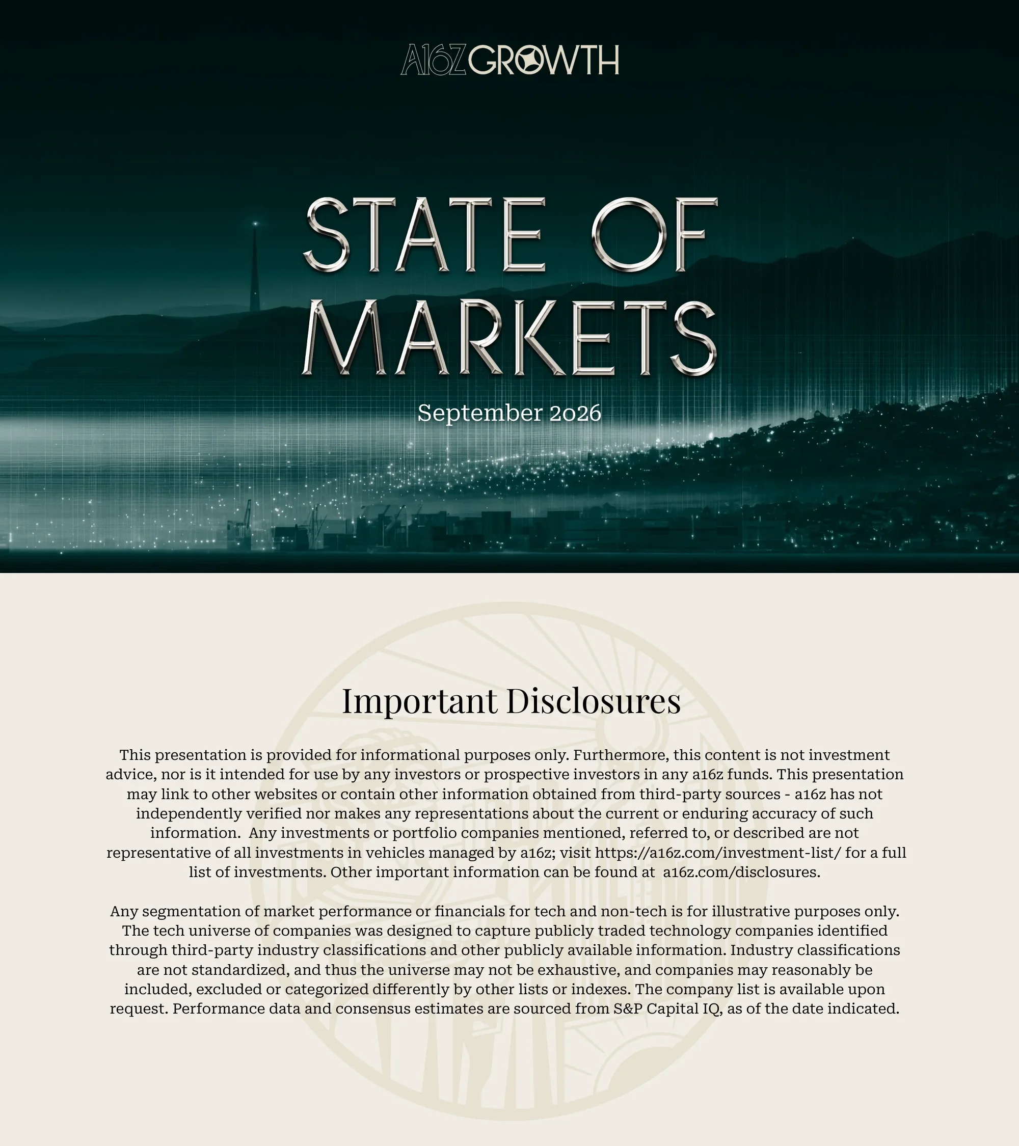
Cover slide with the a16z Growth wordmark, the title State of Markets in metallic serif capitals and the date September 2026 over a moody teal cityscape.

लेआउट संरचना

Full-bleed dark teal background image with centered logo, title and subtitle stack

मुख्य दृश्य तत्व

  • •metallic chrome title lettering
  • •night skyline with light streaks
  • •a16z Growth wordmark
पृष्ठ 2
disclaimer

Important Disclosures

सामग्री

Legal disclaimer stating the deck is informational only, not investment advice, with notes on third-party data and the tech-universe methodology.

लेआउट संरचना

Centered title with two justified paragraphs on a cream background and a faint seal watermark

मुख्य दृश्य तत्व

  • •faint embossed seal watermark
  • •serif heading
  • •dense legal text block
पृष्ठ 3
agenda

Table of Contents

सामग्री

Eight numbered sections: Tech Is The Everything Cycle, AI Is A Generational Platform Shift, Capex Is Working, Atoms Are So Back, SaaSpocalypse? More Like SaaS-Prove-It, Take a Walk On The Private Side, It's A Brave New World For Startups Too, PrivateCos Telling The Macro Story.

लेआउट संरचना

Dark green header band with title, numbered list of eight section names below on cream

मुख्य दृश्य तत्व

  • •gold section numbers
  • •thin divider rules
  • •two-tone header band
पृष्ठ 4
section divider

Tech Is The Everything Cycle

सामग्री

Section divider for part one.

लेआउट संरचना

Full-bleed dark city-and-bridge photo with large serif section title at left

मुख्य दृश्य तत्व

  • •night skyline with Bay Bridge
  • •large serif headline
  • •vertical light-streak overlay
पृष्ठ 5
narrative with data visualization

Tech Is The Everything Cycle

सामग्री

Thesis narrative that tech has left the cottage and is now the prime mover of the economy, paired with a chart showing tech is now 55% of all U.S. capital spending.

लेआउट संरचना

Dark green left sidebar with title and three paragraphs, large chart card on the right

मुख्य दृश्य तत्व

  • •area chart of high-tech share of capex since 1960
  • •sidebar body text
  • •source footnote
पृष्ठ 6
data visualization

The World's Largest Companies Are Tech Companies

सामग्री

Two stacked bar charts showing tech is roughly 35% of the Global 100 by count and roughly 60% by market cap, rising steadily since 2010.

लेआउट संरचना

Headline across the top, two equal chart cards side by side

मुख्य दृश्य तत्व

  • •100% stacked bars in teal and coral
  • •tech versus non-tech legend
  • •year axis 2010 to 2026
पृष्ठ 7
data visualization

Tech Drives Value Creation and Earnings Growth

सामग्री

Three charts: tech is nearly half of S&P 500 profits, tech earnings have grown about 3.8x more than non-tech, and tech contributed about 76% of earnings growth.

लेआउट संरचना

Headline and subtitle, three chart cards in a row

मुख्य दृश्य तत्व

  • •line chart of market cap versus earnings share
  • •indexed cumulative earnings lines
  • •stacked bar of net income change
पृष्ठ 8
data visualization

Tech Drives Margin Expansion

सामग्री

Three charts showing S&P 500 margins at historic highs near 17.5%, margin expansion for tech and non-tech, and tech profit margins far above the rest.

लेआउट संरचना

Headline and subtitle, three chart cards in a row

मुख्य दृश्य तत्व

  • •quarterly margin line with recession shading
  • •dual-line margin comparison
  • •tech versus ex-tech profit margin lines
पृष्ठ 9
data visualization

Leading To Very Strong Fundamental Performance

सामग्री

Tech and energy lead EPS growth but growth is broad-based, with a record 93.6% of S&P 500 companies meeting or beating estimates.

लेआउट संरचना

Headline and subtitle, two chart cards side by side

मुख्य दृश्य तत्व

  • •multi-sector EPS growth lines
  • •bar chart of beat rates with average line
  • •callout of 93.6%
पृष्ठ 10
data visualization with key takeaway

Hard To Call It A Bubble

सामग्री

Earnings per share surge while P/E multiples compress, and tech profits grow 71% year over year off an already high base.

लेआउट संरचना

Headline and two-line subtitle, two chart cards, green takeaway line at bottom

मुख्य दृश्य तत्व

  • •dual-axis EPS versus P/E chart
  • •quarterly bar chart with high-base annotations
  • •green bold conclusion text
पृष्ठ 11
comparison table and data visualization

Multiple Compression Across the Board, But Especially Tech

सामग्री

Table decomposing year-to-date sector returns into EPS growth and multiple change, plus a bar chart showing tech P/E roughly 20% below its five-year average.

लेआउट संरचना

Headline and subtitle, table card on the left and bar chart card on the right

मुख्य दृश्य तत्व

  • •three-column return decomposition table
  • •green and red horizontal bars
  • •dashed highlight box on technology
पृष्ठ 12
narrative with data visualization

The Market Is Not a Mag-Whatever Story, Anymore

सामग्री

Rest of tech, not the Mag 7, has carried the year as hyperscalers pour profits into the AI buildout.

लेआउट संरचना

Dark green left sidebar with narrative, large indexed performance chart on the right

मुख्य दृश्य तत्व

  • •multi-line indexed chart of Mag 7, hyperscalers, rest of tech, S&P 500, Nasdaq 100
  • •sidebar paragraphs
पृष्ठ 13
data visualization

Momentum, Retail, and Leverage

सामग्री

Momentum factor swings and leveraged ETF assets reaching $192B show retail piling into consensus themes.

लेआउट संरचना

Headline and subtitle, two chart cards side by side

मुख्य दृश्य तत्व

  • •indexed factor return lines
  • •stacked area chart of leveraged ETF AUM
  • •date callouts
पृष्ठ 14
section divider

AI Is A Generational Platform Shift

सामग्री

Section divider for part two.

लेआउट संरचना

Full-bleed dark city photo with large serif section title at left

मुख्य दृश्य तत्व

  • •night skyline background
  • •two-line serif headline
पृष्ठ 15
data visualization

AI Capex is Big. Really Big.

सामग्री

Hyperscaler capex approaching $800B in 2026 and over $1T annually from 2027, and every compute cycle is bigger than the last.

लेआउट संरचना

Headline, two chart cards side by side

मुख्य दृश्य तत्व

  • •bar chart of capex 2020 to 2030
  • •log-scale bubble chart of compute eras
  • •orange AI-era bubble
पृष्ठ 16
data visualization

We Keep Underestimating The Capex To Meet Demand

सामग्री

Capex is near the peaks of past cycles as a share of GDP, and hyperscaler capex estimates keep being revised upward every year.

लेआउट संरचना

Headline and subtitle, two chart cards side by side

मुख्य दृश्य तत्व

  • •historical cycle comparison lines for railroads, telecoms, shale
  • •fan chart of capex estimate revisions
पृष्ठ 17
data visualization

Capex Is Eating Hyperscaler Cashflows (For Now)

सामग्री

Hyperscaler capex rising to about $1.18T by 2028 while free cash flow as a share of sales drops sharply before recovering.

लेआउट संरचना

Headline and subtitle, single wide chart card centered

मुख्य दृश्य तत्व

  • •bar chart of capex
  • •three-line cash flow chart with forecast marker
पृष्ठ 18
data visualization

Debt Markets Step In (On and Off Balance Sheet)

सामग्री

Hyperscaler and Nvidia investment-grade debt issuance spikes above $300B in 2026, and AI borrowing is adding long-duration supply to the market.

लेआउट संरचना

Headline and subtitle, two chart cards side by side

मुख्य दृश्य तत्व

  • •stacked bar by issuer
  • •stacked area of net duration supplied
  • •multi-color legend
पृष्ठ 19
narrative with data visualization

Hyperscaler ROE Still Higher Than Their Cost of Borrowing

सामग्री

Hyperscaler ROIC near 20% remains well above cost of debt and WACC, which is why lenders are comfortable.

लेआउट संरचना

Dark green left sidebar with narrative, single chart card on the right

मुख्य दृश्य तत्व

  • •three-line chart of ROIC, cost of debt and WACC
  • •sidebar text
पृष्ठ 20
data visualization

Capex Is Having A Positive Impact On The Broader Economy

सामग्री

Data centers have driven a surge in construction and skilled-trades hiring and pay a large premium on wages for the same job titles.

लेआउट संरचना

Headline and subtitle at left with a chart card below, tall dumbbell chart card on the right

मुख्य दृश्य तत्व

  • •stacked area of construction employment
  • •dumbbell chart of annual and hourly pay
  • •percentage premium labels
पृष्ठ 21
data visualization with quote

Surprise! Data Centers May Be Lowering Your Electricity Bill

सामग्री

Scatter plot shows the largest price increases came with the largest demand decreases, with a research quote estimating rates fell 6% where capacity grew 160%.

लेआउट संरचना

Headline and subtitle, scatter chart card on the left and large pull-quote card on the right

मुख्य दृश्य तत्व

  • •bubble scatter of load growth versus price change
  • •italic pull quote
  • •citation line
पृष्ठ 22
section divider

Capex is Working: AI Is Showing Up Everywhere

सामग्री

Section divider for part three.

लेआउट संरचना

Full-bleed warm-toned night city photo with serif title and italic subtitle

मुख्य दृश्य तत्व

  • •amber city lights
  • •serif headline with italic emphasis
पृष्ठ 23
data visualization

Revenue Growth Is Unprecedented For Speed and Scale

सामग्री

OpenAI and Anthropic ARR ramping toward $150B, and labs added more revenue in 2026 than all public software combined.

लेआउट संरचना

Headline and subtitle, two chart cards side by side

मुख्य दृश्य तत्व

  • •single-line ARR ramp
  • •stacked bar comparing public software to labs
  • •company name labels
पृष्ठ 24
data visualization

Hyperscalers Keep Saying The Same Thing: Demand Greater Than Supply

सामग्री

Cloud revenue backlogs have doubled year over year, and consensus expects hyperscaler free cash flow to come roaring back by 2030.

लेआउट संरचना

Headline and subtitle, two chart cards side by side

मुख्य दृश्य तत्व

  • •stacked bar with YoY growth line
  • •stacked bar of FCF by company with arrow annotation
पृष्ठ 25
data visualization

Neoclouds Are Also Growing Historically Quickly

सामग्री

CoreWeave and other neoclouds are scaling quarterly revenue faster than AWS, Azure and GCS did at the same stage.

लेआउट संरचना

Headline, two chart cards side by side

मुख्य दृश्य तत्व

  • •multi-line revenue since launch chart
  • •zoomed-out long-horizon comparison
  • •solid versus dashed estimate lines
पृष्ठ 26
narrative with data visualization

Reports Of GPU Obsolescence Are Greatly Exaggerated

सामग्री

GPU rental prices and residual values are climbing or holding steady even for older chips, undermining the depreciation bear case.

लेआउट संरचना

Dark green left sidebar with narrative, single chart card on the right

मुख्य दृश्य तत्व

  • •dual-axis chart of residual value bars and rental price lines by GPU generation
  • •sidebar paragraphs
पृष्ठ 27
data visualization

Despite All The Demand, It's Still So Early

सामग्री

Companies reporting quantifiable AI impact are rising, yet 69% of the S&P 500 cite a live deployment while only 2% disclose a tracked metric.

लेआउट संरचना

Headline and subtitle, two chart cards side by side

मुख्य दृश्य तत्व

  • •grouped bar chart by quarter
  • •grouped bar of disclosure stages Q1 versus Q2 2026
पृष्ठ 28
testimonial grid

Anecdata Around AI ROI Abound

सामग्री

Grid of ten earnings-call quotes on AI ROI from Amazon, Meta, Shopify, ServiceNow, Affirm, Lemonade, Chime, Snowflake, Microsoft and Walmart.

लेआउट संरचना

Headline, two rows of five logo cards each with a category label, quote and citation

मुख्य दृश्य तत्व

  • •company logos
  • •green category labels
  • •bold quote excerpts
  • •italic citations
पृष्ठ 29
narrative with data visualization

Enterprise AI Spending Has Plenty of Room-to-Run

सामग्री

Only 20% of organizations cite cost as a constraint, most sectors plan to increase AI spend, and cloud reached only 4% of IT budgets in year two.

लेआउट संरचना

Dark green left sidebar with narrative, 2x2 grid of chart cards on the right

मुख्य दृश्य तत्व

  • •horizontal bar by industry
  • •stacked spend-intent bars
  • •cloud share of IT budget bar and line
पृष्ठ 30
data visualization

Let's Just Say That There Were Signs

सामग्री

Gen Z business applications surge and GitHub shows an explosion of merged pull requests, commits and new repos.

लेआउट संरचना

Headline and subtitle, two chart cards side by side

मुख्य दृश्य तत्व

  • •multi-line chart by generation
  • •three small area charts of code activity
पृष्ठ 31
data visualization

AI Intensity Leads to MORE Hiring, Especially For SWEs

सामग्री

High-intensity AI adopters increase entry-level headcount share, and AI-related white-collar hiring in the U.S. is running above trend.

लेआउट संरचना

Headline, two chart cards side by side

मुख्य दृश्य तत्व

  • •line chart with confidence bands around AI adoption date
  • •stacked area of additional jobs by role
  • •strikethrough wordplay in chart title
पृष्ठ 32
narrative with data visualization

More Signs That We're Still Early: Beneath the Surface, AI Is Not Normal

सामग्री

Adoption is wide but shallow; a tiny share of power users drive growth, and AI natives generate far more revenue at the tail.

लेआउट संरचना

Wide dark green left panel with five narrative paragraphs, single chart card on the right

मुख्य दृश्य तत्व

  • •quantile scatter of revenue treatment versus control
  • •long-form sidebar text
पृष्ठ 33
data visualization

Power Users Are Pulling Away

सामग्री

The top 1% of AI spenders outspend the top 10% by roughly 8x, and frontier firms' token output has pulled far ahead of typical firms across industries.

लेआउट संरचना

Narrow dark green left panel with title and subtitle, two chart cards on the right with multiple small multiples

मुख्य दृश्य तत्व

  • •median spend lines by percentile
  • •small-multiple line charts by industry
  • •gap annotations
पृष्ठ 34
data visualization

Jevons Paradox: Cheaper Intelligence, More Demand

सामग्री

The price of intelligence has fallen as much in three years as PCs did in fifteen, while H100 rental prices rise even as token prices fall.

लेआउट संरचना

Headline, two chart cards side by side

मुख्य दृश्य तत्व

  • •indexed price decline curves
  • •dual-axis line chart with shaded regimes
पृष्ठ 35
data visualization

Cheaper Tokens Have Ushered In The Age of Agents

सामग्री

Agents now consume 7.3 trillion tokens on OpenRouter, far more than humans, and over 85% of agentic token burn comes from cached prompts.

लेआउट संरचना

Narrow dark green left panel with title and subtitle, two chart cards on the right

मुख्य दृश्य तत्व

  • •line chart of agentic versus human tokens
  • •stacked bar of token types for humans and agents
पृष्ठ 36
narrative with data visualization

Instead of Open v. Closed, Why Not Both?

सामग्री

Open models are growing quickly but remain a tiny slice of spend, while frontier labs capture about 70% of spend on 35% of tokens.

लेआउट संरचना

Headline, two text columns at top, two chart cards below

मुख्य दृश्य तत्व

  • •stacked bar of open model spend
  • •share of spending and tokens line chart
पृष्ठ 37
narrative with data visualization

As Users Optimize Their Spend, Demand for Compute Only Builds

सामग्री

Price per token is falling and older models keep share, yet GPU rental prices keep rising even for older accelerators.

लेआउट संरचना

Dark green left sidebar with narrative, two small chart cards on top and one wide chart card below

मुख्य दृश्य तत्व

  • •token price index lines
  • •stacked bar of frontier versus non-frontier spend
  • •multi-line GPU rental price chart
पृष्ठ 38
data visualization

On the Consumer Side, Things Are (Also) Just Getting Started

सामग्री

Households paying for AI and their monthly spend keep rising, retention curves smile, and paid consumer subscriptions are up roughly 5x since 2025.

लेआउट संरचना

Dark green left panel with title, 2x2 grid of chart cards on the right

मुख्य दृश्य तत्व

  • •bar charts of household adoption and spend
  • •retention curves by provider
  • •stacked bar of subscriptions
पृष्ठ 39
data visualization

Consumer AI: Search Referrals Gaining (but still very small)

सामग्री

Search referral traffic is declining while AI referrals remain tiny compared with direct, paid and social channels.

लेआउट संरचना

Headline, single centered chart card

मुख्य दृश्य तत्व

  • •multi-line traffic-by-channel chart
  • •dashed search line
पृष्ठ 40
data visualization

Waiting for the SuperApp: Muse Has Entered the Chat

सामग्री

Meta's Muse app rapidly captured a share of U.S. downloads against ChatGPT, Instagram, Threads and Claude in mid-September.

लेआउट संरचना

Headline, single centered chart card

मुख्य दृश्य तत्व

  • •stacked area chart of download share
  • •blue Muse wedge with logo
पृष्ठ 41
comparison and data visualization

Not The First Capex Rodeo: Semis Led Software Before

सामग्री

In the mobile internet cycle semiconductors led, then infrastructure, then software; the AI cycle is repeating the pattern.

लेआउट संरचना

Headline, two chart cards side by side

मुख्य दृश्य तत्व

  • •stacked area charts of relative stock performance
  • •company logo annotations by layer
पृष्ठ 42
section divider

Atoms Are So Back

सामग्री

Section divider for part four, noting AI has led to a broader rotation from bits to atoms.

लेआउट संरचना

Full-bleed dark city photo with serif title and subtitle

मुख्य दृश्य तत्व

  • •night skyline background
  • •serif headline and subtitle
पृष्ठ 43
narrative with data visualization

Follow The Money

सामग्री

Hardware has taken center stage as hyperscaler free cash flow effectively becomes semiconductor free cash flow, with EVs, grid, defense, rockets and robots adding to the atoms cycle.

लेआउट संरचना

Wide dark green left panel with four paragraphs, single chart card on the right

मुख्य दृश्य तत्व

  • •crossing line chart of semiconductor versus hyperscaler FCF
  • •long sidebar narrative
पृष्ठ 44
data visualization and flow diagram

Follow The Money: Capex to AI infra (cont.)

सामग्री

U.S. investment was a software story until hardware and data center spending recently turned up, and a Sankey diagram traces $100 of AI capex across the supply chain.

लेआउट संरचना

Headline at top left with chart card below, tall Sankey chart card on the right

मुख्य दृश्य तत्व

  • •three-line investment share chart
  • •colorful Sankey flow of capex to components
पृष्ठ 45
data visualization

The Rotation From Bits to Atoms Is More Than Just Chips

सामग्री

Roughly $90T of global infrastructure investment is needed by 2040, with U.S. funding gaps in water, roads, power and transit.

लेआउट संरचना

Headline and subtitle, single wide chart card with two panels

मुख्य दृश्य तत्व

  • •stacked bars of planned versus needed U.S. funding
  • •regional investment-need bars
पृष्ठ 46
data visualization

A Growing Manufacturing Base

सामग्री

U.S. manufacturing PMI, new orders and production are back in expansion, and output in semiconductors and electrical equipment is running ahead of capacity.

लेआउट संरचना

Headline, two chart cards each with small-multiple panels

मुख्य दृश्य तत्व

  • •four small PMI line charts
  • •five capacity-versus-output line panels
पृष्ठ 47
data visualization

Electrification of Everything

सामग्री

Electricity demand growth comes from EVs, buildings and industry as much as data centers, and utility capex is set to exceed $1T by 2030.

लेआउट संरचना

Headline, two chart cards side by side

मुख्य दृश्य तत्व

  • •stacked area of demand by source
  • •relative growth lines
  • •stacked bar of utility capex by category
पृष्ठ 48
data visualization

Rockets To More Than Just The Moon

सामग्री

Launch costs have fallen to about $3,868 per kg while payload mass soars, and commercial operators now own most launched objects.

लेआउट संरचना

Headline, two chart cards side by side

मुख्य दृश्य तत्व

  • •dual-axis cost and payload chart
  • •stacked bar of owner share by decade
पृष्ठ 49
narrative with data visualization

We're Going To Need More Robots, And Those Robots Need More Parts

सामग्री

Annual robot sales forecasts rise sharply, humanoids need the most actuators per unit, and earnings calls show a new automation wave.

लेआउट संरचना

Dark green left sidebar with narrative, two small chart cards on top and a wide chart card below

मुख्य दृश्य तत्व

  • •stacked bar of robot sales by type
  • •horizontal bar of components per robot
  • •mention-frequency lines with logo callouts
पृष्ठ 50
timeline and data visualization

Robotaxis Inbound

सामग्री

Waymo reached half a million weekly rides with a timeline of city launches, and robotaxi weekly active users are climbing.

लेआउट संरचना

Headline, two chart cards side by side

मुख्य दृश्य तत्व

  • •annotated milestone line chart
  • •multi-line user chart for Waymo, Tesla and Zoox
पृष्ठ 51
data visualization

Rising Defense Spending

सामग्री

Global defense budgets as a share of GDP are rising again, and U.S. defense new orders and shipments are on the march.

लेआउट संरचना

Headline at top left with chart card below, tall two-panel chart card on the right

मुख्य दृश्य तत्व

  • •dual-axis defense spending lines
  • •stacked area of orders and shipments by category
पृष्ठ 52
narrative with data visualization

The Rotation To Atoms Has Flipped The Field In Markets

सामग्री

After a decade of capital-light dominance, asset-heavy businesses are outperforming asset-light, with the AI supply chain as the winning trade.

लेआउट संरचना

Dark green left sidebar with narrative, single chart card on the right

मुख्य दृश्य तत्व

  • •indexed asset-heavy versus asset-light line with recession shading
  • •sidebar paragraphs
पृष्ठ 53
data visualization

The AI Supply Chain Has Been The Winning Trade

सामग्री

Semis and storage have nearly doubled year to date, and NAND and DRAM memory prices have spiked to multi-year highs.

लेआउट संरचना

Headline and subtitle at left with chart card below, tall two-panel chart card on the right

मुख्य दृश्य तत्व

  • •indexed price level lines
  • •two memory price charts with spot and contract lines
पृष्ठ 54
narrative with data visualization

What If Semis Are Still Cheap?

सामग्री

Chipmaker forward multiples sit well below what their expected earnings growth would predict, suggesting the cycle may not be like past ones.

लेआउट संरचना

Headline, two text columns with an embedded chart on the left and a bubble chart card on the right

मुख्य दृश्य तत्व

  • •PMI versus earnings breadth chart
  • •bubble scatter of EPS growth versus P/E
  • •text wrapped around charts
पृष्ठ 55
infographic table

The Semi Supply Chain Remains Backlogged

सामग्री

GPUs arrive on time but substrates, HBM, DRAM, optics, transformers and gas turbines all have unusually long lead times.

लेआउट संरचना

Dark green left sidebar with narrative, single lead-time matrix card on the right

मुख्य दृश्य तत्व

  • •four-column component matrix
  • •colored tightness indicators
  • •supplier name labels
पृष्ठ 56
section divider

SaaSpocalypse?

सामग्री

Section divider for part five, subtitled Software's Selective Selloff as SaaS enters a prove-it era.

लेआउट संरचना

Full-bleed dark city photo with serif title and two-line subtitle

मुख्य दृश्य तत्व

  • •night skyline background
  • •serif headline with question mark
पृष्ठ 57
narrative with data visualization

More Prove-It Than Pocalypse

सामग्री

SaaS has re-rated to reflect a shift from growth to profitability, but fundamentals remain stronger than returns suggest.

लेआउट संरचना

Wide dark green left panel with six paragraphs, single chart card on the right

मुख्य दृश्य तत्व

  • •grouped bars of returns and earnings growth by AI-related industry
  • •inline data table
पृष्ठ 58
data visualization

Software's Selective Selloff: Cyber Greater Than Vertical Greater Than Horizontal

सामग्री

Cyber and observability is the runaway software winner year to date and commands the premium multiple versus vertical and horizontal SaaS.

लेआउट संरचना

Headline at top left with chart card below, tall 2x2 scatter card on the right

मुख्य दृश्य तत्व

  • •cumulative return lines by category
  • •four bubble scatters of EV to revenue versus growth
पृष्ठ 59
data visualization

Software Multiples Compress, But Not Uniformly

सामग्री

Median EV to revenue has compressed across segments, with horizontal software at 2.7x, while high-growth multiples have normalized rather than collapsed.

लेआउट संरचना

Headline, two chart cards side by side

मुख्य दृश्य तत्व

  • •grouped bars by segment and year with trend arrows
  • •two-line multiple chart with shaded forecast
पृष्ठ 60
data visualization

Growth And Operating Leverage Stable Or Improving (Mostly)

सामग्री

Software revenue growth has slowed but stabilized across percentiles, and operating leverage measures are stable or improving.

लेआउट संरचना

Headline, two chart cards side by side with small multiples

मुख्य दृश्य तत्व

  • •percentile growth lines for all software and SaaS
  • •eight small operating-metric panels
पृष्ठ 61
data visualization

SaaS (And Software) Have Traded Growth For Profitability

सामग्री

High-growth SaaS has become rare while high-margin SaaS is common; about 75% of software is profitable but only about 30% grows 20% plus.

लेआउट संरचना

Headline and subtitle, single wide chart card with two stacked area panels

मुख्य दृश्य तत्व

  • •stacked area by growth and margin band
  • •purple and teal profitable versus unprofitable area
पृष्ठ 62
historical comparison

Will Software Go the Way of Print Media?

सामग्री

Historical analogue showing newspaper stocks sold off five years before consensus earnings collapsed.

लेआउट संरचना

Headline, single centered chart card

मुख्य दृश्य तत्व

  • •two-line chart of newspaper returns versus forward earnings
पृष्ठ 63
data visualization

Or Is AI A Rising Tide of ROE to Lift All Boats?

सामग्री

Capital-light businesses carry great ROE expectations near 25% versus capital-intensive ones in the mid-teens.

लेआउट संरचना

Headline, single centered chart card

मुख्य दृश्य तत्व

  • •two-line ROE chart with dashed forecast
पृष्ठ 64
section divider

Take a Walk on the Private Side

सामग्री

Section divider for part six.

लेआउट संरचना

Full-bleed warm-toned night city photo with two-line serif title

मुख्य दृश्य तत्व

  • •amber city lights
  • •serif headline
पृष्ठ 65
data visualization

An Historically Large IPO

सामग्री

VC-backed exit value hit a new high watermark of $2,188B in 2026 year to date versus modest venture capital raised.

लेआउट संरचना

Headline, single centered chart card with two bar panels

मुख्य दृश्य तत्व

  • •green bars of VC raised
  • •teal bars of exit value with towering 2026 bar
पृष्ठ 66
data visualization

The Most Valuable Private Cos Are Larger Than Ever

सामग्री

$3-4T of value is accruing on the private side, and the five largest private companies are worth more than the past decade of tech IPOs combined.

लेआउट संरचना

Headline and subtitle, two chart cards side by side

मुख्य दृश्य तत्व

  • •bar chart of private valuations with benchmark lines
  • •step chart of cumulative IPO value versus stacked private bar
पृष्ठ 67
data visualization

Private-For-Longer: Skip Small Cap, Go Straight to Mega

सामग्री

Value accrues to private markets as time to IPO lengthens, and active U.S. unicorns at $5.34T have lapped the Russell 2000.

लेआउट संरचना

Headline, two chart cards side by side

मुख्य दृश्य तत्व

  • •EV to invested capital curve with IPO-timing annotations
  • •two-line aggregate value chart
पृष्ठ 68
data visualization

Power Law Abides, But Even More So

सामग्री

The top 1% of exits account for 84% of exit value and the top 10% for 94% in the first half of 2026.

लेआउट संरचना

Headline, single wide chart card

मुख्य दृश्य तत्व

  • •combo bar and line chart of exit value and concentration shares
  • •percentage labels
पृष्ठ 69
data visualization

Secondary Markets Tell The Same Story

सामग्री

Tender subscription rates are at highs, tender discounts are rare and small, and secondary trades show no discounts to last round.

लेआउट संरचना

Narrow dark green left panel with title and subtitle, three chart cards on the right

मुख्य दृश्य तत्व

  • •two-line tender rate chart
  • •lollipop chart of discounts
  • •percentile band chart of premiums
पृष्ठ 70
data visualization

Power Law Applies To Managers, As Well

सामग्री

Top 30 VC portfolios have appreciated far more than the top 10 public companies, and venture NAV is concentrated at a crowded top.

लेआउट संरचना

Headline, two chart cards side by side

मुख्य दृश्य तत्व

  • •indexed two-line chart
  • •stacked area of NAV share with annotations
पृष्ठ 71
data visualization and comparison table

For VC Funds, The Difference Between Top Decile And The Rest Has Never Been Wider

सामग्री

VC IRR dispersion by vintage has never been wider, and a table of net IRR, TVPI and DPI by percentile shows it pays to be top decile.

लेआउट संरचना

Headline, box-plot chart card on the left and data table card on the right

मुख्य दृश्य तत्व

  • •range bars with top and bottom decile markers
  • •percentile table with green highlights
पृष्ठ 72
section divider

It's A Brave New World For Startups, Too

सामग्री

Section divider for part seven.

लेआउट संरचना

Full-bleed dark city photo with two-line serif title

मुख्य दृश्य तत्व

  • •night skyline background
  • •serif headline
पृष्ठ 73
narrative with data visualization

Adjusting To Life After ZIRP

सामग्री

Startups traded growth for profitability after ZIRP, but those that recently raised still grow at or above peak-ZIRP pace.

लेआउट संरचना

Dark green left sidebar with narrative, single chart card on the right

मुख्य दृश्य तत्व

  • •connected scatter of growth versus margin by sector and quarter
  • •highlight boxes for recently raised companies
पृष्ठ 74
narrative with data visualization

Everything Is AI Computer

सामग्री

AI-related deals now capture 86% of U.S. VC deal value in 2026, with concentration masking a mix-shift into services and capital-intensive verticals.

लेआउट संरचना

Dark green left sidebar with title, subtitle and narrative, single chart card on the right

मुख्य दृश्य तत्व

  • •100% stacked bars of AI versus non-AI deal value by year
  • •percentage labels
पृष्ठ 75
data visualization

A New Breed Of Unicorn

सामग्री

New unicorns are getting younger with a 37% decline in median age, and most unicorns are profitable but growing 20% or less.

लेआउट संरचना

Headline and subtitle, two chart cards side by side

मुख्य दृश्य तत्व

  • •two-line unicorn age chart with trend arrows
  • •five-column benchmark bar grid
पृष्ठ 76
data visualization

The AI Generation Is Built Differently?

सामग्री

Post-AI startup vintages are on a roughly 3x steeper revenue curve, and top AI apps grow about 5x off a small base and 2.5x off a larger base.

लेआउट संरचना

Headline, two chart cards side by side

मुख्य दृश्य तत्व

  • •grouped bars of revenue by years since founding
  • •slope charts of ARR growth by base-year band
पृष्ठ 77
section divider

Private Co Data Is Telling the Macro Story

सामग्री

Section divider for part eight, noting private techcos increasingly generate the leading signal on key economic questions.

लेआउट संरचना

Full-bleed dark city photo with two-line serif title and explanatory paragraph

मुख्य दृश्य तत्व

  • •night skyline background
  • •serif headline
  • •body paragraph
पृष्ठ 78
case study with data visualization

Token Rails (OpenRouter)

सामग्री

Weekly tokens on OpenRouter reached 126.2T in September 2026, about 27x year over year and doubling roughly monthly.

लेआउट संरचना

Black left panel with OpenRouter logo, gold title and subtitle, single chart card on the right

मुख्य दृश्य तत्व

  • •OpenRouter logo
  • •green area chart with 2x annotations
  • •gold serif title
पृष्ठ 79
case study with data visualization

AI Adoption Is Wide and Shallow (For Now) (OpenAI)

सामग्री

OpenAI data shows 95% of power users adopt plugins and 93% adopt skills versus 21% and 19% at frontier firms and single digits at typical firms.

लेआउट संरचना

Black left panel with OpenAI logo, gold title and subtitle, single chart card on the right

मुख्य दृश्य तत्व

  • •OpenAI logo
  • •grouped bar chart of plugins and skills adoption
पृष्ठ 80
case study with data visualization

The Token Efficient Frontier (Databricks)

सामग्री

Databricks Smart Router solves 92.3% of coding tasks at $2.13 per task, 35% cheaper and 1.3 points better than the best single model.

लेआउट संरचना

Black left panel with Databricks logo, gold title and subtitle, single chart card on the right

मुख्य दृश्य तत्व

  • •Databricks logo
  • •scatter of tasks solved versus cost per task with star marker
  • •model labels by vendor
पृष्ठ 81
case study with data visualization

Pricing the Forward Compute Curve? (Kalshi)

सामग्री

Kalshi prediction markets price the forward cost of Nvidia B200 compute per hour, making compute price a tradable KPI.

लेआउट संरचना

Black left panel with Kalshi logo, gold title and subtitle, single chart card on the right

मुख्य दृश्य तत्व

  • •Kalshi logo
  • •line chart of B200 price per hour with threshold line
पृष्ठ 82
case study with data visualization

Inference and Insinuations (Baseten, Fireworks, Modal, Together)

सामग्री

Private inference providers added about three quarters of the revenue of Snowflake plus Datadog in 2026 at about one fifth of the equity value.

लेआउट संरचना

Black left panel with four logos, gold title and subtitle, single chart card on the right

मुख्य दृश्य तत्व

  • •Baseten, Fireworks AI, Modal and Together AI logos
  • •stacked bars comparing added ARR and equity value
पृष्ठ 83
case study with data visualization

SaaS Acceleration? (Stripe)

सामग्री

Stripe payment data shows SaaS revenue growth accelerated into 2026 for both mature and young companies, contradicting the SaaSpocalypse narrative.

लेआउट संरचना

Black left panel with Stripe logo, gold title and subtitle, single chart card on the right with two line panels

मुख्य दृश्य तत्व

  • •Stripe logo
  • •two line charts of YoY growth by company maturity
  • •shaded SaaSpocalypse marker
पृष्ठ 84
case study with data visualization

AI is Saving Lives (Protege)

सामग्री

Protege data shows in-system mortality per 100k patients falling faster in health systems adopting ambient AI fastest.

लेआउट संरचना

Black left panel with Protege logo, gold title and subtitle, single chart card on the right

मुख्य दृश्य तत्व

  • •Protege logo
  • •two-line mortality chart with error bars
पृष्ठ 85
case study with data visualization and quote

Making life easier for renters and owners with AI (EliseAI)

सामग्री

EliseAI voice localization lifted tour conversions 5.28% and caller engagement 7.8%, with a quote describing the ElevenLabs and Cartesia collaboration.

लेआउट संरचना

Black left panel with EliseAI logo, gold title and narrative, bar chart card and italic quote card stacked on the right

मुख्य दृश्य तत्व

  • •EliseAI logo
  • •three green bars of outcome lifts
  • •italic pull quote with underlined phrases
पृष्ठ 86
infographic comparison

A New Defense Prime (Anduril, Castelion, Covenant)

सामग्री

Infographic shows how many new-entrant munitions one legacy round buys, from 3x to 8x cheaper alternatives.

लेआउट संरचना

Black left panel with three logos, gold title and subtitle, single infographic card on the right

मुख्य दृश्य तत्व

  • •Anduril, Castelion and Covenant logos
  • •missile icon rows with multiplier labels
  • •price-per-round tags
पृष्ठ 87
case study with data visualization

Stopping Crime Is Good Actually (Flock)

सामग्री

Flock license plate readers reduced motor vehicle theft, shortened recovery times and increased arrest clearance rates.

लेआउट संरचना

Black left panel with Flock logo, gold title and subtitle, single chart card on the right

मुख्य दृश्य तत्व

  • •Flock logo
  • •dot-and-whisker chart of percent change with confidence limits
पृष्ठ 88
case study with data visualization

Collectibles Are Timeless (Whatnot)

सामग्री

Pokemon card prices beat technology stocks, and Pokemon sales rise alongside Whatnot weekly active users as live auctions take flight.

लेआउट संरचना

Black left panel with Whatnot logo over a collectibles photo, gold title and subtitle, single chart card with two line panels

मुख्य दृश्य तत्व

  • •Whatnot logo
  • •indexed line chart versus tech stocks
  • •two-line sales and WAU chart
पृष्ठ 89
conclusion and outlook

Looking Ahead: The Big Untapped Opportunities

सामग्री

Seven forward-looking opportunity areas: Heavy-use consumer, Robotics, Autonomy, AI x Bio, Personal Health, Diffusion into the Enterprise beyond Coding, and a New era of American Dynamism.

लेआउट संरचना

Dark city background with gold centered headline and a 4-plus-3 grid of icon cards with gold rule accents

मुख्य दृश्य तत्व

  • •gold line icons
  • •gold divider bars
  • •two-row icon card grid
पृष्ठ 90
closing slide

Closing Medallion

सामग्री

Closing slide featuring a bronze Art Deco medallion of a figure holding a glowing orb over a city skyline, with no text.

लेआउट संरचना

Full-bleed teal cityscape with a large centered bronze medallion

मुख्य दृश्य तत्व

  • •embossed bronze medallion
  • •Art Deco figure and skyline relief
  • •teal night backdrop

अक्सर पूछे जाने वाले प्रश्न

इस स्लाइड और अंतर्निहित प्रस्तुति सामग्री के बारे में सामान्य प्रश्न।

What is the a16z Growth State of Markets September 2026 presentation about?

It is a 90-page market review from Andreessen Horowitz's growth team covering the tech-led equity cycle, the AI capex buildout, the rotation from software to hardware and infrastructure, the state of SaaS, private-market value creation, startup fundraising conditions, and macro signals from private company data.

Who should download this State of Markets deck?

Venture and growth investors, public equity analysts covering tech and AI, startup founders benchmarking growth and profitability, corporate strategy and IR teams, and students or journalists who want a sourced, chart-driven view of the 2026 market.

What design style does the deck use and can I reuse it?

The deck pairs a cream background with dark green and black sidebars, serif editorial headlines, and white chart cards with source footnotes. The section divider, sidebar-plus-chart, two-chart, three-chart and logo case-study layouts are all easy to adapt for your own market or LP update.

Does the presentation argue that AI is a bubble?

No. It argues it is hard to call a bubble because earnings are growing off a high base while multiples have compressed, hyperscaler returns exceed their cost of borrowing, and demand for compute still exceeds supply. It does flag debt, concentration and retail leverage as risks to watch.

What does the deck say about the SaaSpocalypse?

It reframes the software selloff as a prove-it era rather than an apocalypse. Cyber and observability outperformed, vertical SaaS held up better than horizontal, fundamentals and operating leverage stayed stable, and Stripe data shows SaaS revenue actually accelerated into 2026.

What data sources are cited in the charts?

Charts cite S&P Capital IQ, Bloomberg, FactSet, JPMAM, Goldman Sachs, Morgan Stanley, BofA, PitchBook, Carta, Indeed, Ahrefs, SensorTower, OpenRouter, Stripe, Kalshi, and a16z portfolio companies such as Databricks, Protege, EliseAI, Anduril, Flock and Whatnot, with source lines on every chart.

Which future opportunities does the deck highlight?

The closing slide names seven untapped areas: heavy-use consumer AI, robotics, autonomy, AI x bio, personal health, diffusion of AI into the enterprise beyond coding, and a new era of American Dynamism including defense and manufacturing.

Can I use this template to build my own market outlook with 2Slides?

Yes. Use the section structure and chart-card layouts as a reference, then generate your own slides from your data or documents with 2Slides AI to match a similar editorial, chart-first style.

2slides

Create Your Own Slides

Turn your ideas into professional presentations in seconds with 2slides AI.

सेकंडों में विश्व-स्तरीय स्लाइड्स बनाएं

पेशेवर डिज़ाइन का संदर्भ लें, अपनी शैली चुनें, और सही टेक्स्ट रेंडरिंग के साथ स्लाइड्स जेनरेट करें। Nano Banana द्वारा संचालित—अभी अपना प्रेजेंटेशन बनाना शुरू करें।

2Slides logo

स्लाइड के लिए आपका AI एजेंट। बुद्धिमान प्रस्तुति निर्माण के साथ समय बचाएं, तेजी से चमकें।

AI के साथ सारांशित करें

ChatGPTClaudeGrokPerplexity
सभी सेवाएँ ऑनलाइन

उत्पाद

सुविधाएं

गैलरी

टेम्प्लेट

इंटीग्रेशन

संसाधन

तुलना

© 2026 2slides। सभी अधिकार सुरक्षित।

