
Snowflake Investor Day 2026 — a 70-slide investor presentation delivered at Snowflake Summit 26 (June 2026), in which the CEO, EVP of Product and CFO lay out the company's agentic-AI product strategy, its land-and-expand growth drivers, and a framework for reaching GAAP profitability by Q4 FY28.
Navigation rapide
Étiquettes
Partager les diapositives
Snowflake Investor Day 2026 — a 70-slide investor presentation delivered at Snowflake Summit 26 (June 2026), in which the CEO, EVP of Product and CFO lay out the company's agentic-AI product strategy, its land-and-expand growth drivers, and a framework for reaching GAAP profitability by Q4 FY28.
Vue détaillée de chaque page de diapositive, incluant la mise en page, le contenu clé et les éléments visuels.
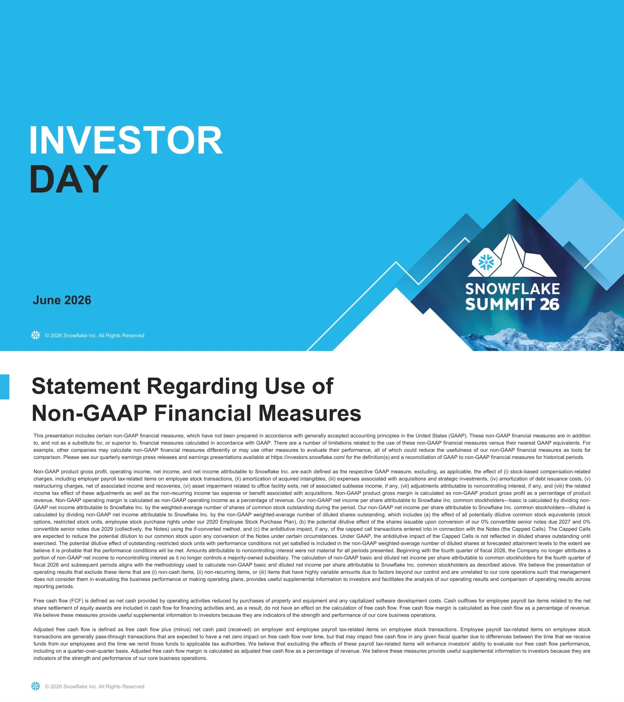
Cover slide announcing Snowflake Investor Day, dated June 2026 and tied to Snowflake Summit 26.
Full-bleed brand-blue field; two-line headline set left at roughly one third height, with the word INVESTOR in white and DAY in near-black; date lower left; event lockup bottom right over a layered mountain graphic.
Legal text defining each non-GAAP measure used in the deck — product gross profit, operating income, net income, free cash flow and adjusted free cash flow — and the items excluded from each.
White background, dense single-column body copy justified across the full width, heading in black with a small blue accent bar at the left margin.
Forward-looking-statements disclaimer under the Securities Act and Exchange Act, enumerating risk factors and directing readers to Snowflake's 10-Q and 10-K filings.
White background, two-column justified legal text, heading with blue accent bar; trademark notice closes the right column.
Speaker introduction card for the CEO, opening the strategy section.
Aurora-and-mountain photographic band across the top quarter; solid brand-blue field below; circular portrait left of centre with name in white and title in black beside it.
A single user asks a question and must traverse a tangled network of systems, errors and handoffs before reaching a single action.
Title top left; left third holds the label OLD over 'Single User — many steps to get to a single action'; right two thirds show a sprawling orange node graph connected by dashed arrows.
The same user, now with agentic leverage, reaches the action through a short blue path while the old tangle fades into the background.
Mirror of the previous slide for direct comparison: label NEW at left, simplified blue path at right, the former orange network greyed back behind it.
Product revenue Y/Y growth rate by quarter from Q2 FY25 to Q1 FY27: 30%, 29%, 28%, 26%, 32%, 29%, 30%, 34% — a dip followed by re-acceleration.
Stacked label 'Product Revenue — Y/Y Growth Rate' at left; eight gradient bars rising from a horizontal axis at right, each topped with its percentage, endpoints labelled Q2 FY25 and Q1 FY27.
Architecture diagram placing an Agentic Control Plane at the centre, fed by Snowflake CoWork and Snowflake CoCo, and connected to AI models, enterprise data and context, and software and applications.
Centred hub-and-spoke: dark navy circle at the centre with concentric halos, two gradient product tiles left and right feeding in by arrows, three labelled circles above and below on dotted connectors.
The platform overview: five workload cards — Data Engineering, Analytics, Transactions, AI, Applications & Collaboration — over a bar reading Fully Managed, Cross-Cloud, Interoperable, Secure, Governed.
Glowing particle sphere centred behind a blue panel; wordmark and subtitle above the cards; five equal white cards in a row; dark navy attribute bar beneath.
Features released roughly doubled from about 200 in FY24 to about 430 in FY26.
Signature big-number layout: metric label with icon at left, grey past-value block, gradient arrow carrying the multiple, blue future-value block; fiscal-year band beneath; faint wave texture at the base.
Net new customer adds grew from 1,719 in FY25 to 2,330 in FY26, up 36%.
Identical to the previous slide's grammar — label and icon left, grey block, arrow with +36%, blue block, fiscal-year band — so the two read as a series.
Five FY27 execution bets presented as equal cards: AI Salesforce, AI Software Engineering, AI-First Internal, SREs and FDEs.
Five rounded blue tiles in a single row, each with a white line icon above its label; pale FY27 band beneath; wave texture at the base.
A single commitment: GAAP profitability targeted for Q4 FY28.
Almost empty white field with two words centred in large brand-blue type; a pale arrow band beneath carries the FY28 Q4E label and points right.
Speaker introduction card opening the product section.
Same card as the CEO slide: aurora photo band, brand-blue field, circular portrait, name and title.
The agentic control plane diagram again, now under an explicit thesis headline about enterprise context, governance and security.
Two-line headline in brand blue at the top; the hub-and-spoke diagram from page 8 repeated beneath, slightly reduced.
The three-pillar differentiation frame introduced in full: Easy (managed platform), Connected (friction-free ecosystem), Trusted (interoperability with universal governance).
Three equal columns, each an icon over a bold navy heading over two or three lines of supporting copy; a glowing globe arc rises from the bottom edge.
The same three pillars with Easy brought forward and the other two greyed back, opening the section on developer and analyst experience.
Identical to the previous slide with a colour-state change only: active column in full colour, inactive columns at low contrast.
CoCo positioned as moving users from 'I have an idea' to 'it's deployed' fast, with three supporting claims: accelerates end-to-end development, understands enterprise data context, and is governed wherever you build.
Left column holds an eyebrow title, a large two-line promise and three icon-led benefit blocks; right third is a gradient panel with stacked product screenshots labelled Snowsight, Desktop and CLI.
What's new in CoCo — Cloud Agents, Local Sandbox, Autonomous Agents, Skill Catalog, and Desktop/Excel/VSCode — with why it matters and the customer impact.
The deck's recurring product template: white left half with a WHAT'S NEW table of five rows; dark navy right half split into WHY THIS MATTERS and CUSTOMER IMPACT bullet groups.
Two tracks — virtualization (run Teradata on Snowflake without rewriting) and modernization (migrate data warehouses, migrate and modernize Spark workloads) — served by an AIM Migration Agent, with twelve supported source systems listed.
Two labelled header bars over three detail cards; a full-width migration-agent strip beneath; a deployment bar; a supported-sources rail listing vendor names across the bottom.
CoWork answers complex questions, automates work and takes action across tools; what's new spans Personal Work Agent, Personal Skills, Automations and Artifacts/Dashboards.
The recurring product template — WHAT'S NEW table at left, navy WHY THIS MATTERS and CUSTOMER IMPACT panel at right.
Saving, sharing and continuing to interact with governed analyses; certified dashboards published from CoCo into CoWork; conversation sharing with citations.
Product template with a dashboard screenshot inside the WHAT'S NEW card at left and the navy two-section panel at right.
Cortex Sense automatically turns metadata into grounded, AI-usable context across all Cortex AI products, with a global ontology and pre-built plugins.
Product template; the WHAT'S NEW card carries a paragraph rather than a list; the navy panel closes with a competitive accuracy claim.
On a sample eval set, accuracy on hard questions rises from 24.1% (frontier coding agent plus SQL MCP) to 47.1% (CoCo/CoWork) to 86.3% (plus Cortex Sense), while monthly cost falls from $78.08 to $19.47.
Two cards side by side — horizontal accuracy bars at left, a three-row cost table at right with the recommended row tinted; a three-column takeaway strip beneath.
A Snowflake and Natoma partnership giving Cortex AI governed access to a verified library of MCP servers, identity-aware authorization over agent actions, and full auditability.
Co-branded logo lockup with a plus sign centred near the top; three text columns beneath, each a bold navy heading over a paragraph.
Six attributes of Datastream: Apache Kafka API compatible, seconds-fresh data in the lake, built-in Snowflake CoCo, topic/table duality, data-centric streaming, and Snowflake-managed native service.
Radial layout — pale blue hub labelled Datastream ringed by six icon nodes, each on a dotted connector to a captioned tile, three left and three right; a small CoCo chat card overlaps the lower left.
The three-pillar frame with Connected brought forward, opening the interoperability and sharing section.
Three-column pillar slide with the middle column active and the outer two muted.
Read any data and write to any Iceberg table across data engineering, AI/ML, analytics and sharing, over Iceberg and Snowflake tables, on any storage location across AWS, Azure and Google Cloud.
Nested rounded containers: workload bar at the top, a table-formats box in the middle, a cloud-logo row beneath, and a natural-language-interactions bar straddling the bottom edge.
Iceberg V3, Horizon Catalog and Snowflake Storage for Apache Iceberg deliver access to data in place, universal governance across engines, and interoperability without lock-in.
Product template — three-row WHAT'S NEW table at left, navy WHY THIS MATTERS and CUSTOMER IMPACT panel at right.
An organization at the centre exchanging data with third-party data providers, apps, native apps, IoT, partner CSPs and consumer CSPs.
Central blue circle containing a buildings icon, surrounded by six orange icon-and-label nodes connected by directional arrows.
Four parties — publisher/media partner, advertiser, measurement partner/agency and outcomes data provider — collaborating around a shared Snowflake core.
Concentric halos around a large snowflake mark, with four person icons at the compass points joined by double-headed arrows.
One platform connected to every system of record — Salesforce and SAP generally available, Workday in private preview, AVEVA and IBM as new partnerships — delivering trusted enterprise data for AI without ETL pipelines.
Three-line claim and three bullets at left; at right a petal diagram with the Snowflake mark at the centre, five partner logos in surrounding lobes, and callout labels on connector lines.
The three-pillar frame with Trusted brought forward, opening the governance, security and performance section.
Three-column pillar slide with the right column active and the other two muted.
Active context for AI, BI and apps: collect from Snowflake, data lakes, SaaS, databases and BI/ETL tools; enrich with schemas, lineage, popularity, descriptions, tags and semantic views; activate into CoCo, CoWork, Cortex Agents and BI tools.
Left-to-right flow — five source cards at left, a central blue ENRICH panel holding six labelled chips, four destination cards at right, with COLLECT and ACTIVATE arrows between; the Horizon Catalog sits on a navy bar beneath.
Trust Center AI Security Package, data exfiltration controls and ransomware protection — secure guardrails against prompt injection, centralized governance, and automated protection policies.
Product template — three-row WHAT'S NEW table at left, navy two-section panel at right.
Adaptive Compute adjusts performance as workloads evolve, delivering 1.6x faster analytics, 2.2x more query throughput per hour and 3.5x faster DML operations versus Gen 1.
Product template with a single-item WHAT'S NEW card at left; the navy panel's CUSTOMER IMPACT section carries three multiplier bullets and a comparison footnote.
Interactive Tables and Interactive Warehouses combine into Interactive Analytics, characterised as low-latency, high-concurrency, fresh-data and low cost per query.
Three-node horizontal diagram with a haloed square at the centre and circular nodes either side on dotted connectors; a full-width blue attribute bar beneath.
All teams, all tools and all data flow into the AI Data Cloud and out to predictable performance at scale, faster time to market and enterprise-grade reliability.
Inputs as three icon circles with chevrons at left, the AI Data Cloud platform panel from page 9 at the centre, three outcome labels with chevrons at right, joined by dotted paths.
The agentic control plane diagram shown a third time, closing the product section on the same picture that opened it.
Headline over the hub-and-spoke diagram, identical to page 15.
Speaker introduction card opening the financial section.
The standard speaker card: aurora photo band, brand-blue field, circular portrait, name and title.
Section divider introducing the market sizing discussion.
Full-bleed brand-blue field with a two-line, two-tone headline set left; layered mountain graphic bottom right.
Snowflake's estimated total addressable market roughly doubles from $225 billion in FY26 to $460 billion in FY31.
The big-number grammar again — grey $225 block, gradient arrow carrying 2x, blue $460 block — with a dotted FY26-to-FY31 timeline beneath.
Average trailing twelve-month product revenue rises across FY24–FY26 for both cohorts: top 25 product revenue customers from $21.9M to $34.1M, Forbes Global 2000 customers from $1.6M to $2.4M.
Stacked metric title at left; three paired-bar groups at right, each pairing a small dark navy bar with a tall blue bar and value labels; two-item legend beneath.
Section divider introducing the land-and-expand growth engine.
Full-bleed brand-blue divider matching page 41.
Net new customer adds by fiscal year — 1,662 in FY24, 1,719 in FY25, 2,330 in FY26 — a 36% year-over-year increase described as the fundamental driver of long-term durable growth.
Three vertical bars with value labels above; a blue callout tile at right carries +36% with a short interpretive sentence beneath it.
Net revenue retention rate holds between 124% and 126% across FY26 Q1 through FY27 Q1.
Five horizontal bars stacked at left with quarter labels outside and percentages inside; a stacked headline reading 'Best-in-Class Net Revenue Retention Rate' at right.
A stacked area chart from FY19 to FY26 showing each annual customer cohort continuing to grow rather than decay, with earlier cohorts forming a widening base.
Full-width stacked area chart with a right-hand legend naming eight cohorts from FY19-and-earlier through FY26; fiscal years along the horizontal axis.
Migration count grew 1.9x and use case count excluding migrations grew 1.7x from FY25 to FY26.
Two paired-bar groups side by side, each a dark navy FY25 bar and a taller blue FY26 bar with a multiplier callout attached to the taller bar; captions beneath.
Five migration source categories: mixed on-prem OLAP/OLTP, first-generation cloud data warehouse, on-prem data warehouse, first-generation cloud ISV and on-prem big data.
Five rounded blue tiles in a three-over-two arrangement, centred; faint wave texture behind the lower row.
The mix of target commissions across FY24 to FY27E shifts among consumption, bookings and new customers, with new customers established as a separate component beginning in FY25.
Four stacked columns, one per fiscal year, each segmented into up to three colour-coded bands with icons; a right-hand legend names the three components.
Two priorities: stable execution (depth of experience, no changes to sales compensation plans, technical depth on core competencies) and AI opportunity (improving go-to-market efficacy and driving productivity).
Two outlined cards side by side, each with an icon-and-heading lockup at the top and a short bulleted list beneath.
Section divider introducing evidence that AI is already affecting the core business.
Full-bleed brand-blue divider matching pages 41 and 44.
Three operating improvements: sales cycles shortening from FY25 to FY26, trailing-twelve-month dollar-weighted time to ramp falling from 10 months to 7, and median won-to-deployed migration time improving 40%.
Three tinted panels in a row, each with a bold heading above, a small chart inside and a metric definition caption below.
A $1M+ equipment company's product revenue trajectory, with forecasts before and after adopting Snowflake CoWork diverging from FY27 Q1 onward.
Line chart with an actual-revenue line to the adoption point marked by a circled sparkle icon, then two forecast lines — orange above, navy below — with the gap between them shaded.
The same before-and-after forecast treatment for a $1M+ semiconductor company adopting Snowflake CoCo.
Line chart matching the previous slide so the two read as a pair.
Two framing questions used as a transition into discussion.
Two large rounded blue panels side by side, each with an icon top left and a two-line question in white; halftone dot texture at the right edge of each.
Section divider introducing the margin and capital allocation discussion.
Full-bleed brand-blue divider, the fourth in the deck.
Non-GAAP operating margin rising from 6.4% in FY25 to 10.5% in FY26 and 13.5% in FY27E, while non-GAAP product gross margin eases from 76.3% to 75.8% to 75.0%.
Two charts side by side — an ascending line with point labels at left, three bars with value labels at right — each with a bold caption beneath; a long reconciliation note runs across the bottom.
Headcount-related expenses falling as a percentage of revenue while cloud spend rises modestly, combining to produce operating leverage.
Two equation-style cards side by side, each stacking a term, a plus sign, a second term, an equals sign and an outcome; curly braces beneath converge on the words Operating Leverage.
A topic slide announcing the free cash flow discussion.
Aurora photo band across the top; brand-blue field below with a two-line white headline centred.
Billings by payment terms: annual in-advance at 82% in FY24, 82% in FY25 and 86% in FY26 — evidence that cash flow strength is not the product of changing terms.
Three large rounded blue tiles in a row, each with a percentage in oversized white type over the label Annual In-Advance, with the fiscal year beneath the tile.
Billings growth can diverge from revenue growth within a single year: FY24 36% revenue against 29% billings, FY25 29% against 20%, FY26 29% against 36%.
Stacked headline at left; three paired-bar groups at right, light blue for revenue and dark navy for billings, with percentage labels above each bar and a two-item legend beneath.
Over a multiyear timeframe the divergence resolves: a 29% revenue CAGR against a 28% billings CAGR.
Same chart as the previous slide with the percentage labels removed and two dashed CAGR lines overlaid, each ending in a large right-hand callout; four-item legend beneath.
Non-GAAP operating margin leverage plus a consistent decrease in stock-based compensation as a percentage of revenue equals GAAP profitability in Q4 FY28.
A single centred equation card — blue upper half holding the two inputs separated by a plus badge, white lower half holding the conclusion after an equals badge.
Three uses of capital: organic growth through R&D and sales and marketing investment, a stock repurchase program with $0.8 billion remaining of a $4.5 billion authorization, and M&A to accelerate the product roadmap.
Three cards in a row, each with a blue header band carrying the category name and a white body holding an icon or figure over a short description.
Four closing pillars: large and growing market opportunity, durable growth drivers supporting the core business, AI accelerating revenue growth, and a clear framework to reach GAAP profitability.
Four columns separated by thin vertical rules, each an icon above a two- or three-line label; generous white space above and below.
Question and answer holding slide.
Full-bleed brand-blue field with a single word set large in white at the left; mountain graphic bottom right.
Closing slide with the Snowflake wordmark.
Full-bleed brand-blue field with a two-line, two-tone headline set left; wordmark and copyright bottom left over a fine wave texture.
Divider opening the appendix.
Full-bleed brand-blue divider with a single-word headline in near-black.
Definitions for every metric footnoted in the deck: product revenue, net revenue retention rate, Forbes Global 2000 customers, total customers, migration count, target commissions, dollar-weighted average time to contract consumption run rate, top 25 product revenue customers, cohort, average trailing twelve-month product revenue, and median won-to-deployed.
White background, single-column body copy at small size with each term bolded as a run-in lead; heading with blue accent bar.
Questions courantes sur cette diapositive et le contenu de présentation sous-jacent.
A 70-page investor day presentation in both PDF and editable PowerPoint, plus a page-by-page preview so you can see every slide before you download. The PPTX keeps the layouts, charts and section dividers editable so you can swap in your own numbers and branding.
It is Snowflake's own Investor Day presentation from June 2026, published by the company for its investors — including the non-GAAP statement, safe harbor language and the full metric definitions appendix. That is what makes it useful as a reference: the structure and the disclosure discipline are what a public company actually ships, not an approximation of it.
The spine here is worth stealing: legal disclaimers up front, then CEO strategy, then a product deep dive led by the product executive, then the CFO's financial framework, then Q&A, then an appendix of definitions. Four full-bleed section dividers — Market Opportunity, Core Growth Drivers, AI Accelerates Growth, Margins and Capital Allocation — break 70 pages into acts the audience can follow.
The 'WHAT'S NEW / WHY THIS MATTERS / CUSTOMER IMPACT' product template appears eight times and works for any feature announcement. The big-number comparison layout — grey past value, arrow with the multiple, blue future value — is used for product velocity, customer adds and TAM, so it adapts to almost any growth metric. The three-pillar navigator slide, shown once in full then three times with one pillar highlighted, is a clean way to keep a long deck oriented.
It includes the financial section in full: quarterly product revenue growth, net revenue retention, product revenue by cohort as a stacked area chart, operating and gross margin trends, billings versus revenue divergence and its multiyear normalization, payment terms, and capital allocation. Those are the chart types investor decks are usually missing.
Open the PPTX and check each chart before you commit to it — exported investor decks often contain a mix of native PowerPoint charts and pasted images. The layouts, text, colours and shapes are editable regardless, so even a flattened chart can be replaced in place without rebuilding the slide.
One brand blue carries nearly the whole deck, supported by dark navy for contrast bars and secondary chart series, grey for prior-period values, and orange used almost exclusively to represent the 'before AI' state. Headings sit at the top left behind a small blue accent bar, body text stays sparse, and section dividers invert to a full-bleed blue field with a two-tone headline.
Because nearly every number in the body carries a footnote pointing there. Defining net revenue retention, cohort, migration count and time-to-ramp in writing lets the chart slides stay clean while keeping each claim checkable — the single easiest practice to copy if analysts have ever questioned how you calculate a metric.
The deck itself directs readers here for non-GAAP definitions and GAAP reconciliations; quarterly earnings releases and presentations are published on this page.

Create Your Own Slides
Turn your ideas into professional presentations in seconds with 2slides AI.
Référencez des conceptions professionnelles, choisissez votre style et générez des diapositives avec un rendu de texte parfait. Alimenté par Nano Banana—commencez à créer votre présentation maintenant.
Your AI Agent for slides. Save time, shine faster with intelligent presentation creation.




© 2026 2slides. All rights reserved.