
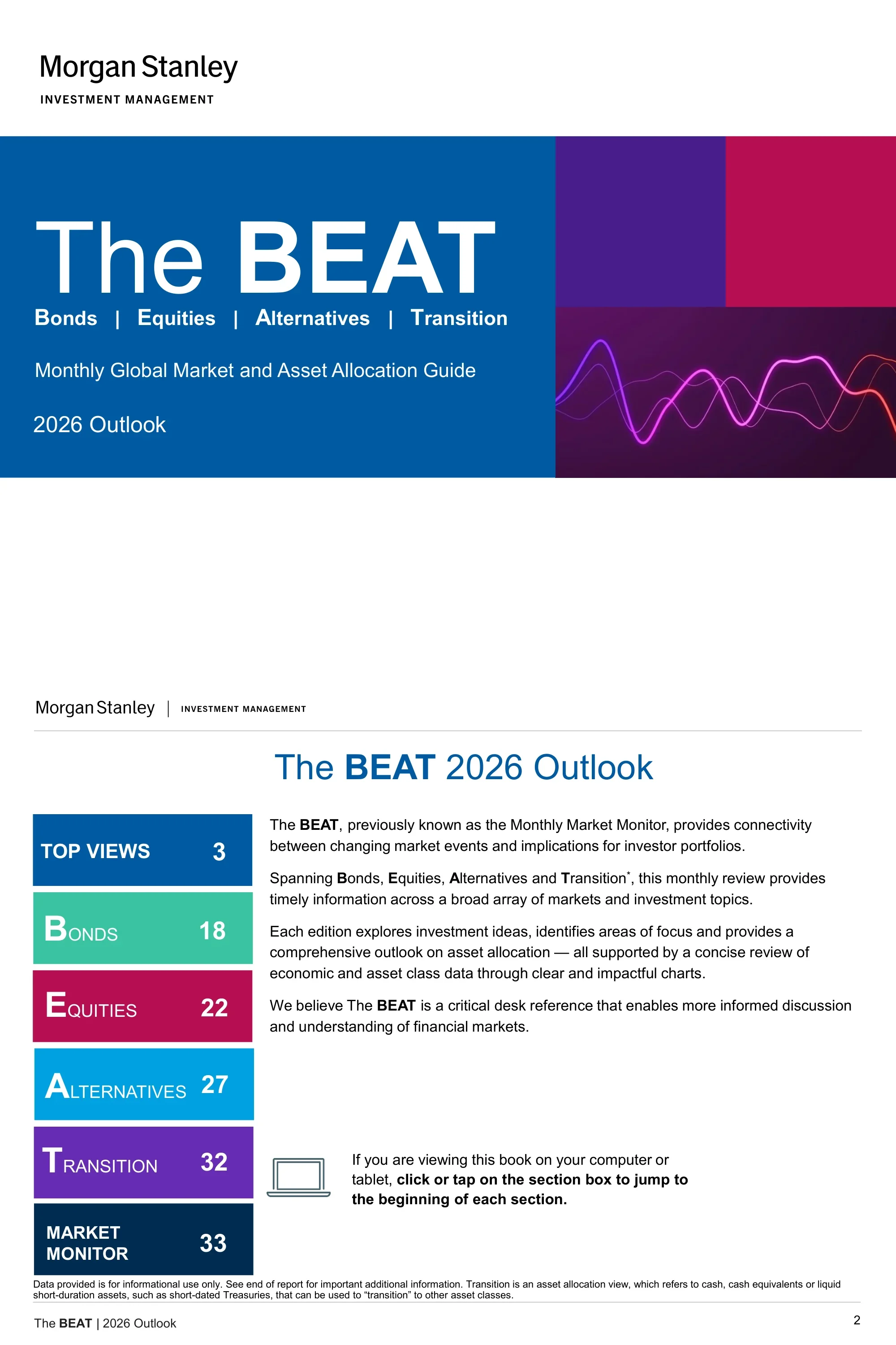
The BEAT 2026 Outlook — Morgan Stanley Investment Management's monthly global market and asset allocation guide covering Bonds, Equities, Alternatives, and Transition for 2026.
Быстрая навигация
Теги
Поделиться слайдами
The BEAT 2026 Outlook — Morgan Stanley Investment Management's monthly global market and asset allocation guide covering Bonds, Equities, Alternatives, and Transition for 2026.
Подробный просмотр каждой страницы слайда, включая макет, ключевой контент и визуальные элементы.
Cover page featuring the title 'The BEAT', subtitle 'Bonds | Equities | Alternatives | Transition', and '2026 Outlook' branding on a navy blue background with abstract purple/magenta wave graphics.
Full-bleed cover with centered title text, Morgan Stanley Investment Management logo, and abstract decorative wave graphic in lower portion.
Lists six main sections (Top Views p3, Bonds p18, Equities p22, Alternatives p27, Transition p32, Market Monitor p33) and describes The BEAT as a desk reference connecting market events to portfolio implications.
Clean two-column layout with section names on left and page numbers on right, introductory paragraph at top describing the guide's purpose.
Presents the thesis that 2026 may see a U-shaped economic recovery supported by procyclical policy, inflation/labor stabilization, deregulation focus, and international pro-growth policies including EU reindustrialization.
Text-driven executive summary page with bullet-point thesis statements and supporting narrative under bold section header.
Six numbered active investment views: overweight US equities, prefer US large-cap with mid-cap exposure, selective Europe overweights, underweight duration with steepening bias, prefer higher-yielding credit, and Non-Agency MBS/RMBS as highest conviction bond overweight.
Numbered list format with six distinct views, each with a concise headline and supporting rationale in a structured grid.
Asset allocation matrix spanning Bonds, Equities, Alternatives, and Transition with conviction dots ranging from double-underweight to double-overweight for each sub-asset class.
Four-column matrix table with conviction dot scale (-- to ++) for each asset class row, color-coded by BEAT section.
Narrative commentary on the representative portfolio positions: duration underweight with 10-year UST above 4%, credit underweight due to tight spreads, equities neutral with US overweight regionally, and commodities neutral with precious metals structural tailwinds.
Four-section commentary block with bold category headers (Duration, Credit, Equities, Commodities) and supporting prose paragraphs.
Detailed allocation matrix for fixed income covering government bonds (USTs, TIPS, Eurozone, EM hard/local) and public credit (munis, IG, MBS/ABS, HY, bank loans) with conviction ratings; highest conviction overweight in MBS/ABS.
Two-section table (Government Bonds and Public Credit) with sub-asset class rows and conviction ratings column.
Detailed per-sub-asset-class commentary on positioning rationale for each fixed income segment including rationale for underweighting IG, overweighting TIPS and European peripherals, and overweighting bank loans.
Multi-paragraph commentary organized by sub-asset class with bold subheadings for each fixed income category.
Equity allocation matrix covering US, Eurozone, Japan, and EM by style (growth vs value, quality, size, cyclicals vs defensives) with conviction ratings; overweight US, targeted Europe exposure, prefer large-caps and cyclicals.
Regional and style-factor matrix table with conviction ratings, organized by geography and investment style rows.
Commentary on US overweight driven by 3Q25 earnings strength and AI adoption; Europe neutral with targeted bank/German mid-cap overweights; Japan neutral due to tariff uncertainty; EM neutral with China trade truce and India headwinds noted.
Four-region commentary block (US, Europe, Japan, EM) with bold country/region subheadings and supporting rationale paragraphs.
Four key 2026 investment themes with implementation ideas: Global Fiscal Expansion, EU Investment Renaissance, US Productivity Boom, and Corporate Credit Is Expensive — each showing overweight and underweight trade ideas.
Four-row table with theme name, description, and implementation columns; green text for overweights and red text for underweights.
Line chart of US Industrial Capacity Utilization, JOLTS Job Opening Rate, and NY Fed Financial Conditions from 2015–2025 showing softening labor market and industrial cycle that interrupted the mid-cycle rebound.
Full-width line chart with three data series, legend, time axis 2015–2025, and chart title with explanatory caption below.
Table outlining four growth acceleration drivers for 2026: Fed Policy easing, Fiscal Policy via OBBBA tax breaks, Trade Policy with peak tariff headwinds fading in 2H26, and Deregulation.
Four-row table with driver name and detailed description columns, bold driver headings and explanatory prose.
Charts showing 62% of S&P 500 firms discussed AI on 3Q25 earnings calls, with a sector breakdown led by Communication Services, Financials, and Information Technology.
Dual-panel chart page with a headline statistic (62%), a bar chart of sector AI discussion rates, and explanatory text.
Two downside risk scenarios: Downside #1 is labor market deterioration illustrated by an initial jobless claims chart; Downside #2 is non-tariff inflation rise illustrated by Atlanta Fed Wage Tracker chart.
Two-panel layout with each downside scenario in its own column, each containing a chart and descriptive risk narrative.
Germany's fiscal expansion mirrors post-Reunification (23.4% vs 19.9% cumulative change in cyclically adjusted balance) and Japan's supplementary budget is at its highest in 20 years, illustrating fiscal expansion as a global 2026 theme.
Two-chart layout with Germany fiscal comparison chart on one side and Japan supplementary budget bar chart on the other, with explanatory captions.
Bar charts showing year-over-year changes in G10 and major EM central bank policy rates for 2025 and 2026, illustrating that monetary easing continues but at a slower pace globally.
Dual bar chart layout with G10 central banks on left and major EM central banks on right, showing 2025 vs 2026 YoY rate changes.
Taylor Rule vs Fed Funds Rate chart (1991–2025) supporting the duration underweight case, with base case at 3.7%, market pricing at 3.1%, overheating risk at 4.9%, and recession risk at 1.5%.
Full-width time series chart with Taylor Rule and Fed Funds Rate overlaid, annotated scenario range bands, and supporting rate scenario table.
Credit card delinquency chart and Moody's default rate forecast through 2026 showing that while spreads are tight, underlying credit fundamentals remain healthy.
Two-chart layout with credit card delinquency trend on left and Moody's default rate forecast bar/line chart on right.
Municipal bond yield curve compared to the Treasury curve, highlighting the steepest portion from 10 to 20 years as the key area of focus for active muni management in 2026.
Dual yield curve chart comparing muni curve vs Treasury curve with maturity on x-axis and yield on y-axis, annotated steepest segment.
Spread percentile ranks vs 10-year history show Non-Agency RMBS at 56th percentile and CMBS at 66th percentile, with current yields above 10-year averages supporting the highest-conviction bond overweight.
Two-panel layout with spread percentile rank bar chart for securitized sectors and current yield vs 10-year average comparison table.
Chart of ISM Composite PMI vs S&P 500 12-month total return from 1997–2025 showing that improving PMI readings historically correlate with positive equity returns.
Dual-axis time series chart with ISM PMI on one axis and S&P 500 12-month return on the other, spanning 1997–2025.
Sector EPS growth rates for growth, cyclical, and defensive sectors from 2023 to 2026 estimates, identifying which sectors could drive upside to earnings expectations.
Grouped bar or line chart showing EPS growth by sector category (growth/cyclical/defensive) across 2023–2026 time period.
AI momentum vs cyclical recovery by region showing US at ~13% EPS growth led by growth sectors and EM at ~17% EPS growth, with different driver profiles for Europe and Japan.
Regional comparison matrix or quad chart showing AI momentum vs cyclical recovery positioning for US, Europe, Japan, and EM with EPS growth annotations.
MSCI Europe EPS growth contribution by sector showing Financials and Industrials now dominating earnings contributions, a structural shift vs the 2009–2019 period.
Stacked bar chart of MSCI Europe sector EPS contribution comparing current period vs 2009–2019 historical baseline.
Three reasons the bull market extension is expected: Year 4 of bull markets historically averages 13.7% return, monetary policy friendly environment yields 1.7% average return when rates fall, and OBBBA provides $170.4B in consumer aid from fiscal policy.
Three-panel supporting evidence layout, each panel containing a chart or data point supporting the bull market extension thesis.
Overview of private markets outlook by sub-asset class: PE neutral/positive on improving M&A, Private Credit neutral with tactical caution, Infrastructure neutral/positive on data centers, Real Estate positive on living/industrial, Natural Resources neutral/positive on farmland.
Five-row summary table with sub-asset class, outlook rating, and key commentary columns.
Positive on buyouts and growth equity, neutral on venture capital; buyout valuations at 10–11x vs 14–15x for public equities, and AI consolidating more than 50% of the VC market.
Split-layout page with buyout/growth analysis on one side and venture capital analysis on the other, supported by valuation comparison charts.
Direct lending assessed as less attractive while special situations are better positioned; PIK interest increasing as a stress indicator and new issue spreads tightening as a caution signal.
Two-panel layout with direct lending assessment on one side and special situations opportunity analysis on the other, with supporting spread and PIK charts.
Constructive on energy infrastructure and selective on digital infrastructure; strong data center demand, renewables positive, transport infrastructure negative to neutral.
Sub-sector breakdown table or chart with energy/digital/transport rows and constructive/selective/cautious outlook ratings.
Residential and industrial real estate supported by long-term tailwinds with cap rates at best entry point since post-GFC, while new development has significantly reduced supply.
Real estate sector analysis with cap rate chart showing current levels vs post-GFC historical comparison and supply/demand balance commentary.
Five-year and 10-year correlation matrix between major asset classes including S&P 500, International, EM, Small Cap, US Aggregate, Municipal, High Yield, Bank Loan, and Commodities.
Full correlation matrix table with asset classes on both axes, color-coded cells from high positive to high negative correlation, with 5-year and 10-year columns.
Comparison of developed market and emerging market 10-year sovereign bond yields across countries, providing a global rates snapshot.
Bar chart or table comparing DM and EM 10-year sovereign yields with country labels and current yield values.
Comprehensive table of current key rates vs 12 months ago across central bank policy rates, short-term rates, and benchmark yields for major economies.
Multi-column data table with rate name, current value, and 12-month-ago value columns for all major global interest rates.
Central bank policy rates and market-implied forward rate expectations across major central banks globally.
Chart or table showing current policy rates and market-priced forward paths for the Fed, ECB, BOJ, BOE, and other major central banks.
US Treasury yield curves and performance table showing current curve shape, historical comparisons, and return attribution across Treasury maturities.
Dual-panel with US Treasury yield curve chart and performance/characteristics data table below.
Developed market currency performance and yield comparison showing returns and current yield levels across major DM currencies vs the US dollar.
Bar chart of currency returns with corresponding yield table for DM currencies.
Comprehensive bond index characteristics and performance table covering yield, duration, spread, quality, and return metrics across all major fixed income indices.
Large multi-column data table with bond index rows and characteristics/performance columns including YTD, 1-year, 3-year returns.
Range chart showing current credit spreads vs historical ranges for all major credit sectors, enabling relative value assessment across the credit universe.
Horizontal range bar chart with credit sector rows showing minimum, maximum, average, and current spread levels in basis points.
Detailed investment grade and high yield corporate bond performance data including index returns, spread levels, issuance volumes, and fund flow statistics.
Two-section page with IG data on top and HY data below, each with performance table and supporting chart.
Continuation of corporate bond analysis with spread trend charts and default rate data for investment grade and high yield markets.
Two-chart layout showing spread history and default rate trends for the corporate bond market.
Municipal bond index performance table covering major muni indices by maturity, credit quality, and sector with YTD and trailing return data.
Multi-row performance table organized by muni index type, maturity, and credit quality with return period columns.
AAA municipal-to-Treasury yield ratios and credit quality spread analysis illustrating relative value in the muni market.
Two-chart layout with muni-to-Treasury ratio chart on left and credit quality spread chart on right.
Performance and characteristics data for EM sovereign hard currency, EM corporate, and EM local currency bond markets.
Three-section performance table (EM sovereign, EM corporate, EM local) with spread, yield, and return metrics.
Comparison of local currency sovereign yields for developed and emerging market countries, providing a global rates landscape snapshot.
Bar chart or table showing local sovereign yields for DM and EM countries sorted by yield level.
Yearly return ranking table for fixed income asset classes showing annual performance from multiple years through the current period.
Color-coded performance quilt/ranking table with fixed income asset classes in columns and years in rows, sorted by return.
Value, core, and growth return comparison by market capitalization (large, mid, small) across 1-month, 1-year, and 3-year periods.
Style-box matrix grid showing returns for 9 style/size combinations across three time periods.
Historical and current dividend yield analysis for major equity indices alongside S&P 500 correlation data and VIX volatility index levels.
Multi-chart page with dividend yield trend chart, equity correlation chart, and VIX volatility chart.
Next-twelve-months P/E ratios by region and investment style showing current levels vs historical highs, lows, and averages for global equity markets.
Bar or dot chart with NTM P/E for each region/style, showing current dot vs high/low/average range bars.
S&P 500 sector-level NTM P/E ratios comparing current valuation to historical high, low, and average ranges for all 11 GICS sectors.
Sector-by-sector range chart with current P/E dot and historical min/max/average range bars for each S&P 500 sector.
Expected vs actual earnings per share growth by region and sector, tracking consensus estimates against realized EPS for global equity markets.
Multi-panel chart showing EPS growth expected vs actual for US, international, and EM equity markets by sector.
S&P 500 1-month returns analyzed by factor quintiles including earnings growth, P/E ratio, ROE, market cap, beta, and dividend yield.
Factor analysis table or bar chart showing 1-month average returns sorted by factor quintile for six equity characteristics.
Year-to-date S&P 500 returns analyzed by the same factor quintiles (earnings growth, P/E, ROE, market cap, beta, dividend yield) as the 1-month analysis.
Factor analysis table or bar chart showing YTD average returns by factor quintile, mirroring the 1-month format.
S&P 500 and MSCI World sector returns for 1-month and 1-year periods across all major GICS sectors.
Dual-index sector return table with S&P 500 and MSCI World columns for both 1-month and 1-year return periods.
Detailed index characteristics table with sector metrics plus S&P 500 and MSCI World sector weight donut charts showing current portfolio composition.
Split page with metrics table on top or left and two donut charts showing S&P 500 and MSCI World sector weights.
Comprehensive equity return table covering US equities, global equities, and sector returns for multiple time periods.
Multi-row performance table with equity asset class rows and time period return columns (1-month, 3-month, YTD, 1-year, 3-year, 5-year).
Yearly return ranking quilt for equity asset classes (Growth, Value, S&P 500, etc.) showing annual performance rankings across multiple years.
Color-coded performance quilt with equity asset classes ranked by annual return from best (top) to worst (bottom) for each calendar year.
Detailed commodities return table by sub-category covering agriculture, energy, industrial metals, precious metals, and livestock across multiple return periods.
Multi-section table organized by commodity sub-category with individual commodity rows and return period columns.
Annual performance ranking quilt for hedge fund strategies showing how different strategies ranked against each other each year.
Color-coded performance quilt with hedge fund strategy categories ranked by annual return for each calendar year.
Top 10 and bottom 10 mutual fund and ETF categories by fund flows, showing where investor capital is moving into and out of.
Two-column layout with top 10 inflow categories on one side and top 10 outflow categories on the other, with flow dollar amounts.
Comprehensive yearly return ranking table for all major asset classes (equities, fixed income, alternatives) from 2015 through YTD 2025.
Full-page color-coded performance quilt spanning all major asset classes and 10+ calendar years.
Team photo and biographies for the Portfolio Solutions Group, featuring Jim Caron (CIO) and other key team members including Mark Bavoso.
Team photo grid with individual headshots, names, and titles for Portfolio Solutions Group members.
Full listing of Asset Allocation Committee members with their names and titles within Morgan Stanley Investment Management.
Formatted list or table of committee member names with corresponding titles/roles.
Comprehensive glossary of index definitions for all benchmarks and indices referenced throughout the presentation.
Two-column text glossary with index name in bold and definition in regular text, alphabetically or logically organized.
Continuation of index definitions plus general terms definitions and introductory risk disclosures for the presentation.
Continued two-column glossary format transitioning into risk disclosure section with header separation.
Detailed risk considerations for the asset classes covered in the presentation plus additional legal and informational disclaimers.
Dense text page with Risk Considerations section followed by Additional Information section, using small font size for regulatory compliance text.
Jurisdiction-specific distribution and legal disclaimers for EMEA, Middle East, and United States investors.
Multi-section legal disclaimer page organized by jurisdiction with EMEA, Middle East, and US sections clearly delineated.
Legal disclaimers and distribution information specific to Asia Pacific jurisdictions for Morgan Stanley Investment Management.
Full-page legal disclaimer text organized by Asia Pacific country or jurisdiction.
Распространенные вопросы об этом слайде и основном содержании презентации.
The BEAT 2026 Outlook is a 68-page institutional investment guide published by Morgan Stanley Investment Management. BEAT stands for Bonds, Equities, Alternatives, and Transition — the four asset class pillars covered. It serves as a monthly desk reference connecting market events to portfolio implications for professional investors.
The six top active views are: overweight US equities, prefer US large-cap with some mid-cap exposure, selective overweights in Europe (banks and German fiscal beneficiaries), underweight duration with a yield curve steepening bias, prefer higher-yielding credit over investment grade, and Non-Agency MBS/RMBS as the highest-conviction bond overweight.
The central thesis is a shift 'From K Shaped to U Shaped' recovery, where four drivers support 2026 growth acceleration: Federal Reserve policy easing, fiscal policy stimulus via the OBBBA tax package, fading trade policy headwinds in the second half of 2026, and deregulation — together enabling a mid-cycle rebound resumption.
The Alternatives section covers private equity (positive on buyouts, neutral on venture capital), private credit (neutral with caution on direct lending, preference for special situations), infrastructure (constructive on energy, selective on digital/data centers), real estate (positive on residential and industrial), and natural resources. Each sub-asset class includes outlook rating and key drivers.
The highest-conviction overweight is Non-Agency MBS and RMBS (spread percentile at 56th, yields above 10-year averages). Other preferences include TIPS (inflation protection), EM hard currency bonds, and bank loans. The team is underweight duration overall and underweight investment grade credit due to tight spreads.
The Market Monitor section spans pages 33 through 61 — 29 pages of granular market data covering sovereign yields, key rates, monetary policy, US Treasuries, currencies, bond characteristics, spread analysis, corporate and municipal bonds, emerging markets, equities valuation, earnings, factor returns, commodities, hedge funds, fund flows, and multi-year asset class performance quilts.
The presentation uses a clean, professional institutional format on white backgrounds with Morgan Stanley's signature navy blue (#003B73) for headers and accents. Charts use a consistent palette of blue, gray, teal, magenta, and purple. Every page has a footer reading 'The BEAT | 2026 Outlook' with a page number. Data sources include Bloomberg, FactSet, and Morningstar.
Yes. The presentation demonstrates best practices for institutional asset allocation communications: a clear top-views framework with conviction ratings, section-by-section asset class deep dives, comprehensive market data appendix, multi-scenario risk analysis, and full regulatory disclaimers. It can serve as a structural reference for fixed income, equity, or multi-asset investment outlook presentations.

Create Your Own Slides
Turn your ideas into professional presentations in seconds with 2slides AI.
Используйте профессиональные дизайны, выберите свой стиль и генерируйте слайды с идеальной отрисовкой текста. На базе Nano Banana—начните создавать свою презентацию прямо сейчас.
Ваш AI-агент для слайдов. Экономьте время, сияйте быстрее с интеллектуальным созданием презентаций.




© 2026 2slides. Все права защищены.